Configuration of a Cell
Each cell of a layout takes a configuration object that defines what the cell shows and how it behaves. The properties of this object set the content and the header of a cell, its size and borders, and the ability of a user to collapse, hide or resize the cell. The sections below go through these settings one by one, while the full list of the available properties is in the Cell API overview.
HTML content
A layout cell can have any HTML content inside it. You can set it with the html attribute in the object of a cell.
const layout = new dhx.Layout("layout_container", {
    cols: [
        { header: "Cell header", html: "Hello world"}
    ]
});
Related sample: Layout. HTML content
Cell header
Each layout cell can have a header with some text that describes the content of this cell.
const layout = new dhx.Layout("layout_container", {
    cols: [
        { header: "Perfect cell header"}
    ]
});
You can also add an icon or an image into the header of a cell with the help of corresponding attributes - headerIcon and headerImage.
const layout = new dhx.Layout("layout_container", {
    cols: [
        { header: "Cell header", headerIcon: "dxi dxi-check" }
    ]
});

// or
const layout = new dhx.Layout("layout_container", {
    cols: [
        { header: "Cell header", headerImage:"/img.png"}
    ]
});
Related sample: Layout. Header
Height of a header cell
You can specify the necessary height of the header of a cell using the headerHeight configuration option of the cell:
const layout = new dhx.Layout("layout_container", {
    rows: [
        {
            id: "row1"
        },
        {
            id: "row2",
            header: "Row 2",
            headerHeight: 80
        }
    ]
});
Related sample: Layout. Header
If the header property is not set in the config of a cell, the headerHeight option will add a header without text for a cell.
Custom content in a cell header
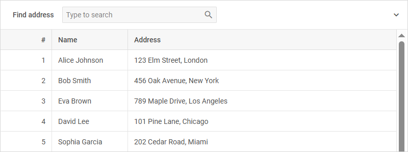
Besides a text, the header of a cell can contain HTML markup or a DHTMLX widget. For this purpose, set the header property to a callback function. While rendering the cell, Layout calls the function with the configuration object of the cell and places the returned content into the header.
The type of the value that you set for the header property defines the expected behavior:
- a string: the header shows it as plain text, and Layout doesn't interpret HTML tags, it displays them as part of the text
- a callback function: tells Layout that the header supports HTML content
A cell with a custom header collapses and expands as any other cell, see the Collapsibility section.
HTML markup in a header
To render HTML markup in a header, return a string with the necessary tags from the callback:
const layout = new dhx.Layout("layout_container", {
    cols: [
        {
            id: "orders",
            header: cell => `<b>Orders</b> <i>3 new</i>`
        }
    ]
});
Related sample: Layout. Cell header with HTML template
A DHTMLX widget in a header
To render a DHTMLX component in a header, return an initialized widget, the same object that you pass to the attach() method of a cell. The name of a component doesn't work here, as the header treats any returned string as HTML:
const toolbar = new dhx.Toolbar(null, {
    data: [
        { id: "add", type: "button", value: "Add", icon: "dxi dxi-plus" },
        { id: "remove", type: "button", value: "Remove", icon: "dxi dxi-delete" }
    ]
});

const layout = new dhx.Layout("layout_container", {
    cols: [
        { header: () => toolbar }
    ]
});
Related samples:
Icon, image and height of a custom header
The headerIcon and headerImage options work with a custom header as well. The cell renders the icon and the image before the content that the callback returns.
The height of a header adjusts to the size of the custom content. To use a fixed height, set the headerHeight option.
Events of the header content
To handle clicks and other DOM events of the markup that the callback returns, use the on property of the cell with the selector of the necessary element.
The example below shows how to make a control inside a custom cell header interactive. The header callback returns markup with a "Check now" button, and a click on that button rebuilds the content of the cell:
// builds the HTML content of the cell
function metrics() {
    return `<div>Checked at ${new Date().toLocaleTimeString()}</div>`;
}

const layout = new dhx.Layout("layout_container", {
    rows: [
        {
            id: "service",
            html: metrics(),
            header: () => `<span>API service</span>
                <button type="button">Check now</button>`,
            on: {
                click: {
                    "button": function() {
                        layout.getCell("service").attachHTML(metrics());
                    }
                }
            }
        }
    ]
});
The attachHTML() call repaints the cell, so Layout calls the header callback again and renders the header with the current data as well.
Related sample: Layout. Cell header with HTML template
Cell size
You can easily control and change the size of a cell via the width and height attributes of the object of a cell.
const layout = new dhx.Layout("layout_container", {
    rows: [
        {
            cols: [
                {
                    header: "Block 1",
                    width: "40%"
                },
                {
                    header: "Block 2",
                    width: "60%"
                }
            ]
        },
        {
            rows: [
                {
                    header: "Block 3",
                    height: "200px"
                },
                {
                    header: "Block 4",
                    height: "300px"
                }
            ]
        }
    ]
});
Starting from v7.0, you can define the maximal and minimal sizes for a cell by using its corresponding configuration properties: maxHeight, maxWidth, minHeight, minWidth.
const layout = new dhx.Layout("layout_container", {
    cols: [
        {
            header: "Cell header",
            minWidth: "400px",
            maxWidth: "600px",
            minHeight: "40px",
            maxHeight: "100px"
        }
    ]
});
Note, that minWidth/maxWidth properties prevent the width of a cell from being less/greater than minWidth/maxWidth values accordingly. The minHeight/maxHeight options work in the same way.
const layout = new dhx.Layout("layout_container", {
    cols: [
        {
            header: "Cell header",
            width: "50%",
            maxWidth: "200px"
        }
    ]
});
As you can see from the code example above, the width of the cell occupies 50% of the parent container width but is not larger than 200px.
Autosize for cells
Starting with v7.0, you can configure a cell so that its width/ height would automatically adjust to the width/ height of the cell content. For this purpose, you need to set the width/ height options to "content":
const layout = new dhx.Layout("layout_container", {
    cols: [
        {
            header: "Cell header",
            width: "content"
        },
        // more options
    ]
});
Resizability
To allow resizing of a cell, make use of the resizable option in the object of a cell.
const layout = new dhx.Layout("layout_container", {
    cols: [
        { header: "Cell header", resizable:true}
    ]
});
Related sample: Layout. Collapsable and resizable
Hidden cell
It is possible to add the hidden attribute into the the object of a cell(s) to render a layout with some cells hidden:
const layout = new dhx.Layout("layout_container", {
    cols: [
        { header: "Cell header", hidden:true}
    ]
});
Collapsibility
There are two attributes of the object of a cell: collapsable and collapsed. The first one defines whether a cell can be collapsed and expanded, and the second one checks whether a cell is collapsed during
the initialization of a layout.
const layout = new dhx.Layout("layout_container", {
    cols: [
        { header: "Cell header", collapsable:true, collapsed:false}
    ]
});
A collapsable cell keeps its collapse/expand icon when the header contains custom content. A click on the custom content itself calls no API of the cell, so buttons and other controls inside the header remain operable. A user collapses and expands the cell by clicking the collapse icon or the free space of the header.
Related samples:
Progress bar
You can configure a Layout cell so that it would render a progress bar (in other words, a loading spinner) if there is no any component or HTML content attached to the cell. To do that, enable the progressDefault attribute in the configuration object of the cell:
const layout = new dhx.Layout("layout_container", {
    type: "line",
    rows: [
        {
            id: "one",
            header: "Header",
            height: "250px",
            resizable: true,
            progressDefault: true
        },
        {
            id: "two",
            height: "250px",
            progressDefault: true,
        },
    ]
});
Note, as soon as you attach a component or HTML content to the cell, the progress bar will be hidden.
By default, the progressDefault attribute is disabled.
Setting borders for cells
By default, there is no space and borders between cells inside a layout and the cells look like they are merged. Starting from v7.0, it is possible to split the cells by adding borders or space between them via the type configuration property of a Layout cell:
const layout = new dhx.Layout("layout_container", {
    type: "space",
    cols: [
        {
            html: "1"
        },
        {
            html: "2"
        },
        {
            html: "3"
        }
    ]
});
Related sample: Layout. Types: space, wide, line, none
Related sample: Layout. Types in a complex layout
The available values of the option are "line", "wide", "space", "none".
| type:"line" | type:"wide" | type:"space" | type:"none" |
|---|---|---|---|
 |  |  |  |