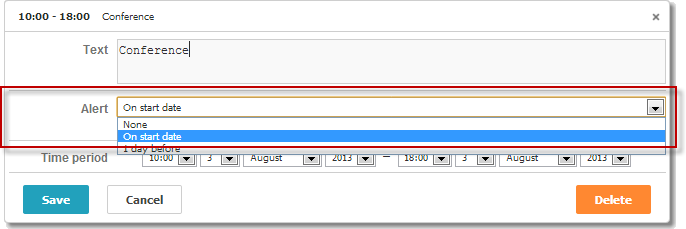
Select

var alert_opts = [
    { key: 1, label: 'None' },
    { key: 2, label: 'On start date' },
    { key: 3, label: '1 day before' }
];

scheduler.locale.labels.section_select = 'Alert';

scheduler.config.lightbox.sections = [
    { name:"text", height:50, map_to:"text", type:"textarea", focus:true },
    { name:"select", height:40, map_to:"type", type:"select", options:alert_opts},
    { name:"time", height:72, type:"time", map_to:"auto"}
];
Basic select editor in the lightbox
Initialization
To add the Select control to the lightbox, follow these steps:
- Add the section to the lightbox configuration:
scheduler.config.lightbox.sections =
    { name:"description", ... },
    { name:"alert", height:40,map_to:"type",type:"select", options:alert_opts},
    { name:"time", ...}
];
- Set the label for the section:
scheduler.locale.labels.section_select = "Alert";
Basic select editor in the lightbox
Properties
The following properties are mostly important and commonly set for the 'select' control (see the full list here):
| name | (string) section's name |
| height | (number) section's height |
| map_to | (string) the name of a data property that will be mapped to the section |
| type | (textarea,time,select,template,multiselect,radio,checkbox,combo) the type of the section's control |
| options | (array of objects) defines select options of the control (for 'select', 'multiselect', 'radio', 'combo' controls). Each object in the array specifies a single option and takes these properties:
|
| onchange | (function) specifies the 'onchange' event handler function for the section's control Linking select controls in the lightbox |
Populating the control with data
Generally, to set values for the Select control you should use the options parameter:
scheduler.config.lightbox.sections =
    {      name:"alert", type:"select",
        ...
        options:[
            { key: 1, label: 'None'},
            { key: 2, label: 'On start date'},
            { key: 3, label: '1 day before'}
    ]},
    ...
];
Items in the options parameter must have 2 mandatory properties:
- key - the option's id
- label - the option's label
Changing options dynamically
To populate the control from the server, set the options option to the value returned by the serverList method:
scheduler.config.lightbox.sections = [
    {name:"description", ...},
    {name:"type",map_to:"type",type:"select",options:scheduler.serverList("type")},
    {name:"time", ...}
];

scheduler.load("/api/types");
The details on the serverList method are given in the related article.
The data response for the load method should contain a collection with the server list name specified in JSON of the following format:
{
   "data":[
      {
          "id":"1",
          "start_date":"2019-03-02 15:00:00",
          "end_date":"2019-03-04 16:00:00",
          "text":"Interview",
          "type":"1"
      },
      {
          "id":"2",
          "start_date":"2019-03-02 17:00:00",
          "end_date":"2019-03-04 18:00:00",
          "text":"Performance review",
          "type":"2"
      }
   ],
   "collections": {/*!*/
      "type":[/*!*/
         {"value":"1","label":"Interview"},/*!*/
         {"value":"2","label":"Performance review"},/*!*/
         {"value":"3","label":"Request"}/*!*/
      ]/*!*/
   }/*!*/
}
The parse method can be also used if you need to load options after initialization of the scheduler.
In case you need to update the specified options of the control with new ones, you can use the updateCollection method:
scheduler.updateCollection("type", [
    {"key":"1","label":"Interview"},
    {"key":"2","label":"Performance review"},
    {"key":"3","label":"Request"}
]);
Check the details in the scheduler.serverList article.