Grid View
This view is available in the Scheduler PRO version only.
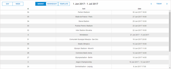
The Grid view presents a list of upcoming events and, unlike the Agenda view, allows configuring any number of columns.
Initialization
To add the Grid view to the scheduler, follow these steps:
- Activate the "grid view" extension on the page:
scheduler.plugins({
    grid_view: true
});
- Add the view's tab to the scheduler's markup:
<div id="scheduler_here" class="dhx_cal_container" ...>
    <div class="dhx_cal_navline">
       ...
       <div class="dhx_cal_tab" name="grid_tab" style="right:300px;"></div>
    </div>
    ...
</div>
- Set the label for the tab:
//'grid_tab' is the name of our div
scheduler.locale.labels.grid_tab = "Grid";
- Call the createGridView method:
scheduler.createGridView({
    name:"grid",
    fields:[    // defines columns of the grid
        {id:"id",   label:'Id',   sort:'int',  width:80,  align:'right'},
        {id:"date", label:'Date', sort:'date', width:'*'},
        {id:"text", label:'Text', sort:'str',  width:200, align:'left'}
    ],
    from:new Date(2027, 3, 10),//left border of the allowable date range
    to:new Date(2027, 5, 23)    //right border of the allowable date range
});
Limiting date range
The extension allows limiting active dates, so that the users won't be able to get the dates beyond the range.
If, for example, you want to to limit active dates and set the allowable range from 1st January, 2026 to 1st January, 2027 , define the following configuration:
scheduler.createGridView({
     name:"grid",
    ..
    from:new Date(2026, 0, 1),
    to:new Date(2027, 0, 1)
});
Activating navigation
To activate navigation with buttons  in the grid, enable the paging property:
scheduler.createGridView({
    name:"grid",
    ...
    paging:true
});
Once the navigation is enabled, when the user clicks on buttons -
the grid will be scrolled 1 month forward/backward.
To change the default time interval scrolled at a time, use the unit and step properties:
- unit - (minute, hour, day, week, month, year) the scrolling time unit. By default, 'month'
- step - (number) the number of units scrolled at a time. By default, 1.
//scrolling 2 weeks at a time
scheduler.createGridView({
    name:"grid",
    ...
    paging:true,
    unit:"week",
    step:2
});
Sorting
When you click on the header, the grid starts to display a special control indicating, which column the table is currently sorted by and the direction of this sorting (ascending or descending).
Each next click on the same header will reverse the sorting direction.
Columns can have different type of content (numbers, strings, dates) and each type of content requires its specific way of sorting.
For this purpose, the view provides 3 sorting types to ensure correct sorting of columns:
- int;
- date;
- str.
To enable sorting and assign the appropriate sorting type to a column, use the sort property.
scheduler.createGridView({
    name:"grid",
    fields:[
        {id:"date",  label:'Date', sort:'date'},
        {id:"text",  label:'Text', sort:'str'}
    ]
});
Custom sorting functions
If you want to apply a custom sorting behavior, define the related logic in a function and set this function as the value of parameter sort.
This function will be called for each pair of adjacent values and return 1,-1 or 0:
- 1 - an object with the first value in pair must go before the second one;
- -1 - the second object goes before the first one;
- 0 - the objects are equal.
The function can be defined in a general way:
scheduler.createGridView({
    name:"grid",
    fields:[
        {id:"id",   label:'Id',      sort: sortById},
        {id:"text", label:'Text', sort:'str'}
    ]
});

function sortById(a,b){
    a = a.id;
    b = b.id;
    return a>b?1:(a<b?-1:0);
}
Data Templates
By default, columns display data of a property that specified as id of a column.
To customize data content, you can use templates. In such a case, the column will be populated with data returned by the template function.
Data templates are set in the related column by the property template.
scheduler.createGridView({
    name:"grid",
    fields:[
      {id:"date",label:'Date',template:function(start,end,ev){return "1# "+ev.text}},
       ...
    ]
});
The template function takes 3 parameters:
- start - the start date of an event
- end - the end date of an event
- ev - the event object