Skins
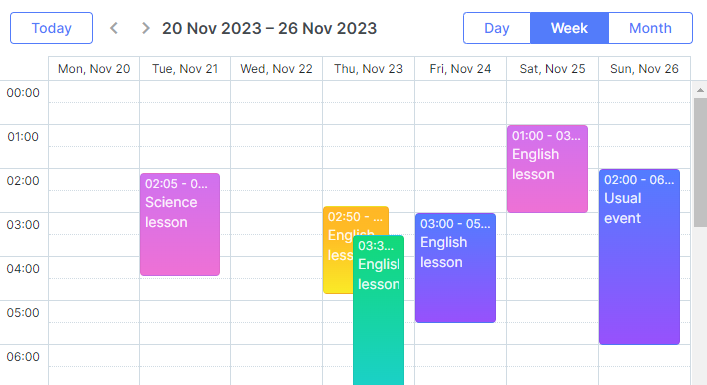
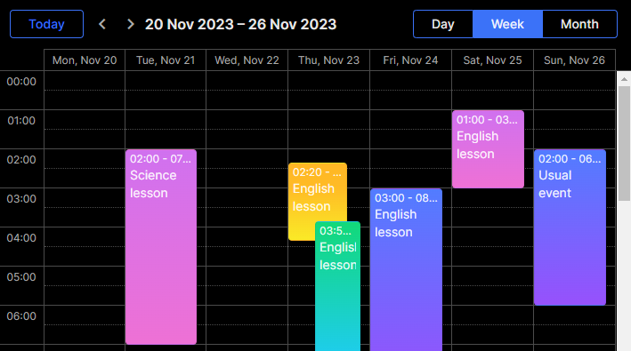
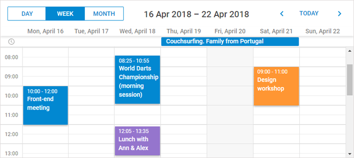
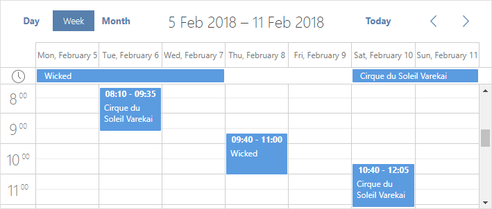
There are several predefined skins:
Starting from v7.0, all skins are bundled in the main dhtmlxscheduler.css file. A skin can be activated by setting the scheduler.skin property:
scheduler.skin = "dark";
Or by calling the scheduler.setSkin() method:
scheduler.setSkin("dark");
In Scheduler v6.0 and earlier skins are defined in separate CSS files.
Using fonts
By default, skins import the Inter font from https://fonts.googleapis.com. Read more about Google Fonts here.
@import (css) url(
'https://fonts.googleapis.com/css2?family=Inter:wght@300;400;500;600;700&display=swap'
);
If necessary, you can remove the font directly from .less files in the codebase/sources/less/skins/material folder and then rebuild the skin as described in the Skins Customization article.
'Terrace' skin
To apply the default skin, include the default CSS file:
- dhtmlxscheduler.css

'Dark' skin
To apply the 'Dark' skin, include the default CSS file:
- dhtmlxscheduler.css
And set the skin via the scheduler.skin property:
scheduler.skin = "dark";

'Material' skin
To apply the 'Material' skin, include the default CSS file:
- dhtmlxscheduler.css
And set the skin via the scheduler.skin property:
scheduler.skin = "material";

The Material skin requires Roboto which is not imported by default. So you must add it manually as follows:
@import url(
'https://fonts.googleapis.com/css2?family=Roboto:wght@300;400;500;600;700&display=swap'
);
'Flat' skin
To apply the 'Flat' skin, include the default CSS file:
- dhtmlxscheduler.css
And set the skin via the scheduler.skin property:
scheduler.skin = "flat";

'Contrast Black' skin
To apply the 'Contrast Black' skin, include the default CSS file:
- dhtmlxscheduler.css
And set the skin via the scheduler.skin property:
scheduler.skin = "contrast-black";

'Contrast White' skin
To apply the 'Contrast White' skin, include the default CSS file:
- dhtmlxscheduler.css
And set the skin via the scheduler.skin property:
scheduler.skin = "contrast-white";
