Configuration
DHTMLX Grid possesses flexible configuration that let you get desired look and feel via a collection of versatile properties.
Setting the TreeGrid mode
If you use the PRO version of DHTMLX Grid, you can initialize Grid in the TreeGrid mode which allows showing the nested tabular data. To create Grid in the TreeGrid mode, use the type: "tree" configuration option.
const Grid = new dhx.Grid("grid_container", {
    type: "tree",
    columns: [
        { id: "name", header: [{ text: "Name" }], gravity: 1.5 },
        { id: "native", type: "string", header: [{ text: "Native name" }], gravity: 1.5 },
        { id: "capital", type: "string", header: [{ text: "Capital" }] },
        { id: "currency", type: "string", header: [{ text: "Currency" }] }
    ],
    data: dataset,
    autoWidth: true
});
Check the details on the TreeGrid mode in the related article.
Width/height
You can specify the necessary size of your Grid via the width and height configuration properties:
const grid = new dhx.Grid("grid_container", {
    columns: [
        // columns config
    ],
    width: 400,
    height: 400,
    data: dataset
});
Related sample: Grid. Custom sizes
If the width and height options aren't set in the Grid configuration, the Grid will take the size of its container. If you don't specify the height for the container, it will be equal to "0px" and Grid won't be visible on the page.
Autoheight for Grid
If you use the PRO version of DHTMLX Grid, you may enable the auto height mode of Grid. For this, set the value of the height property to "auto". In this mode, Grid will expand on adding new rows, and will shrink on removing rows not to occupy external place.
const grid = new dhx.Grid("grid_container", {
    columns: [
        // columns config
    ],
    height: "auto",
    data: dataset
});
This functionality is available from v8.1.
Related sample: Grid. Set automatic height (PRO)
If needed, you may set the minimal and maximal height for the container via the min-height and max-height CSS properties:
<div class="grid" id="grid_container"></div>

<style>
    .grid {
        min-height: 400px;
        max-height: 600px;
    }
</style>
Columns
It is possible to adjust the configuration of grid columns via the corresponding option columns. As a value it takes an array with objects each of which contains config of a column.
The full list of properties you can set for a column is given in the API reference.
const grid = new dhx.Grid("grid_container", {
    columns: [
        { width: 100, id: "a", header: [{ text: "#" }] },
        { width: 100, id: "b", header: [{ text: "Title" }] },
        { width: 200, id: "c", header: [{ text: "Name" }] },
        { width: 200, id: "d", header: [{ text: "Address" }] }
    ],
    data: dataset
});
Each column object may contain a set of properties.
You will find the full list of the configuration properties of a Grid column here.
Alignment
Starting from v6.5, there is the ability to align data in a column as well as to align data in the column's header/footer via the align option:
const grid = new dhx.Grid("grid_container", {
    columns: [
        { id: "name", header:  [{ text: "Name", align: "center" }], align: "right"}
        // more options
    ],
    data: dataset
});
Related sample: Grid. Content align
The available values of the option are "left", "center" and "right".
Autosize for columns
You can configure columns' settings so that their width would automatically adjust to their content. Use the adjust property for this purpose. The property can take one of four values:
| "header" | adjusts the columns to the width of their header |
| "footer" | adjusts the columns to the width of their footer |
| "data" | adjusts the columns to the width of their content |
| true | combines the above mentioned modes and adjusts the column to the bigger value |
const grid = new dhx.Grid("grid_container", {
    columns: [
        // columns config
    ],
    adjust: "header",
    data: dataset
});
Related sample: Grid. Adjust columns by header, data, all
It is also possible to use the adjust property in the configuration of a separate column:
const grid = new dhx.Grid("grid_container", {
    columns: [
        { id: "country", header: [{ text: "Country" }], adjust: "header" },
        { id: "population", header: [{ text: "Population" }] }
    ],
    adjust: false,
    data: dataset
});
In case complex HTML content is added into a column, the column width may be calculated incorrectly.
Autowidth for columns
It is possible to automatically adjust the size of Grid columns to the size of Grid with the help of the autoWidth configuration option, like this:
const grid = new dhx.Grid("grid_container", {
    columns: [
        // columns config
    ],
    autoWidth: true,
    data: dataset
});
Related sample: Grid. Columns auto width
You can disable this functionality for a specified column via setting the autoWidth property to false in the configuration of the column:
const grid = new dhx.Grid("grid_container", {
    columns: [
        { id: "country", header: [{ text: "Country" }], autoWidth: false },
        { id: "population", header: [{ text: "Population" }] },
    ],
    autoWidth: true,
    data: dataset
});
Also note:
- If
autoWidthis set for a column, the width of the column is calculated on the base of the sizes of the container of the grid and the values of theminWidth/maxWidthproperties if they are set for the column. - The property is ignored if the
adjustproperty is used. - If the
widthproperty is specified in the configuration object of a column, theautoWidthproperty won't work for this column.
Formatting columns
You can display the values of the cells of a Grid column in the desired format with the help of the numberMask and patternMask properties. There is also the dateFormat option that allows specifying the format of dates.
numberMask
The numberMask property sets an input mask for entering number values. This property is applied both to the displayed data and to the data which is being edited.
If the type of a column hasn't been set and the numberMask property is specified, the column type will be set as type:number.
The numberMask property can be specified in two ways:
- as an object with the following properties:
- prefix - renders a text before the resulting value
- suffix - renders a text after the resulting value
- groupSeparator - sets a separator for thousands
- decSeparator - sets a separator for decimals
- allowNegative - allows using negative numbers
- maxIntLength - allows setting the maximal length of the integer value
- maxDecLength - allows setting the maximal length of the decimal value
- minDecLength - allows setting the minimal rendered length of the decimal value
For example, the numberMask config can be set as the following object:
{
    width: 130,
    id: "cost",
    header: [{ text: "Cost" }, { content: "inputFilter" }],
    numberMask: {
        prefix: "$",
        groupSeparator: ",",
        decSeparator: ".",
        maxIntLength: 7,
        maxDecLength: 2,
        minDecLength: 0
    }
}
The value 100000.01 is converted into $100,000.01 by the pattern given above.
Default numberMask configs depending on the column type
When the type:"number" is specified for a column, the resulting number is converted into the number type. The default config for this column type is the following:
{
    groupSeparator: ",",
    decSeparator: ".",
    allowNegative: true,
    maxIntLength: 16,
    maxDecLength: 2,
    minDecLength: 0
}
The default config for the type:"string" is the following:
{
    groupSeparator: ",",
    decSeparator: ".",
    minDecLength: 0
}
When the type:"string" type is specified for a column, the resulting number is converted into the string type without a mask, as if it were a number. For example, if the input value is "$ 1,000,000", the value returned by the getValue() method is "1000000".
- as a boolean value the
numberMaskproperty converts the number value displayed in the column into one of the predefined templates (depending on the specified column type):
{
    width: 130,
    id: "cost",
    header: [{ text: "Cost" }, { content: "inputFilter" }],
    numberMask: true
}
For the above example, the value 100000.01 is converted into 100,000.01 by the predefined template of the column type:"number", since the numberMask:true property is specified.
Related sample: Grid. Pattern and number masks
patternMask
The patternMask property sets an input mask for entering number and string values. Allows setting a necessary pattern for entering data. It can be set in two ways:
- as an object with the following properties:
- pattern - (function | string) allows specifying the necessary mask and change it dynamically, depending on the entered values. Can be set as:
- a function that takes as a parameter an entered value specified as a string or as a number and returns a string with a pattern mask
- a string with a pattern mask
- charFormat - (object) optional, allows specifying a regular expression for an optional symbol. It is set as an object with key:value pairs, where the key is a symbol and the value is a regular expression. This property has a predetermined configuration provided below:
- pattern - (function | string) allows specifying the necessary mask and change it dynamically, depending on the entered values. Can be set as:
{
    "0": /\d/,
    "a": /[A-Za-z]/,
    "#": /[A-Za-z0-9]/,
    "*": /./,
}
| Symbol | Description |
|---|---|
| "0" | any number from 0 to 9 |
| "a" | a single letter of the Roman alphabet, including all capital letters from A to Z and all lowercase letters from a to z |
| "#" | a single letter of the Roman alphabet (either an uppercase or a lowercase one) or a single number from 0 to 9 |
| "*" | any symbol |
The inputMask property supports static masks. These are the symbols not specified in the charFormat and rendered without the possibility of being changed.
Here's an example of the patternMask property that specifies an input mask pattern for entering a ZIP code:
{
    id: "zip_code", header: [{ text: "ZIP Code" }], width: 120,
    patternMask: {
        pattern: value => {
            const [outcode, incode] = value.split(" ");
            if (outcode?.length && incode?.length) {
                return `a${"".padStart(outcode.length - 1, "#")} #aa`
            }
            return "a## #aa";
        }
    }
},
An example of a ZIP code according to the pattern mask is WC2N 5DU.
- as a string value the
patternMaskproperty allows setting a mask as a string using a predefined set of symbols. Here's an example of thepatternMaskproperty that specifies an input mask pattern for entering an ID:
{
    id: "employee_id",
    header: [{ text: "Employee ID" }],
    width: 110,
    patternMask: "ID.000"
}
An example of an ID according to the pattern mask is ID.001.
Related sample: Grid. Pattern and number masks
Selecting the suitable data format
Depending on the type of the data entered into an input, you can specify different patterns for input masks. Check examples below to learn how to provide a suitable data format:
- phone number format
The phone number format may include a set of numbers, symbols and spaces. You can specify this data format as a string value of the patternMask property:
{
    id: "phone_number",
    header: [{ text: "Phone number" }],
    patternMask: "+0 (000) 000-0000",
};
Example: +9 (123) 123-1234
- license plate format
The format for license plate usually contains a combination of letters, numbers and symbols. You can specify this data format as a string value of the patternMask property:
{
    id: "license_plate",
    header: [{ text: "License plate" }],
    patternMask: "0-aaa-000",
}
Example: 9-AAA-999
- price format
The format for price can be set via the numberMask property. For example, you can specify a number mask as the following object for a "salary" column:
{
    id: "salary",
    header: [{ text: "Salary" }],
    numberMask: { prefix: "£", maxDecLength: 0 }
}
Example: £10,000
In the above example the prefix property sets the currency sign and the maxDecLength property defines that decimal values aren't used in the number.
- date and time format
For a date and time input you can specify the patternMask property as an object of the following type:
patternMask: {
    pattern: "00/00/0000 H0:M0",
    charFormat: {
        "H": /[0-2]/,
        "M": /[0-5]/,
    }
}
Example: 01/01/2001 12:59
In the above example:
- the
patternproperty sets a common mask pattern for date and time - the
charFormatproperty specifies regular expressions for setting hours and minutes:"H": /[0-2]/- a number from 0 to 2 for setting an hour asH0"M": /[0-5]/- a number from 0 to 5 for setting minutes asM0
Related sample: Grid. Pattern and number masks
Setting the format for dates
To specify the necessary format for dates, set the type: "date" property for a column and define the format of dates with the help of the dateFormat option:
{
    width: 150, id: "date", header: [{ text: "Date" }],
    type: "date", dateFormat: "%M %d %Y"
}
The date format must include delimiters (spaces or symbols), otherwise an error will be thrown.
Related sample: Grid. Data formats
Frozen columns
You can fix (or "freeze") a column or several columns, so that they will become static when you scroll the grid, while the rest of columns remain movable.
- To fix columns to the left side of the grid, use the leftSplit property.
- To fix columns to the right side of the grid, use the rightSplit property.
Just set the number of columns you want to freeze as a value of the related property in the Grid configuration.
const grid = new dhx.Grid("grid_container", {
    columns: [
        // columns config
    ],
    leftSplit: 1,
    rightSplit: 2,
    data: dataset
});
Related sample: Grid. Frozen columns and rows
Hidden columns
You can set the hidden:true property in the config of a column so that it doesn't appear on a page.
{
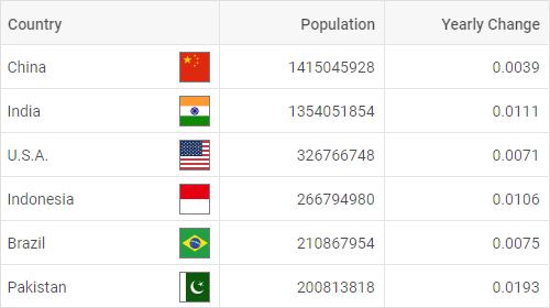
width: 150, id: "population", header: [{ text: "Population" }]
},
{
hidden: true, width: 150, id: "yearlyChange", header: [{ text: "Yearly Change" }]
}
Related sample: Grid. Hidden columns
Sortable columns
By default, DHTMLX Grid allows sorting content of any Grid column by clicking on its header.
To disable this option, set the sortable property in the Grid configuration to false:
const grid = new dhx.Grid("grid_container", {
    columns: [
        // columns config
    ],
    sortable: false,
    data: dataset
});
Related sample: Grid. Sortable columns
Making separate columns sortable
You can make separate columns sortable by specifying the sortable:true property in the configuration of a column:
In the example below all columns will be sortable, except for the second one:
const grid = new dhx.Grid("grid_container", {
    columns: [
        { width: 200, id: "country", header: [{ text: "Country" }], sortable: true },
        { width: 150, id: "land", header: [{ text: "Land" }] },
        { width: 150, id: "density", header: [{ text: "Density" }], sortable: true }
    ],
    data: dataset,
    sortable: false,
});
The following sample demonstrates the same result:
const grid = new dhx.Grid("grid_container", {
    columns: [
        { width: 200, id: "country", header: [{ text: "Country" }] },
        { width: 150, id: "land", header: [{ text: "Land" }], sortable: false },
        { width: 150, id: "density", header: [{ text: "Density" }] }
    ],
    data: dataset
});
Resizable columns
The columns of Grid have a fixed width with no possibility to change it from UI. You can switch on the corresponding configuration option to make all columns of Grid resizable.
const grid = new dhx.Grid("grid_container", {
    columns: [
        // columns config
    ],
    data: dataset,
    resizable: true
});
Then you will be able to change the width of columns using the mouse. With the cursor grab the right border and drag to the desired width.
If you also set the autoWidth configuration option, you will be able to change the width of columns only inside the container of Grid.
You can disable the resizing of any column by setting the resizable:false property in the config of a column.
const grid = new dhx.Grid("grid_container", {
    columns: [
        { width: 150, id: "test1", header: [{ text: "Test1" }] },
        { width: 150, id: "test2", header: [{ text: "Test2" }], resizable: false }
    ],
    data: dataset,
    resizable: true
})
Related sample: Grid. Resizable columns
To define the resizing limits, set necessary values to the minWidth/maxWidth properties in the config of a column.
HTML content of Grid columns
DHTMLX Grid allows adding HTML content into Grid cells (such as images, icons, text styles, etc.). You can enable the possibility to add HTML content both for the whole Grid and for a particular column, or even for a certain column header/footer. Below you'll find all the available options:
- setting HTML content for all Grid columns
This way presupposes making each cell of Grid capable of displaying the HTML content via using the htmlEnable property in the configuration object of Grid.
const dataset = [
    {
        "country": "China",
        "flag": "<img src='../flags/cn.jpg' />",
        "id": "1"
    }
];

const grid = new dhx.Grid("grid_container", {
    columns: [
        // columns config
    ],
    data: dataset,
    htmlEnable: true
});
- setting HTML content for a particular column
If you want to add custom elements into cells of the specified column, you need to set the htmlEnable:true property in the configuration of a column:
const dataset = [
    {
        "country": "<span>China</span><img src='../flags/cn.jpg' />",
        "id": "1"
    }
];

const grid = new dhx.Grid("grid_container", {
    columns: [
        {
            width: 200, id: "country", header: [{ text: "Country" }],
            htmlEnable: true
        },
        {
            width: 150, id: "urban", header: [{ text: "Urban Pop" }]
        },
        // more columns
    ],
    data: dataset
});
Related sample: Grid. Html in data
- setting HTML content for the header/footer of a column
You can set HTML content in the header or the footer of a column independently. The htmlEnable property enabled for the header/footer redefines the value of the same config specified for the parent column and for the whole Grid:
const grid = new dhx.Grid("grid", {
    columns: [
        { width: 200, id: "country", header: [
            {
                text: "<span style='font-size:16px; color: steelblue'>Country</span>",
                htmlEnable: true,
            }
        ]},
        // other columns' configs
    ],
    data: dataset,
    htmlEnable: false
});
Related sample: Grid. Styling header cells (custom CSS)
Event handlers for HTML content
HTML elements defined in the data set
Starting from v7.0, you can add event handlers to the HTML elements defined in a data set of Grid with the help of the eventHandlers configuration property, for instance:
const data = [
    {
        "country": "<div className='cell__html'><span>China</span><img src='../flags/cn.svg'></div>",
        "population": "1415045928", "yearlyChange": "0.0039",
        "netChange": "5528531", "density": "151",
        "urban": "0.5800", "id": "1"
    },
    // more options
];

const grid = new dhx.Grid("grid_container", {
    columns: [
        { width: 200, id: "country", header: [{ text: "Country" }], htmlEnable: true },
        // more options
    ],
    data: data,
    eventHandlers: {
        onclick: {
            cell__html: function(event, data) {
                console.log(JSON.stringify(data.col, null, 2));
            },
        },
        onmouseover: {
            cell__html: function(event) {
                console.log("You are over " + event.target.tagName);
            },
        }
    }
});
Related sample: Grid. Handling events in template
HTML elements in the header/footer cell
The Suite version 8.3 brought the possibility to add events handlers for the header/footer cell's content. Use the eventHandlers configuration property for this purpose:
const grid = new dhx.Grid("grid", {
    columns: [
        {
            width: 60,
            id: "paid",
            header: [
                {
                   text: `
                       <label className="dhx_checkbox dhx_cell-editor__checkbox ">
                          <input type="checkbox" className="dhx_checkbox__input dhx_checkbox--check-all"/>
                          <span className="dhx_checkbox__visual-input "></span>
                       </label>
                   `,
                   rowspan: 2,
                   htmlEnable: true,
                }
            ],
            type: "boolean",
            sortable: false,
        },
         // more columns
    ],
    data,
    eventHandlers: {
        onclick: {
            "dhx_checkbox--check-all": function(event, data) {
                grid.data.forEach(row => {
                    grid.data.update(row.id, {
                        [data.col.id]: event.target.checked,
                    });
                });
            }
        },
    },
});
Related sample: Grid. Rich example with templates and different editors
Editing Grid and separate columns
DHTMLX Grid provides the editing feature that includes two options:
- editing of the whole Grid, i.e. of all its columns
To make all columns of the Grid editable, specify the editable option in the configuration of Grid:
const grid = new dhx.Grid("grid_container", {
    columns: [
        // columns config
    ],
    data: data,
    editable: true
});
Related sample: Grid. Editing with different editors (combobox, select, multiselect, boolean, date)
- editing of the specified columns only
This option implies that you can enable/disable editing of particular columns by setting the editable: true property in the configuration of a column:
In the example below all columns will be editable, except for the first one:
const grid = new dhx.Grid("grid_container", {
    columns: [
        {
            width: 150, id:"project",
            editable: false,
            header: [
              {text: "Project"}, {content: "selectFilter"}
            ]
        },
        { width:150, id: "owner", header: [{text: "Owner"},{content: "inputFilter"}]},
        { width:150, id: "hours", header: [{text: "Hours"}, {content: "inputFilter"}]},
        // more columns
    ],
    data: data,
    editable: true
});
And the following example demonstrates an opposite situation when only the first column is editable:
const grid = new dhx.Grid("grid_container", {
    columns: [
        {
           width: 150, id: "project",
           editable: true,
           header: [
            {text:"Project"}, {content:"selectFilter"}
           ]
        },
        { width: 150, id: "owner", header: [{text: "Owner"},{content: "inputFilter"}]},
        { width: 150, id: "hours", header: [{text: "Hours"}, {content: "inputFilter"}]},
        // more columns
    ],
    data: data
});
Note that on scrolling the grid the cell editor will be closed only when the cell is not in the visible area of the table anymore.
Types of column editor
You can specify the way of editing the cells of a Grid column depending on its content as a simple input, a date picker, a textarea control, a checkbox, a select, a multiselect or a combobox. The type of the used editor can be defined either by the editorType property of a column or via the type one.
There are several types of column editors:
-
input
An editor for cells with a simple text (the default one, unless a column has type:"date").
// cells of the "project" column will be edited as inputs
const grid = new dhx.Grid("grid_container", {
    columns: [
        {
            width: 150,
            id: "project",
            header: [{ text: "Project" }, { content: "selectFilter" }]
        }
    // more columns
    ],
    data: data,
    editable: true
});
Related sample: Grid. Editing with different editors (combobox, select, multiselect, boolean, date)
-
datePicker
An editor for cells with dates (default for a column with type:"date").
To use this editor, you should specify the type:"date" property for a column. It is also possible to set the necessary format of date while editing a cell content with the help of the dateFormat option.
By default, after editing dates are transformed and displayed as string values.
You can also save a date as a string representation of the Date object by setting the asDateObject property to true in the editorConfig object:
{
    // if the type:"date" config is set in the column config,
    // there's no need to specify the type of the editor
    width: 150, id: "start_date",
    header: [{ text: "Calendar", colspan: 2 }, { text: "Start date" }],
    type: "date", dateFormat: "%d/%m/%Y",
    editorConfig: {
        asDateObject: true // sets the datePicker mode when dates are saved as string representations of the Date object
    }
}
Related sample: Grid. Editing with different editors (combobox, select, multiselect, boolean, date)
You can configure the date picker by passing the properties of Calendar (except for the value and range ones) to the editorConfig object, as in:
{
    id: "start_date",
    header: [{ text: "Start date" }],
    type: "date",
    dateFormat: "%d/%m/%Y %H:%i",
    editorConfig: {
        timePicker: true,
        weekStart: "sunday",
        thisMonthOnly: true,
        weekNumbers: true
    }
}
-
textarea
An editor for cells that contain text.
To use this editor, you should specify the editorType:"textarea" property for a column.
The textarea editor allows editing multiple lines of text when the autoHeight:true configuration option of Grid is enabled. The functionality is available only in PRO version of the DHTMLX Grid (or DHTMLX Suite) package.
const grid = new dhx.Grid("grid_container", {
    columns: [
        {
            width: 150, id: "project",
            header: [{ text: "Project" }, { content: "selectFilter" }],
            editorType: "textarea"
        }
    // more columns
    ],
    data: data,
    editable: true,
    autoHeight: true
});
Related sample: Grid. Editing with different editors (combobox, select, multiselect, boolean, date)
-
checkbox
An editor for cells with a two-state check box.
To use this editor, you need to specify the type: "boolean" property for a column.
{
    // if the type:"boolean" config is set in the column config,
    // there's no need to specify the type of the editor
    width: 160, id: "test",
    header: [{ text: "Test" }],
    type: "boolean"
}
Related sample: Grid. Editing with different editors (combobox, select, multiselect, boolean, date)
If you specify the editing option in the configuration of Grid, then editing of a column with checkbox will always be enabled.
-
select
An editor for cells that should contain several options to choose from.
To set this editor type you need to specify the editorType:"select" property for a column and define a list of options via the options property.
You may either specify the same list of editor options for all cells of the column. For that, use either an array of string values or an array of options' objects as a value of the property as in:
{
    width: 150, id: "status", header: [{text: "Status"}, {content: "selectFilter"}],
    editorType: "select", options: ["Done", "In Progress", "Not Started"]
}

// or
{
    width: 150, id: "status", header: [{text: "Status"}, {content: "selectFilter"}],
    editorType: "select",
    options: [
        { id: "done", value: "Done" },
        { id: "in progress", value: "In Progress" },
        { id: "not started", value: "Not Started" },
    ],
}
Related sample: Grid. Editing with different editors (combobox, select, multiselect, boolean, date)
Or define unique lists of options for different column cells. For that, use a function as a value of the property:
{
    id: "select_example",
    header: [{ text: "Select example" }],
    editorType: "select",
    options: (column, row) => getCurrentOptions(row),
},
Related sample: Grid. Individual option lists for select, multiselect and combobox editors
-
multiselect
An editor for cells that enables selection of multiple options. You can select one option, several options, all options, or no options.
To set this editor type you need to specify the editorType:"multiselect" property for a column and define a list of options via the options property.
You may either specify the same list of editor options for all cells of the column. For that, use either an array of string values or an array of options' objects as a value of the property as in:
{
    id: "renewals", type: "string",
    header: [{ text: "Number of renewals" }],
    editorType: "multiselect",
    options: ["1 time", "1-2 times", "more than 5 times"],
},

// or
{
    id: "renewals", type: "string",
    header: [{ text: "Number of renewals" }],
    editorType: "multiselect",
    options: [
        { id: "1", value: "1 time" },
        { id: "1-2", value: "1-2 times" },
        { id: "5+", value: "more than 5 times" },
    ],
}
Related sample: Grid. Editing with different editors (combobox, select, multiselect, boolean, date)
Or define unique lists of options for different column cells. For that, use a function as a value of the property:
{
    id: "multiselect_example",
    header: [{ text: "Multiselect example" }],
    type: "string",
    editorType: "multiselect",
    options: (column, row) => getCurrentOptions(row),
    minWidth: 360
},
Related sample: Grid. Individual option lists for select, multiselect and combobox editors
If you use the multiselect editor, you can predefine several options to be shown in a cell. You should separate the options in the dataset using the , separator.
const data = [
    {
        renewals: "1 time", //one option is shown in a cell
        ...
    },
    {
        renewals: "more than 5 times, 1 time" //two options are shown in a cell
        ...
    }
];
Note that the ids of the multiselect editor options specified as objects and the options specified as strings shouldn't contain the , separator.
Configuring the multiselect editor
There is a list of configuration settings you may provide for the multiselect editor type. Use the editorConfig property to specify the desired settings:
{
    id: "renewals", type: "string",
    header: [{ text: "Number of renewals" }],
    editorType: "multiselect",
    options: ["1 time", "1-2 times", "more than 5 times"],
    editorConfig: {selectAllButton:true}
}
-
combobox
An editor for cells that should contain several options to choose from. There is a possibility to find an option by entering text in the edit control.
To use this editor you need to specify the editorType: "combobox" property for a column and define a list of options via the options property.
You may either specify the same list of editor options for all cells of the column. For that, use either an array of string values or an array of options' objects as a value of the property as in:
{
    width: 160, id: "test", header: [{ text: "Test" }], type: "string",
    editorType: "combobox", options: ["1 time", "1-2 times", "more than 5 times"]
}

//or
{
    width: 160, id: "test", header: [{ text: "Test" }], type: "string",
    editorType: "combobox",
    options: [
        { id: "1", value: "1 time" },
        { id: "1-2", value: "1-2 times" },
        { id: "5+", value: "more than 5 times" },
    ],
}
Related sample: Grid. Editing with different editors (combobox, select, multiselect, boolean, date)
Or define unique lists of options for different column cells. For that, use a function as a value of the property:
{
    id: "combobox_example",
    header: [{ text: "Combobox example" }],
    editorType: "combobox",
    options: (column, row) => getCurrentOptions(row),
    minWidth: 160
},
Related sample: Grid. Individual option lists for select, multiselect and combobox editors
Configuring the combobox editor
There is a list of configuration settings you may provide for the combobox editor type. Use the editorConfig property to specify the desired settings:
{
    width: 160, id: "test", header: [{ text: "Test" }], type: "string",
    editorType: "combobox", options: ["1 time", "1-2 times", "more than 5 times"],
    editorConfig: {readonly:true}
}
Editing columns with the "number" type
For columns with the type:"number" setting the editorConfig object may contain the following properties. They are:
min- (optional) the minimum allowed valuemax- (optional) the maximum allowed value
const grid = new dhx.Grid("grid", {
  columns: [
    {
      id: "col1",
      width: 180,
      type: "number",
      editorConfig: { min: 5, max: 100 },
    },
    // more columns
  ]
});
In case a user enters a value that goes beyond the limits specified by the above settings, the entered value is highlighted in red:

If the user ignores the warning and still tries to enter an unallowable value, it will be replaced with the minimum/maximum value defined in the editorConfig object by the min/max values. Thus, in the above example the entered value 200 will be replaced with 100, since it is the upper limit set in the editor configuration.
Related sample: Grid. Editing with different editors
Styling the warning
There is a possibility to redefine the style of the warning on entering an invalid number value. You need to change the dhx_cell-editor__input--not-valid class for this purpose. Here is what it looks like:
.dhx_cell-editor__input--not-valid {
    color: var(--dhx-color-primary);
    font-weight: var(--dhx-font-weight-medium);
}
Editable combobox
From v7.3, you may allow end users to add new options into the combobox editor (editorType: "combobox") from UI. To activate the functionality, specify the newOptions: true attribute of the editorConfig property in the configuration of the column:
{
    width: 150,
    id: "status",
    header: [{text: "Status"}, {content: "selectFilter"}],
    editorType: "combobox",
    // enables the ability to add new values into the combobox editor of the "Status" column
    editorConfig: { newOptions: true },
    options: ["Done", "In Progress", "Not Started"]
},
Related sample: Grid. Rich example with templates and different editors
The new option will be added into the combobox after the user types a new value into the input field and either presses "Enter" or clicks on the appeared Create "newValue" option in the drop-down list.
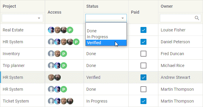
At the same time, the created option will also appear in the drop-down list of the header/footer filters (content: "selectFilter" | "comboFilter") of the column:
To localize the Create option, translate the corresponding string and apply a ready locale to the Combobox component:
const locale = {
    en: {
        createItem: "Create"
    },
    de: {
        createItem: "Schaffen"
    }
};

dhx.i18n.setLocale("combobox", locale["de"]);
Opening editor with one click
By default, you can open the editor by double-clicking on a cell. But if you need the editor to open after a single click, apply the cellClick event of the grid.
Note, that it does not work for the select editor (editorType: "select") and you need to use the combobox editor (editorType:"combobox") if you want a drop-down list to open on the mouse click.
Custom statistics in the column header/footer and spans
You can form the summary of calculated values based on the columns data for a particular column or for the whole component and render custom statistics by using the column and Grid summary in:
- the configuration objects of the
textandtooltipTemplateproperties of the column header/footer - the configuration objects of the
textandtooltipTemplateproperties of the Gridspansproperty
It is also possible to get the object with the calculated values using the getSummary() method.
Related sample: Grid. Custom totals for footer and columns
Related sample: Grid. Custom totals for footer and columns with dynamic updates on edit
Use the dhx.methods helper to define the default statistical functions and to create custom functions for data calculation while creating the summary list.
Column summary
To form a summary list that will be available at the column's level only, you should use the summary configuration option of the column. The summary configuration option of a column can be initialized either as an object or as a string. As an object it contains calculated values set as key:value pairs, where the keys are the field names and values can be:
-
a string with the name of the applied functor
-
a tuple
[string, string]that specifies the field name and the name of the applied functor -
a
(rows: IRow[]) => string | number;function for calculating the summary of the column
{
    id: "quantity",
    type: "number",
    header: [{ text: "Quantity" }],
    footer: [{ text: ({ sum }) => sum }],
    summary: "sum",
    numberMask: { prefix: "$" },
},
When the column summary property is initialized as a string, the resulting value (excluding "count") is used with applied patternMask/numberMask, if there are any.
Grid summary
To form a summary list at the Grid's level, you need to use the summary configuration option of Grid. The defined list will be available both on the grid's level and on the column's level. The summary configuration option of Grid is an object with calculated values, where the keys are the field names and the values can be:
-
a string with the name of the applied functor
-
a tuple
[string, string]that specifies the field name and the name of the applied functor -
a
(rows: IRow[]) => string | number;function for calculating the summary of the column
Here's an example of using the Grid and column summary configuration options:
// defining the method for calculating the density of population
dhx.methods.populationDensity = (rows) => {
    const totalPopulation = rows.reduce((sum, row) => sum + row.population, 0);
    const totalArea = rows.reduce((sum, row) => sum + row.area, 0);
    return totalArea ? (totalPopulation / totalArea).toFixed(2) : 0;
};

// adjusting a grid and using the method for calculating density
const grid = new dhx.Grid("grid_container", {
    columns: [
        {
            width: 150,
            id: "population",
            header: [{ text: () => `<mark>Population</mark>`, htmlEnable: true }],
            footer: [{ text: ({ totalPopulation, count }) => `Total: ${totalPopulation}, Count: ${count}` }],
            // initializing column summary as a string
            summary: "count"
        },
        {
            width: 150,
            id: "area",
            header: [{ text: ({ customSum }) => `Area: ${customSum}` }],
            // initializing column summary as an object
            summary: {
                customSum: rows => {
                    return dhx.methods.sum(rows, "population") + dhx.methods.sum(rows, "area");
                },
            }
        },
        {
            width: 150,
            id: "density",
            header: [{ text: "Density" }],
            footer: [{ text: ({ density }) => `Density: ${density}` }],
        }
    ],
    // initializing grid summary
    summary: {
        totalPopulation: ["population", "sum"],
        totalArea: ["area", "sum"],
        density: "populationDensity" // adding the summary value for density
    },
    data: dataset
});

// an example of getting the values of population density
const summary = grid.getSummary();
console.log(summary); // { totalPopulation: 1000000, totalArea: 50000, density: 20.00 }
In the above example the dhx.methods helper is used to:
- create a custom function for calculating the density of population
- redefine the default
sumfunctor by using custom calculations for the summary of the "area" column
Getting the summary object
To get the object with the calculated values, you should use the getSummary() method. When called without parameters, the method returns an object with the calculated values defined in the configuration of the component.
You can also pass the id of a column to the method to get an object with the calculated values defined in the column's configuration together with the calculated values defined in the component's configuration. In the following example calculated values are used for rendering the summary for a column:
const grid = new dhx.Grid("grid_container", {
    columns: [
        { width: 150, id: "population", header: [{ text: "Population" }] },
        {
            width: 150,
            id: "age",
            header: [{ text: "Med. Age" }],
            summary: { avgAge: "avg" }
        }
    ],
    summary: {
        totalPopulation: ["population", "sum"],
    },
    data: dataset
});

// getting summary data for the component
const totalSummary = grid.getSummary();
console.log(totalSummary); //{ totalPopulation: 1000000 } - sum of all the values in the "population" column

// getting summary data for the column
const columnSummary = grid.getSummary("age");
console.log(columnSummary); //{ totalPopulation: 1000000, avgAge: 28 } - the value of the "age" column only
Column header/footer
Header/footer text
You can specify the text of the header/footer column via the text property. It can be set either as a string or a callback function which is called with the following parameter:
content- an object with the content of the header/footer tooltip that contains the calculated values from thesummaryproperty as key:value pairs, where:- the key is either the key defined in the list or the functor name
- the value can be a string, number or null
The calculated values are taken from the summary config option of the component and the summary config option of a column.
In case key names in the summary configs are the same, values are taken from the column's configuration option.
In the example below the text of the column's header is set as a string and the text of the footer is set as a callback function that takes calculated values both from the column summary config (count) and the Grid summary config (totalPopulation):
const grid = new dhx.Grid("grid_container", {
    columns: [
        {
            width: 150,
            id: "population",
            header: [{ text: () => `<mark>Population</mark>`, htmlEnable: true }],
            footer: [{ text: ({ totalPopulation, count }) => `Total: ${totalPopulation}, Count: ${count}` }],
            summary: "count"
        }
    ],
    summary: { totalPopulation: ["population", "sum"] },
    data: dataset
});
Header/footer filters
There are the following types of filters that you can specify in the header/footer content of a Grid column: inputFilter, selectFilter, comboFilter, dateFilter (PRO version).
- inputFilter
Provides a way of filtering data of a Grid column by using a text input field.
{
    width: 160, id: "budget",
    header: [{ text: "Budget" }, { content: "inputFilter" }]
}
If you specify inputFilter as the header or footer content of a column, you can set a configuration object for it via the filterConfig property.
The list of configuration properties for inputFilter
placeholder- (string) - optional, the placeholder text in the input fieldicon- (string) - optional, the CSS class for the filter icon
{
    width: 160, id: "population",
    header: [
        { text: "Population" },
        { content: "inputFilter", filterConfig: { placeholder: "Type something" } }
    ]
}
Related sample: Grid. Header filters (dateFilter, comboFilter, inputFilter, selectFilter)
- selectFilter
Allows end users to filter data of a column by choosing an option from a presented dropdown list.
{
    id: "status",
    header: [{ text: "Status" }, { content: "selectFilter" }],
    editorType: "select",
    options: ["Done", "In Progress", "Not Started"]
}
Related sample: Grid. Header filters (dateFilter, comboFilter, inputFilter, selectFilter
- comboFilter
Provides a way to filter data of a column by choosing an option from a presented combobox. To find an option quickly, you can enter text into the edit control.
{
    id: "renewals",
    header: [{ text: "Number of renewals" }, { content: "comboFilter" }],
    type: "string", editorType: "combobox",
    options: ["1 time", "1-2 times", "more than 5 times"]
}
If you specify comboFilter as the header or footer content of a column, you can set an additional config with properties for it via the filterConfig property.
The list of configuration properties for comboFilter
- filter - (function) sets a custom function for filtering Combo Box options
- multiselection - (boolean) enables selection of multiple options
- readonly - (boolean) makes ComboBox readonly (it is only possible to select options from the list, without entering words in the input). The default value of the readonly property depends on the following conditions:
- the
readonly:trueis set as a default value, ifhtmlEnable:trueis set for a column and there is no template specified for a column - in all other cases,
readonly:falseis set by default
- the
- placeholder - (string) sets a placeholder in the input of ComboBox
- virtual - (boolean) enables dynamic loading of data on scrolling the list of options, true by default
- template - (function) a function which returns a template with content for the filter options. Takes an option item as a parameter
{
    id: "category",
    header: [
        { text: "Category" },
        { content: "comboFilter", filterConfig: { placeholder: "Select a category" } }
    ]
}
Related sample: Grid. Header filters (dateFilter, comboFilter, inputFilter, selectFilter
Redefining the default sorting for comboFilter
By default the elements of the comboFilter are sorted by ID. You can modify the way of sorting elements in this type of the filter inside the handler of the beforeOpen event. For example, you can specify that the options in the comboFilter should be sorted by value in the following way:
const comboFilter = grid.getHeaderFilter("access").getFilter();
comboFilter.events.on("beforeOpen", function() {
    comboFilter.data.sort({
        by: "value",
    });
});
- dateFilter
This functionality requires PRO version of the DHTMLX Grid (or DHTMLX Suite) package.
Provides a way of filtering data of a Grid column by using a calendar for selecting a date or a date range.
If you specify dateFilter as the header or footer content of a column, you can set an additional config with properties for it via the filterConfig property.
The list of configuration properties for dateFilter
Main properties:
icon- (string) - the CSS class for the calendar icon.placeholder- (string) - the placeholder text in the input field when no date is selected.asDateObject- (boolean) - determines how the filter processes data forcustomFilterand thebeforeFilterandfilterChangeevents. Iftrue, the comparison is performed using Date objects.range- (boolean) - enables the date range selection mode (from and to).dateFormat- (string) - the date display format (e.g.,"%d/%m/%Y"). By default, applies thedateFormatused for the column.
Calendar API configuration properties:
date- (Date | string) - the initial date opened in the calendar.mark- (function) - a function for adding custom CSS classes to specific dates.disabledDates- (function) - a function for disabling the selection of specific dates.weekStart- (string) - the start day of the week ("saturday","sunday","monday").weekNumbers- (boolean) - shows week numbers iftrue.mode- (string) - the calendar display mode ("calendar","year","month","timepicker").timePicker- (boolean) - adds the ability to select time.timeFormat- (number) - the time format (12or24hours).thisMonthOnly- (boolean) - iftrue, allows selecting dates only within the current month.width- (string | number) - the width of the dropdown calendar.
dateFilter supports two modes of operation:
-
single mode (default) - the filter allows selecting a single specific date by default. Only records corresponding to the selected day will remain in the table.
-
range mode - this mode is activated by setting the
range: trueproperty in thefilterConfigobject. In this mode, the user can select the start date and the end date. The table will filter records falling within the selected time interval (inclusive).
{
    id: "receivedDate",
    type: "date",
    dateFormat: "%d.%m.%Y",
    header: [
        { text: "Received Date" },
        {
            content: "dateFilter",
            filterConfig: {
                placeholder: "Select a date",
                range: true
            }
        }
    ]
}
Related sample: Grid. Header filters (dateFilter, comboFilter, inputFilter, selectFilter)
Customizing header/footer filters
To add a custom function with your you own logic for the filter of a Grid column, you need to set the customFilter attribute when configuring the header/footer content of the column.
The customFilter attribute can be used when content: "inputFilter" | "selectFilter" | "comboFilter" | "dateFilter" is set.
The customFilter attribute is a callback function that compares the value of each cell of the row with the value which is selected in the header/footer filter of the column. It takes two parameters:
value- (string | number | Date | Date[]) the cell value in the rowmatch- (string | string[] | Date | Date[]) the value selected in the filter
and returns true, if the row matches the filtering criteria, otherwise false.
const grid = new dhx.Grid("grid_container", {
    columns: [
        { width: 150, id: "country", header: [
            { text: "Country" },
            {
                content: "comboFilter",
                // filters values by the same length
                customFilter: (value, match) => value.length === match.length
            }
        ]},
    ],
    // other configuration properties
});
Related sample: Grid. Custom filters in the header (dateFilter, comboFilter, inputFilter, selectFilter)
Header/footer height
You can change the height of the header/footer in one of the following ways:
- Specify the necessary height of the rows in the header/footer via the related API options
The height of the header/footer of Grid is calculated as a sum of rows which are included into it. To set the height of a row inside the header/footer, use the headerRowHeight/footerRowHeight
properties, correspondingly. The default value of the mentioned properties is 40.
const grid = new dhx.Grid("grid_container", {
    columns: [
        // columns config
    ],
    footerRowHeight:50
    headerRowHeight: 50
});
Related sample: Grid. Header, footer and rows height
- Provide the automatic adjustment of the header/footer height for the content to fit in
Use the headerAutoHeight and footerAutoHeight configuration options of Grid (PRO version only) to redefine the autoHeight config for the header and the footer, correspondingly:
// enabling autoheight only in the content
const grid1 = new dhx.Grid("grid", {
    columns: [
        // columns config
    ],
    data: dataset,
    autoHeight: true, // enable autoHeight in the data (content)
    headerAutoHeight: false, // disable autoHeight in the header
    footerAutoHeight: false, // disable autoHeight in the footer
});

// enabling autoheight only in the header
const grid2 = new dhx.Grid("grid", {
    columns: [
        // columns config
    ],
    data: dataset,
    autoHeight: false, // disable autoHeight in the data, the header and the footer
    headerAutoHeight: true, // enable autoHeight in the header
});
Related sample: Grid. Header/footer autoHeight mode
Footer position
This functionality requires PRO version of the DHTMLX Grid (or DHTMLX Suite) package.
You can define the logic of setting the position of the Grid footer as well as of the frozen rows fixed at the Grid bottom by the bottomSplit option with another Grid property footerPosition. The property has the following values:
relative- (default) the footer follows the content immediately. If the number of rows is small and doesn't fill the container, the footer moves up to stay attached with the last row.
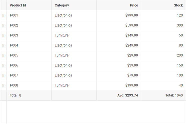
bottom- the footer and bottom-pinned (frozen) rows are strictly locked to the bottom edge of the container. They remain at the base of the component even if the content takes only a part of the available height.
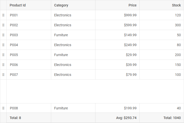
Here is the example of positioning the footer and a frozen row at the bottom of the Grid, as presented in the above image:
const grid = new dhx.Grid("grid_container", {
    columns: [
        {
            id: "productId",
            header: [{ text: "Product Id" }],
            summary: "count",
            footer: [{ text: summary => `Total: ${summary.count}` }],
        },
        {
            id: "category",
            header: [{ text: "Category" }],
        },
        {
            id: "price",
            type: "number",
            numberMask: { prefix: "$" },
            header: [{ text: "Price" }],
            summary: "avg",
            footer: [{ text: summary => `Avg: ${summary.avg}` }],
        },
        {
            id: "stock",
            type: "number",
            header: [{ text: "Stock" }],
            summary: "sum",
            footer: [{ text: summary => `Total: ${summary.sum}` }],
        },
    ],
    data: dataset,
    footerPosition: "bottom", // "relative" by default
    bottomSplit: 1
});
Related samples:
Rows
Row height
The default height of a grid row is 40. You can change it and set any other height via the rowHeight property, e.g.:
const grid = new dhx.Grid("grid_container", {
    columns: [
        // columns config
    ],
    rowHeight: 30,
    data: dataset
});
Related sample: Grid. Header, footer and rows height
In this case, the height of each row is 30.
Setting height for a separate row
Starting with v7.1, it is possible to specify the height for the necessary row of data in Grid via setting the number value to the height option when defining the data set:
const dataset = [
    {
        "country": "China",
        "population": "1415045928",
        "height": 80,
        "id": "1"
    },
    {
        "country": "India",
        "population": "1354051854",
        "id": "2",
    }
];
Related sample: Grid. Row height
The height option has a higher priority than the autoHeight:true configuration property of Grid.
Autoheight for rows
This functionality requires PRO version of the DHTMLX Grid (or DHTMLX Suite) package.
Starting from v7.1, you can set the autoHeight: true option in the configuration of Grid to make a long text split into multiple lines automatically based on the width of the column:
const grid = new dhx.Grid("grid_container", {
    columns: [
        // columns config
    ],
    autoHeight: true,
    data: dataset
});
Related sample: Grid. Rows auto height
As a result, the height of the cells will automatically adjust to their content.
Please note that the autoHeight option does not adjust the height of the cells of the header/footer of Grid.
The option just makes their text split into multiple lines, but the height of the cells will remain the same. To set the height of the rows in the header/footer, you can:
- use the headerRowHeight and footerRowHeight configuration options of Grid to set specific values for the header/footer rows height
- use the headerAutoHeight and footerAutoHeight configuration options of Grid (PRO version only) to enable autoheight for the header/footer rows
Automatic adding of empty row into Grid
There is a possibility to automatically add an empty row after the last filled row in the grid. Use the autoEmptyRow property in the Grid configuration object to enable this feature:
const grid = new dhx.Grid("grid_container", {
    columns: [
        // columns config
    ],
    autoEmptyRow: true,
    data: dataset
});
Related sample: Grid. Auto empty row
Frozen rows
You can fix (or "freeze") a row or several rows, so that they will become static when you scroll the grid, while the rest of rows remain movable.
- To fix rows on the top of the grid, use the
topSplitproperty. - To fix rows on the bottom of the grid, use the
bottomSplitproperty.
const grid = new dhx.Grid("grid_container", {
    columns: [
        // columns config
    ],
    topSplit: 3,
    bottomSplit: 2,
    data: dataset
});
Related sample: Grid. Frozen columns and rows
Spans
The Grid component has the spans property that allows you to specify all necessary columns and rows spans right through the initial configuration. It represents an array with spans objects.
const grid = new dhx.Grid("grid_container", {
    columns: [
        // columns config
    ],
    spans: [
        {row:"0", column:"a", rowspan:5 },
        {row:"0", column:"b", rowspan:9, text:"<h2>Some content here</h2>"},
        {row:"0", column:"c", colspan:2, text:"Some content"},
        {row:"10", column:"a", colspan:4, text:"Some header", css:"myCustomColspan"}
    ],
    data: dataset
});
Each span object contains the following properties:
row- (string | number) obligatory, the id of a rowcolumn- (string|number) obligatory, the id of a columnrowspan- (number) optional, the number of rows in a spancolspan- (number) optional, the number of columns in a spantext- (string|number) optional, the content of a span. You can specify the text of the column span via thetextproperty. It can be set either as a string or a callback function which is called with the following parameter:content- an object with the content of the span tooltip that contains the calculated values of thesummaryproperty, set as key:value pairs where:- the key is either the key defined in the list or the functor name
- the value can be a string, number or null
The calculated values are taken from the summary config option of the component and the summary config option of a column.
In case key names in the summary configs are the same, values are taken from the column's configuration option.
If the value of a spanned cell is initialized with the text property set as a callback function, the cell content can't be edited.
const grid = new dhx.Grid("grid_container", {
    columns: [
        { width: 200, id: "country", header: [{ text: "Country" }] },
        {
            width: 150,
            id: "population",
            header: [{ text: "Population" }],
            summary: "count"
        }
    ],
    summary: { totalPopulation: ["population", "sum"] },
    spans: [
        {
            row: "rowid",
            column: "population",
            rowspan: 9,
            text: ({ count }) => ("Count population:" + count)
        },
    ],
    data: dataset
});
css- (string) optional, the name of a CSS class applied to a spantooltip- (boolean|object) optional, enables a tooltip on hovering over the content of a span, or sets the configuration object with the tooltip settings; true by default. When set as an object, thetooltipconfig can have the following properties:force- (optional) forces opening of a tooltip; if set to true, theshowDelayandhideDelaysettings are ignored, false by defaultshowDelay- (optional) the time period that should pass before showing a tooltip, in mshideDelay- (optional) the time period that should pass before hiding a tooltip, in msmargin- (optional) the margin between the node and tooltipposition- (optional) the position of a tooltip: "right", "bottom", "center", "left", "top"; "bottom" by defaultcss- (optional) the style of a tooltip box
const grid = new dhx.Grid("grid_container", {
    columns: [
        // columns config
    ],
    spans: [
        {row:"0", column:"a", rowspan:5 },
        {row:"0", column:"b", rowspan:9, text:"<h2>Some content here</h2>"},
        {row:"0", column:"c", colspan:2, text:"Some content"},
        {row:"10", column:"a", colspan:4, text:"Some header", css:"myCustomColspan"}
    ],
    data: dataset
});
tooltipTemplate- (function) sets a template for the span tooltip. The value of thetooltipTemplateproperty is a callback function which is called with the following parameters:content- an object with the content of the span tooltip. Contains two properties which are available either from the component's or from the column's configuration:value- the value rendered in a cell, including the applied templates- an object with the calculated values of the
summaryproperty, set as key:value pairs where:- the key is either the key defined in the list or the functor name
- the value can be a string, number or null
span- the object of the column span
const grid = new dhx.Grid("grid_container", {
    columns: [
        { width: 200, id: "country", header: [{ text: "Country" }] },
        {
            width: 150,
            id: "population",
            header: [{ text: "Population" }],
            summary: "count"
        }
    ],
    summary: { totalPopulation: ["population", "sum"] },
    spans: [
        {
            row: "rowid",
            column: "population",
            rowspan: 9,
            text: "Some text",
            tooltipTemplate: ({ value, count }) => (`value: ${value}; count: ${count}`),
        },
    ],
    data: dataset
});
Related sample: Grid. Grouped cells (spans)
Note, that if both the spans and leftSplit properties are set in the Grid config, the following rules will be applied:
- All necessary columns or rows will be in a span if the
spansproperty is set for the columns located within the frozen area. - If the
spansproperty is set for a number of columns or rows placed as in the frozen part as in the movable one, then the columns remained in the movable part only will be in a span.
Tooltip
Grid tooltips
The default configuration of Grid provides tooltips that are rendered when a user hovers over the content of a column's cell. All the tooltips can be controlled via the tooltip configuration property of Grid. By default, the tooltips are enabled. You can disable them, by setting the config to false:
const grid = new dhx.Grid("grid_container", {
    columns: [
        //columns config
    ],
    data: dataset,
    tooltip: false
});
Related sample: Grid. Hiding tooltips
The tooltip configuration option can be set as an object with the following properties:
force- (optional) forces opening of a tooltip; if set to true, theshowDelayandhideDelaysettings are ignored, false by defaultshowDelay- (optional) the time period that should pass before showing a tooltip, in mshideDelay- (optional) the time period that should pass before hiding a tooltip, in msmargin- (optional) the margin between the node and tooltipposition- (optional) the position of a tooltip: "right", "bottom", "center", "left", "top"; "bottom" by defaultcss- (optional) the style of a tooltip box
const grid = new dhx.Grid("grid_container", {
    columns: [
        // columns config
    ],
    data: dataset,
    tooltip: {
       force: true
    }
});
Related sample: Grid. Tooltip config
It is also possible to control the header and footer tooltips, independently. There are the headerTooltip and footerTooltip Grid configuration properties, that you can use for this purpose:
const grid = new dhx.Grid("grid_container", {
    columns: [
        // columns config
    ],
    data: dataset,
    tooltip: false, // Disable all tooltips
    headerTooltip: true, // Enable all header tooltips
    footerTooltip: true, // Enable all footer tooltips
});
The headerTooltip and footerTooltip configs can be specified as objects the same as the main tooltip config.
Column and spans tooltips
There is a possibility to enable/disable tooltips for separate columns or spans by using the tooltip option in the configuration object of the columns or spans accordingly:
const grid = new dhx.Grid("grid_container", {
    columns: [
        { width: 200, id: "country", header: [{ text: "Country" }], tooltip: true },
        { width: 150, id: "population", header: [{ text: "Population" }] },
    ],
    spans: [
        { row: "1", column: "country", rowspan: 5, tooltip: true },
    ],
    data: dataset,
    tooltip: false
});
The same as with the common Grid tooltips, column and span tooltips can be set as objects with the following properties:
force- (optional) forces opening of a tooltip; if set to true, theshowDelayandhideDelaysettings are ignored, false by defaultshowDelay- (optional) the time period that should pass before showing a tooltip, in mshideDelay- (optional) the time period that should pass before hiding a tooltip, in msmargin- (optional) the margin between the node and tooltip; 8px by defaultposition- (optional) the position of a tooltip: "right", "bottom", "center", "left", "top"; "bottom" by defaultcss- (optional) the style of a tooltip box
const grid = new dhx.Grid("grid_container", {
    columns: [
        { width: 200, id: "country", header: [{ text: "Country" }], tooltip: { force: true } },
        { width: 150, id: "population", header: [{ text: "Population" }] },
    ],
    spans: [
        { row: "1", column: "country", rowspan: 5, tooltip: { force: true } },
    ],
    data: dataset,
    tooltip: false
});
Adding templates for column and spans tooltip
You can add a template for a column or spans tooltip.
- to set a template for a column tooltip use a function which takes 3 parameters:
value- (required) the value of a cellrow- (required) an object with all cells in a rowcolumn- (required) an object with the configuration of a column
Returning false from the function will block showing of the tooltip.
const grid = new dhx.Grid("grid_container", {
    columns: [
        {
            width: 200, id: "country", header: [{ text: "Country" }], align: "left",
            htmlEnable: true,
            tooltipTemplate: function (value, row, column) {
                // the template logic
            }
        },
        { width: 150, id: "population", header: [{ text: "Population" }] },
        { width: 150, id: "yearlyChange", header: [{ text: "Yearly Change" }] },
        // more options
    ],
    data: dataset
});
You can check an example of applying a template for a column tooltip.
- to set a template for a spans tooltip use the
tooltipTemplateconfiguration property. The value of thetooltipTemplateproperty is a callback function which is called with the following parameters:content- an object with the content of the span tooltip. Contains two properties which are available either from the component's or from the column's configuration:value- the value rendered in a cell, including the applied templates- an object with the calculated values of the
summaryproperty, set as key:value pairs where:- the key is either the key defined in the list or the functor name
- the value can be a string, number or null
span- the object of the column span
const grid = new dhx.Grid("grid_container", {
    columns: [
        { width: 200, id: "country", header: [{ text: "Country" }] },
        {
            width: 150,
            id: "population",
            header: [{ text: "Population" }],
            summary: "count"
        }
    ],
    summary: { totalPopulation: ["population", "sum"] },
    spans: [
        {
            row: "rowid",
            column: "population",
            rowspan: 9,
            text: "Some text",
            tooltipTemplate: ({ value, count }) => (`value: ${value}; count: ${count}`),
        },
    ],
    data: dataset
});
Column header/footer tooltip
The tooltip set for a column enables/disables all its tooltips. However, you can control the tooltips of the column header/footer separately, by specifying the tooltip property in the corresponding header/footer object inside the column:
const grid = new dhx.Grid("grid_container", {
    columns: [
        // Enables a tooltip for the country title
        { id: "country", header: [{ text: "Country", tooltip: true }] },
        { id: "population", header: [{ text: "Population" }] },
           // more columns
    ],
    data: dataset,
    tooltip: false,
});
What is more, you can specify a necessary template for the header/footer tooltip via the tooltipTemplate configuration property. The value of the tooltipTemplate property is a callback
function which is called with the following parameters:
content- an object with the content of the header/footer tooltip. Contains two properties which are available either from the component's or from the column's configuration:value- (string) the value rendered in a cell, including the applied templates- an object with the calculated values of the
summaryproperty, set as key:value pairs where:- the key is either the key defined in the list or the functor name
- the value can be a string, number or null
header/footer- (object) the object of the column header/footercolumn- (object) the object of a column
and returns a string with the tooltip template for the header/footer or false to disable a tooltip.
const grid = new dhx.Grid("grid_container", {
    columns: [
        {
            width: 150,
            id: "population",
            header: [
                {
                    text: "Population",
                    tooltipTemplate: ({ totalPopulation, count }) => `Total: ${totalPopulation}, Count: ${ count }`
                }
            ],
            summary: "count"
        }
        // more columns
    ],
    summary: { totalPopulation: ["population", "sum"] },
    data: dataset
Related sample: Grid. Header/footer tooltip
Tooltips for filters
You can provide a tooltip template for the header content of any type, which allows showing tooltips for filters.
Check the example below:
const balanceTemplate = value => {
    return value > 0
        ? `<div style='color:green'>⬆ $${value}</div>`
        : `<div style='color:red'>⬇ $${value}</div>`;
};

const grid = new dhx.Grid("grid_container", {
    columns: [
        {
            minWidth: 150,
            id: "project",
            header: [
                {text: "Project"},
                {content: "comboFilter", tooltipTemplate: () => "Select project"}
            ],
            footer: [{text: "Total"}],
            resizable: true,
            draggable: false
        },
        {
            width: 130,
            id: "balance",
            header: [{text: "Balance"}, {content: "inputFilter"}],
            footer: [
                {
                    tooltipTemplate: balanceTemplate
                },
            ],
            template: balanceTemplate,
            htmlEnable: true,
            numberMask: {
                prefix: "$"
            }
        },
    ],
});
Row expander
The row expander functionality allows using nested content in Grid sub-rows. You can add a Grid or any other Suite widget, as well as some HTML content into a sub-row.
This functionality requires PRO version of the DHTMLX Grid (or DHTMLX Suite) package.
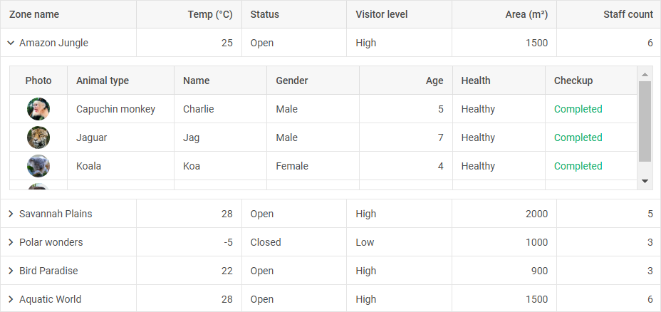
Adding sub-rows
In order to enable the row expander feature, you should use the subRow configuration option. It defines the content of sub-rows for each row of the Grid. The subRow property is a callback function which is called with the row object as a parameter and should return an HTML string or the constructor of a Suite component (Grid, Chart, Form, DataView, etc.).
Note that when the subRow config is used, Grid doesn't support the TreeGrid mode, except for the data grouping functionality.
Check the example of using a sub-row with an HTML content:
const grid = new dhx.Grid("grid_container", {
    columns: [
        { id: "zone_name", header: [{ text: "Zone name" }] },
        { id: "temperature", header: [{ text: "Temperature" }] },
        { id: "status", header: [{ text: "Status" }] },
    ],
    data: dataset,
    subRow: ({ zone_name }) => {
        return `<div>Details for ${zone_name}</div>`;
    },
});
Related sample: Grid. Row expander. Custom HTML and hiding toggle icon
In the example below a sub-row contains a subgrid:
const grid = new dhx.Grid("grid_container", {
    columns: [
        { id: "zone_name", header: [{ text: "Zone name" }] },
        { id: "temperature", header: [{ text: "Temperature" }] },
    ],
    data: dataset,
    subRow: ({ data }) => {
        return new dhx.Grid(null, {
            columns: [
                { id: "animal_type", header: [{ text: "Animal type" }] },
                { id: "name", header: [{ text: "Name" }] },
            ],
            data,
            autoWidth: true,
        });
    },
});
Related sample: Grid. Row expander. Full config
For Grid (in the TreeGrid mode) or Tree used in a sub-row it is important to specify the id of the root element to link data to the corresponding collection:
- by using the
rootParentproperty for Grid in the TreeGrid mode - by using the
rootIdproperty for Tree
For example:
const grid = new dhx.Grid("grid_container", {
    columns: [
        // columns config
    ],
    data: dataset,
    subRow: (row) => (
        new dhx.Grid(null, {
            rootParent: "root", // Add the root id
            columns: [
                { id: "country", header: [{ text: "Country" }] },
                { id: "order_quantity", header: [{ text: "Orders" }], type: "number" },
                { id: "average_check", header: [{ text: "Avg check" }], type: "number" },
            ],
            data: row.data,
            autoWidth: true,
            type: "tree",
        })
    ),
});
Adjusting configuration of sub-rows
You can define common configuration settings of all sub-rows or provide specific options for each sub-row via the subRowConfig configuration property of Grid.
This property can be used either as a callback function or as an object:
- when set as an object, the specified parameters are applied to all the rows
- when set as a callback function, it is called with the row object as a parameter and returns an object, which allows providing specific configuration for each particular row
The subRowConfig object may contain the following properties:
expanded- (boolean) defines whether a sub-row is expanded by default, false by defaultpreserve- (boolean) saves the state of sub-rows when they are expanded/collapsed, hidden from the visible area, the data is updated, false by defaulttoggleIcon- (boolean) enables the icon for sub-rows expanding/collapsing, true by defaultheight- (number) the height of a sub-row in pixels, 200 by defaultpadding- (string|number) the inner padding of a sub-row, 8 by defaultcss- (string) user-defined CSS classes for a sub-rowfullWidth- (boolean) defines whether a sub-row will take all the width of Grid, false by default
The fullWidth property works only if the subRowConfig property is initialized as an object.
The following example shows how to provide global configuration options for sub-rows:
const grid = new dhx.Grid("grid_container", {
    columns: [
        { id: "zone_name", header: [{ text: "Zone name" }] },
        { id: "temperature", header: [{ text: "Temperature" }] },
    ],
    data: dataset,
    subRowConfig: {
        height: 200,
        padding: 8,
        fullWidth: true,
    },
    subRow: ({ zone_name }) => `<div>Details for ${zone_name}</div>`,
});
Related sample: Grid. Row expander. Full config
Dynamic configuration of sub-rows
You can dynamically expand/collapse certain sub-rows or adjust their appearance (specify the size of a cell, provide particular styles for sub-rows, etc.) on initialization of Grid depending on some conditions, using the subRowConfig configuration property of Grid set as a callback function. Check the example below:
const grid = new dhx.Grid("grid_container", {
    columns: [
        { id: "zone_name", header: [{ text: "Zone name" }] },
        { id: "temperature", header: [{ text: "Temperature" }] },
    ],
    data: dataset,
    subRowConfig: (row) => ({
        height: 200,
        expanded: row.temperature > 30,
        css: row.temperature > 30 ? "hot-zone" : "cool-zone",
    }),
    subRow: ({ zone_name }) => `<div>Details for ${zone_name}</div>`,
});
In the above example the sub-rows are dynamically configured depending on the value in the column with the "temperature" id. If the temperature value is more than 30, a sub-row will be expanded and gets the CSS "hot-zone" class (or "cool-zone", if the temperature value is less than 30). The height of an expanded sub-row cell will be 200px.
Adding sub-rows for specific rows
You can define which row a sub-row should be created for with the help of the height property of the subRowConfig configuration option. If you don't want to create sub-rows for particular rows, specify the height:0 setting in the subRowConfig property.
The described functionality works only if the subRowConfig property is initialized as a callback function.
const grid = new dhx.Grid("grid_container", {
    columns: [
        // columns config
    ],
    data: dataset,
    autoWidth: true,
    subRowConfig: (row) => ({
        height: row.data.length ? 250 : 0,
        expanded: true
    }),
    subRow: (row) => new dhx.Grid(null, {
        columns: [
            // columns config
        ],
        data: row.data
    }),
});
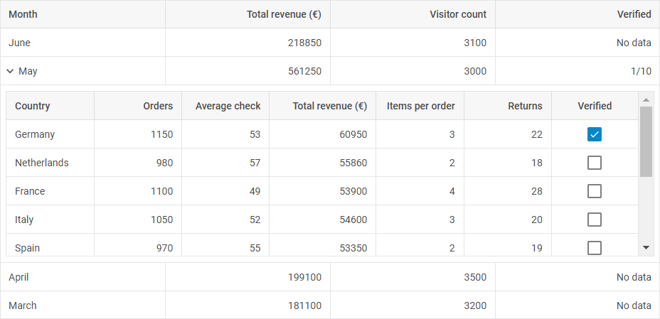
In the above example the subRowConfig config set as a callback function defines that sub-rows with the height 250px will be created for rows that have some data. For rows without data the height:0 setting is specified, so sub-rows won't be created for these rows.
Related sample: Grid. Row expander. Subgrid only in specific rows
Saving state of nested components or data in sub-rows
You can save the state of the nested components or the data of sub-rows while updating data, scrolling or collapsing sub-rows by using the preserve property of the subRowConfig configuration option of Grid. By default, sub-rows are destroyed when they are hidden (e.g. if a row leaves the visible area during scrolling) or collapsed, which leads to resetting of any changes made in the inner components.
When the preserve: true setting is specified, sub-rows aren't destroyed when hidden or collapsed and their content is saved. It means that any change (such as sorting, data input or state change) is saved and the sub-row is restored in the same state when displayed again.
It's important to take into account that the preserve: true setting increases the size of the used memory, since the sub-rows data are kept in the memory even when they aren't displayed.
When using preserve is useful
- When the data of sub-rows should be interactive. It means when a sub-row contains a form or any other component the content of which can be changed by a user and the changes shouldn't be reset
- For complex sub-rows with a state. For example, if a sub-row renders a component with a dynamic content and a complex user interface
When preserve shouldn't be used
- When sub-rows are used just for rendering static information. If a sub-row presents a simple text or a static HTML, the use of
preserveis not rational - In case a large amount of data is used. If a grid has a lot of rows and sub-rows, using
preservemay increase the size of the used memory, which will affect the performance
In the example below the preserve config is used to save the context of the Form nested in a sub-row:
const grid = new dhx.Grid("grid_container", {
    columns: [
        { id: "name", header: [{ text: "Name" }] },
        { id: "age", header: [{ text: "Age" }] },
    ],
    data: dataset,
    subRowConfig: {
        preserve: true, // saves the state of sub-rows
    },
    subRow: (row) => {
        return new dhx.Form(null, {
            rows: [
                { type: "input", name: "details", label: "Details", value: row.details },
            ],
        });
    },
});
Loading data into a sub-row
You can dynamically load data into a sub-row using the load() method of DataCollection or TreeCollection, depending on the nested component:
const grid = new dhx.Grid("grid_container", {
    columns: [
        { id: "country", header: [{ text: "Country" }] },
        { id: "population", header: [{ text: "Population" }] },
    ],
    data: dataset,
    subRowConfig: { height: 400 },
    subRow: () => {
        const subGrid = new dhx.Grid(null, {
            columns: [
                { id: "title", header: [{ text: "Title" }] },
                { id: "authors", header: [{ text: "Authors" }] },
            ],
        });

        subGrid.data.load("https://some/dataset.json").then(() => {
            subGrid.selection.setCell(subGrid.data.getId(0));
        });

        return subGrid;
    },
});
In the above example the load() method of DataCollection is used for loading data into a nested Grid.
Related sample: Grid. Row expander. Subgrid data loading
Handling events
Grid event handlers
If a sub-row initializes a nested component (any Suite component), the sub-component's events can be set in the subRow callback function. It allows specifying event handlers directly for the nested component:
const grid = new dhx.Grid("grid_container", {
    columns: [
        { width: 200, id: "zone_name", header: [{ text: "Zone Name" }] },
        { width: 150, id: "temperature", header: [{ text: "Temperature" }] },
    ],
    data: dataset,
    subRow: ({ zone_name }) => {
        const subGrid = new dhx.Grid(null, {
            columns: [
                { id: "animal", header: [{ text: "Animal" }] },
                { id: "count", header: [{ text: "Count" }] },
            ],
            data: zooMap[zone_name],
        });

        subGrid.events.on("cellClick", (row, column) => {
            console.log(`${row} ${column}`);
        });

        return subGrid;
    },
});
Related sample: Grid. Row expander. Subgrid events handling
HTML template event handlers
To specify the event handlers for a sub-row with an HTML content, use the eventHandlers configuration option of Grid:
const grid = new dhx.Grid("grid_container", {
    columns: [
        { width: 200, id: "name", header: [{ text: "Name" }] },
        { width: 150, id: "details", header: [{ text: "Details" }] },
    ],
    data: dataset,
    subRow: (row) => `
        <div className="subrow_container">
            <p className="subrow_text">Details for ${row.name}</p>
            <button className="subrow_button">Click Me</button>
        </div>
    `,
    eventHandlers: {
        onclick: {
            // the button click event in a sub-row
            subrow_button: (event, data) => {
                console.log(`A button click in the row ${data.row.id}`); // subRow id
            }
        },
    }
});
Multi-level Grid nesting
It is possible to create as many levels of nested subgrids, as necessary.
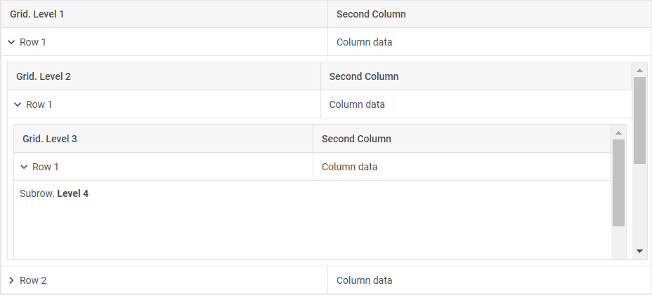
To specify the structure of a multi-level Grid nesting, do the following:
- create a Grid with columns and data
- in the Grid configuration specify the
subRowoption as a callback function, which:- returns a nested Grid that contains the
subRowconfig set as a callback function that may return:- some Suite component
- HTML as string
- a subgrid instance for another nesting level (that contains the
subRowconfig set as a callback function to return another subgrid, a Suite component, or HTML content)
- returns a nested Grid that contains the
Check the example below:
const grid = new dhx.Grid("grid_container", {
    columns: [
        { id: "col_1", header: [{ text: "Grid. Level 1" }] },
        { id: "col_2", header: [{ text: "Second Column" }] },
    ],
    data: dataset,
    autoWidth: true,
    subRowConfig: (row) => ({
        height: 300,
        expanded: row.col_1 === "Row 1",
    }),
    subRow: ({ data }) => {
        return new dhx.Grid(null, {
            columns: [
                { id: "col_1", header: [{ text: "Grid. Level 2" }] },
                { id: "col_2", header: [{ text: "Second Column" }] },
            ],
            data,
            autoWidth: true,
            subRowConfig: (row) => ({
                height: 300,
                expanded: row.col_1 === "Row 1",
            }),
            subRow: ({ data }) => {
                return new dhx.Grid(null, {
                    columns: [
                        { id: "col_1", header: [{ text: "Grid. Level 3" }] },
                        { id: "col_2", header: [{ text: "Second Column" }] },
                    ],
                    data,
                    autoWidth: true,
                    subRowConfig: (row) => ({
                        height: 300,
                        expanded: row.col_1 === "Row 1",
                    }),
                    subRow: () => (`<span>Subrow. <b>Level 4</b></span>`),
                })
            },
        })
    },
});
Related sample: Grid. Row expander. Subgrid with rows expanded by criteria
Adjusting sub-row width
You can adjust the sub-row width depending on the width of its parent Grid via the fullWidth property of the subRowConfig configuration object.
The fullWidth property works only if the subRowConfig property is initialized as an object.
If the fullWidth: true configuration option is specified, the sub-row width is the same as the full width of the Grid content, including the area outside the visible area borders (it means that the sub-row will be scrolled together with the horizontal scroll). By default, a sub-row takes just the width of the visible Grid area.
Check the example below:
const grid = new dhx.Grid("grid_container", {
   width: 400,
    columns: [
        { id: "name", header: [{ text: "Name" }], width: 150 },
        { id: "value", header: [{ text: "Value" }], width: 150 },
        { id: "description", header: [{ text: "Description" }], width: 300 },
    ],
    data: dataset,
    subRow: (row) => {
        return `<div className="subrow-content">Details for ${row.name}</div>`;
    },
    subRowConfig: {
        fullWidth: true, // makes the sub-row width equal to the Grid content width
    },
});
In the above example:
- the width of the Grid container is set as 400px
- if the
fullWidthconfig isn't enabled, the sub-row width will be equal to the Grid width (400px) - the common width of all the columns is 600px, thus if the
fullWidth: truesetting is specified, the sub-row width will be equal to 600px
Getting sub-row config and content
You can get the configuration settings applied to a sub-row and the content inside it using the getSubRow() method.
Note that the method works if a sub-row is in the visible area or if the preserve:true property is specified in the subRowConfig object of the sub-row.
The method takes as a parameter the id of a row and returns an object that includes the following properties:
| css | (string) user-defined CSS classes for a sub-row |
| element | (HTMLElement | null) the parent container of the current sub-row |
| expanded | (boolean) defines whether a sub-row is expanded by default, false by default |
| fullWidth | (boolean) defines whether a sub-row will take all the width of Grid, false by default |
| height | (number) the height of a sub-row in pixels, 200 by default |
| padding | (string | number) the inner padding of a sub-row, 8 by default |
| preserve | (boolean) saves the state of sub-rows while expanding/collapsing, disappearing from the visible area, data updating, false by default |
| toggleIcon | (boolean) enables the icon for expanding/collapsing, true by default |
| view | (string | object | null) that can be presented by:
|
Drag-n-drop
The drag-n-drop functionality allows you to reorder one or several rows or columns inside the grid or between several grids.
If you use the GPL version of DHTMLX Grid (or DHTMLX Suite), you will be able to reorder only rows and only one by one.
Note, to be able to drag-n-drop a column and (or) multiple rows, you need to use PRO version of the DHTMLX Grid (or DHTMLX Suite) package.
There are some peculiarities of the drag-n-drop functionality in the Grid in the TreeGrid mode. Check the related section for details.
Drag-n-drop inside the grid
It is possible to reorder a row or column of Grid by drag and drop. To enable the functionality, define the dragItem: "both" property in the configuration object of Grid:
const grid = new dhx.Grid("grid_container", {
    columns: [
        // columns config
    ],
    dragItem: "both",
    data: dataset
});
Related sample: Grid. Drag-n-drop
To activate the functionality for columns or rows separately, use dragItem: "column" or dragItem: "row" respectively.
If needed, you can disable the drag-n-drop functionality for a separate column via the draggable configuration option of the column:
const grid = new dhx.Grid("grid_container", {
    columns: [
        { width: 200, id: "country", header: [{ text: "Country" }]},
        { width: 150, id: "land", header: [{ text: "Land" }] },
        { width: 150, id: "density", header: [{ text: "Density" }], draggable: false }
    ],
    data: dataset,
    dragItem: "column",
});
Drag-n-drop between grids
DHTMLX Grid supports drag-n-drop of rows/columns between grids in several modes. To begin with, you should specify the dragMode property in the configuration object of Grid. Then define which mode you need:
- "target" - a grid takes a row/column from other grids, while its row/colmn can't be dragged out of it
- "source" - a grid allows dragging its row/column out and can't take a row/column from other grids
- "both" - a grid both takes a row/column from other grids and allows dragging its row/column out as well
const grid = new dhx.Grid("grid_container", {
    columns: [
        { id: "country", header: [{ text: "Country" }] },
        { id: "population", header: [{ text: "Population" }] }
    ],
    data: dataset,
    dragMode: "source",
    // dragItem: "column" - allows reordering columns one by one
});
Related sample: Grid. Drag-n-drop between grids
Drag-n-drop of multiple rows
This functionality requires PRO version of the DHTMLX Grid (or DHTMLX Suite) package.
To allow a user to drag-n-drop multiple rows at once, you need to enable multiselection of rows when configuring drag-n-drop. For example:
const grid = new dhx.Grid("grid", {
    columns: [
        // columns config
    ],
    data: data,
    selection: "row",
    //drag-n-drop rows inside the grid
    multiselection: true,
    dragItem: "both" // or dragItem: "row"
});
Related sample: Grid. Drag-n-drop
or
const grid = new dhx.Grid("grid", {
    columns: [
        // columns config
    ],
    data: dataset,
    selection: "row",
    //drag-n-drop rows between grids
    multiselection: true,
    dragMode: "both" // or dragMode: "source"
});
Adjusting DragPanel module
This functionality requires PRO version of the DHTMLX Grid (or DHTMLX Suite) package.
The DragPanel module allows configuring the drag-n-drop functionality in Grid. It provides settings for adjusting the look and feel of the drag panel that appears when the drag-n-drop functionality is activated. Check the details below.
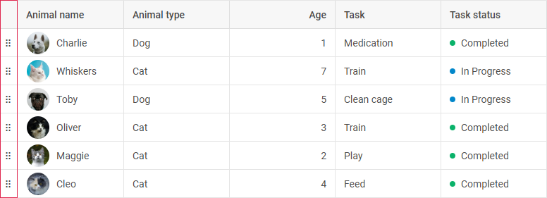
To initialize the DragPanel module, you should enable the dragPanel property in the Grid configuration together with the row Drag-and-Drop functionality (e.g. via the dragItem: "row" or dragItem: "both" properties). For example:
const grid = new dhx.Grid("grid_container", {
    columns: [
        { id: "a", header: [{ text: "A" }] },
        { id: "b", header: [{ text: "B" }] },
    ],
    data: [
        { id: "1", a: "A1", b: "B1" },
        { id: "2", a: "A2", b: "B2" },
    ],
    dragItem: "row", // enables row Drag-and-Drop
    dragPanel: true // enables the DragPanel module
});
Related sample: Grid (TreeGrid). DragPanel. Initialization
The module is also automatically enabled if the row Drag-and-Drop functionality is activated
(e.g. via the dragItem: "row" or dragItem: "both" properties) and either the BlockSelection or Clipboard modules are enabled.
The following example demonstrates enabling the DragPanel module with row Drag-and-Drop and the BlockSelection module:
const grid = new dhx.Grid("grid_container", {
    columns: [
        { id: "a", header: [{ text: "A" }] },
        { id: "b", header: [{ text: "B" }] },
    ],
    data: [
        { id: "1", a: "A1", b: "B1" },
        { id: "2", a: "A2", b: "B2" },
    ],
    dragItem: "row", // enables row Drag-and-Drop
    blockSelection: true // triggers DragPanel activation
});
You can specify additional configuration options for the DragPanel module while initializing the component. For this, you need to set the dragPanel property as an object. The following options are available:
css- (string) specifies a custom CSS class for styling the drag panelicon- (string) defines a custom icon for the drag handlewidth- (number) sets the width of the drag panel in pixels
The following example demonstrates configuring the DragPanel module with custom styling and width:
<style>
    .custom-drag-panel {
        background-color: var(--dhx-color-primary);
        border: 1px solid var(--dhx-color-secondary);
    }
</style>

<script>
const grid = new dhx.Grid("grid_container", {
    columns: [
        { id: "a", header: [{ text: "A" }] },
        { id: "b", header: [{ text: "B" }] },
    ],
    data: [
        { id: "1", a: "A1", b: "B1" },
        { id: "2", a: "A2", b: "B2" },
    ],
    dragPanel: {
        css: "custom-drag-panel",
        icon: "dxi dxi-drag",
        width: 40
    }
});
</script>
Selection
DHTMLX Grid includes the selection feature that allows highlighting Grid elements depending on the chosen mode. The selection property enables selection in a grid. It can take three values:
| row | to move selection between Grid rows |
| cell | to move selection between Grid cells |
| complex | to highlight both a selected cell and the row it belongs to |
const grid = new dhx.Grid("grid_container", {
    columns: [
        // columns config
    ],
    selection: "complex",
    data: dataset
});
Related sample: Grid. Selection
Multiple selection of Grid cells
While setting the selection property to "row", "cell", or "complex" value, you can enable the multiselection property to allow a user to select multiple Grid elements:
const grid = new dhx.Grid("grid_container", {
    columns: [
        // columns config
    ],
    multiselection: true,
    selection: "row",
    data: dataset
});
Related sample: Grid. Multiselection
Since the multiselection configuration option is set to true, using the "Ctrl + Click" combination allows selecting the desired cells or rows.
A range of Grid cells/rows can be selected by clicking the first element to select and then, while holding down the Shift key, clicking the last element to select.
Managing range selection in Grid
This functionality requires PRO version of the DHTMLX Grid (or DHTMLX Suite) package.
The Grid functionality provides the range selection management feature for setting/resetting a range of cells, retrieving information about the current range, and checking whether specific cells belong to the selected range.
To enable range selection management within a grid, you should use the RangeSelection module. To initialize the module, enable the rangeSelection property in the Grid configuration:
const grid = new dhx.Grid("grid_container", {
    columns: [
        { id: "a", header: [{ text: "A" }] },
        { id: "b", header: [{ text: "B" }] },
    ],
    data: [
        { id: "1", a: "A1", b: "B1" },
        { id: "2", a: "A2", b: "B2" },
    ],
    rangeSelection: true // enables the RangeSelection module
});
The rangeSelection property can be set in two ways:
- as a boolean value it enables or disables the range selection module upon the component initialization
- as an object it enables the module and allows setting additional configuration options during the component initialization. The following options are available:
disabled- (boolean) makes the module inactive upon initialization of the component
The example below demonstrates interaction with the RangeSelection module's API when range selection is configured to be inactive on the component initialization.
const grid = new dhx.Grid("grid_container", {
    // other configuration
    columns: [
        { id: "a", header: [{ text: "A" }] },
        { id: "b", header: [{ text: "B" }] },
    ],
    data: [
        { id: "1", a: "A1", b: "B1" },
        { id: "2", a: "A2", b: "B2" },
    ],
    rangeSelection: { disabled: true }
});

console.log(grid.range.isDisabled()); // `true` - module is inactive
grid.range.setRange({ xStart: "a", yStart: "1" }); // the range will not be set
For information on using the Range Selection API, read the Work with RangeSelection module guide.
Managing block selection in Grid
This functionality requires PRO version of the DHTMLX Grid (or DHTMLX Suite) package.
The Grid functionality provides the block selection management feature for selecting cells' ranges via the mouse pointer, touch input, and keyboard navigation, as well as adjusting the appearance of the selection and managing the behavior of the module, depending on the applied mode.
To enable managing of the block selection within a grid, you should use the BlockSelection module. To initialize the module, enable the blockSelection property in the Grid configuration:
const grid = new dhx.Grid("grid_container", {
    columns: [
        { id: "a", header: [{ text: "A" }] },
        { id: "b", header: [{ text: "B" }] },
    ],
    data: [
        { id: "1", a: "A1", b: "B1" },
        { id: "2", a: "A2", b: "B2" },
    ],
    blockSelection: true // enables the BlockSelection module
});
The blockSelection property can be set in two ways:
- as a boolean value it enables or disables the block selection module upon the component initialization
- as an object it enables the module and allows setting additional configuration options during the component initialization. The following options are available:
| disabled | (boolean) disables the module on startup, false by default |
| mode | (string) the operating mode of the module:
|
| handle | (boolean | object) enables the handle for resizing or provides additional configuration options, true by default. As an object can contain the following properties:
|
| area | (boolean) enables the display of the selection area, true by default |
By default, the blockSelection property is set to false. When blockSelection is set to true or the module is set to the "range" mode, the RangeSelection module is initialized.
The example below demonstrates configuring the module with the handle disabled and the "range" mode enabled:
const grid = new dhx.Grid("grid_container", {
    columns: [
        { id: "a", header: [{ text: "A" }] },
        { id: "b", header: [{ text: "B" }] },
    ],
    data: [
        { id: "1", a: "A1", b: "B1" },
        { id: "2", a: "A2", b: "B2" },
    ],
    blockSelection: {
        mode: "range", // setting the "range" mode
        handle: false // the handle is disabled
    }
});
The following example demonstrates configuring the handle:
const grid = new dhx.Grid("grid_container", {
    columns: [
        { id: "a", header: [{ text: "A" }] },
        { id: "b", header: [{ text: "B" }] },
    ],
    data: [
        { id: "1", a: "A1", b: "B1" },
        { id: "2", a: "A2", b: "B2" },
    ],
    blockSelection: {
        mode: "range", // setting the "range" mode
        handle: { allowAxis: "y" } // restricts the handle movement to the vertical direction
    }
});
Related sample: Grid. BlockSelection in the "range" mode. Selection with restricted columns
For information on using the Block Selection API, read the Work with Block Selection module guide.
Clipboard
This functionality requires PRO version of the DHTMLX Grid (or DHTMLX Suite) package.
The Grid component provides the functionality for interacting with the clipboard, such as copying, cutting, and pasting data from a selected range of cells, as well as integrating with other grids or external applications like Google Spreadsheets.
To enable the clipboard functionality within a grid, you should use the Clipboard module. To initialize the module, enable the clipboard property in the Grid configuration. The Clipboard module requires the RangeSelection module to be enabled. For convenient range selection via the UI, it is recommended to use the BlockSelection module with the mode: "range" setting. It allows users to visually select areas before copying or pasting.
The blockSelection: { mode: "range" } property is automatically initialized in the Grid configuration when the Clipboard module is enabled.
const grid = new dhx.Grid("grid_container", {
    columns: [
        { id: "a", header: [{ text: "A" }] },
        { id: "b", header: [{ text: "B" }] },
    ],
    data: [
        { id: "1", a: "A1", b: "B1" },
        { id: "2", a: "A2", b: "B2" },
    ],
    blockSelection: { mode: "range" }, // required for Clipboard to function (initializes automatically)
    clipboard: true // enables the Clipboard module
});
The clipboard property can be set in two ways:
- as a boolean value it enables or disables the
clipboardmodule upon the component initialization - as an object it enables the module and allows defining modifier functions for data processing. The following properties are available:
copyModifier- (function) modifies data before copying to the clipboard. Accepts as parameters the cell value, the cell object, and thecutflag (set totrue, if it's a cut operation)cutModifier- (function) modifies the cell data before cutting (before clearing the cell). Accepts as parameters the cell value and the cell objectpasteModifier- (function) modifies data from the clipboard before pasting into a cell. Accepts as parameters the cell value and the cell object
The example below demonstrates the clipboard configuration with all the modifiers in use:
const grid = new dhx.Grid("grid_container", {
    columns: [
        { id: "a", header: [{ text: "A" }] },
        { id: "b", header: [{ text: "B" }] },
    ],
    data: [
        { id: "1", a: "A1", b: "B1" },
        { id: "2", a: "A2", b: "B2" },
    ],
    clipboard: {
        // adds a suffix based on the operation
        copyModifier: (value, cell, cut) => `${value}${cut ? "-cut" : "-copied"}`,
        cutModifier: (value, cell) => `${value}-removed`, // before cutting a value
        pasteModifier: (value, cell) => value.replace("-copied", "") // removes the suffix on data pasting
    }
});
Related sample: Grid. Clipboard. Custom copy/cut/paste for number and date columns
For information on working with Clipboard, read the Work with Clipboard module guide.
History of Grid actions
This functionality requires PRO version of the DHTMLX Grid (or DHTMLX Suite) package.
DHTMLX Grid provides the functionality for managing the history of actions in the component.
To enable the history functionality within a grid, you should use the History module. To initialize the module, enable the history property in the Grid configuration.
const grid = new dhx.Grid("grid_container", {
    columns: [
        { id: "a", header: [{ text: "A" }] },
        { id: "b", header: [{ text: "B" }] },
    ],
    data: [
        { id: "1", a: "A1", b: "B1" },
        { id: "2", a: "A2", b: "B2" },
    ],
    history: true // enables the History module
});
The history property can be set in two ways:
- as a boolean value it enables or disables the
Historymodule upon the component initialization - as an object it enables the module and allows setting additional parameters:
limit- (number) the maximum number of actions stored in the history. When the limit is exceeded, the oldest actions are removeddisabled- (boolean) iftrue, the module is disabled on initialization, and no actions are recorded in the history
The example below demonstrates configuring the module with a history limit of 10 actions. The module is disabled on initialization:
const grid = new dhx.Grid("grid_container", {
    columns: [
        { id: "a", header: [{ text: "A" }] },
        { id: "b", header: [{ text: "B" }] },
    ],
    data: [
        { id: "1", a: "A1", b: "B1" },
        { id: "2", a: "A2", b: "B2" },
    ],
    history: {
        limit: 10, // limits history to 10 actions
        disabled: true // the module is disabled on start
    }
});

grid.history.enable(); // enabling the module
Related sample: Grid. History. Configuration
For information on working with the History API, read the Work with History module guide.
Keyboard navigation
DHTMLX Grid provides the keyboard navigation that will help you manipulate your grid faster.
Default shortcut keys
The navigation shortcut keys and keys combinations that Grid enables by default are provided below:
| PageUp | scrolls Grid up to the height of the visible content (without change of the selected cell) |
| PageDown | scrolls Grid down to the height of the visible content (without change of the selected cell) |
| Home | navigates to the beginning of the Grid content (without change of the selected cell) |
| End | navigates to the end of the Grid content (without change of the selected cell) |
| Ctrl+Enter | expands/collapses the parent item in the TreeGrid mode |
If you need to disable this functionality, set the keyNavigation property to false.
const grid = new dhx.Grid("grid_container", {
    columns: [
        // columns config
    ],
    data: dataset,
    keyNavigation: false
});
Related sample: Grid. Key navigation
Shortcut keys for moving selection between cells
In case you want to enable the shortcut keys that allow moving the selection between cells, you need to specify the selection property for Grid.
const grid = new dhx.Grid("grid_container", {
    columns: [
        // columns config
    ],
    data: dataset,
    selection: "complex",
    keyNavigation: true // true - by default
});
Related sample: Grid. Key navigation
The list of the shortcut keys and their combinations used for moving selection between cells is the following:
| ArrowUp | moves selection to the previous vertical cell |
| ArrowDown | moves selection to the next vertical cell |
| ArrowLeft | moves selection to the previous horizontal cell |
| ArrowRight | moves selection to the next horizontal cell |
| Ctrl+ArrowUp | moves selection to the first vertical cell |
| Ctrl+ArrowDown | moves selection to the last vertical cell |
| Ctrl+ArrowLeft | moves selection to the first horizontal cell |
| Ctrl+ArrowRight | moves selection to the last horizontal cell |
| Tab | moves selection to the next horizontal cell or the first cell of the next row |
| Shift+Tab | moves selection to the previous horizontal cell or to the first cell of the previous row |
The combinations of the shortcut keys listed below do not work when the selection property is set to "complex". Use another mode ("cell" or "row") in case you want to activate these navigation keys:
| Shift+ArrowUp | moves selection to the previous vertical cell with the change of the selected cells |
| Shift+ArrowDown | moves selection to the next vertical cell with the change of the selected cells |
| Shift+ArrowLeft | moves selection to the previous horizontal cell with the change of the selected cells |
| Shift+ArrowRight | moves selection to the next horizontal cell with the change of the selected cells |
| Ctrl+Shift+ArrowUp | moves selection to the first vertical cell with the change of the selected cells |
| Ctrl+Shift+ArrowDown | moves selection to the last vertical cell with the change of the selected cells |
| Ctrl+Shift+ArrowLeft | moves selection to the first horizontal cell with the change of the selected cells |
| Ctrl+Shift+ArrowRight | moves selection to the last horizontal cell with the change of the selected cells |
Shortcut keys for editing
It is possible to use shortcut keys for editing a cell in Grid by setting the editable:true property in the configuration object of Grid.
const grid = new dhx.Grid("grid_container", {
    columns: [
        // columns config
    ],
    data: dataset,
    selection: "complex",
    editable: true,
    keyNavigation: true // true - by default
});
Related sample: Grid. Key navigation
The list of the shortcut keys for editing is given below:
| Enter | opens the editor in the selected cell. If the editor is currently opened - closes the editor and saves changes |
| Escape | closes the editor of the selected cell without saving |
| Delete | clears data in the selected cells. Works only with the BlockSelection module in the "range" mode |
Shortcut keys for selecting ranges of cells
If you need to use the keyboard navigation for selecting ranges of cells via the user interface, you should enable the BlockSelection module in the Grid configuration.
Keyboard navigation works in both the "range" and "manual" modes. In the "manual" mode, applying the selection (e.g., after Enter) requires handling via the events, such as beforeBlockSelectionApply and afterBlockSelectionApply.
The module supports keyboard navigation for selecting and managing ranges, similar to keyboard navigation used in Google Spreadsheets. The following shortcut keys and their combinations are available:
| ArrowUp | resets the selected range and moves the focus to the previous vertical cell, setting the initially selected cell if no selection is active |
| ArrowDown | resets the selected range and moves the focus to the next vertical cell, setting the initially selected cell if no selection is active |
| ArrowLeft | resets the selected range and moves the focus to the previous horizontal cell, setting the initially selected cell if no selection is active |
| ArrowRight | resets the selected range and moves the focus to the next horizontal cell, setting the initially selected cell if no selection is active |
| Shift+ArrowUp | extends the selected range from the current initial cell to the previous vertical cell |
| Shift+ArrowDown | extends the selected range from the current initial cell to the next vertical cell |
| Shift+ArrowLeft | extends the selected range from the current initial cell to the previous horizontal cell |
| Shift+ArrowRight | extends the selected range from the current initial cell to the next horizontal cell |
| Ctrl+ArrowUp | resets the selected range and moves the focus to the first vertical cell |
| Ctrl+ArrowDown | resets the selected range and moves the focus to the last vertical cell |
| Ctrl+ArrowLeft | resets the selected range and moves the focus to the first horizontal cell |
| Ctrl+ArrowRight | resets the selected range and moves the focus to the last horizontal cell |
| Ctrl+Shift+ArrowUp | extends the selected range to the first vertical cell |
| Ctrl+Shift+ArrowDown | extends the selected range to the last vertical cell |
| Ctrl+Shift+ArrowLeft | extends the selected range to the first horizontal cell |
| Ctrl+Shift+ArrowRight | extends the selected range to the last horizontal cell |
The following shortcut key and mouse combination is available:
| Shift + click | sets the end cell of the range, extending the selection from the current initial cell |
The following shortcut key is available when the editable mode is set for the Grid component and the BlockSelection module is used in the "range" mode:
| Delete | allows clearing the selected cells |