Customization
Styling grid
There is a possibility to make changes in the look and feel of a grid.
Related sample: Grid. Styling (custom CSS)
For this you need to take the following steps:
- add a new CSS class(es) with desired settings in the <style> section of your HTML page or in your file with styles (don't forget to include your file on the page in this case)
<style>
    .my-first-class {
        /*some styles*/
    }

    .my-second-class {
        /*some styles*/
    }
</style>
- specify the name of the created CSS class (or names of classes separated by spaces) as the value of the css property in the Grid configuration:
const grid = new dhx.Grid("grid_container", {
    css:"my-first-class my-second-class"
});
For example:
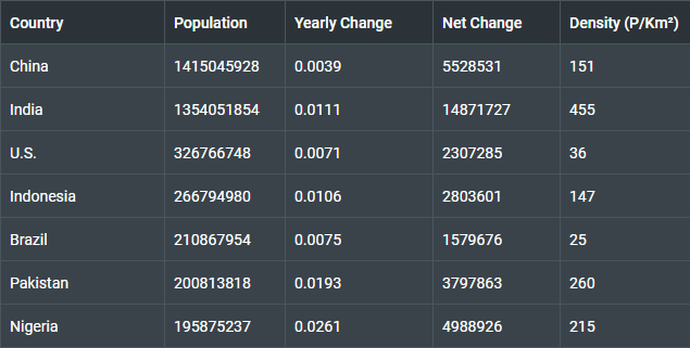
<style>
    .custom {
        --dhx-font-color-primary: #fff;
        --dhx-background-primary: #3A434A;
        --dhx-s-grid-header-background: #2C3338;

        --dhx-border-color: #4A555E;
        --dhx-border: var(--dhx-border-width) solid var(--dhx-border-color);
    }
</style>

<script>
    const grid = new dhx.Grid("grid_container", {
        columns: [
            { minWidth: 150, id: "country", header: [{ text: "Country" }] },
            { id: "population", header: [{ text: "Population" }] },
            { id: "yearlyChange", header: [{ text: "Yearly Change" }] },
            // more columns
        ],
        adjust: true,
        data: dataset,
        css: "custom",
    });
</script>
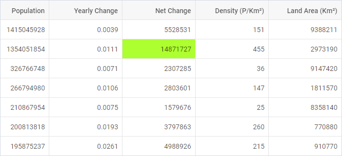
Styling selection
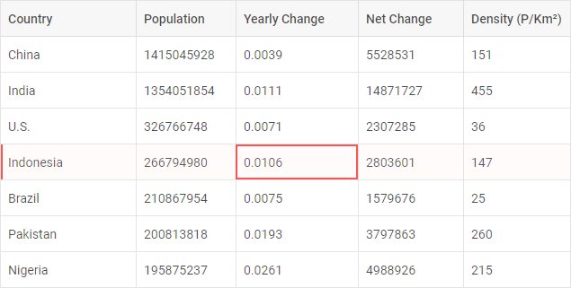
Related sample: Grid. Styling selection (custom CSS)
Here is an example of how you can style selection in Grid:
<style>
    .custom {
        --dhx-color-primary: #ff5252;
        --dhx-s-grid-selection-background: rgba(255, 198, 198, 1);
    }
</style>

<script>
    const grid = new dhx.Grid("grid_container", {
        columns: [
            { minWidth: 150, id: "country", header: [{ text: "Country" }] },
            { id: "population", header: [{ text: "Population" }] },
            { id: "yearlyChange", header: [{ text: "Yearly Change" }] },
            // more columns
        ],
        adjust: true,
        data: dataset,
        selection: true,
        css: "custom"
    });
</script>
Styling header cells
You can easily set some styling to the text of header cells by applying some inline style or a CSS class to the text property of the header of a column:
<style>
    .title {
        font-size: 1.2em;
        color: tomato;
    }

</style>

<script>
    const grid = new dhx.Grid("grid_container", {
        columns: [
              { width: 200, id: "country", header: [{ text: "<span style='font-size:2em'>Country</span>" }] },
              { width: 150, id: "population", header: [{ text: "<span class='title'>Population</span>" }] },
              { width: 150, id: "yearlyChange", header: [{ text: "Yearly Change" }] },
              { width: 150, id: "netChange", header: [{ text: "Net Change" }] },
              { width: 150, id: "density", header: [{ text: "Density (P/Km²)" }] },
              { width: 150, id: "area", header: [{ text: "Land Area (Km²)" }] },
        ],
        data: dataset
    });
</script>
Related sample: Grid. Styling header cells (custom CSS)
Styling footer cells
You can easily set some styling to the text of footer cells by applying some inline style or a CSS class to the text property of the footer of a column:
<style>
    .custom_footer{
        font-size: 18px;
        text-decoration: underline;
    }
</style>

<script>
    const grid = new dhx.Grid("grid_container", {
    columns: [
        {
            width: 200, id: "country", header: [{ text: "Country" }],
            footer: [
                { text: '<div class="custom_footer">Total</div>' },
                { text: '<div class="custom_footer">Minimal value</div>' },
            ],
            htmlEnable: true
        },
        {
            width: 150, id: "population", header: [{ text: "Population" }],
            footer: [
                { text: ({ totalPopulation}) => `${totalPopulation}`},
                { text: ({ minimalValue }) => `${minimalValue}`}
            ],
        },
    ],
    summary: {
        totalPopulation: ["population", "sum"],
        minimalValue: ["population", "min"]
    },
    data: dataset
});
</script>
Related sample: Grid. Styling footer cells (custom CSS)
Styling rows
It is possible to change the appearance of grid rows by applying custom CSS styles to them. There are two ways to do it:
- via the rowCss property in the configuration of Grid. As a value of property set a function that takes the id of a row as a parameter and returns a string with the name of a CSS class.
<style>
    .my_custom_row {
        background: coral;
    }
</style>

<script>
    const grid = new dhx.Grid("grid_container", {
        columns: [
            // columns config
        ],
        rowCss: function (row) { return row.custom ? "my_custom_row" : "" },
        data: dataset
    });
</script>
Related sample: Grid. Custom row style
- with the help of the addRowCss() method:
<style>
    .myCustomClass{
        background:greenyellow;
    }
</style>

<script>
    const rowId = grid.data.getId(1);
    grid.addRowCss(rowId, "myCustomClass");
</script>
Related sample: Grid. Add row CSS
where:
| rowId | (string,number) the id of a row |
| css | (string) the name of a CSS class |
Styling cells
It is easy to style necessary cells using the addCellCss() method. It takes three parameters:
| row | (string,number) the id of a row |
| column | (string,number) the id of a column |
| css | (string) the name of the CSS class |
<style>
.myCustomClass{
    background:greenyellow;
}
</style>

<script>
    const grid = new dhx.Grid("grid_container", {
        columns: [
            // columns config
        ],
        data: dataset,
        adjust: true
    });

    const rowId = grid.data.getId(1);

    grid.addCellCss(rowId, "country", "my_сustom_сlass");
</script>
Related sample: Grid. Add cell CSS
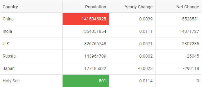
Adding custom marks to cells
You can mark particular cells in a grid using the mark property of a column configuration. You need to set its value as a function that takes the following parameters:
| cell | (string) the value of a cell |
| columnCells | (array) an array of all cell values in the specified column |
| row | (object) an object with all cells in a row |
| column | (object) the config of a column (see the columns config) |
The function should return a string with a custom CSS class for your mark.
<style>
    .my_custom_mark {
        background: lightcoral;
    }

    .total_col {
        background: #f2f2f2;
    }
</style>

<script>
    const grid = new dhx.Grid("grid_container", {
        columns: [
            {
                id: "population", header: [{ text: "Population" }],
                // marks specified cells in a column
                mark: function (cell, data, row, column) {
                    return cell > 100000000 ? "my_custom_mark" : ""
                }
            },
            {
                id: "density", header: [{ text: "Density (P/Km²)" }],
                // marks all cells in a column
                mark: function (cell, data) { return "total_col"; }
            },
        ],
        data: dataset
    });
</script>
Related sample: Grid. Conditional formatting. Marking cells with colors
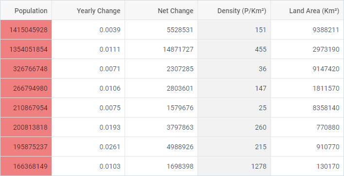
It is also possible to highlight cells with minimum and (or) maximum values in a grid using the mark property of a column configuration. The property is an object which takes two optional parameters:
| min | (string) a custom CSS class to mark a cell that contains the minimum value |
| max | (string) a custom CSS class to mark a cell that contains the maximum value |
<style>
    .max_cell {
        background: #f44336;
        color: #FFF;
    }

    .min_cell {
        background: #4CAF50;
        color: #FFF
    }
</style>

<script>
    const grid = new dhx.Grid("grid_container", {
        columns: [
            { width: 200, id: "country", header: [{ text: "Country" }] },
            {
                width: 150, id: "population", header: [{ text: "Population" }],
                mark: {
                    min: "min_cell",
                    max: "max_cell"
                }
            },
            // more options
        ],
        data: dataset
    });
</script>
Related sample: Grid. Mark cells
Adding template to cells
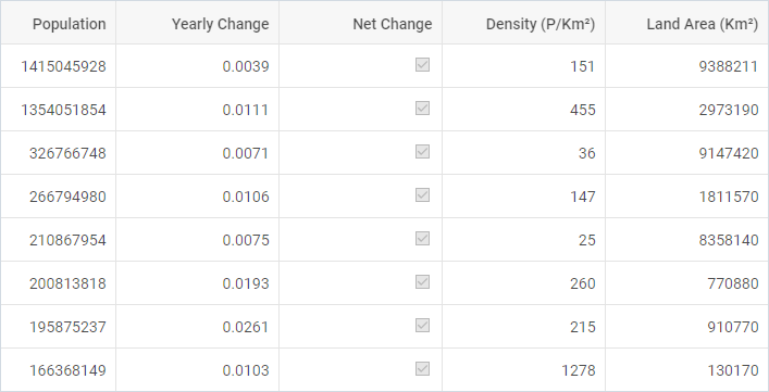
It is possible to customize the content of cells of Grid via the template property of a column configuration. The template option is a function that takes three parameters:
| cellValue | (any) the value of a cell |
| row | (object) an object with all cells in a row |
| column | (object) the config of a column |
const grid = new dhx.Grid("grid_container", {
    columns: [
        { width: 200, id: "country", header: [{text: "Country"}] },
        { width: 150, id: "population", header: [{text: "Population"}] },
        { width: 150, id: "netChange", header: [{text: "Net Change"}],
          htmlEnable: true,
          template: function (text, row, column) {
            return "<input type=\"checkbox\" " + (text /> 300000 ? "checked": "")  + ">";
          }
        }
    ],
    data: dataset
});
Related sample: Grid. Cell templates
Event handlers for the template
Starting from v7.0, you can assign event handlers to HTML elements of a custom template of Grid cells via using the eventHandlers configuration property of Grid, for instance:
const grid = new dhx.Grid("grid_container", {
    columns: [
        { width: 200, id: "country", header: [{ text: "Country" }], htmlEnable: true },
        { width: 150, id: "netChange", header: [{text: "Net Change"}],
            htmlEnable: true,
            tooltip: false,
            template: function (text, row, column) {
                return "<div className='cell__template'><input type='checkbox'
                    disabled " + (text /> 3000000 ? "checked" : "") + " ></div>";
            }
        },
        // more options
    ],
    data: data,
    eventHandlers: {
        onmouseover: {
            cell__template: function(event, data) {
                console.log(JSON.stringify(data.row, null, 2));
            }
        }
    }
});
Related sample: Grid. Handling events in template
Adding template to tooltip
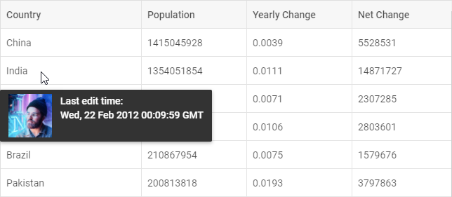
Starting with v7.1, you can customize the content of the tooltip of a column via the tooltipTemplate configuration option of the column. The tooltipTemplate function takes three parameters:
| value | (any) the value of a cell |
| row | (object) an object with all cells in a row |
| column | (object) the config of a column |
const grid = new dhx.Grid("grid_container", {
    columns: [
        {
            width: 200, id: "country", header: [{ text: "Country" }], align: "left",
            htmlEnable: true,
            tooltipTemplate: function (value, row, column) {
                if (row.country === "Bangladesh") {
                    return false; // prevent a tooltip from being shown
                }
                return `<div className="custom-tooltip">
                    <img src="../data/common/img/02/${row.avatar}.jpg" />
                    <span>Last edit time:<br/>${row.editing.toUTCString()}</span>
                </div>`;
            }
        },
        { width: 150, id: "population", header: [{ text: "Population" }] },
        { width: 150, id: "yearlyChange", header: [{ text: "Yearly Change" }] },
        // more options
    ],
    data: dataset
});
To prevent a tooltip from being shown, return false from the function (from v7.1.12).
Related sample: Grid. Rich tooltip template for the first column
Related sample: Grid. Tooltip template
You should enable the htmlEnable option in the configuration of Grid (or configuration of the column) to activate HTML support for the tooltip.