Customization
Styling Calendar
You can change the look and feel of a calendar. For example, change its background color:
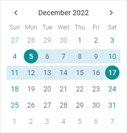
Related sample: Calendar. Styling (custom CSS)
Follow these steps:
- Add one or more CSS classes in the
<style>section of your HTML page or in a separate stylesheet linked on the page:
<style>
    .my_first_class {
        /*some styles*/
    }

    .my_second_class {
        /*some styles*/
    }
</style>
- Assign the class name (or several names separated by spaces) to the css property:
const calendar = new dhx.Calendar("calendar_container", {
    css:"my_first_class my_second_class"
});
For example:
<style>
    .custom {
        --dhx-color-primary: #118d8d;
    }
</style>

<script>
    const calendar = new dhx.Calendar("calendar_container", {
        css: "custom dhx_widget--bordered"
    });
</script>
Styling selected dates
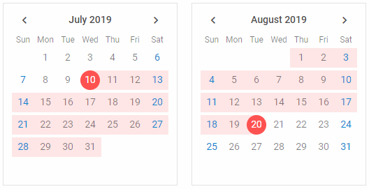
Related sample: Calendar. Custom styles for selected date
You can style selected dates and date ranges with your own CSS. Override these system styles:
<style>
    /* system style for selected dates */
    .dhx_calendar-day--selected::before {
        background-color: #ff5252;
    }

    /* system style for a date range */
    .dhx_calendar-day--in-range:after {
        background-color: #ffe7e7;
     }
</style>

<script>
    const calendar1 = new dhx.Calendar("calendar1", {css: "dhx_widget--bordered"});
    const calendar2 = new dhx.Calendar("calendar2", {css: "dhx_widget--bordered"});
</script>