Customization
You can customize the look and feel of the header and footer of Window together with their functionality.
Default and custom icons
DHTMLX Window uses the Material Design-based icons by default. However, you can use any other icon font pack, if necessary. For this, you need to include the desired icon font on a page and apply icons in any possible part of the window: in the header or the footer.
For example, you can use the Font Awesome icon pack by including link to its CDN after the source files of DHTMLX Window as follows:
<script type="text/javascript" src="../../codebase/window.js"></script>
<link rel="stylesheet" href="../../codebase/window.css">

<link rel="stylesheet" href="https://use.fontawesome.com/releases/v5.3.1/css/all.css"
  integrity="sha384-mzrmE5qonljUremFsqc01SB46JvROS7bZs3IO2EmfFsd15uHvIt+Y8vEf7N7fWAU"
  crossOrigin="anonymous">
Then you can use the name of the icon as the value of the icon property in the object with the control parameters for the header or the footer. See details below.
Related sample: Window. Custom icons
Controls and operations
It is possible to add any Toolbar controls into the header/footer of a window. You can work with controls in the header/footer of a window in the same way as with Toolbar controls, i.e. add new controls, delete unnecessary ones and update the settings of controls, e.g. labels and icons.
Adding controls
Besides initial controls, you can add other controls into the header/footer on the fly.
For this, you should apply the add() method of Data Collection. It takes the parameters below:
| config | (object) the configuration object of the added control |
| index | (number) optional, the position to add a control at |
| parent | (string) optional, the id of a parent control (for the menuItem control type) |
dhxWindow.header.data.add({icon: "mdi mdi-fullscreen", id: "fullscreen"}, 2);
dhxWindow.footer.data.add({type: "spacer"});
dhxWindow.footer.data.add({icon: "mdi mdi-thumb-up", id: "like"});
dhxWindow.footer.data.add({icon: "mdi mdi-thumb-down", id: "dislike"})
Related sample: Window. Custom buttons
Updating controls
You can change the icon of the Window control and its other config options with the help of the update() method of Data Collection. It takes two parameters:
- the id of an icon button
- an object with a new configuration of the control
dhxWindow.header.data.update("close", {
    // using FA icon for the Close button
    icon: "fas fa-times"
});
Related sample: Window. Custom icons
Deleting controls
To remove a control from the header/footer, make use of the remove() method of Data Collection. Pass the id of the control that should be removed to the method:
dhxWindow.footer.data.remove("accept");
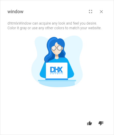
Styling
There is a possibility to make changes in the look and feel of a window.
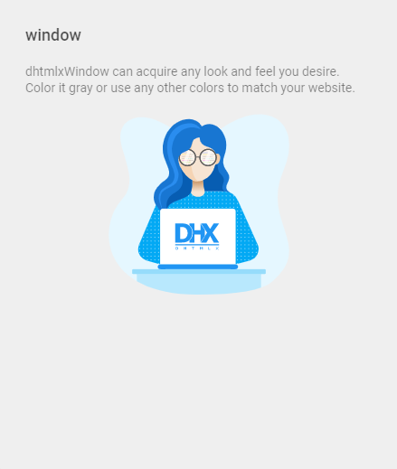
Related sample: Window. Styling (custom CSS)
For this you need to take the following steps:
- add a new CSS class(es) with desired settings in the <style> section of your HTML page or in your file with styles (don't forget to include your file on the page in this case)
<style>
    .my-first-class {
        /*some styles*/
    }

    .my-second-class {
        /*some styles*/
    }
</style>
- specify the name of the created CSS class (or names of classes separated by spaces) as the value of the css property in the Window configuration:
const dhxWindow = new dhx.Window({
    title: "Window",
    css:"my-first-class my-second-class"
});
dhxWindow.show();
For example:
<style>
    .custom {
        --dhx-background-primary: #efefef;
    }
</style>

<script>
    const dhxWindow = new dhx.Window({
        height: 400,
        width: 400,
        title: "window",
        css: "custom",
        html,
    });

    dhxWindow.show();
</script>