Configuration
Close buttons for tabs
Related sample: Tabbar. Close button
You can equip each Tabbar tab with a close button to make it easily closable via interface. To enable close buttons in all tabs at once, make use of the closable configuration property:
const tabbar = new dhx.Tabbar("tabbar_container", {
    closable:true
});
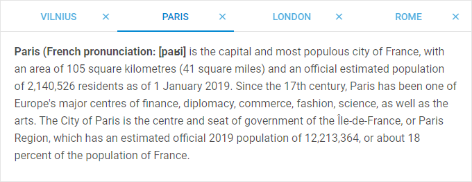
You can also add close buttons for separate tabs by setting an array with ids of the tabs as a value for the closable property:
const tabbar = new dhx.Tabbar("tabbar_container", {
    closable: ["paris", "london"]
});
Disabled tabs
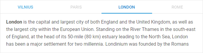
By default, all tabs in Tabbar are enabled. It is possible to make one or several tabs disabled using the disabled configuration property:
// make one tab disabled
const tabbar = new dhx.Tabbar("tabbar_container", {
    disabled: "London"
});

// make several tabs disabled
const tabbar = new dhx.Tabbar("tabbar_container", {
    disabled: ["Paris", "Rome"]
});
Related sample: Tabbar. Rich configuration (close, disable, overflow, active tab)
Position of tabbar
Related sample: Tabbar. Mode: top, left, right, bottom
When initialized with default settings, Tabbar is located at the top of a page. You can locate DHTMLX Tabbar at any desired side of your application by using any other value of the mode property. Besides "top", it can also take "bottom","left" or "right" values. e.g.:
const tabbar = new dhx.Tabbar("tabbar_container", {
    mode: "left"
});
Size of tabs
DHTMLX Tabbar allows you to control the height and width of tabs with the help of appropriate configuration options - tabWidth and tabHeight. By default, they are set to 200px and 45px, correspondingly. This is how you can change the default settings:
const tabbar = new dhx.Tabbar("tabbar_container", {
    tabWidth: 190,
    tabHeight: 50
});
Related sample: Tabbar. Tab size
Structure of tabs
The structure of Tabbar should be defined during initialization of the component. It is set within the views property. Each tab is an object with attributes, which are:
- id - the id of a tab
- tab - the name of a tab
- tabCss - the name of the CSS class used for a tab
- css - the name of the CSS class used for a cell
- header - the header of a cell
- html - HTML content for a tab
- padding - the distance between the content of a cell and the border of tabbar
- tabWidth - the width of a tab (for more information, see views)
- tabHeight - the height of a tab (for more information, see views)
const tabbar = new dhx.Tabbar("tabbar_container", {
    views:[
        { tab: "left", css:"panel flex", header:"Left"},
        { tab: "west", css:"panel flex", header:"West"},
        { tab: "east", css:"panel flex", header:"East"},
        { tab: "right", css:"panel flex", header:"Right" }
    ]
});
Related sample: Tabbar. Tab size
Autosize for tabs
When the width or height of tabs are not specified, you can configure the tabs so that their width/height would automatically adjust to the size of the container of Tabbar. For this purpose, make use of the tabAutoWidth/tabAutoHeight properties of Tabbar.
const tabbar = new dhx.Tabbar("tabbar_container", {
    views:[
        { tab: "left", css:"panel flex", header:"Left"},
        { tab: "west", css:"panel flex", header:"West"},
        { tab: "east", css:"panel flex", header:"East"},
        { tab: "right", css:"panel flex", header:"Right" }
    ],
    tabAutoWidth: true,
    mode: "top"
});
Related sample: Tabbar. Tab auto width
Related sample: Tabbar. Tab auto height
The tabAutoWidth configuration option is used when mode is set to "top" or "bottom", whereas tabAutoHeight is applied when mode is set to "right" or "left".
Tabs without content

It is possible to render a tabbar without any content. Use the noContent option for this purpose:
const tabbar = new dhx.Tabbar("tabbar_container", {
    noContent:true
});
Related sample: Tabbar. Without content
Alignment
Starting from v7.0, there is the ability to set alignment for tabs via the tabAlign configuration option of Tabbar:
const tabbar = new dhx.Tabbar("tabbar_container", {
    views:[
        { tab: "left", css:"panel flex", header:"Left"},
        { tab: "west", css:"panel flex", header:"West"},
        { tab: "east", css:"panel flex", header:"East"},
        { tab: "right", css:"panel flex", header:"Right" }
    ],
    tabAlign: "center"
});
Related sample: Tabbar. Tab align
The available values of the option are "left" | "start", "center" | "middle", "right" | "end".