Block
The Block control groups related controls.
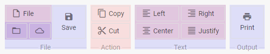
Create a block
The following example configures a block with two buttons in a row:
{
    type: "block",
    title: "Action",
    items: [
        { id: "copy", icon: "mdi mdi-content-copy", value: "Copy" },
        { id: "cut", icon: "mdi mdi-content-cut", value: "Cut" }
    ]
}
Properties
Check the list of properties that you can set in the configuration object of a Block control.
Add a block
Use the add() method of TreeCollection to add a block to a ribbon:
ribbon.data.add({
    title:"File",
    type:"block",
    id:"files",
    direction:"row"
});
Use the same method to add controls to the block:
ribbon.data.add({
    type:"button",
    icon:"dxi dxi-plus",
    value:"New"
},-1,"files");

ribbon.data.add({
    type:"iconButton",
    icon:"dxi dxi-file"
},-1,"files");
In these calls, the add() method takes three parameters:
item | the configuration of the added item |
index | defines the position of the item in the block (-1 places the item after the last control) |
blockId | the ID of the block |
Add HTML content
Use the html property to add custom HTML content to a block item:
{
    type: "block",
    title: "Progress",
    items: [
        {
            html: "<div id='preloader'><div id='loader'></div></div >",
            size: "auto"
        }
    ]
};
Related sample: Ribbon. Item HTML content
Nest blocks
You can put blocks inside other blocks to arrange controls in several rows and columns, for example:
{
    title:"File",
    type:"block",
    direction:"col",
    items:[
        {
            type:"block", direction:"row",
            items:[
                { type:"button", icon:"dxi dxi-plus", value:"New" },
                { type:"button", icon:"dxi dxi-file", value:"File" }
            ]
        },
        {
            type:"block", direction:"row",
            items:[
                {
                    type:"imageButton", count:10,
                    src:"../img/avatar4.png"
                },
                {
                    type:"imageButton", value:"Torch",
                    src:"../img/avatar3.png"
                }
            ]
        }
    ]
}
Show and hide blocks
The show() and hide() methods show and hide a block by its ID:
ribbon.show(id);
ribbon.hide(id);
Enable and disable blocks
The enable() and disable() methods enable and disable a block by its ID:
ribbon.enable(id);
ribbon.disable(id);