Configuration
In this article you will find the detailed list of properties that you can use inside the constructors of message boxes and tooltip to adjust their configuration.
Message box
Related sample: Message. Show Message
You can configure a message box on its initialization:
dhx.message({
    text:"Message text",
    icon:"dxi-clock",
    css:"expire",
    expire:1000
});
Related sample: Message. Message Configuration
You will find the list of configuration properties the constructor of the message box may take in the related article.
Working with message box
From v8.0, you can close a message box via the close() method of the message box API:
<section class="dhx_sample-controls">
    <button id="show" class="dhx_sample-btn dhx_sample-btn--flat" onclick="show()">show</button>
    <button id="close" class="dhx_sample-btn dhx_sample-btn--flat" onclick="close()">close</button>
</section>

<script>
    let message;
    function show() {
        message = dhx.message({ text: "Here is dhtmlxMessage", icon: "dxi-close" });
    }
    document.querySelector("#close").addEventListener("click", () => {
        message?.close()
    });
</script>
Related sample: Message. Show Message
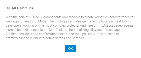
Alert box
Related sample: Message. Show Alert
You can define the configuration of an alert box on its initialization:
dhx.alert({
    header:"Alert Header",
    text:"Alert text",
    buttonsAlignment:"center"
});
Related sample: Message. Alert and confirm configuration
See the list of configuration properties the constructor of the alert box may take here.
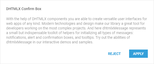
Confirm box
Related sample: Message. Show Confirm
You can configure a confirm box on its initialization:
dhx.confirm({
    header:"Confirm Header",
    text:"Confirm text",
    buttons:["cancel", "apply"],
    buttonsAlignment:"center"
});
Related sample: Message. Alert and confirm configuration
You can find the list of configuration properties the constructor of the confirm box may take in the related article.
Working with confirm
To find out which button was pressed, use the callback function that returns a Promise:
dhx.confirm({
    header: "confirm the action",
    text: "can you apply?",
    buttons: ["cancel", "apply"]
}).then(function(answer){
    if (answer){
        console.log("confirmed")
    }
    else {
        console.log("cancelled")
    }
});
Tooltip

Related sample: Message. Show Tooltip
You can configure a tooltip on its initialization:
dhx.tooltip("Tooltip From Right", {
    node: "fourth",
    position: "right",
    margin: 8
});
Related Samples:
See the list of configuration properties the constructor of the tooltip may take here.
Smart positioning
If the target of the tooltip is placed close to some edge of the browser, the tooltip will be shown from the opposite side of the target.
In the image below the target is adjacent to the right side of screen. Its tooltip that has the position:"right" attribute in the config object appears from the left side of the target.

Tooltip API
You can control the activity of the Tooltip via the pair of methods.
- to switch the tooltip off, use the disableTooltip() method:
dhx.disableTooltip();
- to switch the tooltip on again, apply the enableTooltip() method:
dhx.enableTooltip();