List of Menu controls
In this article you'll find the controls you can use in DHTMLX Menu. Their descriptions contain lists of attributes and examples of adding the controls into Menu on the fly.
To operate Menu controls, you can use Menu API and Tree Collection API. Check the related article.
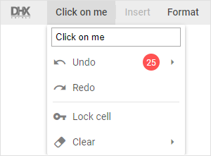
MenuItem
MenuItem is a drop-down list of options.

Adding menuItem
You can add a MenuItem control into the menu with the help of the add() method of Tree Collection:
menu.data.add({
    type:"menuItem", value:"Menu", items:[
        { type:"menuItem", value:"Option 1" },
        { type:"menuItem", value:"Option 2" },
        { type:"separator"},
        { type:"menuItem", value:"Option Infinite" }
    ]
});
Related sample: Menu. Menu Item
Properties
See the full list of properties that you can provide in the configuration object of a MenuItem control.
Custom HTML
This is an item that contains any custom HTML content (for example, an image, icon or other element).
Adding Custom HTML
Any custom HTML content can be easily added to a menu with the help of the add() method of Tree Collection:
menu.data.add({
    id: "input",
    parent: "edit",
    type: "customHTML",
    html: "<img src='../logo.svg' alt=''/>",
    css: "custom-image"
});
Related sample: Menu. Custom HTML
Properties
See the full list of properties that you can provide in the configuration object of a Custom HTML control.
Separator
This is a horizontal (between menu options) or vertical (between menu items) line separating items/groups of items from each other.

Adding Separator
A new Separator can be created with the help of the add() method of Tree Collection:
menu.data.add({
    type:"separator"
});
Related sample: Menu. Separator
Properties
See the full list of properties that you can provide in the configuration object of a Separator control.
Spacer
This item takes space on the toolbar and is used for aligning controls.

Adding Spacer
A new Spacer can be created with the help of the add() method of Tree Collection:
menu.data.add({
    type:"spacer"
});
Related sample: Menu. Spacer
Properties
See the full list of properties that you can provide in the configuration object of a Spacer control.