Customization
Styling
There is a possibility to make changes in the look and feel of a colorpicker.
Related sample: Colorpicker. Styling (custom CSS)
For this you need to take the following steps:
- add a new CSS class(es) with desired settings in the <style> section of your HTML page or in your file with styles (don't forget to include your file on the page in this case)
<style>
    .my-first-class {
        /*some styles*/
    }

    .my-second-class {
        /*some styles*/
    }
</style>
- specify the name of the created CSS class (or names of classes separated by spaces) as the value of the css property in the Colorpicker configuration:
const colorpicker = new dhx.Colorpicker("colorpicker_container", {
    css:"my-first-class my-second-class"
});
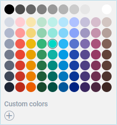
For instance:
<style>
    .custom-class {
        background: #f2f2f2;
        border: solid 1px lightblue;
    }

    .custom-class .dhx_palette__cell {
        border-radius: 50%;
    }

    .custom-class .dhx_palette__cell:after {
        border-radius: 50%;
    }

    .custom-class .dhx_colorpicker-custom-colors__picker {
        border-radius: 50%;
    }
</style>

<script>
    const colorpicker = new dhx.Colorpicker("colorpicker_container", {
        css: "custom-class dhx_widget--bordered",
    });
</script>