Configuration
Custom colors in palette
The Colorpicker palette contains the following default colors:
const palette = [
    ["#D4DAE4","#B0B8CD","#949DB1","#727A8C","#5E6677","#3F4757","#1D2534"],
    ["#FFCDD2","#FE9998","#F35C4E","#E94633","#D73C2D","#CA3626","#BB2B1A"],
    ["#F9E6AD","#F4D679","#EDB90F","#EAA100","#EA8F00","#EA7E00","#EA5D00"],
    ["#BCE4CE","#90D2AF","#33B579","#36955F","#247346","#1D5B38","#17492D"],
    ["#BDF0E9","#92E7DC","#02D7C5","#11B3A5","#018B80","#026B60","#024F43"],
    ["#B3E5FC","#81D4FA","#29B6F6","#039BE5","#0288D1","#0277BD","#01579B"],
    ["#AEC1FF","#88A3F9","#5874CD","#2349AE","#163FA2","#083596","#002381"],
    ["#C5C0DA","#9F97C1","#7E6BAD","#584A8F","#4F4083","#473776","#3A265F"],
    ["#D6BDCC","#C492AC","#A9537C","#963A64","#81355A","#6E3051","#4C2640"],
    ["#D2C5C1","#B4A09A","#826358","#624339","#5D4037","#4E342E","#3E2723"]
];

Related sample: Colorpicker. Initialization
You can redefine the palette structure with the palette configuration option and set an array of custom colors that the component shows on initialization. For example:
const colorpicker = new dhx.Colorpicker("colorpicker_container", {
    // removes the section with gray shades shown at the top of palette by default
    grayShades: false,
    palette: [
        ["#ffffc0", "#ffff9c", "#ecd078", "#a59154", "#5e5330"],
        ["#ff916b", "#ff7657", "#d95b43", "#973f2e", "#56241a"],
        ["#ff4169", "#f93555", "#c02942", "#861c2e", "#4c101a"],
        ["#863958", "#6d2e47", "#542437", "#3a1926", "#210e16"],
        ["#84bec3", "#6b9a9e", "#53777a", "#3a5355", "#212f30"]
    ]
});

Related sample: Colorpicker. Custom palette and custom colors
Gray shades
The default Colorpicker palette includes a section with gray shades at the top of the palette. You can hide this section and leave only the main colors: default or custom.

Related sample: Colorpicker. Palette without gray shades
Use the grayShades configuration option to hide the section:
const colorpicker = new dhx.Colorpicker("colorpicker_container", {
    grayShades: false
});
List of custom colors

When Colorpicker appears on a page, its list of custom (user-defined) colors is empty. To fill this section on initialization, list the colors in the customColors configuration option. Specify colors as an array of strings in the Hex format:
const colorpicker = new dhx.Colorpicker("colorpicker_container", {
    customColors: ["#1d2de7", "#ab31ff", "#a3fa76"]
});
"palette" or "picker" mode only
DHTMLX Colorpicker supports two main modes: "palette" (default) and "picker". To initialize the component in the "picker" mode, set the pickerOnly property to true in the Colorpicker configuration.
const colorpicker = new dhx.Colorpicker("colorpicker_container", {
    pickerOnly: true
});
In this mode, Colorpicker hides the palette and displays only the picker.
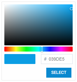
Related sample: Colorpicker. Picker only
You can also create the component in the palette mode only with the paletteOnly configuration option:
const colorpicker = new dhx.Colorpicker("colorpicker_container", {
    paletteOnly: true
});

In the paletteOnly mode, the palette does not include the panel with custom (user-defined) colors.
Related sample: Colorpicker. Disabled custom colors
Width of Colorpicker
The default width of the component is 238 px. If you change the number of colors in the palette, you may need to adjust the Colorpicker width accordingly. Use the width property:
const colorpicker = new dhx.Colorpicker("colorpicker_container", {
    width: "300px"
});
Color transparency
In the "picker" mode, users set color transparency when they pull the handle on the transparency scale. The default Colorpicker configuration includes this feature. To switch it off, set the transparency configuration option to false:
const colorpicker = new dhx.Colorpicker("colorpicker", {
    mode: "picker",
    transparency: false
});
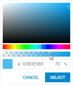
Related sample: Colorpicker. Disable color transparency