Gantt 스타일 다루기
dhtmlxGantt는 모양을 수정하기 위한 다양한 옵션을 제공합니다. 미리 정의된 스킨 중 하나를 사용하여 간트 차트의 일반적인 모양을 변경하는 것과 구성 요소의 개별 요소(작업, 선, 축척, 격자 등)의 스타일을 조정하는 두 가지를 모두 수행할 수 있습니다.
이 가이드에서는 Gantt 구성 요소의 스타일 작업에 대한 일반 지침을 한데 모아 문서를 탐색하는 데 도움이 되도록 정리했습니다.
특정 각 요소에 대한 자세한 정보는 관련 문서에 제공됩니다.
그리드 스타일링
관련 그리드 템플릿을 통해 그리드 영역의 스타일을 변경할 수 있습니다.
그리드 열의 헤더
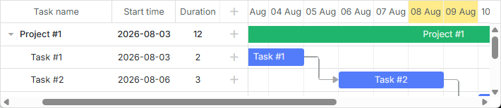
그리드 열의 헤��더에 사용자 정의 스타일을 적용할 수 있는 [grid_header_class] 템플릿이 있습니다. 예를 들어 다음과 같은 방법으로 특정 그리드 열의 헤더 배경 색상을 변경할 수 있습니다:
<style>
    .gantt-grid__header--highlighted {
        background-color: #ffeb8a !important;
    }
</style>

gantt.templates.grid_header_class = (columnName) =>
    (columnName === 'duration' || columnName === 'text')
        ? 'gantt-grid__header--highlighted'
        : '';
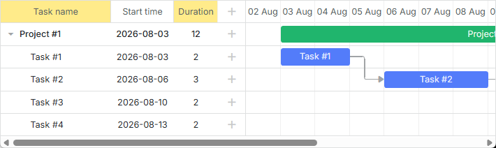
관련 예제: 그리드 열 헤더 스타일링
그리드 헤더의 커스텀 요소
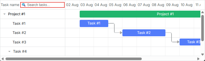
그리드 헤더에 버튼, 아이콘, 입력 창 등과 같은 커스텀 요소를 추가할 수 있습니다. 요소를 추가하려면 해당 HTML을 label 속성의 값으로 설정하면 됩니다. 내부 구성 옵션은 gantt.config.columns에서 확인할 수 있습니다:
gantt.config.columns = [
    {
        name: "text",
        label: `<div className="gantt-grid__header-search-wrapper">Task name
                    <input id="task-search" type="text" placeholder="Search tasks..."/>
                </div>`,
        width: 250, tree: true
    },
    // 다른 열들
];
검색 기능의 구현은 다음과 같습니다:
const taskSearchInput = document.getElementById('task-search');

taskSearchInput.addEventListener('input', () => {
    gantt.refreshData();
});

function hasSubstring(parentId, searchValue) {
    const task = gantt.getTask(parentId);
    if (!task) return false;

    if (task.text.toLowerCase().includes(searchValue)) {
        return true;
    }

    const children = gantt.getChildren(parentId);
    for (let i = 0; i < children.length; i++) {
        if (hasSubstring(children[i], searchValue)) {
            return true;
        }
    }

    return false;
}

gantt.attachEvent('onBeforeTaskDisplay', (id) => {
    const searchValue = taskSearchInput.value.toLowerCase().trim();
    if (!searchValue) return true;
    return hasSubstring(id, searchValue);
});
관련 예제: 그리드 헤더의 커스텀 요소
그리드 헤더의 아이콘 및 이미지
헤더에 이미지나 아이콘을 추가하려면 셀의 내부 HTML로도 넣을 수 있으며, 이는 label 속성에 설정합니다:
const textLabel = `
    <div className="gantt-grid__header-label">
        <img src="http://docs.dhtmlx.com/scheduler/assets/index/icon1.png" alt="icon">
        <span>Text</span>
    </div>
`;

gantt.config.columns = [
    { name: "text", label: textLabel, tree: true, width: "*", resize: true },
    { name: "start_date", align: "center", resize: true },
    { name: "duration", align: "center" },
    { name: "add", width: 44 }
];
관련 예제: 이미지 in Grid Header: Columns Config
또는 CSS의 셀 헤더를 CSS로 설정할 수도 있습니다. 이때는 .gantt_grid_head_
.gantt_grid_head_text {
    background-image: url("http://docs.dhtmlx.com/scheduler/assets/index/icon1.png");
    background-repeat: no-repeat;
}
관련 예제: Images in Grid Header:CSS
그리드 헤더의 다중 행 텍스트
다중 행 텍스트는 How to display several lines in the grid cell/header 섹션의 예제를 참고하십시오.
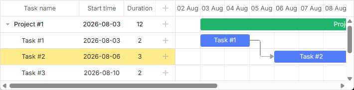
그리드 행의 배경 색
그리드의 모든 행 또는 작업이 포함된 특정 행의 배경 색을 커스텀 색으로 적용하려면 [grid_row_class] 템플릿을 사용합니다. 예를 들어 특정 행의 배경 색을 다음과 같이 바꿀 수 있습니다:
<style>
    .gantt-grid__row--highlight {
        background-color: #ffeb8a !important;
    }
</style>

gantt.templates.grid_row_class = (start, end, task) =>
    task.id === 3 ? "gantt-grid__row--highlight" : "";
관련 예제: Coloring Grid Rows
마우스 올리기 시 그리드 행 색상
마우스 오버 시 그리드 행을 하이라이트하려면 아래 스타일 규칙을 적용합니다:
.gantt_grid_data .gantt_row.odd:hover, .gantt_grid_data .gantt_row:hover,
.gantt_grid_data .gantt_row.gantt_selected,
.gantt_grid_data .gantt_row.odd.gantt_selected,
.gantt_task_row.gantt_selected {
    background-color: cyan;
}
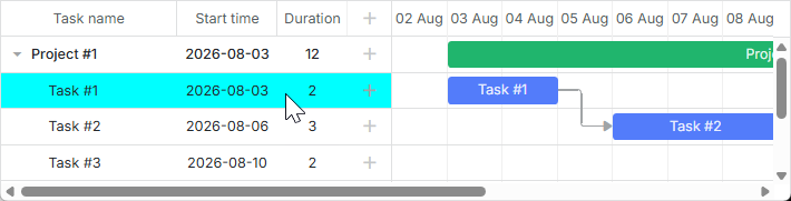
관련 예제: Hover 시 그리드 행 색상 변경
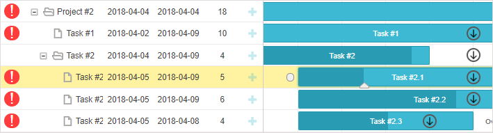
그리드 열 맞춤화
dhtmlxGantt는 gantt.config.columns 설정 옵션의 template 속성을 통해 기본 그리드 열의 모양을 수정할 수 있는 기능을 제공합니다.
template 속성은 데이터 아이템 객체를 매개변수로 받아 최종 데이터 템플릿을 반환하는 함수입니다. 이 함수 정의를 통해 거의 모든 콘텐츠를 표현할 수 있습니다. 예를 들어, 그리드 행의 텍스트 기본 색상을 변경하거나 그리드 열에 커스텀 요소를 사용할 수 있습니다.
그리드 행의 텍스트 색
작업의 우선순위에 따라 텍스트 색상을 정의할 수 있습니다:
gantt.config.columns = [
    { name: "text", label: "Task name", tree: true, width: 230,
        template: gridTaskTextTemplate
    },
    { name: "start_date", label: "Start time", align: "center" },
    { name: "duration", label: "Duration", align: "center" }
];

function gridTaskTextTemplate (task) {
    const text = `${task.text} (${task.users})`;
    if (task.priority === 1) {
        return `<div className="gantt-grid__text--important">${text}</div>`;
    }
    return text;
}
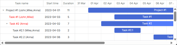
관련 예제: Template for tree nodes
그리드 열에 커스텀 요소 추가
그리드 열에 버튼, 입력 창 등과 같은 커스텀 요소를 추가하려면 열의 template 속성에 해당 요소의 HTML을 설정합니다:
function gridColumnTemplate (task) {
    return `
        <i className="fa fa-pencil" onclick="clickGridButton(${task.id}, 'edit')"></i>
        <i className="fa fa-plus" onclick="clickGridButton(${task.id}, 'add')"></i>
        <i className="fa fa-times" onclick="clickGridButton(${task.id}, 'delete')"></i>
    `;
}

gantt.config.columns = [
    { name: "text", tree: true, width: "*", resize: true },
    { name: "start_date", align: "center", resize: true },
    { name: "duration", align: "center" },
    { name: "buttons", width: 75, label: gridColumnHeaderTemplate,
        template: gridColumnTemplate /*!*/
    }
];
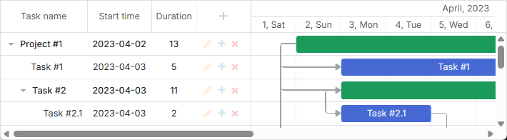
관련 예제: Custom Buttons in a Grid
그리드 셀의 다중 행 텍스트
다중 행 텍스트에 대한 예제는 How to display several lines in the grid cell/header 섹션의 예제를 참조하십시오.
축척 스타일링
축척 스타일링은 관련 타임라인 영역 템플릿으로 정의됩니다.
축척 행
축척 행의 스타일은 [scale_row_class] 템플릿으로 정의할 수 있습니다. 예를 들어 배경 색상을 정의하려면:
<style>
    .gantt-scale__row--highlight {
        background-color: #ffeb8a !important;
    }
</style>
gantt.templates.scale_row_class = (scale) => "gantt-scale__row--highlight";
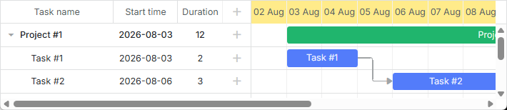
관련 예제: Styling Row of the Scale
축척 셀
축척의 특정 셀을 스타일링할 수 있도록 [scale_cell_class] 템플릿도 있습니다. 예를 들어 타임라인 영역의 ��특정 날짜를 색상으로 표시할 수 있습니다:
gantt.templates.scale_cell_class = date =>
    date.getDay() === 0 || date.getDay() === 6 ? "gantt-scale__cell--highlight" : "";
관련 예제: Styling Separate Cells on the Scale
축척 설정에 대한 자세한 내용은 관련 기사 Setting up Scale 및 Highlighting Time Slots를 참조하십시오.
서브 스케일
축척에 새로운 스타일을 지정하려면 scales 속성의 css 속성을 사용할 수 있습니다. 예를 들어 주말에 특정 색상을 설정하려면 다음과 같이 합니다:
<style type="text/css">
    .weekend{
        background: #F0DFE5 !important;
    }
</style>
const isWeekendStyle = (date) => {
    const day = gantt.date.day_start(date).getDay();
    return (day === 0 || day === 6) ? "gantt-scale__cell--weekend" : "";
};

gantt.config.scales = [
    // 기타 축척
    { unit: "day", format: "%D", css: isWeekendStyle }
];
관련 예제: Multiple scales
Styling Tasks
작업의 스타일은 타임라인 영역의 해당 템플릿을 통해 변경할 수 있습니다.
작업 막대
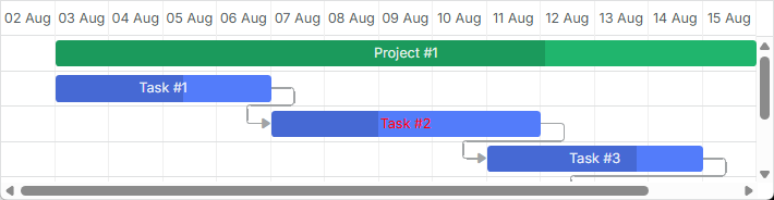
작업의 스타일을 업데이트하려면 [task_class] 템플릿을 재정의하세요.
자세한 내용은 Tasks Coloring 문서를 참고합니다.
gantt.templates.task_class = (start, end, task) => "";
관련 예제: Task styles
템플릿은 스타일을 동적으로 적용할 수 있게 해줍니다. 예를 들어 작업의 진행 상태에 따라 색상을 변경할 수 있습니다:
gantt.templates.task_class = (start, end, task) =>
    task.progress > 0.5 ? "" : "task--low-progress";
관련 예제: Styling task bars with events
작업 막대의 텍스트
task_text 템플릿은 작업 막대 텍스트의 스타일을 변경하기 위한 인라인 스타일 사용을 허용합니다:
gantt.templates.task_text = (start, end, task) =>
    task.id === 12 ? `<span style={{color: 'red'}}>${task.text}</span>` : task.text;
관련 예제: Inline Styling of the Task Text
다중 행 텍스트
How to display several lines in the grid cell/header 섹션의 예제를 참고하십시오.
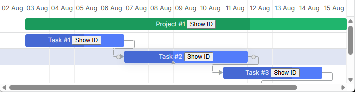
작업 막대의 커스텀 요소
작업 막대에도 task_text 템플릿을 통해 커스텀 요소를 삽입할 수 있습니다. 예를 들어 다음과 같은 방법으로 작업 막대에 버튼을 추가할 수 있습니다:
gantt.templates.task_text = (start, end, task) => `${task.text} <button>Text</button>`;
관련 예제: Custom Elements in Task Bars
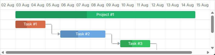
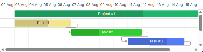
작업 객체 속성으로 스타일 설정
작업의 색상을 정의하기 위해 작업 객체 구성에 추가 속성을 설정할 수 있습니다. 이 속성은: color, textColor 및 progressColor 입니다.
const data = {
    tasks: [
        { id: 1, text: "Task #1", start_date: "01-04-2026", duration: 2, color:"red" },
        { id: 2, text: "Task #2", start_date: "02-04-2026", duration: 3, color:"blue" }
    ]
};

gantt.init("gantt_here");
gantt.parse(data);

const task = gantt.getTask(2);
task.color = "red";
세부 내용은 Tasks Coloring 문서를 참조하십시오.
라이트박스를 통한 작업 막대 스타일링
사전에 정의된 색상 집합을 정의하고 라이트박스 구성에서 옵션으로 지정하여 작업의 텍스트 색상이나 배경 색상을 설정할 수 있습니다:
const colors = [
    { key: "", label: "Default" },
    { key: "#4B0082", label: "Indigo" },
    { key: "#FFFFF0", label: "Ivory" },
    { key: "#F0E68C", label: "Khaki" }
    // 더 많은 색상
];

gantt.config.lightbox.sections = [
    { name: "description", height: 38, map_to: "text", type: "textarea", focus: true },
    { name: "priority", height: 22, map_to: "color", type: "select", options: colors },
    { name: "textColor", height: 22, map_to: "textColor", type: "select",
        options: colors
    },
    { name: "time", type: "duration", map_to: "auto" }
];
관련 예제: Specify inline colors for Tasks and Links
타임라인 영역의 행
타임라인 영역의 행 색상을 바꾸려면 [task_row_class] 템플릿을 사용합니다. (Gantt 작업 뒤에 위치하는 타임라인 영역의 행)
<style>
    .gantt-timeline__row--highlight {
        background-color: #ffeb8a !important;
    }
</style>

gantt.templates.task_row_class = (start, end, task) =>
    task.id === 3 ? "gantt-timeline__row--highlight" : "";

관련 예제: Styling Rows of the Timeline Area
관련 예제: Custom tree formatting
타임라인 셀 하이라이트
요일에 따라 필요한 타임라인 셀을 강조하려면 [timeline_cell_class] 템플릿을 사용합니다. 템플릿 함수는 셀들을 순회하며 지정된 셀에 원하는 CSS 클래스를 적용합니다. 예를 들어 주말을 강조하는 방법은 다음과 같습니다:
<style>
    .gantt-timeline__cell--weekend {
        background-color: #f4f7f4;
    }
</style>

gantt.templates.timeline_cell_class = (task, date) =>
    (date.getDay() === 0 || date.getDay() === 6) ? "gantt-timeline__cell--weekend" :"";

관련 예제: Highlighting weekends
이 주제에 대한 자세한 내용은 Highlighting Time Slots 문서를 참조하십시오.
외부 요소 표시(기준선, 마감일 등)
이 기능은 PRO 에디션에서만 제공됩니다.
Gantt에 기준선이나 마감선 마커와 같은 추가 요소를 표시할 수 있습니다. 이를 위해서는 addTaskLayer 메서드를 통해 새로 표시 가능한 레이어를 생성하고 그곳에 커스텀 요소를 배치합니다. 매개변수로는 작업 객체를 받아 표시될 DOM 요소를 반환하거나, false를 반환하는 함수가 전달됩니다(작업에 대한 요소를 숨겨야 하는 경우).
gantt.addTaskLayer(function createTaskLayerElement(task) {
    const layerElement = document.createElement('div');
    // 여기에 코드 작성
    return layerElement;
});
외부 요소의 예시는 다음과 같습니다:
- baselines

관련 예제: Display baselines
- deadlines
관련 예제: Displaying deadlines
외부 요소 표시 방법에 대한 자세한 내용은 Custom Elements in Timeline Area 문서를 참조하십시오.
작업 도구 설명(tooltips)
작업의 세부 정보를 간단하게 표시하기 위해 도구 팁을 제공할 수 있습니다.
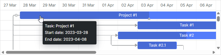
도구 팁은 기본적으로 태스크에 대해 자동으로 표시되며 tooltip 플러그인을 활성화하면 사용 가능합니다.
도구팁의 사용자 정의 텍스트
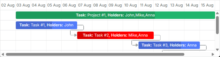
도구팁의 사용자 정의 텍스트를 설정하려면 tooltip_text 템플릿을 사용하세요:
gantt.templates.tooltip_text = (start, end, task) =>
    `<b>Task:</b> ${task.text}<br/><b>Duration:</b> ${task.duration}`;
간트의 도구팁에 대한 자세한 내용은 Tooltips for Gantt Elements 문서를 참조하십시오.
Links 스타일링
의존성 링크의 스타일은 관련 Dependency Links 템플릿을 통해 변경할 수 있습니다.
의존성 링크의 선
링크 선의 색상을 변경하려면 [link_class] 템플릿을 사용합니다.
gantt.templates.link_class = (link) => "";
관련 예제: Link styles
더 자세한 내용은 관련 문서 Links Coloring and Styling을 참조하십시오.
링크 객체의 속성으로 색상 지정
링크 객체의 color 속성을 지정하여 의존성 링크의 색상을 커스텀으로 설정할 수도 있습니다:
const data = {
    tasks: [
        // 작업 구성
    ],
    links: [
        { id: 1, source: 1, target: 2, type: "1", color: "red" },
        { id: 2, source: 2, target: 3, type: "0", color: "blue" }
    ]
};

gantt.init("gantt_here");
gantt.parse(data);

gantt.getLink(2).color = "blue";
자세한 내용은 Links Coloring and Styling 문서를 참조하십시오.
마우스 오버 시 링크 색상
호버 시 링크 색상을 CSS로 수정할 수 있습니다:
.gantt_task_link:hover .gantt_line_wrapper div {
    box-shadow: 0 0 5px 0 yellowgreen;
    background: yellowgreen
}

.gantt_task_link:hover .gantt_link_arrow_left,
.gantt_task_link:hover .gantt_link_arrow_right {
    border-left-color: yellowgreen !important;
    border-right-color: yellowgreen !important;
}
더 자세한 내용은 Links Coloring and Styling을 참조하십시오.
의존성 링크의 팝업
[drag_link_class] 템플릿은 사용자가 작업 간 의존성 선을 드래그하기 시작할 때 나타나는 팝업의 스타일을 지정할 수 있습니다. 예를 들어 팝업의 배경색을 색칠하고 팝업 텍스트의 색상을 변경할 수 있습니다:
<style>
    .gantt_link_tooltip {
        color: red;
        background-color: yellow;
    }
</style>

gantt.templates.drag_link_class = (from, from_start, to, to_start) =>
    `gantt_link_tooltip`;
관련 예제: Styling the Popup of Dependency Link
주제에 대한 더 자세한 내용은 Templates of Dependency Links 문서를 참고하십시오.
UI에서 링크 값 편집
작업 막대에 대한 편집 및 스타일링을 위한 라이트박스가 있지만, 링크를 편집하기 위한 기본 UI는 제공되지 않습니다. 그래도 아래의 방법으로 직접 UI를 만들 수 있습니다. 자세한 내용은 dedicated article을 참조하십시오.
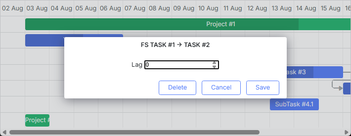
관련 예제: Custom UI for Editing Link Values
Styling Quick Info Popup
Quick Info 팝업의 스타일링은 'Quick Info' Extension (Touch Support) 템플릿으로 정의됩니다.
필요한 스타일을 팝업 편집 양식에 적용하려면 [quick_info_class] 템플릿을 사용합니다. 예를 들어 특정 작업의 Quick Info 팝업을 다음과 같이 스타일링할 수 있습니다:
<style>
    .quick-info-highlight {
        background-color: #ffeb8a !important;
    }
    .quick-info-highlight .gantt_cal_qi_title {
        background-color: #ffeb8a !important;
    }
</style>

gantt.templates.quick_info_class = (start, end, task) =>
    task.id === "2" ? "quick-info-highlight" : "";
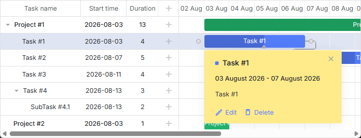
관련 예제: Styling Quick Info Popup