使用甘特图样式
dhtmlxGantt 提供了一大组选项来修改其外观。您既可以通过使用预定义皮肤来 改变甘特图的总体外观,也可以调整组件各个元素(任务、链接、刻度、网格等)的样式。
在本指南中,我们将关于甘特图各部分样式的通用说明汇总在一起,便于您在文档中浏览。每个具体元素的详细信息在相关的文章中提供。
网格样式
您可以通过相关的 网格模板 更改网格区域的样式。
网格列的表头
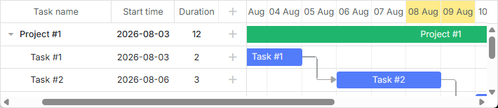
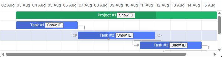
有一个 grid_header_class 模板,允许您为网格列的表头应用自定义样式。例如,您可以通过以下方式更改某些网格列表头的背景色:
<style>
    .gantt-grid__header--highlighted {
        background-color: #ffeb8a !important;
    }
</style>

gantt.templates.grid_header_class = (columnName) =>
    (columnName === 'duration' || columnName === 'text')
        ? 'gantt-grid__header--highlighted'
        : '';
相关示例: Styling Headers of Grid Columns
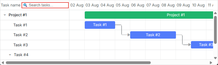
自定义网格头部元素
可以在网格头部添加自定义元素(如按钮、图标、输入框等)。要添加元素,需要将其 HTML 设置为在 gantt.config.columns 配置选项中的 label 属性的值:
gantt.config.columns = [
    {
        name: "text",
        label: `<div className="gantt-grid__header-search-wrapper">Task name
                    <input id="task-search" type="text" placeholder="Search tasks..."/>
                </div>`,
        width: 250, tree: true
    },
    // other columns
];
搜索功能的实现如下所示:
const taskSearchInput = document.getElementById('task-search');

taskSearchInput.addEventListener('input', () => {
    gantt.refreshData();
});

function hasSubstring(parentId, searchValue) {
    const task = gantt.getTask(parentId);
    if (!task) return false;

    if (task.text.toLowerCase().includes(searchValue)) {
        return true;
    }

    const children = gantt.getChildren(parentId);
    for (let i = 0; i < children.length; i++) {
        if (hasSubstring(children[i], searchValue)) {
            return true;
        }
    }

    return false;
}

gantt.attachEvent('onBeforeTaskDisplay', (id) => {
    const searchValue = taskSearchInput.value.toLowerCase().trim();
    if (!searchValue) return true;
    return hasSubstring(id, searchValue);
});
相关示例: Custom Elements in Grid Header
网格头部的图标和图片
要在表头中添加图片或图标,也可以将其放入单元格内部 HTML,使用 label 属性:
const textLabel = `
    <div className="gantt-grid__header-label">
        <img src="http://docs.dhtmlx.com/scheduler/assets/index/icon1.png" alt="icon">
        <span>Text</span>
    </div>
`;

gantt.config.columns = [
    { name: "text", label: textLabel, tree: true, width: "*", resize: true },
    { name: "start_date", align: "center", resize: true },
    { name: "duration", align: "center" },
    { name: "add", width: 44 }
];
相关示例: Images in Grid Header: Columns Config
或者,您也可以在 CSS 中使用 header 单元格选择器 .gantt_grid_head_
.gantt_grid_head_text {
    background-image: url("http://docs.dhtmlx.com/scheduler/assets/index/icon1.png");
    background-repeat: no-repeat;
}
相关示例: Images in Grid Header:CSS
网格头部的多行文本
请参照 How to display several lines in the grid cell/header 小节中的示例。
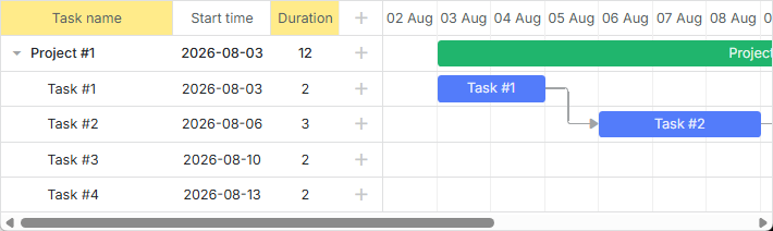
网格行的背景色
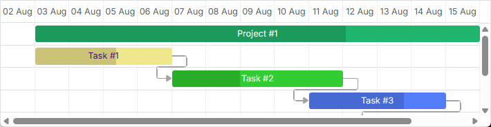
您可以通过 grid_row_class 模板为所有或带任务的单独网格行应用自定义颜色。例如,您可以按如下方式更改某一特定行的背景色:
<style>
    .gantt-grid__row--highlight {
        background-color: #ffeb8a !important;
    }
</style>

gantt.templates.grid_row_class = (start, end, task) =>
    task.id === 3 ? "gantt-grid__row--highlight" : "";
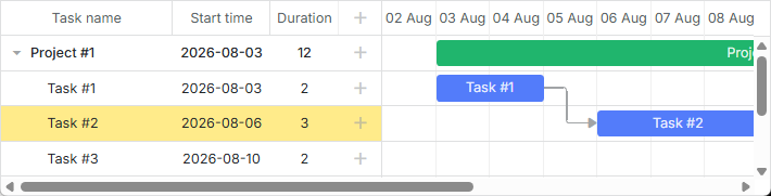
相关示例: Coloring Grid Rows
鼠标悬停时网格行的颜色
您可以通过应用以下样式规则在悬停时突出显示网格行:
.gantt_grid_data .gantt_row.odd:hover, .gantt_grid_data .gantt_row:hover,
.gantt_grid_data .gantt_row.gantt_selected,
.gantt_grid_data .gantt_row.odd.gantt_selected,
.gantt_task_row.gantt_selected {
    background-color: cyan;
}
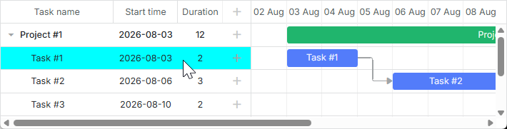
相关示例: Coloring Grid Rows on Hover
自定义网格列
dhtmlxGantt 提供了通过 gantt.config.columns 配置选项的 template 属性来修改网格列的默认外观的能力。该属性是一个函数,接收数据项对象作为参数并返回最终的数据模板。该函数定义几乎可以呈现任何内容,例如可以改变网格行中文本的默认颜色,或在网格列中使用自定义元素。
网格行中文本的颜色
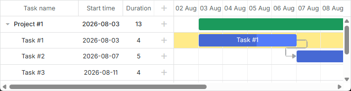
您可以为任务的文本定义一个特殊的颜色,具体如下:
gantt.config.columns = [
    { name: "text", label: "Task name", tree: true, width: 230,
        template: gridTaskTextTemplate
    },
    { name: "start_date", label: "Start time", align: "center" },
    { name: "duration", label: "Duration", align: "center" }
];

function gridTaskTextTemplate (task) {
    const text = `${task.text} (${task.users})`;
    if (task.priority === 1) {
        return `<div className="gantt-grid__text--important">${text}</div>`;
    }
    return text;
}
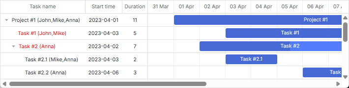
相关示例: Template for tree nodes
网格列中的自定义元素
要在网格列中添加自定义元素,例如按钮、输入框等,请将元素的 HTML 作为列的 template 属性的值:
function gridColumnTemplate (task) {
    return `
        <i className="fa fa-pencil" onclick="clickGridButton(${task.id}, 'edit')"></i>
        <i className="fa fa-plus" onclick="clickGridButton(${task.id}, 'add')"></i>
        <i className="fa fa-times" onclick="clickGridButton(${task.id}, 'delete')"></i>
    `;
}

gantt.config.columns = [
    { name: "text", tree: true, width: "*", resize: true },
    { name: "start_date", align: "center", resize: true },
    { name: "duration", align: "center" },
    { name: "buttons", width: 75, label: gridColumnHeaderTemplate,
        template: gridColumnTemplate /*!*/
    }
];
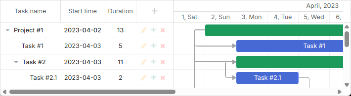
相关示例: Custom Buttons in a Grid
网格单元格的多行文本
请参考 How to display several lines in the grid cell/header 小节中的示例。
时间刻度的样式
时间刻度的样式由相关的时间轴区域模板定义(参见 guides/timeline-templates.md)。
时间刻度行
可以借助 [scale_row_class] 模板来美化时间刻度的行。例如,设置背景颜色:
<style>
    .gantt-scale__row--highlight {
        background-color: #ffeb8a !important;
    }
</style>
gantt.templates.scale_row_class = (scale) => "gantt-scale__row--highlight";
相关示例: Styling Row of the Scale
时间刻度单元格
也可以通过 scale_cell_class 模板来为时间轴区域的某些单元格设置样式。例如,可以给时间线的特定日期着色:
gantt.templates.scale_cell_class = date =>
    date.getDay() === 0 || date.getDay() === 6 ? "gantt-scale__cell--highlight" : "";
相关示例: Styling Separate Cells on the Scale
更多信息,请参阅相关文章:Setting up Scale 与 Highlighting Time Slots。
Subscale
您可以通过 [scales] 属性的 css 属性为新的刻度指定样式。例如,可以如下为周末设置特定颜色:
<style type="text/css">
    .weekend{
        background: #F0DFE5 !important;
    }
</style>
const isWeekendStyle = (date) => {
    const day = gantt.date.day_start(date).getDay();
    return (day === 0 || day === 6) ? "gantt-scale__cell--weekend" : "";
};

gantt.config.scales = [
    // other scales
    { unit: "day", format: "%D", css: isWeekendStyle }
];
相关示例: Multiple scales
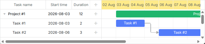
任务样式
您可以通过相应的 时间线区域的模板 来修改任�务的外观。
任务条
您可以重新定义 task_class 模板来刷新任务的样式。详细信息请参阅文章 任务着色。
gantt.templates.task_class = (start, end, task) => "";
相关示例: Task styles
模板允许动态应用样式。例如,您可以根据任务进度更改颜色:
gantt.templates.task_class = (start, end, task) =>
    task.progress > 0.5 ? "" : "task--low-progress";
相关示例: Styling task bars with events
任务条文本
task_text 模板允许使用内联样式来改变任务条文本的样式:
gantt.templates.task_text = (start, end, task) =>
    task.id === 12 ? `<span style={{color: 'red'}}>${task.text}</span>` : task.text;

相关示例: Inline Styling of the Task Text
多行文本
请参考 How to display several lines in the grid cell/header 小节中的示例。
任务条中的自定义元素
您也可以通过 task_text 模板在任务条中插入自定义元素。例如,您可以按如下方式向任务条中添加按钮:
gantt.templates.task_text = (start, end, task) => `${task.text} <button>Text</button>`;
相关示例: Custom Elements in Task Bars
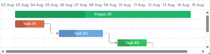
通过任务对象属性设置样式
您可以在任务对象配置中设置额外的属性以定义任务的自定义颜色。它们是:color、textColor 和 progressColor。
const data = {
    tasks: [
        { id: 1, text: "Task #1", start_date: "01-04-2026", duration: 2, color:"red" },
        { id: 2, text: "Task #2", start_date: "02-04-2026", duration: 3, color:"blue" }
    ]
};

gantt.init("gantt_here");
gantt.parse(data);

const task = gantt.getTask(2);
task.color = "red";
请参阅 Tasks Coloring 文章的相关部分以了解详细信息。
通过灯箱设置任务条样式
您可以定义一组预定义颜色,并在灯箱配置中将它们作为选项,以设置任务的文本或背景颜色:
const colors = [
    { key: "", label: "Default" },
    { key: "#4B0082", label: "Indigo" },
    { key: "#FFFFF0", label: "Ivory" },
    { key: "#F0E68C", label: "Khaki" }
    // more colors
];

gantt.config.lightbox.sections = [
    { name: "description", height: 38, map_to: "text", type: "textarea", focus: true },
    { name: "priority", height: 22, map_to: "color", type: "select", options: colors },
    { name: "textColor", height: 22, map_to: "textColor", type: "select",
        options: colors
    },
    { name: "time", type: "duration", map_to: "auto" }
];
相关示例: Specify inline colors for Tasks and Links
时间线区域的行
[task_row_class] 模板允许您改变时间线区域(位于甘特任务背后的那一行)的颜色。
<style>
    .gantt-timeline__row--highlight {
        background-color: #ffeb8a !important;
    }
</style>

gantt.templates.task_row_class = (start, end, task) =>
    task.id === 3 ? "gantt-timeline__row--highlight" : "";
相关示例: Styling Rows of the Timeline Area
相关示例: Custom tree formatting
高亮时间线单元格
您可以通过 [timeline_cell_class] 模板根据日期高亮必要的时间线单元格。模板函数将遍历单元格并为指定的单元应用所需的 CSS 类。例如,可以像下面这样高亮周末:
<style>
    .gantt-timeline__cell--weekend {
        background-color: #f4f7f4;
    }
</style>

gantt.templates.timeline_cell_class = (task, date) =>
    (date.getDay() === 0 || date.getDay() === 6) ? "gantt-timeline__cell--weekend" :"";
相关示例: Highlighting weekends
更多信息,请参阅文章 Highlighting Time Slots。
显示外部元素(基线、截止日期等)
此功能仅在 PRO 版中可用。
您可以在甘特图中显示额外的元素,例如基线或截止日期标记。为此,您需要通过 addTaskLayer 方法创建一个新的可显示图层,并将自定义元素放在其中。作为参数,该方法接收一个函数,该函数接收一个任务对象并返回将显示的 DOM 元素,或返回 false(该任务的元素应隐藏):
gantt.addTaskLayer(function createTaskLayerElement(task) {
    const layerElement = document.createElement('div');
    // your code here
    return layerElement;
});
外部元素的示例包括:
- 基线

相关示例: Display baselines
- 截止日期
相关示例: Displaying deadlines
更多关于在甘特图中显示外部元素的信息,请参阅文章 Custom Elements in Timeline Area。
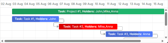
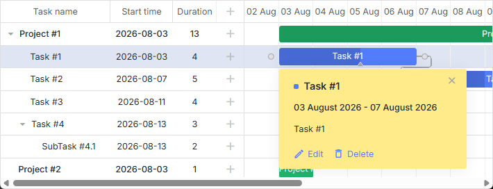
任务的工具提示
您可以为任务提供工具提示,以紧凑地显示它们的详细信息。
在启用 tooltip 插件后,默认工具提示会自动显示在任务上。
自定义工具提示文本
若要为工具提示设置自定义文本,请使用 tooltip_text 模板:
gantt.templates.tooltip_text = (start, end, task) =>
    `<b>Task:</b> ${task.text}<br/><b>Duration:</b> ${task.duration}`;
有关甘特图工具提示的更多信息,请参阅文章 Tooltips for Gantt Elements。
风格化依赖链接
您可以通过相关的 依赖链接模板 来更改依赖链接的样式。
依赖链接的线条
您可以通过 link_class 模板更改依赖线的颜色。
gantt.templates.link_class = (link) => "";
相关示例: Link styles
相关文档还有更多信息,请参阅文章 Links Coloring and Styling。
通过链接对象属性着色链接
您也可以通过在链接对象中指定 color 属性来为依赖链接设置自定义颜色:
const data = {
    tasks: [
        // tasks configuration
    ],
    links: [
        { id: 1, source: 1, target: 2, type: "1", color: "red" },
        { id: 2, source: 2, target: 3, type: "0", color: "blue" }
    ]
};

gantt.init("gantt_here");
gantt.parse(data);

gantt.getLink(2).color = "blue";
请参阅 Links Coloring and Styling 文章的相关部分以了解详情。
悬停时链接的颜色
可以通过 CSS 修改悬停时链接的颜色:
.gantt_task_link:hover .gantt_line_wrapper div {
    box-shadow: 0 0 5px 0 yellowgreen;
    background: yellowgreen
}

.gantt_task_link:hover .gantt_link_arrow_left,
.gantt_task_link:hover .gantt_link_arrow_right {
    border-left-color: yellowgreen !important;
    border-right-color: yellowgreen !important;
}
更多信息,请参阅相关文档 Links Coloring and Styling。
依赖链接的弹出框
drag_link_class 模板允许为用户拖动任务之间的依赖线时弹出的弹出框设样式。例如,您可以为弹出框的背景着色并更改弹出文本的颜色:
<style>
    .gantt_link_tooltip {
        color: red;
        background-color: yellow;
    }
</style>

gantt.templates.drag_link_class = (from, from_start, to, to_start) =>
    `gantt_link_tooltip`;
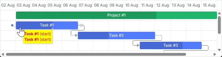
相关示例: Styling the Popup of Dependency Link
请参阅 Templates of Dependency Links 文章以获取该主题的更多细节。
从 UI 编辑链接值
虽然有用于编辑和样式化任务条的灯箱,但没有内置的编辑链接的 UI。尽管如此,您仍然可以通过实现 专门文章 中描述的技术来自己创建这样的 UI。
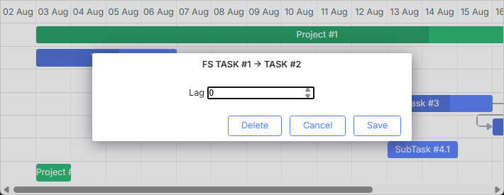
相关示例: Custom UI for Editing Link Values
快速信息弹出框的样式
快速信息弹出框的样式通过 “快速信息”扩展(触控支持)模板 定义。
您可以通过 quick_info_class 模板为弹出编辑表单应用所需的样式。例如,您可以按如下方式为特定任务的快速信息弹出框设定样式:
<style>
    .quick-info-highlight {
        background-color: #ffeb8a !important;
    }
    .quick-info-highlight .gantt_cal_qi_title {
        background-color: #ffeb8a !important;
    }
</style>

gantt.templates.quick_info_class = (start, end, task) =>
    task.id === "2" ? "quick-info-highlight" : "";
相关示例: Styling Quick Info Popup