CSS 文档
本文介绍了如何使用自定义颜色覆盖甘特图元素的默认颜色设置。本文覆盖了用于对如下甘特图部分进行样式化的主要类选择器和模板:网格区域,时间线区域,资源面板。
Styling Grid
本节将为 grid area 的主要元素提供用于样式化的 CSS 选择器。
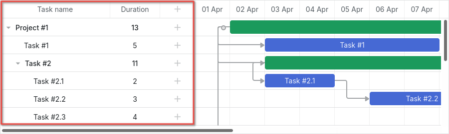
下方给出网格的 DOM 元素的总体结构示意:
- .gantt_grid
    - .gantt_grid_scale
        - .gantt_grid_head_cell
    - .gantt_grid_data
        - .gantt_row.odd
        - .gantt_row
        - .gantt_row.gantt_row_task
        - .gantt_row.gantt_row_project
        - .gantt_row.gantt_row_milestone
            - gantt_cell.gantt_cell_tree
                - .gantt_tree_indent
                - .gantt_tree_icon.gantt_close
                - .gantt_tree_icon.gantt_open
                - .gantt_tree_content
            - gantt_cell
                - .gantt_tree_content
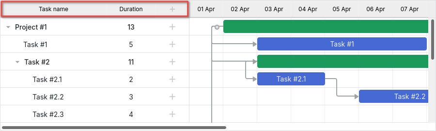
Grid header
你可以通过 .gantt_grid_scale 类选择器来修改网格头部元素的样式。
下面是对网格和时间线头部常见背景色和字体颜色进行统一应用的示例:
.gantt_grid_scale, .gantt_task_scale, .gantt_task_vscroll {
    background-color: #eee;
}
.gantt_grid_scale, .gantt_task_scale,
.gantt_task .gantt_task_scale .gantt_scale_cell,
.gantt_grid_scale .gantt_grid_head_cell {
    color: #000;
    font-size: 12px;
    border-bottom: 1px solid #cecece;
}
相关示例: Styling grid and timeline headers
Scale height
请勿通过 CSS 修改网格头部和时间刻度的高度。
刻度的高度必须通过 Gantt 的 scale_height 配置属性来设置:
gantt.config.scale_height = 50;
A cell of the grid header
你可以通过 .gantt_grid_head_cell 为网格头部的单元格应用自定义样式。
用于样式化单元格的选择器如下:
.gantt_grid_head_cell[data-column-id="columnName"]- 选择特定列的单元格;
columnName 与 列 的 name 属性的取值相对应:
<style>
    .gantt_grid_head_cell[data-column-id="columnName"] {
        background-color: #ededed;
        color: black;
    }
</style>
gantt.config.columns = [
    ...
    { name: "columnName", align: "center" },
    ...
];

相关示例: Styling a particular cell in the grid header
-
.gantt_grid_head_cell[data-column-index="1"]- 通过索引选择特定列; -
.gantt_grid_head_cell[data-column-name="start_date"]- 通过名称选择特定列。
Grid body
你可以通过对 .gantt_grid_data 选择器应用 CSS 样式,为网格主体元素添加自定义颜色。

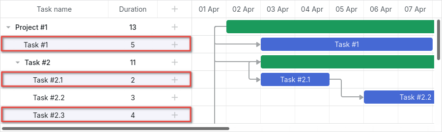
Styling Grid rows
网格行的样式通过 .gantt_row 来修改。

Every other row
要给网格的每隔一行着色,需要为 .gantt_row.odd 选择器指定 CSS 样式,例如:
.gantt_row.odd {
    background-color: #f4f4fb;
}
相关示例: Styling every other row in grid
你会看到偶数行在屏幕上高亮显示,而不是奇数行。 但如果你查看 行索引,你会发现样式应用在索引为奇数的行上(1、3、5 等)。
Selected row
你可以使用 .gantt_row.gantt_selected 选择器为网格中的选中行设定样式:
.gantt_grid_data .gantt_row.gantt_selected,
.gantt_grid_data .gantt_row.odd.gantt_selected,
.gantt_task_row.gantt_selected {
    background-color: #fff3a1;
}
相关示例: Styling selected row
Task rows, project rows, and milestones
要为任务行、项目行或里程碑行设置样式,请使用以下选择器:
.gantt_row.gantt_row_task.gantt_row.gantt_row_project.gantt_row.gantt_row_milestone
例如:
.gantt_row.gantt_row_project {
    background-color: #fafafa;
    font-weight: bold;
}
相关示例: Styling rows of project tasks
Particular rows
如果你想为特定行添加自定义类,可以按以下方式应用 grid_row_class 模板:
<style>
    .highlighted_task.gantt_row {
        background-color: #ff9668;
        border-color: rgba(0,0,0,0.3);
    }
</style>
gantt.templates.grid_row_class = (startDate, endDate, task) => {
    if (task.highlight) {
        return "highlighted_task";
    }
    return "";
};
相关示例: Styling a particular row in the grid
Row height
可以通过使用 row_height 配置来更改行高:
gantt.config.row_height = 40;
或通过任务的 row_height 属性:
{ id: 2, text: "Task #1", start_date: "02-04-2028", duration: 8, row_height: 40 },
请勿尝试通过 CSS 修改行高,否则会破坏布局。
Styling cells/columns of Grid
对网格的单元格或列进行样式化可以通过 .gantt_row .gantt_cell 来实现。
你可以用两种方式对特定列应用 CSS 样式:
- 通过
.gantt_row .gantt_cell[data-column-name="columnName"]选择器,以列的名称来定义列,例如:
.gantt_grid_head_cell[data-column-id="start_date"],
.gantt_row .gantt_cell[data-column-name="start_date"] {
    background-color: #ededed;
    color: black;
}
相关示例: Styling a column in grid
请注意,.gantt_grid_head_cell 与 .gantt_cell 使用的是不同的数据属性:分别是 data-column-id 与 data-column-name。Gantt 的这些 CSS 规则的不一致性将在未来的某个版本中得到修复。
- 或者你可以通过应用
.gantt_row .gantt_cell[data-column-index="1"]选择器来按索引定义列,从而达到相同的结果。
Styling Timeline
“Styling Timeline” 部分将引导你了解可应用于更改 timeline area 的默认样式的 CSS 选�择器。

时间线区域的 DOM 元素的总体结构如下所示:
- .gantt_task
    - .gantt_task_scale
        - .gantt_scale_line
            - .gantt_scale_cell
    - .gantt_data_area
        - .gantt_task_bg
            - .gantt_task_row
            - .gantt_task_row.odd
                - .gantt_task_cell
        - .gantt_links_area
            - .gantt_task_link
        - .gantt_bars_area
            - .gantt_task_line
                - .gantt_task_progress_wrapper
                    - .gantt_task_progress
                - .gantt_task_progress_drag
                - .gantt_task_content
                - .gantt_task_drag.task_start_date
                - .gantt_task_drag.task_end_date
                - .gantt_link_control.task_start_date
                - .gantt_link_control.task_end_date
                    - .gantt_link_point
        - div - custom layers
Time scale
时间刻度的 DOM 元素具有以下结构:
- .gantt_task_scale
    - .gantt_scale_line
        - .gantt_scale_cell
Time scale container
.gantt_task_scale 选择器用来对时间刻度的容器应用自定义 CSS。
例如,改变时间刻度的字体颜色和边框如下所示:
.gantt_grid_scale, .gantt_task_scale {
    border-bottom: 1px solid #0e0e0e;
}

.gantt_task .gantt_task_scale .gantt_scale_cell {
    color: #000;
}

.gantt_grid_scale .gantt_grid_head_cell {
    color: #000;
}
相关示例: Styling text and borders of the time scale
Time scales
.gantt_scale_line 选择器用于给整条时间刻度上色。若要按顺序定位到某一个时间刻度,请使用 .gantt_scale_line:nth-child(n) 选择器。
以下示例设置时间刻度的背景颜色:
.gantt_scale_line:nth-child(1) {
    font-weight: bold;
    background-color: #eee;
}

.gantt_scale_line:nth-child(2) {
    background-color: #fff;
}
相关示例: Background color of the time scale
默认情况下,没有用于按单位定位时间刻度的 CSS 类,但你可以使用 scale_row_class 模板来添加这样的类。
下面给出为 month(月)、week(周)、**day(日)**刻度设置不同样式的示例:
<style>
    .gantt_scale_line.month_scale {
        font-weight: bold;
        background-color: #ddd;
    }

    .gantt_scale_line.week_scale {
        background-color: #e1e1e1;
    }

    .gantt_scale_line.day_scale {
        background-color: #efefef;
    }
</style>
gantt.templates.scale_row_class = (scaleConfig) => `${scaleConfig.unit}_scale`;
相关示例: Styling different time scales
Cells of the time scale
你可以通过 .gantt_scale_cell 选择器为时间刻度的单元格添加自定义样式。
例如,你可以更改单元格的字体颜色和边框:
.gantt_task .gantt_task_scale .gantt_scale_cell {
    color: #a6a6a6;
    border-right: 1px solid #ebebeb;
}
相关示例: Styling text and borders of the scale cells
为了为时间刻度的特定日期着色,请使用 gantt.config.scales 对象的 css 属性,如下所示:
gantt.config.scales = [
    { unit: "month", step: 1, format: "%Y %M" },
    { unit: "day", step: 1, format: "%l, %F %d", css: (date) => {
        if (!gantt.isWorkTime({ date: date, unit: "day" })) {
            return "weekend";
        }
        return "";
    } }
];
<style>
    .gantt_scale_cell.weekend {
        background-color: #F5F5F5;
    }
</style>
相关示例: Duration includes only working days
如果你需要将整列着色,请使用 timeline_cell_class 模板,详见下文。
Data area
数据区域的 DOM 元素结构如下:
- .gantt_data_area
    - .gantt_task_bg
        - .gantt_task_row
        - .gantt_task_row.odd
            - .gantt_task_cell
    - .gantt_links_area
        - .gantt_task_link
    - .gantt_bars_area
        - .gantt_task_line
            - .gantt_task_progress_wrapper
                - .gantt_task_progress
            - .gantt_task_progress_drag
            - .gantt_task_content
            - .gantt_task_drag.task_start_date
            - .gantt_task_drag.task_end_date
            - .gantt_link_control.task_start_date
            - .gantt_link_control.task_end_date
                - .gantt_link_point
    - div - custom layers
Task
Task bar
要改变任务条的外观,请在 .gantt_task_line 选择器中声明自定义样式。
以下示例演示如何更改条形的边框样式:
.gantt_task_line {
    border-radius: 14px;
}
相关示例: Styling borders of the task bars
要改变任务条的颜色,需要完成以下两个步骤:
- 覆盖边框和进度条的样式,使其颜色与应用于任务条的任意自定义颜色相匹配:
.gantt_task_line {
    border-color: rgba(0, 0, 0, 0.25); /* Black color with 25% alpha/opacity */
}

.gantt_task_line .gantt_task_progress {
    background-color: rgba(0, 0, 0, 0.25);
}
- 将所需颜色应用于任务条及其内部内容:
.gantt_task_line {
    background-color: #03A9F4;
}

.gantt_task_line.gantt_task_content {
    color: #fff;
}
你可以在 Task Coloring 文章中找到将边框和进度条的常用颜色应用于不同颜色的任务条的示例。
要为 任务、项目 或 里程碑 的行着色,需要向相关类选择器添加自定义 CSS:
.gantt_task_line.gantt_bar_task.gantt_task_line.gantt_bar_project.gantt_task_line.gantt_bar_milestone
以下为选中条的样式示例:
.gantt_task_line.gantt_selected {
    box-shadow: 0 2px 5px #000;
}

.gantt_task_line.gantt_bar_project.gantt_selected {
    box-shadow: 0 2px 5px #000;
}
相关示例: Styling selected bar
属于 自定义类型 的任务将拥有相应的类名:
{ id: 2, text: "Task #1", start_date: "02-04-2028", duration: 8, type: "custom_type" },
任务条将获得 .gantt_task_line.gantt_bar_custom_type CSS 类。
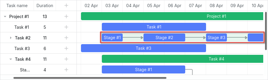
Split tasks
Split tasks 定义为父项的子任务背景中的淡绿色条形,表示该父项的条形。
相关示例: Expand and collapse split tasks
如果打开示例并扩展“Task #2”,你将看到“Task #2”摘要项的绿色条。
当拆分任务在同一行显示时,这个绿色条仍然在同一位置渲染,但其不透明度和 z-index 值会被修改。
你可以用与对时间线中所有条进行样式化相同的方式来样式化它,并使用以下 CSS 完��全隐藏它:
.gantt_task_line.gantt_split_parent {
    display: none;
}
当只有一个拆分任务时,摘要项(type: "project")将不可见,因为它被拆分任务完全覆盖。如果没有拆分子任务,摘要项将具有默认日期和持续时间。
Progress bar
以下选择器可用于为进度条着色:
.gantt_task_progress- 更改进度条填充颜色;.gantt_task_progress_drag- 为进度条的拖拽把手设定样式。
你可以通过应用如下 CSS 规则来改变任务条和进度条的外观:
- 更改背景、��前景和进度颜色的示例:
/* task */

/* 背景颜色(任务条)*/
.gantt_task_line {
    background-color: #3db9d3;
    border: 1px solid #2898b0;
}

/* 文本颜色 */
.gantt_task_line .gantt_task_content {
    color: #fff;
}

/* 进度条填充颜色 */
.gantt_task_progress {
    background: #299cb4;
}
- 对项目(摘要)条进行样式化的示例:
/* project */
/* 背景颜色(项目条)*/
.gantt_task_line.gantt_bar_project {
    background-color: #65c16f;
    border: 1px solid #3c9445;
}

/* 项目条的进度条颜色 */
.gantt_task_line.gantt_bar_project .gantt_task_progress {
    background-color: #46ad51;
}
- 对里程碑条进行样式化的示例:
/* milestone */
.gantt_task_line.gantt_milestone {
    background-color: #d33daf;
    border: 0 solid #61164f;
}
相关示例: Background, foreground, and progress colors. Styling Project and Milestone bars.
Custom color for particular task bars
如果你想为特定的任务条设置颜色,需要使用 gantt.templates.task_class 模板为它们分配一个自定义类:
gantt.templates.task_class = (startDate, endDate, task) => {
    if (task.highlight) {
        return "highlighted_task";
    }
    return "";
};
并在选择器中使用这个自定义类:
.highlighted_task.gantt_task_line {
    background-color: #ff9668;
    border-color: rgba(0,0,0,0.3);
}

.highlighted_task .gantt_task_progress {
    text-align: center;
    z-index: 0;
    background: rgba(0,0,0,0.3);
}
相关示例: Styling particular task bars
Highlighting area inside the task bar
如果你想高亮任务条内部的某些区域,需要使用 gantt.templates.task_text 模板向条内注入附加元素:
gantt.templates.task_text = (startDate, endDate, task) => `
    <div className="custom_progress warm_up" style={{width: '20%'}}></div>
    <div className="custom_progress in_progress" style={{width: '60%'}}>${task.text}</div>
    <div className="custom_progress cool_down" style={{width: '20%'}}></div>
`;
并应用 CSS:
.custom_progress {
    display: inline-block;
    vertical-align: top;
    text-align: center;
    height: 100%;
}

.custom_progress.nearly_done {
    background-color: #4CC259;
}

.custom_progress.in_progress {
    background-color: #88BFF5;
}

.custom_progress.idle {
    background-color: #d96c49;
}
相关示例: Custom html content (Stackbar)
Link
下面给出链接的 DOM 元素结构示意:
- .gantt_task_link
    - .gantt_line_wrapper
    - .gantt_link_line_right
    - .gantt_link_line_left
    - .gantt_link_line_up
    - .gantt_link_line_down
- .gantt_link_arrow.gantt_link_arrow_right
- .gantt_link_arrow.gantt_link_arrow_left
下面是为依赖链接的各个元素着色的示例:
.gantt_line_wrapper div {
    background-color: #ffa011;
}
.gantt_link_arrow_right {
    border-left-color: #ffa011;
}
.gantt_link_arrow_left {
    border-right-color: #ffa011;
}
.gantt_task_link:hover .gantt_line_wrapper div {
    box-shadow: 0 0 5px 0 #ffa011;
}
相关示例: Styling links
链接线的粗细通过 gantt.config.link_line_width 配置来设置。
Resizer
以下选择器可用于对调整大小控件的 DOM 元素进行样式设置:
.gantt_task_drag.gantt_task_drag.task_start_date.gantt_task_drag.task_end_date
禁用开始日期调整大小控件的示例:
.gantt_task_line:hover .gantt_task_drag.task_start_date {
    display: none;
}
相关示例: Disabling resizer of the start date
禁用结束日期调整大小控件的示例:
.gantt_task_line:hover .gantt_task_drag.task_end_date {
    display: none;
}
相关示例: Disabling resizer of the end date
Link control
以下选择器可用于对任务起始(结束)处圆形句柄元素应用样式:
.gantt_link_control .gantt_link_point.gantt_link_control.task_start_date .gantt_link_point.gantt_link_control.task_end_date .gantt_link_point
Background grid
背景网格的 DOM 元素结构如下所示:
- .gantt_data_area
    - .gantt_task_bg
        - .gantt_task_row
        - .gantt_task_row.odd
            - .gantt_task_cell
Background rows
要改变背景行的默认样式,请向 .gantt_task_row 选择器添加自定义样式。例如:
.gantt_row,
.gantt_task_row {
    border-bottom: 1px solid #ebebeb;
    background-color: #fff;
}
要为每隔一行的背景行着色,请在 .gantt_task_row.odd 选择器中定义自定义 CSS 属性。
你可以很容易地为选中行指定自定义颜色,例如:
.gantt_grid_data .gantt_row.gantt_selected,
.gantt_grid_data .gantt_row.odd.gantt_selected,
.gantt_task_row.gantt_selected {
    background-color: #fff3a1;
}
.gantt_task_row.gantt_selected .gantt_task_cell {
    border-right-color: #ffec6e;
}
相关示例: Styling selected row
Background cells
要改变背景单元格的默认样式,��请在 .gantt_task_cell 选择器中指定自定义样式。
为彩色背景列,请使用 timeline_cell_class 模板:
gantt.templates.timeline_cell_class = (task, date) => {
    if (!gantt.isWorkTime({ date: date, unit: "day", task: task })) {
        return "weekend";
    }
    return "";
};
并应用 CSS:
.gantt_task_cell.weekend {
    background-color: #F5F5F5;
}

.gantt_task_row.gantt_selected .gantt_task_cell.weekend {
    background-color: #F8EC9C;
}
相关示例: Duration includes only working days
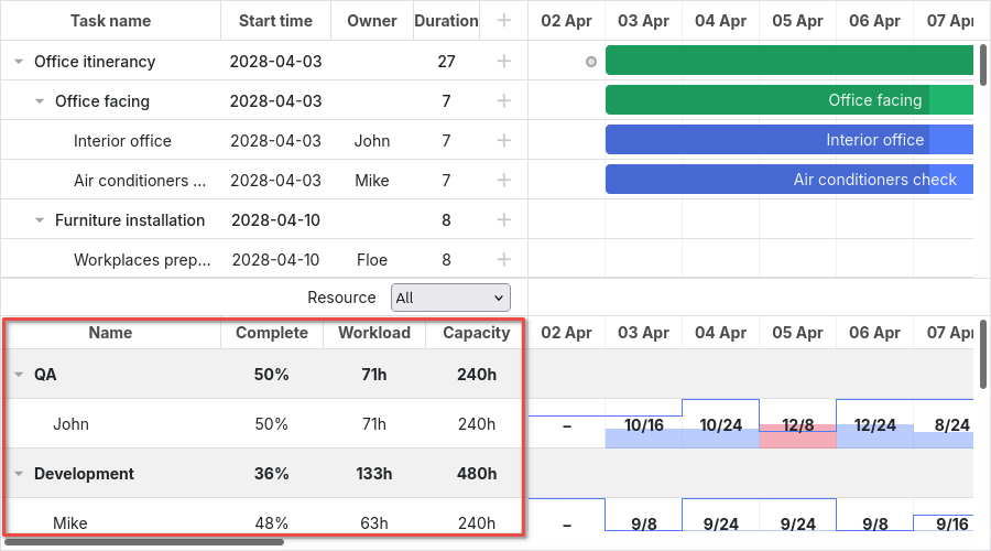
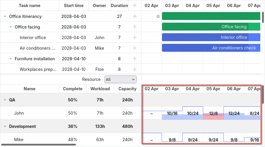
Resource panel
资源面板 由与主甘特图区域类似的网格和时间线组成。
默认情况下,资源视图的网格和时间线将使用全局模板和配置。你可以通过将它们传入 layout config 来为资源面板使用不同的配置和模板。
你可以在 CSS 选择器中使用相应的视图名称来定位资源网格和时间线:
.resourceGrid_cell .gantt_row,
.resourceHistogram_cell .gantt_task_row {
    border-bottom: 1px solid #ebebeb;
    background-color: #fff;
}
资源面板的 DOM 元素结构如下:
- .gantt_layout_root
    - .grid_cell
    - .timeline_cell
    - .resourceGrid_cell
    - .resourceHistogram_cell
    - .resourceTimeline_cell
在 .gantt_layout_root 下的类名来自布局配置,并与布局单元的 view 属性值相匹配:
gantt.config.layout = {
    css: "gantt_container",
    rows: [
        {
            cols: [
                { view: "grid", group: "grids", scrollY: "scrollVer" },
                ...
            ]
        },
        ...
        {
            id: "resources",
            cols: [
                { view: "resourceGrid", group: "grids", scrollY: "resourceVScroll" },
                ...
                { view: "resourceHistogram", capacity: 24, scrollX: "scrollHor",
                    scrollY: "resourceVScroll" },
                ...
            ]
        },
        ...
    ]
};
Resource grid
你可以使用与任务网格相同的选择器,顶级选择器为 .resourceGrid_cell:
.resourceGrid_cell .gantt_row,
.resourceGrid_cell .gantt_row.odd {
    background-color: rgba(232, 232, 232, 0.6);
}
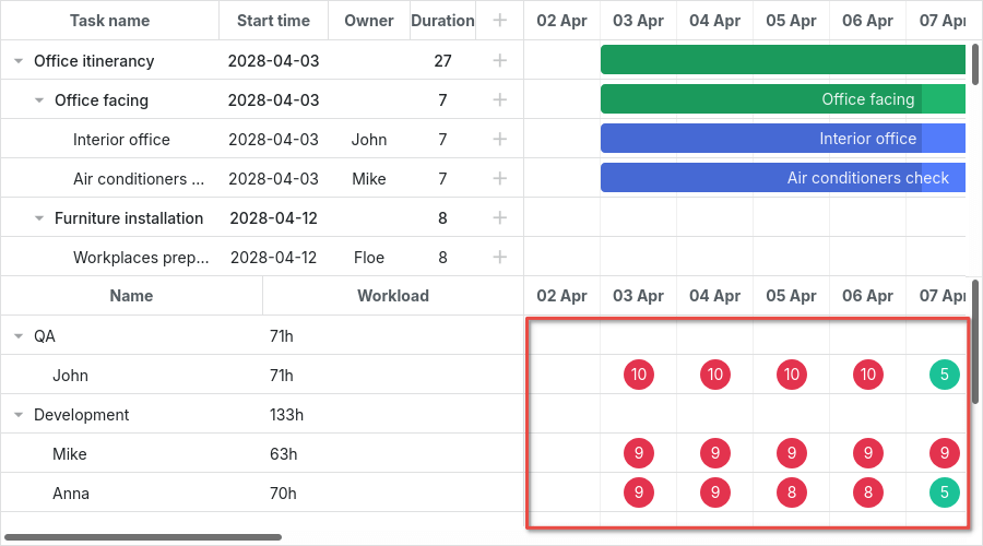
Resource histogram
资源直方图与主时间线具有相同的元素。默认情况下,所有定位主时间线的选择器也会定位资源时间线,除非你在选择器中使用布局单元类(.timeline_cell、.resourceHistogram_cell)。
你可以通过以下选择器定位资源直方图:.resourceHistogram_cell。
资源直方图的 DOM 元素结构如下:
- .gantt_task_bg
- .gantt_bars_area
    - div
        - .gantt_histogram_fill
        - .gantt_histogram_cell
    - div
        - .gantt_histogram_hor_bar
        - .gantt_histogram_vert_bar
以下是改变直方图元素颜色的示例:
.gantt_histogram_cell {
    color: #000;
}

.gantt_histogram_label {
    font-weight: 700;
    font-size: 13px;
}

.gantt_histogram_fill {
    background-color: rgba(41,157,180,.2);
}
若要改变特定单元格的颜色,请使用 gantt.templates.histogram_cell_class 模板:
gantt.templates.histogram_cell_class = (startDate, endDate, resource, resourceTasks) => {
    if (getAllocatedValue(resourceTasks, resource) > getCapacity(startDate, resource)) {
        return "column_overload";
    }
};
并应用 CSS:
.column_overload .gantt_histogram_fill {
    background-color: #ffa9a9;
}
要为直方图线着色,可以对以下类选择器应用自定义 CSS:
.gantt_histogram_hor_bar.gantt_histogram_vert_bar
更改直方图线的颜色如下所示:
.gantt_histogram_hor_bar, .gantt_histogram_vert_bar {
    background: #299db4;
}
Resource diagram
资源图与主时间线具有相同的元素。默认情况下,所有定位主时间线的选择器也会定位资源时间线,除非在选择器中使用布局单元类(.timeline_cell、.resourceTimeline_cell)。
你可以使用以下选择器定位资源图:.resourceTimeline_cell。
资源图的 DOM 元素结构如下:
- .gantt_task_bg
- .gantt_bars_area
    - div
        - .gantt_resource_marker
            - div
顶级选择器是 .resourceTimeline_cell。
资源图标签的样式示例:
.gantt_resource_marker div {
    background: #51c185;
    width: 28px;
    height: 28px;
    line-height: 29px;
    display: inline-block;
    color: #FFF;
    margin: 3px;
}
若要改变特定标记的样式,请使用 gantt.templates.resource_cell_class 模板:
<style>
    .resource_marker.workday_over div {
        border-radius: 3px;
        background: #ff8686;
    }
gantt.templates.resource_cell_class = (startDate, endDate, resource, resourceTasks) => {
    const cssClasses = [];
    cssClasses.push("resource_marker");
    if (resourceTasks.length <= 1) {
        cssClasses.push("workday_ok");
    } else {
        cssClasses.push("workday_over");
    }
    return cssClasses.join(" ");
};
相关示例: Styling resource markers