Manipulations with Lightbox
Getting/setting the control value
To get/set the value of the section's control, use the formSection object as in:
//to get the value
var value = scheduler.formSection('description').getValue();

//to set the value
scheduler.formSection('description').setValue('abc');
Setting/getting values of lightbox's controls
Opening the lightbox on a single click
It is possible to open the existing lightbox on a single click. For this purpose, make use of the onClick event and showLightbox method:
scheduler.attachEvent("onClick", function (id, e){
    scheduler.showLightbox(id);
    return true;
});
Related sample Opening the lightbox on one click
The lightbox will be opened when the user clicks the left mouse button on the event box.
Checking whether the lightbox is opened
To check whether the lightbox is currently opened or closed, use the lightbox_id property of the state object returned by the getState method. If the lightbox is opened, the method will return the id of the opened event, otherwise 'null' or 'undefined' will be returned:
if (scheduler.getState().lightbox_id){
    //the code for the opened lightbox
} else {
    //the code for the closed lightbox
}
Mapping properties of an event object to the lightbox sections
To map a property of an event object to a lightbox section, do the following:
- Make sure your data source returns events in a supported format
{
   "data":[
      {
          "id":"1",
          "start_date":"2019-03-02 00:00:00",
          "end_date":"2019-03-04 00:00:00",
          "text":"Graduation ceremony",
          "type":"1",
          "location":"London"
      },
      ...
   ]
}
Note, that all properties your data source returns will be added to event objects and will available for the client-side API.
- In order to map a lightbox control to a specific property, assign the name of the event property to the map_to property of a section:
scheduler.config.lightbox.sections="["
    {name:"description", height:70, map_to:"text", type:"textarea" , focus:true},
    {name:"locationInput", height:35, map_to:"location", type:"textarea" },
    {name:"typeSelect", map_to:"type", type:"select", options:scheduler.serverList("types")},
    {name:"time", type:"time", map_to:"auto"}
];
Only exceptions are the time and the recurring controls that are always mapped to a fixed properties (event.start_date/event.end_date and event.rec_type/event.event_length/event.event_pid respectively).
Automatic end date in the Time control
To set the initial duration of events and make the end date automatically change to preserve this value, use the event_duration and auto_end_date properties:
//specify the event duration in minutes for the auto_end_time parameter
scheduler.config.event_duration = 60;
scheduler.config.auto_end_date = true;
With such configuration, each time the user changes the start event time or date in the lightbox, the end event time and date will be changed automatically, in order to make the event duration equal to 60 minutes (the value of the event_duration option).
Setting the default value for a lightbox's control
To set the default value for a lightbox's section, use the default_value property of the section's object.
For example, you have added a custom section that displays the event's location to the lightbox and called it 'Location'. When the user creates a new event, the field will be just empty. To correct such a behavior and to display, say, the address of the Greenwich Observatory by default, specify the lightbox as in:
scheduler.config.lightbox.sections = [
    { name:"description", height:50, map_to:"text", type:"textarea", focus:true },
    { name:"location", height:43, map_to:"event_location", type:"textarea",
    default_value:"Blackheath Avenue London,Greenwich,Greater London SE10 8XJ,UK"},
    { name:"time", height:72, type:"time", map_to:"auto"}
];
Note, the default_value property sets the default value for the lightbox's section, not for a new event, i.e. a new event gets the specified value only after the user opens the lightbox and saves the event.
To set the default value directly for new events, use the onEventCreated event:
scheduler.attachEvent("onEventCreated", function(id,e){
    scheduler.getEvent(id).location = 'Blackheath Avenue London, Greenwich...';
    scheduler.updateEvent(id); // renders the updated event
    return true;
});
Changing the order of date-time controls and removing time selectors
You have the possibility to change the order of date-time controls in the 'Time period' section or to remove some of them. To do this, use the time_format property:
scheduler.config.lightbox.sections="["
  {name:"description", height:130, map_to:"text", type:"textarea" , focus:true},
  {name:"time", ..., time_format:["%H:%i","%m","%d","%Y"]}
];
Note, you can't change the data presentation format, just the order of items in the array.
For example, you can change the format as in:
//default
time_format:["%H:%i", "%m", "%d", "%Y"]
//month goes first
time_format:["%m","%d", "%Y", "%H:%i"]
//the year selector is removed
time_format:["%H:%i", "%m", "%d"]
//incorrect
time_format:["%H:%i", "%M", "%d", "%Y"] //"%m" was changed to "%M"
Read-only mode
The detailed information about the read-only mode see in chapter Read-only Mode.
Making a section hidden for some events
To make a section hidden for specific events, redefine its set_value method as in:
scheduler.form_blocks.textarea.set_value="function(node,value,ev){"
    node.firstChild.value="value||""";
    var style = ev.some_property?"":"none";
    node.style.display="style;" // editor area
    node.previousSibling.style.display="style;" //section header
    scheduler.setLightboxSize(); //correct size of lightbox
}
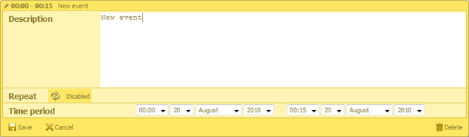
'Full-day event' option
To add the 'full-day event' option to the lightbox, set the full_day option to true. For this, just add the next code line:
scheduler.config.full_day = true;
Once, the full_day option is enabled, the Full Day checkbox will be displayed in the left part of the Time period section. After selection, all entry fields of the section will be blocked, and the event duration will be set as a full day from 0.00am the current cell date to 0.00am next day.
Types of lightbox
The lightbox can be presented in one of 2 types:
- Standard (wide);
- Short.
In the default skin, the lightbox can be presented only in the standard (wide) type, while in the 'glossy' or 'classic' skin you can choose between types.
To set the desired type, use the wide_form property:
scheduler.config.wide_form = true;
Standard (wide) lightbox:
Short form:
Button in the section header
It's possible to have a custom button in the section header. To add a button to the header of a section, complete the following steps:
- Specify the 'button' property to the section object:
{name:"description", height:130, map_to:"text", type:"textarea", button:"help"}
- Set the label for the button:
// 'help' is the value of the 'button' property
scheduler.locale.labels.button_help = "Help label";
- Specify the handler of button clicks:
scheduler.form_blocks.textarea.button_click="function(index,button,shead,sbody){"
    // any custom code
}
where:
- index - (number) the section's index. Zero-based numbering
- button - (HTMLElement) the HTML element of the button
- shead - (HTMLElement) the HTML element of the section header
- sbody - (HTMLElement) the HTML element of the section body
You can define the image used for the button through the following CSS class:
.dhx_custom_button_help{
    background-image:url(imgs/but_help.gif);
}
Linking select controls
You can make select controls in the lightbox dependent on each other. To do this use the onchange property of the select control, as in:
var update_select_options = function(select, options) { // helper function
    select.options.length = 0;
    for (var i="0;" i<options.length; i++) {
        var option = options[i];
        select[i] = new Option(option.label, option.key);
    }
};

var parent_onchange = function(event) {
    var new_child_options = child_select_options[this.value];
    update_select_options(scheduler.formSection('child').control, new_child_options);
};
scheduler.attachEvent("onBeforeLightbox", function(id){
    var ev = scheduler.getEvent(id);
    if (!ev.child_id) {
        var parent_id = ev.parent_id||parent_select_options[0].key;
        var new_child_options = child_select_options[parent_id];
        update_select_options(
            scheduler.formSection('child').control, new_child_options
        );
    }
    return true;
});

scheduler.config.lightbox.sections="["
    ...
    {name:"parent", height:23, type:"select", options: parent_select_options,
     map_to:"parent_id", onchange:parent_onchange },
    {name:"child", height:23, type:"select", options: child_select_options,
     map_to:"child_id" }
    ...
];
Linking select controls in the lightbox
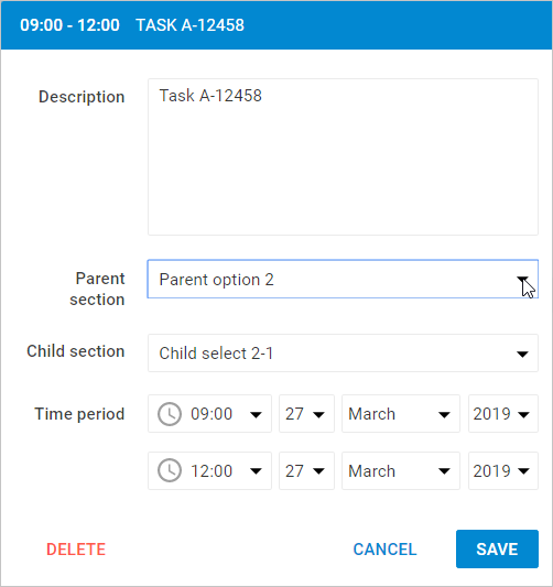
The onchange event is fired when a user changes the selected option of the parent section. The options of the child section will change accordingly.
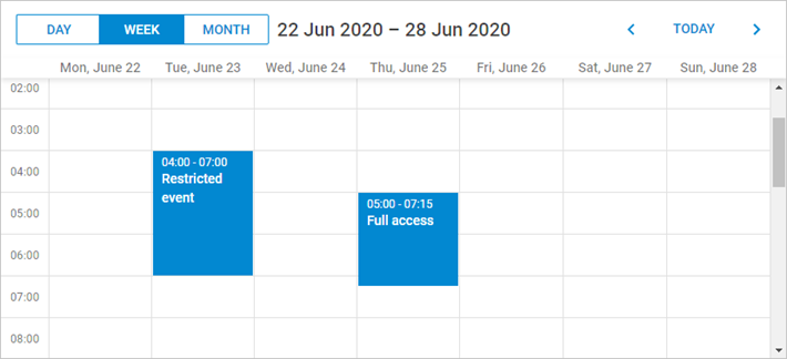
Dynamic changing of the lightbox sections
There is a possibility to change the lightbox sections dynamically. It means, that the sections of the lightbox can be hidden, blocked or displayed depending on the specified configuration.
You can change the lightbox sections dynamically via the resetLightbox() method. For instance:
- Create two arrays with the lightbox configuration that will contain two different sets of controls.
var full_lightbox = [
    { name: "description", height: 200, map_to: "text", type: "textarea", focus: true},
    { name: "hidden", height: 23, map_to: "hidden", type: "textarea"},
    { name: "time", height: 72, type: "time", map_to: "auto"}
];
var restricted_lightbox = [
    { name: "description", height: 200, map_to: "text", type: "textarea", focus: true},
    { name: "time", height: 72, type: "time", map_to: "auto"}
];
- At the next step you need to implement the following steps:
-
Before displaying a new lightbox, call the resetLightbox() method to remove the current set of controls of the edit form and generate a new lightbox object with another set of controls.
-
Get the event object by its id and and specify the condition depending on which this or that lightbox configuration will be applied. In the example below the condition is introduced via the "restricted" attribute.
scheduler.attachEvent("onBeforeLightbox", function(event_id) {
    scheduler.resetLightbox();
    var ev = scheduler.getEvent(event_id);
    scheduler.config.lightbox.sections = (ev.restricted) ?
        restricted_lightbox : full_lightbox;
    return true;
});
- Use the 'restricted' event propery to apply "restricted_lightbox" config. Otherwise, the full lightbox will be displayed.
scheduler.init('scheduler_here', new Date(2017, 5, 30), "week");
scheduler.parse([
    { start_date: "2017-06-27 04:00", end_date: "2017-06-27 7:00",
        text: "Restricted event", hidden: "You won't see me", restricted: true },
    { start_date: "2017-06-29 05:00", end_date: "2017-06-29 11:00",
        text: "Full access", hidden: "Hidden text" }
]);