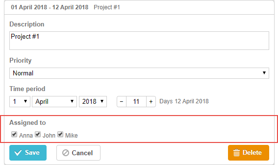
复选框控件
一个两态复选框控件。该控件用于开启/关闭一个选项或多个值。
例如,它在以下场景中很有帮助:
gantt.config.lightbox.project_sections = [
{name: "description", height: 70, map_to: "text", type: "textarea", focus: true},
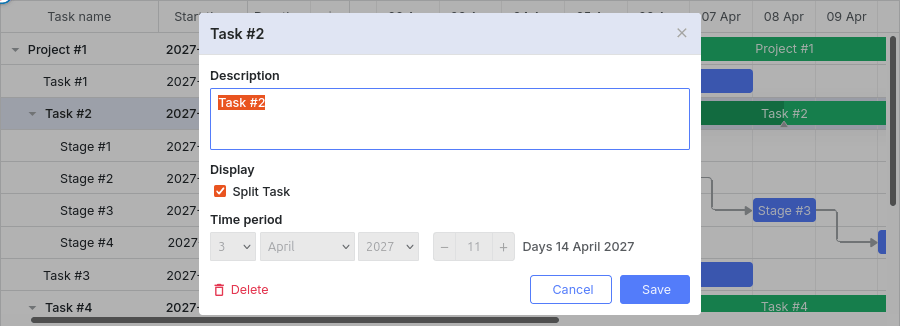
{name: "split", type:"checkbox", map_to: "render", options:[ /*!*/
{key:"split", label:"Split Task"} /*!*/
]}, /*!*/
{name: "time", type: "duration", readonly: true, map_to: "auto"}
];
初始化
要将 复选框控件 添加到灯箱,请遵循以下步骤:
- 向灯箱配置中添加一个部分:
var opts = [
    {key:"split", label:"Split Task"}
];

gantt.config.lightbox.sections = [
    {name: "description", height: 70, map_to: "text", type: "textarea", focus: true},
    {name: "split", type:"checkbox", map_to: "render", options:opts},            /*!*/
    {name: "time", type: "duration", readonly: true, map_to: "auto"}
];
- 为该部分设置标签:
gantt.locale.labels.section_split = "Display";
属性
以下属性对 复选框控件 来说最重要且常用(完整列表请参阅 这里):
- name - (string) 该部分的名称
- map_to - (string) 将映射到该部分的数据属性的名称
- type - (string) 该部分控件的类型
- options - (array) 一个对象数组。定义控件的选项(用于 select、checkbox 和 radio 控件)。数组中的每个对象表示一个选项,并包含以下属性:
- key - (string) 选项的标识符
- label - (string) 选项标签
- focus - (boolean) 如果设置为 true,打开灯箱时该部分将获得焦点
- default_value - (any) 该部分控件的默认值。仅��在输入值未定义时应用
使用数据填充控件
通常,要为 复选框控件 设置值,请使用 options 参数:
gantt.config.lightbox.sections = [
    {name: "split", type:"checkbox", map_to: "render", options:[
        {key:"split", label:"Split Task"}
    ]}
];
-options 参数中的条目有 2 个必填属性:
- key - (string) 选项的标识符
- label - (string) 选项标签
Need help?
Got a question about the documentation? Reach out to our technical support team for help and guidance. For custom component solutions, visit the Services page.