Specifying Columns
Grid's columns are configured with the columns parameter.
// default columns definition
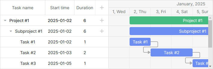
gantt.config.columns = [
{ name: "text", label: "Task name", width: "*", tree: true },
{ name: "start_date", label: "Start time", align: "center" },
{ name: "duration", label: "Duration", align: "center" },
{ name: "add", label: "", width: 44 }
];
You can take a look at the video guide that describes how to specify columns of the grid.
Overview
By default, the grid contains 4 columns:
- Task name
- Start date
- Duration
- '+' column. A special column with the
name="add"that displays the '+' sign which allows users to add children for a task.
Note, you needn't to specify the columns parameter to present the default columns in the grid.
The columns parameter is an array, each object of which presents a single column. So, for example, to define 5 columns in the grid: 'Task', 'Start Date', 'End Date', 'Holder', 'Progress', specify the columns parameter as in:
gantt.config.columns = [
    { name: "text",       label: "Task name",  tree: true, width: "*" },
    { name: "holder",     label: "Holder",     align: "center" },
    { name: "start_date", label: "Start time", align: "center" },
    { name: "end_date",   label: "End date",   align: "center" },
    { name: "progress",   label: "Progress",   align: "center" }
];

gantt.init("gantt_here");
where 'text', 'holder', 'start_date', 'end_date', 'progress' are the names of the data properties.
Displaying end date of tasks
When task data objects contain start and end dates in the format of "%Y-%m-%d" or "%d-%m-%Y" (i.e. without hour-minute part), the result dates in the default format may have values that are not expected. For more details on formatting end dates, see the Task end date display & Inclusive end dates article.
Hiding the "Add" button for certain tasks
A quite easy way to prevent users from adding sub-tasks to specific tasks is to hide the 'Add' button through CSS.
First, assign a CSS class for each task row using the grid_row_class template:
gantt.templates.grid_row_class = ( start, end, task ) => {
    if ( task.$level > 1 ) {
        return "nested_task"
    }

    return "";
};
Then, hide the 'Add' button for such rows:
.nested_task .gantt_add {
    display: none !important;
}
Related sample: Predefined Project Structure
Width
To set the width of a column, use the attribute width in the related column's object:
gantt.config.columns = [
    { name: "text",       label: "Task name",  width: "*", tree: true },
    { name: "start_date", label: "Start time", width: 150 },
    { name: "duration",   label: "Duration",   width: 120 }
];

gantt.init("gantt_here");
Use the '*' value, to make the column occupy all the remaining space.
Note, that the width of Grid columns depends on two attributes: the width of the column and grid_width. If the sum of the width of columns is not equal to the width of the grid, Gantt changes one of the parameters.
- When initializing the gantt via gantt.init(), the width of the column is a priority.
Related sample: Column width priority over grid width at initialization
- When rendering the gantt via gantt.render(), the grid_width is a priority.
Related sample: Grid width priority over column width during rendering
- When initializing the gantt via gantt.init() and either the width of the column is not specified or is set to
'*', the grid_width is a priority.
Related sample: Grid width priority when column width is undefined or set to '*' at initialization
Min/max column width
The min_width/max_width properties can be used to limit the column width in case of resize operations:
gantt.config.columns = [
    { name: "text",       label: "Task name",  width: "*", tree: true, min_width: 150, max_width: 300 },
    { name: "start_date", label: "Start time", width: 150 },
    { name: "duration",   label: "Duration",   width: 120 }
];

gantt.init("gantt_here");
The min_width property of a column has a priority over the min_grid_column_width property of the gantt.
Minimal grid width during resizing
The minimal width that the grid can be resized to is defined via the gantt.config.min_grid_column_width option. The option defines the minimal width to which each column can be resized while resizing the grid:
gantt.config.columns = [
    { name: "text",       label: "Task name",  width: 150, tree: true },
    { name: "start_date", label: "Start time", width: 100 },
    { name: "duration",   label: "Duration",   width: 50 }
];

gantt.config.min_grid_column_width = 30; // the grid can be resized to 90 px

gantt.init("gantt_here");
Related sample: Minimal grid width
Note, that the minimal width of the grid during resizing also depends on the minimal width of the 'add' column (44 by default). To be able to resize the grid to the value smaller than 44 px, specify the min_width option in the object of the 'add' column:
{ name: "add", label: "", min_width: 1 }
Data mapping and templates
By default, dhtmlxGantt populates the grid with data properties that correspond to the names of the columns. For example, if you set name:"holder" for a column, dhtmlxGantt will look for a such data property in the incoming JSON data, and if such a property exists, load it to the column.
Using templates for column data
If you want to present a mix of several data properties in a column, you can use any name for the column, but set the data template via the template attribute of the columns parameter. For instance, you can specify name:"staff" for a column and define a template function that will return the holder and progress data properties to be loaded into the column.
gantt.config.columns = [
    { name: "text",        label: "Task name",  tree: true, width: "*" },
    { name: "start_date",  label: "Start time", align: "center" },
    { name: "staff",       label: "Holder(s)", template: (obj) => {
        return `${obj.holder} (${obj.progress})`;
    } }
];

gantt.init("gantt_here");
Text alignment
To set the horizontal alignment of the text in a column, use the align attribute in the related column's object:
gantt.config.columns = [
    { name: "text",       label: "Task name",  align: "center", tree: true },
    { name: "start_date", label: "Start time", align: "center" },
    { name: "duration",   label: "Duration",   align: "center" }
];

gantt.init("gantt_here");
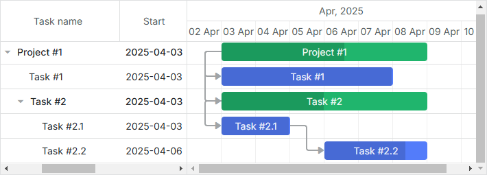
WBS code
You can add a column that will display the outline numbers of tasks (their WBS code). For this, you need to use the getWBSCode method in the column template.
gantt.config.columns = [
    { name: "wbs",        label: "WBS",        width: 40,  template: gantt.getWBSCode },
    { name: "text",       label: "Task name",  width: 170, tree: true },
    { name: "start_date", label: "Start time", width: 90,  align: "center" },
    { name: "duration",   label: "Duration",   width: 60,  align: "center" },
    { name: "add",        width: 40 }
];
Related sample: Show Task WBS Codes (Outline Numbers)
Getting WBS code of the task
The getWBSCode method returns the WBS code of the necessary task. For example, we load the following tasks into gantt:
gantt.parse({
    tasks: [
        { id: 1, text: "Project", start_date: "28-03-2025", duration: 5, open: true },
        { id: 2, text: "Task #1", start_date: "01-04-2025", duration: 3, parent: 1 },
        { id: 3, text: "Task #2", start_date: "02-04-2025", duration: 4, parent: 1 }
    ],
    links: []
});
and we want to get the WBS code of the task with id="3." For this, we pass the object of a task as a parameter to the getWBSCode method. It will return a string with the WBS code of the task:
const wbsCode = gantt.getWBSCode(gantt.getTask(3)); // -> returns "1.2"
Getting task by WBS code
You can also get the object of a task by passing its WBS code to the getWBSCode method:
const task = gantt.getTaskByWBSCode("1.2");
// => { id: 3, text: "Task #2", start_date: …}
Time constraints for tasks
You can add separate grid columns that will allow setting the type of time constraint for a task and the date of constraint, if it is required by the chosen type. These columns have the "constraint_type" and "constraint_date" names, correspondingly.
gantt.config.columns = [
    { name: "constraint_type", align: "center", width: 100, resize: true,
        editor: constraintTypeEditor, template: (task) => { //template logic }
    },
    { name: "constraint_date", align: "center", width: 120, resize: true,
        editor: constraintDateEditor, template: (task) => { //template logic }
    },
    ...
];
The columns are linked to objects of inline editors that allow selecting the necessary type of constraint for a task and edit its date right in the grid.
const constraintTypeEditor = {
    type: "select", map_to: "constraint_type", options: [
        { key: "asap", label: gantt.locale.labels.asap },
        { key: "alap", label: gantt.locale.labels.alap },
        { key: "snet", label: gantt.locale.labels.snet },
        { key: "snlt", label: gantt.locale.labels.snlt },
        { key: "fnet", label: gantt.locale.labels.fnet },
        { key: "fnlt", label: gantt.locale.labels.fnlt },
        { key: "mso", label: gantt.locale.labels.mso },
        { key: "mfo", label: gantt.locale.labels.mfo }
    ]
};

const constraintDateEditor = {
    type: "date",
    map_to: "constraint_date",
    min: new Date(2025, 0, 1),
    max: new Date(2030, 0, 1)
};
Related sample: Auto-Schedule From Project Start & Constraints
Resizing columns
This functionality is available only in the PRO edition
To provide users a possibility to resize a column by dragging the right column's border, use the resize attribute in the related column's object:
gantt.config.columns = [
    { name: "text",       resize: true, tree: true, width: "*" }, // 'resize' active
    { name: "start_date", resize: true, min_width: 100 }, // limited by 'min_width'
    { name: "duration",   align: "center" },              // no resize
    { name: "add",        width: "44" }
];
Related sample: Grid columns resize events
To make the whole grid resizable by dragging the grid's border, use the gantt.config.layout option and specify grid and resizer objects with the necessary configuration inside.
gantt.config.layout = {
    css: "gantt_container",
    rows: [
        {
            cols: [
                { view: "grid", id: "grid", scrollX: "scrollHor",
                    scrollY: "scrollVer"
                },
                { resizer: true, width: 1 },
                { view: "timeline", id: "timeline", scrollX: "scrollHor",
                    scrollY: "scrollVer"
                },
                { view: "scrollbar", id: "scrollVer", scroll: "y" }
            ]
        },
        { view: "scrollbar", id: "scrollHor", scroll: "x", height: 20 }
    ]
};

gantt.init("gantt_here");
To preserve the grid's size during resizing of columns, set the keep_grid_width option to true:
gantt.config.columns = [
    { name: "text",       width: "*", tree: true, resize: true },
    { name: "start_date", width: 100, align: "center" },
    { name: "duration",   width: 70, align: "center" },
    { name: "add",        width: 44 }
];

gantt.config.keep_grid_width = true; /*!*/
gantt.init("gantt_here");
Related sample: Grid columns resize events
Events
dhtmlxGantt provides 6 events for handling the resizing behavior:
- onColumnResizeStart - fires before the user starts to drag the column's border to resize the column
- onColumnResize - fires when the user is dragging the column's border to resize the column
- onColumnResizeEnd - fires after the user finished dragging the column's border to resize the column
- onGridResizeStart - fires before the user starts to drag the grid's border to resize the grid
- onGridResize - fires when the user is dragging the grid's border to resize the grid
- onGridResizeEnd - fires after the user finished dragging the grid's border to resize the grid
Visibility
To manipulate the visibility of a column, use the hide attribute in the related column's object.
Visibility can be toggled dynamically, by changing the value of the 'hide' property and refreshing the Gantt chart:
gantt.config.columns = [
    { name: "text",          label: "Task name", width: "*", tree: true, resize: true },
    { name: "start_date",    label: "Start time" },
    { name: "duration",      label: "Duration",      width: 60, hide: true },
    { name: "planned_start", label: "Planned start", width: 80, hide: true },
    { name: "planned_end",   label: "Planned end",   width: 80, hide: true },
    { name: "add",           label: "",              width: 36 }
];

const showDetails = false;

function toggleView() {
    showDetails = !showDetails;
    gantt.getGridColumn("duration").hide = !showDetails;
    gantt.getGridColumn("planned_start").hide = !showDetails;
    gantt.getGridColumn("planned_end").hide = !showDetails;

    if (showDetails) {
        gantt.config.grid_width = 600;
    } else {
        gantt.config.grid_width = 300;
    }

    gantt.render();
};

gantt.init("gantt_here");
Related sample: Hiding grid columns
You can take a look at the video guide that demonstrates how to manage the visibility of columns in the grid.
Modifying cells after rendering
In some cases you may need to change the look or behavior of a grid cell after its rendering.
Since v7.1, the library provides the onrender attribute of the columns parameter that will help you to modify the cell after rendering, for example:
gantt.config.columns = [
    { name: "text", tree: true, width: "*", resize: true },
    { name: "start_date", align: "center", resize: true },
    { name: "duration",   align: "center", onrender: (task, node) => {
        node.setAttribute("title", task.text);
    } },
    { name: "add", width: 44 }
];
Another way the onrender callback can be used is for injection of external components into the cells of the grid. For instance, you use DHTMLX Gantt with React and need to inject a React component into the grid cells of Gantt. The code sample below shows how it can be implemented:
gantt.config.columns = [
    { name: "text",       label: "Task name", tree: true, width: "*" },
    { name: "start_date", label: "Start time", align: "center" },
    { name: "duration",   label: "Duration",   align: "center" },
    {
        name: "external", label: "Element 1",  align: "center",
        onrender: (item, node) => {
            return <DemoButton
                text="Edit 1"
                onClick="{()" => alert("Element as React Component")}
            />
        }
    }
];
To make it work and display the React component, the gantt.config.external_render config must be defined:
import ReactDOM from 'react-dom';
import React from 'react';

gantt.config.external_render = {
    // checks the element is a React element
    isElement: (element) => {
        return React.isValidElement(element);
    },
    // renders the React element into the DOM
    renderElement: (element, container) => {
        ReactDOM.render(element, container);
    }
};
The logic is the following:
- Firstly, the return object of the onrender callback will be passed into the isElement function to verify it's an object that can be rendered by the framework/library you use.
- If isElement returns true - the object will be passed into renderElement which is supposed to initialize the component object inside the DOM element of the cell.
Horizontal scrollbar
You can make Grid scrollable using the scrollable property of the layout configuration option. Read about binding layout views to a scrollbar.
The presence of a horizontal scrollbar in the grid allows Gantt to automatically adjust the width of the columns during resizing the width of the grid. Read more about how to enable this functionality.
In addition to the scrollable attribute, you need to add a horizontal scrollbar element into the layout and connect it to the grid as follows:
gantt.config.layout = {
    css: "gantt_container",
    cols: [
        {
            width: 400,
            minWidth: 200,
            maxWidth: 600,

            // adding horizontal scrollbar to the grid via the scrollX attribute
            rows: [
                { view: "grid", scrollX: "gridScroll", scrollable: true, /*!*/
                    scrollY: "scrollVer" /*!*/
                }, /*!*/
                { view: "scrollbar", id: "gridScroll" } /*!*/
            ]
        },
        { resizer: true, width: 1 },
        {
            rows: [
                { view: "timeline", scrollX: "scrollHor", scrollY: "scrollVer" },
                { view: "scrollbar", id: "scrollHor" }
            ]
        },
        { view: "scrollbar", id: "scrollVer" }
    ]
};
Since you'll be displaying separate scrollbars for a grid and a timeline, you may want to synchronize their visibility, so both scrollbars would be visible or hidden at the same time.
It can be done by assigning both scrollbars to the same visibility group:
gantt.config.layout = {
    css: "gantt_container",
    cols: [
        {
            width: 400,
            minWidth: 200,
            maxWidth: 600,
            rows: [
                { view: "grid", scrollX: "gridScroll", scrollable: true,
                    scrollY: "scrollVer"
                },
                // horizontal scrollbar for the grid
                { view: "scrollbar", id: "gridScroll", group: "horizontal" }
            ]
        },
        { resizer: true, width: 1 },
        {
            rows: [
                { view: "timeline", scrollX: "scrollHor", scrollY: "scrollVer" },
                // horizontal scrollbar for the timeline
                { view: "scrollbar", id: "scrollHor", group: "horizontal" }
            ]
        },
        { view: "scrollbar", id: "scrollVer" }
    ]
};
If at least one of the scrollbars assigned to the same group is visible, all scrollbars of the group will be visible.
Related sample: Horizontal scroll inside Grid
Styling
For information on styling cells of the grid, read Work with Gantt Styles.