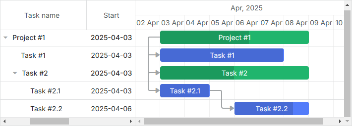
Gantt Layout
Starting from version 5.0, Gantt provides the possibility to specify a configurable layout and arrange the elements of the component as inner views of a layout. It allows you to use additional timelines and grids to make a flexible gantt chart structure and define various schemes of arranging elements.
For example, you can place one more grid to the right side of the timeline:
Related sample: Grid columns rightside of gantt
or add another grid and a timeline below the default ones.
Related sample: Gantt chart with resource panel
Default layout
The layout is set through the gantt.config.layout configuration option. The default configuration of the layout is the following:
gantt.config.layout = {
  css: "gantt_container",
  rows: [
    {
      cols: [
        {
          // the default grid view
          view: "grid",
          scrollX: "scrollHor",
          scrollY: "scrollVer"
        },
        { resizer: true, width: 1 },
        {
          // the default timeline view
          view: "timeline",
          scrollX: "scrollHor",
          scrollY: "scrollVer"
        },
        {
          view: "scrollbar",
          id: "scrollVer"
        }
      ]
    },
    {
      view: "scrollbar",
      id: "scrollHor"
    }
  ]
}
The layout of Gantt consists of cells which are occupied by views. The main and helper gantt elements are presented by views, which are:
- grid - defines the grid part of the Gantt chart. The main grid predefined for showing tasks has the id:"grid";
- timeline - defines the timeline part of the Gantt chart. The main timeline predefined for showing tasks has the id:"timeline";
- resizer - defines the resizer line. To enable a resizer, you need to set the resizer property to true. Available in the PRO edition only;
- scrollbar - defines scrollbars used in the Gantt chart. Grid and timeline views can be bound to particular scrollbars. Read details below.
- resourceGrid - preconfigured grid for a resource panel. Available in the PRO edition only. See more details here.
- resourceTimeline - preconfigured timeline for a resource panel. Available in the PRO edition only. See more details here.
The view configuration is specified as an object with the corresponding properties. You can set custom configuration options for the grid and timeline views. The default options are taken from the global gantt.config object.
Note that you should specify the configuration of layout before Gantt initialization. If you make changes in the layout, you need to refresh it using resetLayout.
Scrollbar
Layout scrollbars are specified by the "scrollbar" view. You can set both a horizontal and vertical scrollbar.
To use a scrollbar in the layout, you need to bind it to a corresponding view with the help of the scrollX or scrollY properties via the id of the necessary scrollbar.
A scrollbar for a view
It is possible to bind several views to the same scrollbar. In order to bind a view to a scrollbar:
- set a scrollbar with the necessary scrolling direction and assign an ID to it
- use the id of the scrollbar as a value of the scrollX/scrollY property inside the view configuration object
Defining a scrollbar inside the cols array will create a vertical scrollbar, defining one in the rows array will make a horizontal scrollbar.
Alternatively, you can define the scroll mode explicitly using the scroll parameter:
{ view: "scrollbar", id: "scroller", scroll: "x" } // horizontal
or:
{ view: "scrollbar", id: "scroller", scroll: "y" } // vertical
Let's bind custom grid and timeline views to the vertical scroll:
gantt.config.layout = {
  css: "gantt_container",
  rows: [
    {
      cols: [
        { view: "grid", scrollY: "scrollVer" },
        { resizer: true, width: 1 },
        { view: "timeline", scrollY: "scrollVer" },
        { view: "scrollbar", id: "scrollVer" }
      ]
    }
  ]
}
When you scroll the vertical scrollbar, the grid and timeline are scrolled together. In the default layout the grid and timeline views are bound to both the horizontal and vertical scrolls.
It is also possible to specify a separate horizontal scrollbar for the Grid view. Read the details in the corresponding section.
Scrollbars for a view
In the sub-section above we've considered how to add one specific scrollbar to the necessary view. For that, it was enough to create a simple layout configuration like:
{ cols: [ { rows: [ {}, {} ] }, { rows: [ {}, {} ] } ] }
or
{ rows: [ { cols: [ {}, {} ] }, { cols: [ {}, {} ] } ] }
In case you need to bind a view to both vertical and horizontal scrollbars, create a complex configuration of the layout when cols and rows arrays are nested multiple times, for instance:
{ cols: [
  {
    rows: [
      {
        cols: [ {}, {} ]
      },
      {
        cols: [ {}, {} ]
      }
    ]
  },
  {
    rows: [
      {
        cols: [ {}, {} ]
      },
      {
        cols: [
          {
            rows: [ {}, {} ]
          },
          {
            rows: [ {}, {} ]
          }
        ]
      }
    ]
  }
]}
Follow the examples below:
Layout customization
You can change the default layout configuration and specify the necessary scheme of arranging the elements of Gantt chart on a page, using additional layout views.
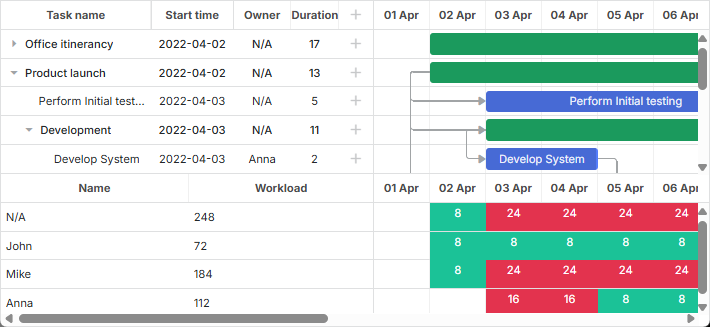
For example, you can create additional grid and timeline views that will make a bottom resource panel for the main gantt chart. The steps to implement such a custom layout are:
- create a multi-row layout
- add a default grid and a timeline to the first row of the layout
- add an additional grid and timeline to the next row and bind them to a custom datasource
- add a resizer between these rows
- add a scrollbar to the last row and bind it to both the default and the resource timeline
gantt.config.layout = {
  css: "gantt_container",
  rows: [
    {
      // the default layout
      cols: [
        { view: "grid", config: mainGridConfig, scrollY: "scrollVer" },
        { resizer: true, width: 1 },
        { view: "timeline", scrollX: "scrollHor", scrollY: "scrollVer" },
        { view: "scrollbar", id: "scrollVer" }
      ]
    },
    { resizer: true, width: 1 },
    {
      // a custom layout
      cols: [
        { view: "grid", id: "resourceGrid", bind: "resource",
          config: resourceGridConfig, scrollY: "resourceVScroll"
        },
        { resizer: true, width: 1 },
        { view: "timeline", id: "resourceTimeline", scrollX: "scrollHor",
          bind: "resource", bindLinks: null, layers: resourceLayers,
          scrollY: "resourceVScroll"
        },
        { view: "scrollbar", id: "resourceVScroll" }
      ]
    },
    { view: "scrollbar", id: "scrollHor" }
  ]
};
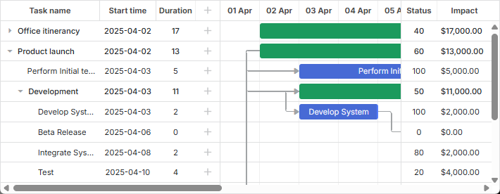
In the above example, an extra grid view has been added. It contains the list of resources and their workload. There is also an extra timeline view which displays the distribution of working hours during the month and indicates standard and overtime hours.
Properties of custom grid and timeline
Custom grid and timeline have additional properties:
For the grid and timeline views
- bind - (string) sets the id of a datastore to take data from ("resource" in the example);
For the timeline view
- bindLinks - (string) points to the source of links. null, if there are no related links;
- layers - (array) a configuration option defined as a set of addLayer() functions that describe the way of styling data.
Adding a datastore for custom views
To populate custom views with corresponding data, you need to add a separate data store. To create a new data store, use the method createDatastore and specify the configuration of the data store:
const resourcesStore = gantt.createDatastore({
  name: "resource",
  initItem: (item) => {
    item.id = item.key || gantt.uid();
    return item;
  }
});
In the above example a data store named "resource" is added.
To load data into custom views from the data store, use the parse method:
resourcesStore.parse([ // resources
  { key: '0', label: "N/A" },
  { key: '1', label: "John" },
  { key: '2', label: "Mike" },
  { key: '3', label: "Anna" }
]);
To return a configuration object of the necessary data store, use the getDatastore method:
const tasksStore = gantt.getDatastore("task");
The method takes the name of the data store as a parameter.
If you use built-in resource views, the gantt can automatically create the data store for them. Read the details.
Disabling/enabling resizers dynamically
In some cases you may need to disable resizers between the cells of the gantt dynamically. The simplest solution is to hide them via CSS.
For that, you'll need a rule like the following:
.no_resizers .gantt_resizer {
  display: none;
}
Then you'll be able to hide the resizers by attaching the class to the container of the gantt:
gantt.$container.classList.add("no_resizers");
To show the resizers again, just remove the class:
gantt.$container.classList.remove("no_resizers");
HTML as Inner View
You can also use some custom HTML as inner views of the Gantt layout. For example:
gantt.config.layout = {
  css: "gantt_container",
  rows: [
    {
      cols: [
        { view: "grid", scrollX: "scrollHor", scrollY: "scrollVer" },
        { html: "<div className='custom-content'>custom content</div>",
          css: "custom-content", width: 50
        },
        { view: "timeline", scrollX: "scrollHor", scrollY: "scrollVer" },
        { html: "<div className='custom-content'>custom content</div>",
          css: "custom-content", width: 50
        },
        { view: "scrollbar", id: "scrollVer" }
      ]
    },
    { view: "scrollbar", scroll: "x", id: "scrollHor" }
  ]
}
Required views and settings
The public API of the gantt object contains methods that are derived from specific layout views, e.g. getTaskPosition, getTaskNode, getScrollState.
In order for these methods to work as expected, the layout must contain the default grid, timeline, scrollbars and the gantt should be able to locate them. It is done by assigning specific ids to the default views:
gantt.config.layout = {
  css: "gantt_container",
  rows: [
    {
      cols: [
        { view: "grid", id: "grid", scrollX: "scrollHor",
          scrollY: "scrollVer"
        },
        { view: "timeline", id: "timeline", scrollX: "scrollHor",
          scrollY: "scrollVer"
        },
        { view: "scrollbar", id: "scrollVer" }
      ]
    },
    { view: "scrollbar", id: "scrollHor" }
  ]
};
The required views and their ids are:
- view: "grid", id: "grid"
- view: "timeline", id: "timeline"
- view: "scrollbar", id: "scrollHor"
- view: "scrollbar", id: "scrollVer"
Note that if the id is not specified, gantt will either use the view name as a default view id, or auto generate a unique id. Thus, in case of the default grid and timeline, the "id" parameter can be omitted:
gantt.config.layout = {
  css: "gantt_container",
  rows: [
    {
      cols: [
        { view: "grid", scrollX: "scrollHor", scrollY: "scrollVer" },
        { view: "timeline", scrollX: "scrollHor", scrollY: "scrollVer" },
        { view: "scrollbar", id: "scrollVer" }
      ]
    },
    { view: "scrollbar", id: "scrollHor" }
  ]
};
The layout can contain any additional number of views.
Configs and templates of views
Grid and Timeline views reuse the templates and configs from the global gantt.config/gantt.templates. However, these settings can be overridden for the specific views at the layout level.
For example:
const secondGridColumns = {
  columns: [
    { name: "status", label: "Status", width: 60, align: "center",
      template: (task) => {
        const progress = task.progress || 0;
        return Math.floor(progress * 100) + "";
      }
    },
    { name: "impact", width: 80, label: "Impact",
      template: (task) => {
        return (task.duration * 1000).toLocaleString("en-US", {
          style: 'currency', currency: 'USD'
        });
      }
    }
  ]
};

gantt.config.layout = {
  css: "gantt_container",
  rows: [
    {
      cols: [
        { view: "grid", id: "grid", width: 320, scrollY: "scrollVer" },
        { resizer: true, width: 1 },
        { view: "timeline", id: "timeline", scrollX: "scrollHor",
          scrollY: "scrollVer"
        },
        { resizer: true, width: 1 },
        { view: "grid", width: 120, bind: "task", scrollY: "scrollVer",
          config: secondGridColumns /*!*/
        },
        { view: "scrollbar", scroll: "y", id: "scrollVer" }
      ]
    },
    { view: "scrollbar", id: "scrollHor", height: 20 }
  ]
};
Views can inherit configs and templates from the parent layout:
const resourceConfig = {  /*!*/
  scale_height: 30      /*!*/
};                        /*!*/

gantt.config.layout = {
  css: "gantt_container",
  rows: [
    {
      cols: [
        { view: "grid", group: "grids", scrollY: "scrollVer" },
        { resizer: true, width: 1 },
        { view: "timeline", scrollX: "scrollHor", scrollY: "scrollVer" },
        { view: "scrollbar", id: "scrollVer", group: "vertical" }
      ],
      gravity: 2
    },
    { resizer: true, width: 1 },
    {
      config: resourceConfig,   /*!*/
      cols: [
        { view: "resourceGrid", group: "grids", width: 435,
          scrollY: "resourceVScroll"
        },
        { resizer: true, width: 1 },
        { view: "resourceTimeline", scrollX: "scrollHor",
          scrollY: "resourceVScroll"
        },
        { view: "scrollbar", id: "resourceVScroll", group: "vertical" }
      ],
      gravity: 1
    },
    { view: "scrollbar", id: "scrollHor" }
  ]
};
Check the Resource Management article.
Visibility groups
Sometimes you need to synchronize visibility of some elements in the layout. For example, if you have horizontal scrollbars in the adjacent cells, you may want both of them to be displayed or hidden at the same time.
Related sample: Horizontal scroll inside Grid
Let's consider another example. You have several grids in different rows of the timeline and want them to have the same width. If one of the grids is resized, another should match its size.
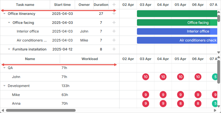
Related sample: Resource load diagram
Both these issues can be solved using the group property of the view. The property takes an arbitrary string value, the views with the same group value will be synchronized.
-
For scrollbars it means that their visibility will be synchronized. If at least one of the scrollbars of the group is visible, all scrollbars of the group will be visible.
-
For other cells it means that they'll have the same width/height, depending on the layout.
Synchronizing the visibility of scrollbars:
gantt.config.layout = {
  css: "gantt_container",
  cols: [
    {
      width: 400,
      minWidth: 200,
      maxWidth: 600,
      rows: [
        { view: "grid", scrollX: "gridScroll", scrollable: true,
          scrollY: "scrollVer"
        },
        { view: "scrollbar", id: "gridScroll", group: "horizontal" }    /*!*/
      ]
    },
    { resizer: true, width: 1 },
    {
      rows: [
        { view: "timeline", scrollX: "scrollHor", scrollY: "scrollVer" },
        { view: "scrollbar", id: "scrollHor", group: "horizontal" }      /*!*/
      ]
    },
    { view: "scrollbar", id: "scrollVer" }
  ]
};
Synchronizing the width of grids:
gantt.config.layout = {
  css: "gantt_container",
  rows: [
    {
      cols: [
        { view: "grid", group: "grids", scrollY: "scrollVer" },
        { resizer: true, width: 1 },
        { view: "timeline", scrollX: "scrollHor", scrollY: "scrollVer" },
        { view: "scrollbar", id: "scrollVer", group: "vertical" }    /*!*/
      ],
      gravity: 2
    },
    { resizer: true, width: 1 },
    {
      config: resourceConfig,
      cols: [
        { view: "resourceGrid", group: "grids", width: 435,
          scrollY: "resourceVScroll"
        },
        { resizer: true, width: 1 },
        { view: "resourceTimeline", scrollX: "scrollHor",
          scrollY: "resourceVScroll"
        },
        { view: "scrollbar", id: "resourceVScroll", group: "vertical" }   /*!*/
      ],
      gravity: 1
    },
    { view: "scrollbar", id: "scrollHor" }
  ]
};
Sizing of Gantt layout parts
You can regulate relative sizes of the Gantt layout cells via the gravity property set in the configuration of each cell. The parameter defines the size of cells in relation to each other.
gantt.config.layout = {
  css: "gantt_container",
  rows: [
    {
      cols: [
        // columns config
      ],
      gravity: 2     /*!*/
    },
    { resizer: true, width: 1 },
    {
      config: resourceConfig,
      cols: [
        // columns config
      ],
      gravity: 1       /*!*/
    },
    { view: "scrollbar", id: "scrollHor" }
  ]
};
In the above example the sizes of the Gantt chart and the resource chart make a proportion 2:1. It means that the Gantt chart will take 66%, while the resource chart will take 33%. By using the proportion 1:1, you will have 50% for both charts.
Min/max cell width/height
The minWidth/maxWidth properties can be used to limit the width of the layout part in case of resize operations. Note that these settings can be applied only to the cells inside the cols array. You can also apply the minHeight/maxHeight properties to the cells in the rows array to define the minimal/maximal height of the layout cells.
The example below shows how the minWidth/maxWidth properties can be added into the columns configuration:
gantt.config.grid_elastic_columns = true;

gantt.config.layout = {
  css: "gantt_container",
  cols: [
    {
      width: 400,
      minWidth: 200, /*!*/
      maxWidth: 600, /*!*/
      rows: [
        { view: "grid", scrollable: true, scrollX: "scrollHor1",
          scrollY: "scrollVer"
        },
        { view: "scrollbar", id: "scrollHor1", scroll: 'x', group: 'hor' }
      ]
    },
    { resizer: true, width: 1 },
    {
      rows: [
        { view: "timeline", scrollX: "scrollHor", scrollY: "scrollVer" },
        { view: "scrollbar", id: "scrollHor", scroll: 'x', group: 'hor' }
      ]
    },
    {
      view: "scrollbar", id: "scrollVer"
    }
  ]
};
Hiding parent layout views
If you need to hide a layout view when all its child items are invisible, specify hide_empty:true in the configuration of the related layout cell, for example:
gantt.config.layout = {
  css: "gantt_container",
  cols: [
    {
      hide_empty: true, /*!*/
      rows: [
        { view: "grid" }
      ]
    },
    { resizer: true },
    {
      hide_empty: true, /*!*/
      rows: [
        { view: "timeline" }
      ]
    }
  ]
};
Related sample: Hiding grid/timeline views
Switching between views
If you need to switch between different layout views, check the How to toggle grid/chart and How to toggle the resource view sections for more details.
Freezing columns in the grid view
You may initialize a Gantt chart in which one or more columns will be frozen. To implement this, follow the instructions given in the How to freeze/fix columns in the grid section.