CSS Documentation
This article shows you the ways of overriding the default color settings of the elements of Gantt chart with the custom ones. The article covers the main class selectors and templates for styling the following parts of Gantt: Grid area, Timeline area, Resource panel.
Styling Grid
In this section you will find CSS selectors for styling the main elements of the grid area.

The overall structure of the DOM element of the grid is given below:
- .gantt_grid
    - .gantt_grid_scale
        - .gantt_grid_head_cell
    - .gantt_grid_data
        - .gantt_row.odd
        - .gantt_row
        - .gantt_row.gantt_row_task
        - .gantt_row.gantt_row_project
        - .gantt_row.gantt_row_milestone
            - gantt_cell.gantt_cell_tree
                - .gantt_tree_indent
                - .gantt_tree_icon.gantt_close
                - .gantt_tree_icon.gantt_open
                - .gantt_tree_content
            - gantt_cell
                - .gantt_tree_content
Grid header
You can change the style of the Grid header element via the .gantt_grid_scale class selector.
Here is an example of applying common background and font color for the headers of the grid and timeline:
.gantt_grid_scale, .gantt_task_scale, .gantt_task_vscroll {
    background-color: #eee;
}
.gantt_grid_scale, .gantt_task_scale,
.gantt_task .gantt_task_scale .gantt_scale_cell,
.gantt_grid_scale .gantt_grid_head_cell {
    color: #000;
    font-size: 12px;
    border-bottom: 1px solid #cecece;
}
Related sample: Styling grid and timeline headers
Scale height
Do not change the height of the grid header and time scale via CSS.
The height of the scale must be set via the scale_height configuration property of Gantt:
gantt.config.scale_height = 50;
A cell of the grid header
You can apply a custom style for a cell of the grid header via .gantt_grid_head_cell.
The selectors for styling a cell are given below:
.gantt_grid_head_cell[data-column-id="columnName"]- selects a cell of a specific column;
columnName matches the value of the name property of the column:
<style>
    .gantt_grid_head_cell[data-column-id="columnName"] {
        background-color: #ededed;
        color: black;
    }
</style>
gantt.config.columns = [
    ...
    { name: "columnName", align: "center" },
    ...
];

Related sample: Styling a particular cell in the grid header
-
.gantt_grid_head_cell[data-column-index="1"]- selects a specific column by its index; -
.gantt_grid_head_cell[data-column-name="start_date"]- selects a specific column by name.
Grid body
You can add a custom color to the Grid body element by applying CSS styles to the .gantt_grid_data selector.

Styling Grid rows
The style of the grid row is modified via .gantt_row.

Every other row
To color every other row of the grid, you need to specify CSS styles for the .gantt_row.odd selector, for example:
.gantt_row.odd {
    background-color: #f4f4fb;
}
Related sample: Styling every other row in grid
You can see that the even rows are highlighted on the screen instead of the odd ones. But if you check the indexes of rows, you will see that the style is applied to the rows that have odd indexes (1, 3, 5, etc.).
Selected row
You can style a selected row in the grid with the help of the .gantt_row.gantt_selected selector:
.gantt_grid_data .gantt_row.gantt_selected,
.gantt_grid_data .gantt_row.odd.gantt_selected,
.gantt_task_row.gantt_selected {
    background-color: #fff3a1;
}
Related sample: Styling selected row
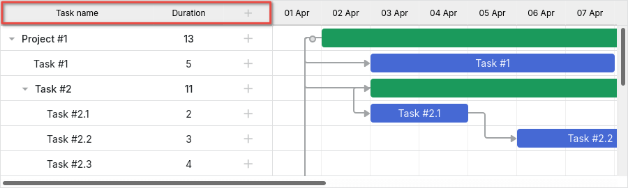
Task rows, project rows, and milestones
To style rows of tasks, projects or milestones, use the following selectors:
.gantt_row.gantt_row_task.gantt_row.gantt_row_project.gantt_row.gantt_row_milestone
For instance:
.gantt_row.gantt_row_project {
    background-color: #fafafa;
    font-weight: bold;
}
Related sample: Styling rows of project tasks
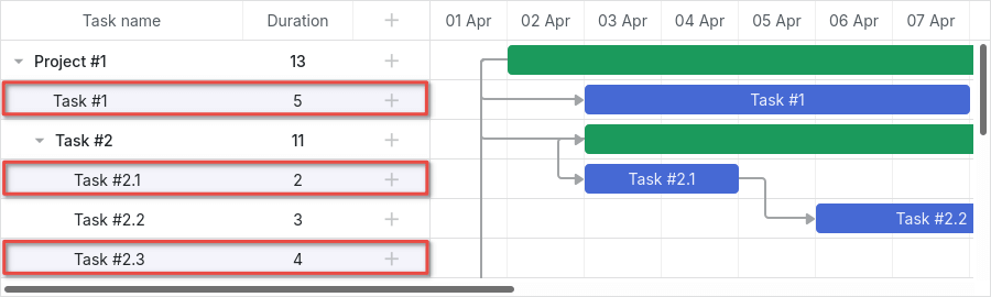
Particular rows
If you want to add custom classes to a specific row, you can apply the grid_row_class template in the following way:
<style>
    .highlighted_task.gantt_row {
        background-color: #ff9668;
        border-color: rgba(0,0,0,0.3);
    }
</style>
gantt.templates.grid_row_class = (startDate, endDate, task) => {
    if (task.highlight) {
        return "highlighted_task";
    }
    return "";
};
Related sample: Styling a particular row in the grid
Row height
The height of the row can be changed either by using the row_height config:
gantt.config.row_height = 40;
or via the row_height property of a task:
{ id: 2, text: "Task #1", start_date: "02-04-2028", duration: 8, row_height: 40 },
Do not attempt changing the row height via CSS, this will break the layout.
Styling cells/columns of Grid
Styling cells or columns of the grid can be implemented via .gantt_row .gantt_cell.
You can apply CSS styles to a specific column in two ways:
- via the
.gantt_row .gantt_cell[data-column-name="columnName"]selector which defines the column by its name, for example:
.gantt_grid_head_cell[data-column-id="start_date"],
.gantt_row .gantt_cell[data-column-name="start_date"] {
    background-color: #ededed;
    color: black;
}
Related sample: Styling a column in grid
Note, that .gantt_grid_head_cell and .gantt_cell use different data attributes: data-column-id and data-column-name respectively. This inconsistency in the CSS rules of Gantt will be fixed in one of the future versions.
- or you can approach the same result by applying the
.gantt_row .gantt_cell[data-column-index="1"]selector which defines the column by its index.
Styling Timeline
The "Styling Timeline" section will guide you through the CSS selectors that you can apply to change the default styles of the elements of the timeline area.

The overall structure of the DOM element of the timeline area is presented below:
- .gantt_task
    - .gantt_task_scale
        - .gantt_scale_line
            - .gantt_scale_cell
    - .gantt_data_area
        - .gantt_task_bg
            - .gantt_task_row
            - .gantt_task_row.odd
                - .gantt_task_cell
        - .gantt_links_area
            - .gantt_task_link
        - .gantt_bars_area
            - .gantt_task_line
                - .gantt_task_progress_wrapper
                    - .gantt_task_progress
                - .gantt_task_progress_drag
                - .gantt_task_content
                - .gantt_task_drag.task_start_date
                - .gantt_task_drag.task_end_date
                - .gantt_link_control.task_start_date
                - .gantt_link_control.task_end_date
                    - .gantt_link_point
        - div - custom layers
Time scale
The DOM element of the time scale has the following structure:
- .gantt_task_scale
    - .gantt_scale_line
        - .gantt_scale_cell
Time scale container
The .gantt_task_scale selector is used to apply custom CSS to the container of the time scale.
For example, changing of the font color and borders of the time scale looks like this:
.gantt_grid_scale, .gantt_task_scale {
    border-bottom: 1px solid #0e0e0e;
}

.gantt_task .gantt_task_scale .gantt_scale_cell {
    color: #000;
}

.gantt_grid_scale .gantt_grid_head_cell {
    color: #000;
}
Related sample: Styling text and borders of the time scale
Time scales
The .gantt_scale_line selector is used to color the whole time scale. To target a specific time scale by its order, just use the .gantt_scale_line:nth-child(n) selector.
An example of setting background color of the time scale:
.gantt_scale_line:nth-child(1) {
    font-weight: bold;
    background-color: #eee;
}

.gantt_scale_line:nth-child(2) {
    background-color: #fff;
}
Related sample: Background color of the time scale
By default, there are no CSS classes to target time scales by units, but you can add such classes using the scale_row_class template.
An example of setting different styles for the month, week, day scales is given below:
<style>
    .gantt_scale_line.month_scale {
        font-weight: bold;
        background-color: #ddd;
    }

    .gantt_scale_line.week_scale {
        background-color: #e1e1e1;
    }

    .gantt_scale_line.day_scale {
        background-color: #efefef;
    }
</style>
gantt.templates.scale_row_class = (scaleConfig) => `${scaleConfig.unit}_scale`;
Related sample: Styling different time scales
Cells of the time scale
You can add custom styles to the cells of the time scale via the .gantt_scale_cell selector.
For example, you can change the font color and borders of the cells:
.gantt_task .gantt_task_scale .gantt_scale_cell {
    color: #a6a6a6;
    border-right: 1px solid #ebebeb;
}
Related sample: Styling text and borders of the scale cells
In order to color specific dates of the time scale, use the css property of the gantt.config.scales object, as it's shown below:
gantt.config.scales = [
    { unit: "month", step: 1, format: "%Y %M" },
    { unit: "day", step: 1, format: "%l, %F %d", css: (date) => {
        if (!gantt.isWorkTime({ date: date, unit: "day" })) {
            return "weekend";
        }
        return "";
    } }
];
<style>
    .gantt_scale_cell.weekend {
        background-color: #F5F5F5;
    }
</style>
Related sample: Duration includes only working days
If you need to color the whole column, use the timeline_cell_class template, as described below.
Data area
The DOM element of the data area has the following structure:
- .gantt_data_area
    - .gantt_task_bg
        - .gantt_task_row
        - .gantt_task_row.odd
            - .gantt_task_cell
    - .gantt_links_area
        - .gantt_task_link
    - .gantt_bars_area
        - .gantt_task_line
            - .gantt_task_progress_wrapper
                - .gantt_task_progress
            - .gantt_task_progress_drag
            - .gantt_task_content
            - .gantt_task_drag.task_start_date
            - .gantt_task_drag.task_end_date
            - .gantt_link_control.task_start_date
            - .gantt_link_control.task_end_date
                - .gantt_link_point
    - div - custom layers
Task
Task bar
To change the look of the task bar, you should declare a custom style in the .gantt_task_line selector.
An example of changing the border style of the bar is given below:
.gantt_task_line {
    border-radius: 14px;
}
Related sample: Styling borders of the task bars
To change the color of the task bars you should implement the following two steps:
- Override styles of borders and progress bars, so that their colors would match any custom color applied to the task bar:
.gantt_task_line {
    border-color: rgba(0, 0, 0, 0.25); /* Black color with 25% alpha/opacity */
}

.gantt_task_line .gantt_task_progress {
    background-color: rgba(0, 0, 0, 0.25);
}
- Apply the necessary color to the task bar and to the content inside the task bar:
.gantt_task_line {
    background-color: #03A9F4;
}

.gantt_task_line.gantt_task_content {
    color: #fff;
}
You can find an example of applying common color of borders and progress bars to the task bars with different colors in the Task Coloring article.
To color rows of tasks, projects, or milestones, you need to add custom CSS to the related class selector:
.gantt_task_line.gantt_bar_task.gantt_task_line.gantt_bar_project.gantt_task_line.gantt_bar_milestone
An example of styling a selected bar:
.gantt_task_line.gantt_selected {
    box-shadow: 0 2px 5px #000;
}

.gantt_task_line.gantt_bar_project.gantt_selected {
    box-shadow: 0 2px 5px #000;
}
Related sample: Styling selected bar
Tasks of a custom type will have the appropriate class name:
{ id: 2, text: "Task #1", start_date: "02-04-2028", duration: 8, type: "custom_type" },
The task bar will receive the .gantt_task_line.gantt_bar_custom_type CSS class.
Split tasks
Split tasks are defined as subtasks of a parent item, and the light green bar in the background is a bar of that parent item, with additional styles applied.
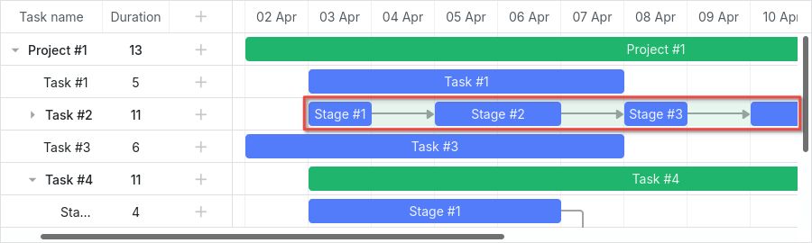
Related sample: Expand and collapse split tasks
If you open the example and expand 'Task #2', you'll see a green bar of the 'Task #2' summary item.
When split tasks are displayed in a single row, this green bar is still rendered at the same position, but with the modified opacity and z-index values.
You can style it in the same way as you can style all bars in the timeline, and hide it completely using the following css:
.gantt_task_line.gantt_split_parent {
    display: none;
}
When you have only one split task, the summary item (type: "project") becomes invisible because it is completely covered by the split task. If there are no split subtasks, the summary item has a default date and duration.
Progress bar
The following selectors can be used to color the progress bar:
.gantt_task_progress- to change the color of the progress bar fill;.gantt_task_progress_drag- to style the drag handle of the progress bar.
You can change the look and feel of the task and progress bars by applying CSS rules as follows:
- an example of changing background, foreground, and progress colors:
/* task */

/* background color of task bars*/
.gantt_task_line {
    background-color: #3db9d3;
    border: 1px solid #2898b0;
}

/* text color */
.gantt_task_line .gantt_task_content {
    color: #fff;
}

/* progress fill */
.gantt_task_progress {
    background: #299cb4;
}
- an example of styling Project(Summary) bars:
/* project */
/* background color of project bars*/
.gantt_task_line.gantt_bar_project {
    background-color: #65c16f;
    border: 1px solid #3c9445;
}

/* progress of project bars */
.gantt_task_line.gantt_bar_project .gantt_task_progress {
    background-color: #46ad51;
}
- an example of styling Milestone bars:
/* milestone */
.gantt_task_line.gantt_milestone {
    background-color: #d33daf;
    border: 0 solid #61164f;
}
Related sample: Background, foreground, and progress colors. Styling Project and Milestone bars.
Custom color for particular task bars
If you want to set color for specific task bars, you need to assign a custom class to them using the gantt.templates.task_class template:
gantt.templates.task_class = (startDate, endDate, task) => {
    if (task.highlight) {
        return "highlighted_task";
    }
    return "";
};
and use this custom class in the selector:
.highlighted_task.gantt_task_line {
    background-color: #ff9668;
    border-color: rgba(0,0,0,0.3);
}

.highlighted_task .gantt_task_progress {
    text-align: center;
    z-index: 0;
    background: rgba(0,0,0,0.3);
}
Related sample: Styling particular task bars
Highlighting area inside the task bar
If you want to highlight some areas inside the task bar, you need to inject additional elements into the bar using the gantt.templates.task_text template:
gantt.templates.task_text = (startDate, endDate, task) => `
    <div className="custom_progress warm_up" style={{width: '20%'}}></div>
    <div className="custom_progress in_progress" style={{width: '60%'}}>${task.text}</div>
    <div className="custom_progress cool_down" style={{width: '20%'}}></div>
`;
and apply CSS:
.custom_progress {
    display: inline-block;
    vertical-align: top;
    text-align: center;
    height: 100%;
}

.custom_progress.nearly_done {
    background-color: #4CC259;
}

.custom_progress.in_progress {
    background-color: #88BFF5;
}

.custom_progress.idle {
    background-color: #d96c49;
}
Related sample: Custom html content (Stackbar)
Link
The structure of the DOM element of the link is given below:
- .gantt_task_link
    - .gantt_line_wrapper
    - .gantt_link_line_right
    - .gantt_link_line_left
    - .gantt_link_line_up
    - .gantt_link_line_down
- .gantt_link_arrow.gantt_link_arrow_right
- .gantt_link_arrow.gantt_link_arrow_left
Here is an example of how you can color the elements of the dependency links:
.gantt_line_wrapper div {
    background-color: #ffa011;
}
.gantt_link_arrow_right {
    border-left-color: #ffa011;
}
.gantt_link_arrow_left {
    border-right-color: #ffa011;
}
.gantt_task_link:hover .gantt_line_wrapper div {
    box-shadow: 0 0 5px 0 #ffa011;
}
Related sample: Styling links
Thickness of the link line is set via the gantt.config.link_line_width config.
Resizer
The following selectors can be applied to style the resizer's DOM element:
.gantt_task_drag.gantt_task_drag.task_start_date.gantt_task_drag.task_end_date
An example of disabling resizer of the start date:
.gantt_task_line:hover .gantt_task_drag.task_start_date {
    display: none;
}
Related sample: Disabling resizer of the start date
An example of disabling resizer of the end date:
.gantt_task_line:hover .gantt_task_drag.task_end_date {
    display: none;
}
Related sample: Disabling resizer of the end date
Link control
The following selectors can be used to apply styles to the element of the round handle at the start (end) of the task:
.gantt_link_control .gantt_link_point.gantt_link_control.task_start_date .gantt_link_point.gantt_link_control.task_end_date .gantt_link_point
Background grid
The structure of the DOM element of the background grid looks as follows:
- .gantt_data_area
    - .gantt_task_bg
        - .gantt_task_row
        - .gantt_task_row.odd
            - .gantt_task_cell
Background rows:
To change the default style settings of the background rows, you need to add a custom style to the .gantt_task_row selector. For instance:
.gantt_row,
.gantt_task_row {
    border-bottom: 1px solid #ebebeb;
    background-color: #fff;
}
To color every other background row, you should define custom CSS properties in the .gantt_task_row.odd selector.
You can easily specify custom colors for the selected row, for instance:
.gantt_grid_data .gantt_row.gantt_selected,
.gantt_grid_data .gantt_row.odd.gantt_selected,
.gantt_task_row.gantt_selected {
    background-color: #fff3a1;
}
.gantt_task_row.gantt_selected .gantt_task_cell {
    border-right-color: #ffec6e;
}
Related sample: Styling selected row
Background cells
To change the default style settings of the background cells, you should specify a custom style in the .gantt_task_cell selector.
In order to color the background columns, use the timeline_cell_class template:
gantt.templates.timeline_cell_class = (task, date) => {
    if (!gantt.isWorkTime({ date: date, unit: "day", task: task })) {
        return "weekend";
    }
    return "";
};
and apply CSS:
.gantt_task_cell.weekend {
    background-color: #F5F5F5;
}

.gantt_task_row.gantt_selected .gantt_task_cell.weekend {
    background-color: #F8EC9C;
}
Related sample: Duration includes only working days
Resource panel
The resource panel consists of the grids and timelines similar to the main gantt area.
By default, grids and timelines of the resource view will use global templates and configs. You can use different configs and templates for the resource panel by passing them into the layout config.
You can target the resource grid and timeline using the appropriate view name in CSS selector:
.resourceGrid_cell .gantt_row,
.resourceHistogram_cell .gantt_task_row {
    border-bottom: 1px solid #ebebeb;
    background-color: #fff;
}
The overall structure of the DOM element of the resource panel is given below:
- .gantt_layout_root
    - .grid_cell
    - .timeline_cell
    - .resourceGrid_cell
    - .resourceHistogram_cell
    - .resourceTimeline_cell
The names of the classes under .gantt_layout_root come from the layout config and match the value of the view property of a layout cell:
gantt.config.layout = {
    css: "gantt_container",
    rows: [
        {
            cols: [
                { view: "grid", group: "grids", scrollY: "scrollVer" },
                ...
            ]
        },
        ...
        {
            id: "resources",
            cols: [
                { view: "resourceGrid", group: "grids", scrollY: "resourceVScroll" },
                ...
                { view: "resourceHistogram", capacity: 24, scrollX: "scrollHor",
                    scrollY: "resourceVScroll" },
                ...
            ]
        },
        ...
    ]
};
Resource grid
You can use the same selectors as for the task grid, the top level selector is .resourceGrid_cell:
.resourceGrid_cell .gantt_row,
.resourceGrid_cell .gantt_row.odd {
    background-color: rgba(232, 232, 232, 0.6);
}
Resource histogram

Resource histogram has the same elements as the main timeline. By default, all selectors that target the main timeline will target the resource timeline as well, unless you use the layout cell class (.timeline_cell, .resourceHistogram_cell) in your selectors.
You can target the resource histogram with the following selector: .resourceHistogram_cell.
The overall structure of the DOM element of the resource histogram:
- .gantt_task_bg
- .gantt_bars_area
    - div
        - .gantt_histogram_fill
        - .gantt_histogram_cell
    - div
        - .gantt_histogram_hor_bar
        - .gantt_histogram_vert_bar
An example of changing the color of histogram elements:
.gantt_histogram_cell {
    color: #000;
}

.gantt_histogram_label {
    font-weight: 700;
    font-size: 13px;
}

.gantt_histogram_fill {
    background-color: rgba(41,157,180,.2);
}
In order to change the color of specific cells, use the gantt.templates.histogram_cell_class template:
gantt.templates.histogram_cell_class = (startDate, endDate, resource, resourceTasks) => {
    if (getAllocatedValue(resourceTasks, resource) > getCapacity(startDate, resource)) {
        return "column_overload";
    }
};
and apply CSS:
.column_overload .gantt_histogram_fill {
    background-color: #ffa9a9;
}
To color the histogram line you can apply custom CSS to the following class selectors:
.gantt_histogram_hor_bar.gantt_histogram_vert_bar
Changing the color of the histogram line looks like this:
.gantt_histogram_hor_bar, .gantt_histogram_vert_bar {
    background: #299db4;
}
Resource diagram

Resource diagram has the same elements as the main timeline. By default, all selectors that target the main timeline will target the resource timeline as well, unless you use the layout cell class (.timeline_cell, .resourceTimeline_cell) in your selectors.
You can target the resource diagram with the following selector: .resourceTimeline_cell.
The overall structure of the DOM element of the resource diagram:
- .gantt_task_bg
- .gantt_bars_area
    - div
        - .gantt_resource_marker
            - div
The top level selector is .resourceTimeline_cell.
An example of style for the labels of the resource diagram:
.gantt_resource_marker div {
    background: #51c185;
    width: 28px;
    height: 28px;
    line-height: 29px;
    display: inline-block;
    color: #FFF;
    margin: 3px;
}
In order to change styles of specific markers, use the gantt.templates.resource_cell_class template:
<style>
    .resource_marker.workday_over div {
        border-radius: 3px;
        background: #ff8686;
    }
gantt.templates.resource_cell_class = (startDate, endDate, resource, resourceTasks) => {
    const cssClasses = [];
    cssClasses.push("resource_marker");
    if (resourceTasks.length <= 1) {
        cssClasses.push("workday_ok");
    } else {
        cssClasses.push("workday_over");
    }
    return cssClasses.join(" ");
};