Links Coloring and Styling
You can change the styling of links connecting tasks to get the desired look and feel of your gantt chart. Coloring dependency links in various colors allows you to visually differentiate them for users.
To set a custom style for links, you can use one of the following approaches:
First, let's have a look at the elements of the link structure, to get the logic of their positioning, sizing, functionality and default styling.
Structure of the link DOM element
The DOM element of the link has the following structure:
- .gantt_task_link - static positioning, zero-sized
- .gantt_line_wrapper/gantt_link_arrow/gantt_link_corner - absolute positioning
- .gantt_link_line_down(/up/right/left) - static positioning inside the wrapper element
- .gantt_line_wrapper/gantt_link_arrow/gantt_link_corner - absolute positioning
The DOM looks as follows:
<div class="gantt_task_link" link_id="3">
    <div class="gantt_line_wrapper">
        <div class="gantt_link_line_left"></div>
      </div>
    <div class="gantt_line_wrapper">
        <div class="gantt_link_line_left"></div>
      </div>
    <div class="gantt_link_corner gantt_link_corner_left_down"></div>
    <div class="gantt_line_wrapper">
        <div class="gantt_link_line_down"></div>
      </div>
    <div class="gantt_link_corner gantt_link_corner_down_right"></div>
    <div class="gantt_line_wrapper">
        <div class="gantt_link_line_right"></div>
      </div>
    <div class="gantt_link_arrow gantt_link_arrow_right"></div>
</div>
where:
- gantt_task_link - the element with zero sizing and static positioning. It is used as a common parent for all parts of the link, for example, to apply styles:
.gantt_task_link{
   --dhx-gantt-link-background:red;
}
You can apply classes from the link_class template to this element.
Critical links
The styling of critical links is defined by adding the gantt_critical_link class to the gantt_task_link element.
- gantt_line_wrapper is responsible for the position and size of a link. It is transparent, absolutely positioned and a little bit larger than the link line, which makes link selection with the mouse pointer more convenient.
The width of this element is defined by the link_wrapper_width configuration property.
gantt.config.link_wrapper_width = 30;
- gantt_link_arrow - the link arrow. It is absolutely positioned. Depending on the direction the arrow points to, the element can have a corresponding additional class:
- gantt_link_arrow_right,
- gantt_link_arrow_left,
- gantt_link_arrow_up, or
- gantt_link_arrow_down.
Now only the gantt_link_arrow_right and gantt_link_arrow_down are used.
The size of the gantt_link_arrow element is defined by the link_arrow_size configuration property.
gantt.config.link_arrow_size = 8;
- gantt_link_line_(dir) - the visible element of a link. Use left/right/up/down instead of the dir part of the element name.
The width of this element can be changed via the link_line_width configuration property:
gantt.config.link_line_width = 3;
- gantt_link_corner - the rounded corner of a link line. The corner radius is defined by link_radius:
gantt.config.link_radius = 2;
Setting gantt.config.link_radius = 1 will remove rounded corners.
Redefining the link's template
To style dependency links, use the link_class template. For example, to color links depending on the tasks priority, use the code as in:
Coloring links depending on the dependency type
gantt.templates.link_class = function(link){
    var types = gantt.config.links;
    switch (link.type){
        case types.finish_to_start:
            return "finish_to_start";
            break;
        case types.start_to_start:
            return "start_to_start";
            break;
        case types.finish_to_finish:
            return "finish_to_finish";
            break;
        case types.start_to_finish:
            return "start_to_finish";
            break;
    }
};
To style other elements of dependency links, use the templates listed in the Templates of Dependency Links article.
A similar approach can be applied to tasks. Read more about it here.
Specifying color in the property of the link object
To specify a custom color for a dependency link, you can add extra property to the data object:
- color - the color of the link

Note, this is a special property. By default, Gantt checks whether a link has it and if it does, applies the related value to the link. Otherwise, the predefined color is applied.
Setting the link's color in the data object
var tasks = {
data:[
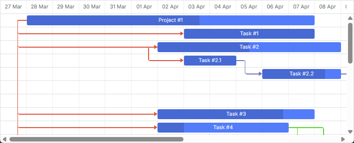
{id:1, text:"Project #1", start_date:"01-04-2013", duration:18},
{id:2, text:"Task #1", start_date:"02-04-2013", duration:8, parent:1},
{id:3, text:"Task #2", start_date:"11-04-2013", duration:8, parent:1}
],
links:[
{id:1, source:1, target:2, type:"1", color:"red"}, /*!*/
{id:2, source:2, target:3, type:"0", color:"blue"},/*!*/
{id:3, source:3, target:4, type:"0", color:"blue"},/*!*/
{id:4, source:2, target:5, type:"2", color:"green"}/*!*/
]
};
gantt.init("gantt_here");
gantt.parse(tasks);
gantt.getLink(4).color = "green";
Related sample Link colors from the "color" property
Adding a custom color via the color property is followed by adding of an inline style, which has the highest priority among other styles. As a result, the critical path won't be highlighted, and any custom style you have added to change the link color won't be applied.
In order to make the links look critical, you can use the following code:
.gantt_critical_link {
  --dhx-gantt-link-background: #e63030 !important;
}
Related sample Coloring critical tasks and links
If at least one of the properties of a link object is assigned, the link receives additional class "gantt_link_inline_color". You can use this class to override some other style for the link:
.gantt_link_inline_color {
    opacity:0.4
}
The properties can have any valid CSS color value, e.g. all of the following notations are valid:
link.color = "#FF0000";
link.color = "red";
link.color = "rgb(255,0,0)";
A similar approach can be applied to tasks. Read more about it here.