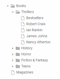
| addItem | adds a new item into TreeView |
| attachEvent | adds any user-defined handler to available events |
| checkItem | checks the item's checkbox |
| clearAll | removes all the loaded items from TreeView and repaints the component |
| closeItem | collapses an item |
| deleteChildItems | deletes child items of the node |
| deleteItem | deletes an item |
| detachEvent | detaches a handler from an event |
| disableCheckbox | disables a particular checkbox in TreeView |
| enableCheckbox | enables a particular checkbox in TreeView |
| enableCheckboxes | shows/hides checkboxes (all checkboxes in the treeview) |
| enableContextMenu | enables context menu |
| enableDragAndDrop | enables drag-n-drop in TreeView |
| enableMultiselect | allows selecting multiple items in TreeView |
| getAllChecked | returns an array of checked items' ids |
| getAllUnchecked | returns an array of unchecked items' ids |
| getItemText | returns the item's text |
| getLevel | returns the level index of the specified item |
| getParentId | returns the item's parent id |
| getSelectedId | returns the selected item's id |
| getSubItems | returns a comma-delimited list of ids of all children nested on the sublevel in relation to the specified item |
| getUserData | returns any user data set into the given input by the setUserData method |
| hideCheckbox | hides the item's checkbox |
| isCheckboxEnabled | checks if the item's checkbox is enabled |
| isCheckboxVisible | checks if the item's checkbox is visible |
| isItemChecked | returns the state of the item's checkbox |
| loadStruct | loads data to the component via XML or JSON, usually component config |
| openItem | opens the specified item |
| refreshItem | reloads subitems of the specified node |
| selectItem | selects an item |
| setIconColor | sets a color for the item's icon, if Font Awesome is used |
| setIconset | enables the font-awesome iconset |
| setItemIcons | sets custom icons for an item |
| setItemText | sets a new item's text |
| setSizes | adjusts the TreeView sizes, if dimension of its parent was changed |
| setSkin | sets a skin for TreeView |
| setUserData | allows attaching user data to a treeview without modifying the DOM |
| showCheckbox | shows the item's checkbox |
| showItem | scrolls a TreeView to make the specified item visible |
| silent | calls treeview function w/o triggering events |
| uncheckItem | unchecks the item's checkbox |
| unload | destructor, unloads TreeView |
| unselectItem | unselects the item, if it's selected |
| onAddItem | fires when a new item is added into TreeView |
| onBeforeCheck | fires before an item's checkbox is checked/unchecked, cancelable |
| onBeforeDeleteItem | fires before item's deleting |
| onBeforeDrag | fires before drag operation starts, cancelable |
| onBeforeDrop | fires before an item is dragged to another target and the mouse button is released, cancelable |
| onBeforeSelect | fires before an item is selected |
| onCheck | fires before an item's checkbox is checked/unchecked |
| onClick | fires when a TreeView item has been clicked |
| onContextMenu | fires when the user clicks on treeview items with the right mouse button |
| onDblClick | fires when a TreeView item has been double clicked |
| onDeleteItem | fires when an item is deleted |
| onDragOver | fires when when a dragged item is moved over the droppable area, cancelable |
| onDrop | fires when the dragged item is dropped |
| onSelect | fires when an item is selected |
| onTextChange | fires when the item's text is changed |
| onXLE | fires when the data loading is finished and a component or data is rendered |
| onXLS | fires when XML loading started |