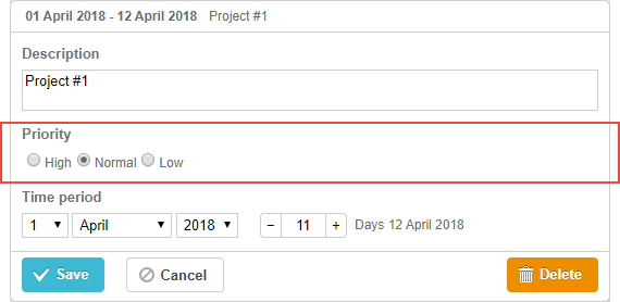
라디오 버튼 컨트�롤
이 컨트롤은 한 번에 하나만 선택할 수 있는 여러 옵션을 제공합니다.
초기화
라이트박스에 radio button 컨트롤을 포함하려면 다음과 같이 설정합니다:
- 라이트박스 설정에 섹션을 추가합니다:
var opts = [
    {key: 1, label: "High"},
    {key: 2, label: "Normal"},
    {key: 3, label: "Low"}
];

gantt.config.lightbox.sections = [
    {name: "description", height: 38, map_to: "text", type: "textarea", focus: true},
    {name: "priority", height: 22, map_to: "priority", type: "radio", options: [opts]}, /*!*/
    {name: "time", type: "duration", map_to: "auto"}
];
- 이 섹션에 대한 라벨을 정의합니다:
gantt.locale.labels.section_priority = "Priority";
속성
radio button 컨트롤에서 자주 사용되는 주요 속성은 다음과 같습��니다 (전체 목록은 여기에서 확인할 수 있습니다):
- name - (string) 섹션의 이름
- map_to - (string) 섹션이 연결되는 데이터 속성
- type - (string) 섹션 컨트롤의 타입
- options - (array) 선택 가능한 옵션을 정의하는 객체 배열 (select, checkbox, radio 컨트롤에서 사용됨). 각 객체는 하나의 옵션을 나타내며 다음을 포함합니다:
- key - (string) 해당 옵션의 식별자, 태스크 데이터와 매칭되어 옵션을 할당
- label - (string) 옵션에 표시되는 텍스트
- focus - (boolean) true로 설정 시, 라이트박스가 열릴 때 해당 섹션이 자동으로 포커스를 가짐
- default_value - (any) 입력값이 정의되지 않았을 때 적용되는 기본값
컨트롤에 데이터 채우기
radio button 컨트롤의 옵션을 지정하려면 options 파라미터를 사용합니다:
gantt.config.lightbox.sections = [
    {name: "priority", map_to: "priority", type: "radio", options: [
        {key: 1, label: "High"},
        {key: 2, label: "Normal"},
        {key: 3, label: "Low"},
    ]}
];
options 배열의 각 항목에는 두 가지 속성이 필요합니다:
- key - 옵션의 식별자
- label - 옵션에 표시되는 텍스트
Need help?
Got a question about the documentation? Reach out to our technical support team for help and guidance. For custom component solutions, visit the Services page.