Checkbox Control
이것은 옵션이나 여러 값을 켜고 끄는 데 사용되는 간단한 2-상태 체크박스 컨트롤입니다.
다음과 같은 상황에서 유용하게 사용할 수 있습니다:
Related sample: Checkbox control
gantt.config.lightbox.project_sections = [
{name: "description", height: 70, map_to: "text", type: "textarea", focus: true},
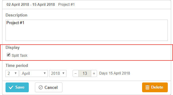
{name: "split", type:"checkbox", map_to: "render", options:[ {key:"split", label:"Split Task"} ]}, {name: "time", type: "duration", readonly: true, map_to: "auto"}
];
초기화
checkbox 컨트롤을 lightbox에 포함하려면 다음 단계를 따라야 합니다:
1) lightbox 설정에 섹션을 추가합니다:
var opts = [
    {key:"split", label:"Split Task"}
];

gantt.config.lightbox.sections = [
    {name: "description", height: 70, map_to: "text", type: "textarea", focus: true},
    {name: "split", type:"checkbox", map_to: "render", options:opts},               {name: "time", type: "duration", readonly: true, map_to: "auto"}
];
2) 해당 섹션에 라벨을 정의합니다:
gantt.locale.labels.section_split = "Display";
속성
checkbox 컨트롤과 함께 자주 사용되는 주요 속성은 다음과 같습니다 (전체 목록은 여기에서 확인할 수 있습니다):
- name - (string) 섹션의 이름
- map_to - (string) 이 섹션과 매핑되는 데이터 속성 이름
- type - (string) 섹션 컨트롤의 타입
- options - (array) 컨트롤의 선택 가능한 옵션을 정의하는 객체 배열 (* select, checkbox, radio 컨트롤에서 사용*). 각 객체에는 다음이 포함됩니다:
- key - (string) 옵션 ID, 작업 데이터 속성과 일치하는 값
- label - (string) 옵션의 표시 라벨
- focus - (boolean) true일 경우 lightbox가 열릴 때 이 섹션에 포커스가 이동합니다
- default_value - (any) 컨트롤의 기본 값, 입력 값이 정의되지 않은 경우에만 적용됨
데이터로 컨트롤 채우기
checkbox 컨트롤의 값을 설정하려면 일반적으로 options 파라미터를 사용합니다:
gantt.config.lightbox.sections = [
    {name: "split", type:"checkbox", map_to: "render", options:[
        {key:"split", label:"Split Task"}
    ]}
];
options 배열의 각 항목에는 다음 두 속성이 반드시 포함되어야 합니다:
- key - 옵션 ID
- label - 옵션 라벨