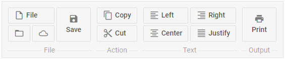
Check documentation for the latest version of dhtmlxSuite Slider Control DHTMLX Docs

Slider Control

an item having a slider in it that allows the user to change item's value within the available limits (the user can drag the slider's thumb in one of two directions):

Attributes

idstring|numberthe slider's id
typestringthe "slider" type
textstringthe slider's label
sizenumberthe slider's size
verticalbooleandefines whether the slider is vertical, false by default
minnumberthe minimal slider's value, 0 by default
maxnumberthe maximal slider's value, 99 by default
valuenumberthe initial slider's value, 0 by default
stepnumberthe slider's step value, 1 by default
disabledbooleandefines whether the slider item is enabled or disabled, false by default
enableTooltipbooleandefines whether the tooltip is enabled for the slider, false by default


myRibbon = new dhtmlXRibbon({
    parent: "myRibbon",
    icons_path: "../codebase/ribbon/",
    items : [
        {type:'block', text:'Block 1', mode:'rows', list:[
            {type:'button', text:'new' , img : "18/new.gif"},
            {type : 'slider', text : "slider 1", size : 50 },
            {type : "newLevel"},
            {type : "group", list : [
                {type:'button', text:'open' , img : "18/open.gif"},
                {type : 'slider', text : "slider 1", size : 50 }
            ]}
        ]},
        {type:'block', text:'Block 2', mode:'cols', list:[
            {type : 'slider', text : "slider 1", size : 50 },
            {type : 'slider', size : 70, isbig : true, vertical : true }
        ]}
    ]
});

Related sample:  Init from object

Back to top