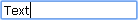
Input Control
presents a standard text input field
Attributes
| id | string|number | the input's id |
| type | string | the "input" type |
| text | string | the input's label |
| img | string | the icon of the input in the enabled state |
| imgdis | string | the icon of the input in the disabled state |
| value | string | the initial text of the input |
| disabled | boolean | defines whether the input item is enabled or disabled, false by default |
myRibbon = new dhtmlXRibbon({
    parent: "myRibbon",
    icons_path: "../codebase/ribbon/",
    items: [
        {type:'block', text:'office document', list:[
            {type: "group", list: [
                {id: "input_1", type:"input", text:"input 1"}
            ]}
                {"id":"input_2", "type":"input", "width":130},
                {"id":"input_3", "type":"input", "text":"input 3", value:"Any text"}
        ]}
    ]
});
Related sample: Init from object
Back to top