ButtonSegment Control
a horizontal control which consists of several separate buttons
Attributes
| id | string|number | the button's id |
| type | string | the "buttonSegment" type |
| text | string | the button's label |
| img | string | the icon of the button in the enabled state |
| imgdis | string | the icon of the button in the disabled state |
| isbig | boolean | defines whether the button is big or small, false by default |
| disable | boolean | defines whether the button is enabled or disabled, false by default |
| state | boolean | defines whether the button is initially clicked, false by default |
myRibbon = new dhtmlXRibbon({
parent: "myRibbon",
icons_path: "../codebase/ribbon/",
items : [
{type:'block', text:'office document', list:[
{id : "group_1", type : "group", list : [
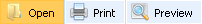
{id: "open", type:"buttonSegment", text:"Open", img : "48/open.gif"},
{id: "print",type:"buttonSegment", text:"Print" , img : "48/printer.png"},
{id: "preview",type:"buttonSegment",text:"Preview",img:"48/zoom_selection.png"}
]},
{id : "group_2", type : "group", list : [
{"id":"copy", "type":"buttonSegment", "text":"copy", "img":"48/copy.gif"},
{"id":"find","type":"buttonSegment","text":"find","img":"48/page_find.png",
state:true},
{"id":"go_to", "type":"buttonSegment", "text":"go to", "img":"48/tab_go.png"}
]},
{type:"newLevel"},
{"id":"bold", "type":"buttonSegment", "text":"bold", "img":"18/text_bold.png"},
{"id":"italis","type":"buttonSegment","text":"italic","img":"18/text_italic.png"},
{"id":"strikethrough","type":"buttonSegment","text":"strikethrough",
"img":"18/text_strikethroungh.png"}
]}
]
});
Related sample: Init from object
Back to top