Radio Button Control
A block of options that allows selecting only one of them at a time.
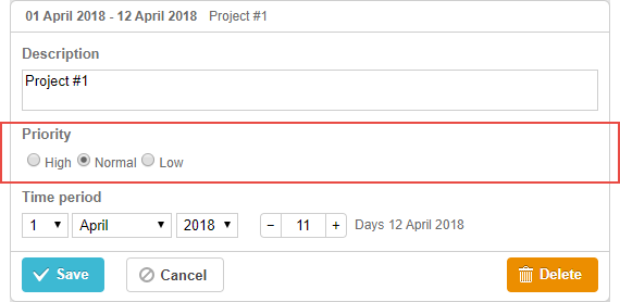
Related sample: Radio control
Initialization
To add the radio button control to the lightbox, follow these steps:
- Add a section to the lightbox configuration:
var opts = [
    { key: 1, label: "High" },
    { key: 2, label: "Normal" },
    { key: 3, label: "Low" }
];

gantt.config.lightbox.sections = [
    { name: "description", height: 38, map_to: "text", type: "textarea", focus: true },
    { name: "priority", height: 22, map_to: "priority", type: "radio", options: [opts] },
    { name: "time", type: "duration", map_to: "auto" }
];
- Set a label for the section:
gantt.locale.labels.section_priority = "Priority";
Related sample: Radio control
Properties
The following properties are mostly important and commonly set for the radio button control (see the full list here):
- name - (string) the section name
- map_to - (string) the name of a data property that will be mapped to the section
- type - (string) the type of the section control
- options - (array) an array of objects. Defines select options of the control (used for the select, checkbox and radio controls). Each object in the array specifies a single option and takes
the following properties:
- key - (string) the option id. This attribute is compared with the task data property to assign options to tasks
- label - (string) the option label
- focus - (boolean) if set to true, the section will take focus on opening the lightbox
- default_value - (any) the default value of the section's control. Applied only if the input value is underfined
Populating control with data
Generally, to set values for the radio button control, use the options parameter:
gantt.config.lightbox.sections = [
    { name: "priority", map_to: "priority", type: "radio", options: [
        { key: 1, label: "High" },
        { key: 2, label: "Normal" },
        { key: 3, label: "Low" },
    ] }
];
Items in the options parameter have 2 mandatory properties:
- key - the option id
- label - the option label
Need help?
Got a question about the documentation? Reach out to our technical support team for help and guidance. For custom component solutions, visit the Services page.