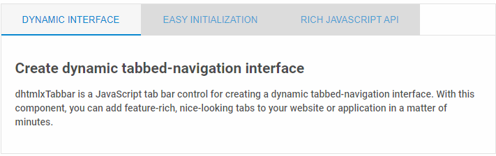
| addTab | adds a new tab to Tabbar |
| adjustOuterSize | adjusts the tabbar's size when the parent's size was changed |
| attachEvent | adds any user-defined handler to available events |
| attachFooter | attaches footer to component's bottom |
| attachHeader | attaches header to component's top |
| attachMenu | attaches dhtmlxMenu to component's top |
| attachRibbon | attaches dhtmlxRibbon to component's top |
| attachStatusBar | attaches a status bar object to component's bottom |
| attachToolbar | attaches dhtmlxToolbar to component's top |
| cells | returns dhtmlXTabBarCell instance (tabbar's tab) |
| clearAll | removes all tabs |
| destructor | unloads the tabbar |
| detachEvent | detaches a handler from an event |
| detachFooter | detaches footer from component's bottom |
| detachHeader | detaches header from component's top |
| detachMenu | detaches dhtmlxMenu from component's top |
| detachRibbon | detaches dhtmlxRibbon from component's top |
| detachStatusBar | detaches status bar object from component's bottom |
| detachToolbar | detaches dhtmlxToolbar from component's top |
| disableTab | disables the specified tab in the tabbar |
| enableAutoReSize | enables/disables automatic adjusting of height and width to the outer container |
| enableAutoSize | enables/disables auto adjusting of height and width to the inner content |
| enableContentZone | enables/disables the content zone |
| enableForceHiding | enables/disables the force hiding mode |
| enableScroll | enables/disables scrolls (enabled by default) |
| enableTab | enables the specified tab in the tabbar |
| enableTabCloseButton | enables/disables a "close" button for tabs |
| forEachCell | an iterator, calls a user-defined handler for each tab |
| forEachTab | an iterator, calls a user-defined handler for each tab |
| forceLoad | reloads the URL attached to a cell |
| getActiveTab | returns id of the active tab |
| getAllTabs | returns an array of the tabbar tabs' ids |
| getAttachedMenu | returns dhtmlxMenu instance attached to component's top |
| getAttachedRibbon | returns dhtmlxRibbon instance attached to component's top |
| getAttachedStatusBar | returns status bar object attached to component's bottom |
| getAttachedToolbar | returns dhtmlxToolbar instance attached to component's top |
| getIndex | returns the tab's index |
| getLabel | returns the tab's text |
| getNumberOfTabs | returns the number of tabs |
| goToNextTab | selects the tab next to the active one |
| goToPrevTab | selects the tab prev to the active one |
| hideMenu | hides dhtmlxMenu attached to component's top |
| hideRibbon | hides dhtmlxRibbon attached to component's top |
| hideStatusBar | hides status bar object attached to component's bottom |
| hideTab | hides the specified tab |
| hideToolbar | hides dhtmlxToolbar attached to component's top |
| loadStruct | loads data to the component via XML or JSON, usually component config |
| loadXML | loads tabs config via xml |
| loadXMLString | loads tabs config via xml string |
| moveTab | moves the specified tab to the specified position |
| normalize | reformats the tabbar to remove the tab's scrolls |
| progressOff | hides progress indicator for full component |
| progressOn | shows progress indicator for full component |
| removeTab | removes the specified tab from the tabbar |
| setAlign | aligns tabs within the tabbar |
| setArrowsMode | sets the mode for auto show/hide left-right tabs arrows |
| setContent | sets the content of a tab |
| setContentHTML | sets the content of a tab as an HTML string |
| setContentHref | sets the content as the href to an external file |
| setCustomStyle | sets some specific colors for the specific tab |
| setHrefMode | sets the mode that allows loading of external content |
| setImagePath | sets the path to the image's folder |
| setLabel | sets the text of a tab |
| setMargin | sets the distance between tabs |
| setOffset | sets an offset before the first tab in the tabbar |
| setOffsets | sets offsets for parent container from each side |
| setSize | sets control size |
| setSizes | adjusts the size of the tabbar when the parent's size is changed |
| setSkin | changes the tabbar's skin |
| setSkinColors | allows setting skin to the specific color |
| setStyle | sets tab style |
| setTabActive | selects the specified tab |
| setTabInActive | unselects any selected tab |
| setTabsMode | sets tabs' mode (top or bottom) |
| showInnerScroll | shows inner cell scrolls |
| showMenu | shows dhtmlxMenu attached to component's top |
| showRibbon | shows dhtmlxRibbon attached to component's top |
| showStatusBar | shows status bar object attached to component's bottom |
| showTab | shows the specified tab |
| showToolbar | shows dhtmlxToolbar attached to component's bottom |
| tabWindow | returns iframe when an URL is attached to a cell |
| tabs | returns dhtmlXTabBarCell instance (tabbar's tab) |
| unload | unloads tabbar (destructor) |