Customizing Vault
Toolbar controls
By default the toolbar of dhtmlxVault has three icon buttons:
- the Add icon button for adding files into Vault (id:"add")
- the Upload icon button for upload files to the server (id:"upload") (if the automatic upload is disabled by the autosend:false property)
- the Clear all icon button for clearing the list of files for upload (id: "remove-all")
To add new controls to the toolbar and delete unnecessary ones, you should make use of the toolbar data collection API. It will be described in detail in the next sections of this chapter.
Using icons
dhtmlxVault uses the Material Design Icons for toolbar controls by default. You can also use a different icon font. To apply a different icon font, e.g. Font Awesome, include it on the page with dhtmlxVault and use desired icons in the toolbar.
Font Awesome can be used from CDN. It should be included after vault.js and vault.css files like this:
<script type="text/javascript" src="../../codebase/vault.js"></script>
<link rel="stylesheet" type="text/css" href="../../codebase/vault.css">
<link rel="stylesheet"
href="https://use.fontawesome.com/releases/v5.0.8/css/all.css"
integrity="sha384-mzrmE5qonljUremFsqc01SB46JvROS7bZs3IO2EmfFsd15uHvIt+Y8vEf7N7fWAU"
crossorigin="anonymous">
Then you can apply any Font Awesome icon for toolbar icon buttons. Use the name of the icon as the value of the icon property in the object with the control parameters. See details below.
Adding controls
To add a control into the toolbar, apply the vault.toolbar.data.add() method. It takes as parameters an object with the control config and the index of the position to place the icon button into:
vault.toolbar.data.add({
    type: "iconButton",
    id: "buttonId",
    tooltip: "Some tooltip",
    icon: "icon name"
}, 2);
The object of an icon button has the following properties:
- type - the type of a button, set it to the "iconButton" value
- id - the id of an icon button
- tooltip - the tooltip of an icon button
- css - the CSS style to apply to an icon button
- icon - the name of an icon from the used icon font
- twoState - the flag that defines whether an icon button can be used in two states
- active - specifies the state of an icon button: true - active, false - inactive
For example:
vault.toolbar.data.add({
    type: "iconButton",
    id: "calc-size",
    tooltip: "calculate total size",
    icon: "fas fa-calculator"
}, 4);
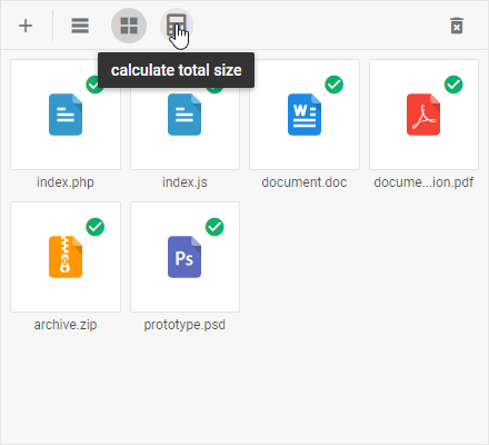
Related sample: Vault. Custom button
Updating controls
You can change the icon of the Toolbar control and its other config options with the help of the vault.toolbar.data.update() method. It takes two parameters:
- the id of an icon button
- an object with new configuration of the control
vault.toolbar.data.update("add", {
    icon: "icon_name"
});
In the example below the default icons of the toolbar icon buttons are changed to Font Awesome ones:
vault.toolbar.data.update("add", {icon: "far fa-plus-square"});
vault.toolbar.data.update("remove-all", {icon: "far fa-trash-alt"});
vault.toolbar.data.update("upload", {icon: "far fa-save"});
Related sample: Vault. Custom icons for toolbar
Deleting controls
To remove a control from the toolbar, make use of the vault.toolbar.data.remove() method. Pass the id of the control that should be removed to the method:
vault.toolbar.data.remove("switch");
Icons for files extensions
Vault provides icons for various types of files. Similar files extensions are combined into groups, for example: the "icon_image" group contains jpg,gif,png,etc. extensions and for all types in the group Vault uses the same icon. For all extensions that do not suit any of the groups the default icon is used.
Default icons
| Group | Icon | Extensions |
|---|---|---|
| icon_image |  |
jpg, jpeg, gif, png, bmp, tiff, pcx, svg, ico |
| icon_psd |  |
psd |
| icon_video |  |
avi, mpg, mpeg, rm, move, mov, mkv, flv, f4v, mp4, 3gp, wmv, webm, vob |
| icon_audio |  |
wav, aiff, au, mp3, aac, wma, ogg, flac, ape, wv, m4a, mid, midi |
| icon_arch |  |
rar, zip, tar, tgz, arj, gzip, bzip2, 7z, ace, apk, deb, zipx, cab, tar-gz, rpm, xar |
| icon_text |  |
txt, nfo, djvu, xml, tex |
| icon_html |  |
html, htm, eml |
| icon_doc |  |
doc, docx, docm, dot, dotx, odt, wpd, wps, pages, rtf |
| icon_pdf |  |
pdf, ps, eps |
| icon_xls |  |
xlr, xls, xlsm, xlsx, ods, csv, tsv |
| icon_exe |  |
exe |
| icon_dmg |  |
dmg |
| icon_ppt |  |
pot, potm, potx, pps, ppsm, ppsx, ppt, pptx, pptm, odp |
| other |  |
for all other formats the default icon is used |
Custom icons for file extensions
To specify custom icons for file extensions, you need to change the related styles. A style for a particular group of extensions has a name formed as .extension-[name], like .extension-js. To change the default icon of a group, set the path to a custom icon as a background of the corresponding style:
<style>
    .extension-js {
        background: url(../JS-custom.svg) no-repeat center center!important;
    }
    .extension-doc {
        background: url(../DOC-custom.svg) no-repeat center center!important;
    }
</style>
Related sample: Vault. Custom icons for files
Status bar
You can add a status bar for Vault to show some information about the files in the queue. A status bar can be placed in any place on a page and contain any data related to files.
For example, here is an example of a status bar that shows the number of files and their size:
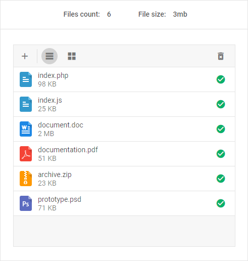
To reproduce the same implementation, follow the step-by-step instruction below:
- specify the structure of the status bar
The container of the status bar has the "info-line" class. Add two more divs for the number of files and the size of files. In their turn, they will have two more divs each: for value and text. You can also wrap the div with status bar into another container to present it in a separate block:
<div class="top-rect-block">
<div class="info-line">
<div class="files-count">
<div id="files-count-value" class="number-value">0</div>
<div class="text-value">Files / </div>
</div>
<div class="files-size">
<div id="files-size-value" class="number-value">0</div>
<div id="files-size-text" class="text-value">b</div>
</div>
</div>
</div>
- define a container for Vault and initialize it
<div id="vault" class="container with-header"></div>

var vault = new dhx.Vault("vault", {
    uploader: {
       target: "/backend/upload"
    }
});
- use the Change event to describe that on each change in the list of files Vault should iterate through its data collection and calculate the number of files, their total size and change the text for size units accordingly:
vault.events.on("change", function() {
    var count = vault.data.getLength();

    var size = vault.data.reduce(function(sum, item) {
        return sum + item.size;
    }, 0);
    filesCountValue.textContent = count;

    var basis = getBasis(size, 0, true);

    filesSizeValue.textContent = basis.size;
    filesSizeText.textContent = basis.metric;
});
- provide variables that will write the resulting values into the corresponding divs of the status bar:
var filesCountValue = document.getElementById("files-count-value");
var filesSizeValue = document.getElementById("files-size-value");
var filesSizeText = document.getElementById("files-size-text");
Related sample: Vault. Info line
Back to top