Integrating Vault with Angular
You should be familiar with the basic concepts and patterns of Angular to use this documentation. If you are not, please refer to the Angular documentation for a getting-started tutorial.
DHTMLX Vault is compatible with Angular. You can check the corresponding example on GitHub: DHTMLX Vault with Angular Demo.
Creating a project
Before you start to create a new project, install Angular CLI and Node.js.
Create a new my-angular-vault-app project using Angular CLI. Run the following command for this purpose:
ng new my-angular-vault-app
The above command will install all the necessary tools and dependencies, so you don't need any additional commands.
Installation of dependencies
After that go to the app directory:
cd my-angular-vault-app
Then run the app with one of the following commands:
yarn start
or
npm start
Now the app should be running on http://localhost:4200.
Creating Vault
Now we should get the DHTMLX Vault code. First of all, we need to stop the app by pressing Ctrl+C in the command line. Then we can proceed with installing the Vault package.
Step 1. Package installation
There are two options available: you can install the Pro package from a local folder or install the trial version using npm or yarn.
Installing the package from a local folder
- Copy the Vault package into some local directory inside the project
- In the project directory run the command below replacing vault-local-package-path with the actual path:
npm install ./vault-local-package-path
//or
yarn add "./vault-local-package-path"
For example:
npm install ./vault_5.0.0_enterprise
// or
yarn add "./vault_5.0.0_enterprise"
Installing the trial version via a package manager
You can install the trial version of Vault using npm or yarn commands:
- for npm:
npm config set @dhx:registry https://npm.dhtmlx.com
npm i @dhx/trial-vault
- for yarn:
yarn config set @dhx:registry https://npm.dhtmlx.com
yarn add @dhx/trial-vault
To get Vault under the proprietary license, refer to the Support Center!
Step 2. Component creation
Now we should create a component, to add a Vault into the application. Let's create the vault folder in the src/app/ directory, add a new file into it and call it vault.component.ts. Then complete the steps described below.
Importing source files
Open the file and import Vault source files. Note that:
- if you've installed the Vault package from a local folder, your import paths will look like this:
vault.component.ts
import { Vault } from 'dhx-vault-package';
import 'dhx-vault-package/codebase/vault.css';
Note that depending on the used package, the source files can be minified. In this case make sure that you are importing the CSS file as vault.min.css.
- if you've chosen to install the trial version, the import paths should be as in:
vault.component.ts
import { Vault } from '@dhx/trial-vault';
import '@dhx/trial-vault/codebase/vault.min.css';
In this tutorial we will use the trial version of Vault.
Setting the container and adding Vault
To display Vault on the page, we need to set the container to render the component inside. Use the code below:
vault.component.ts
import { Vault } from '@dhx/trial-vault';
import '@dhx/trial-vault/codebase/vault.min.css';
import { Component, ElementRef, OnInit, OnDestroy, ViewChild} from '@angular/core';

@Component({
  selector: 'vault',
  template: '<div #vaultContainer></div>',
})
export class VaultComponent implements OnInit, OnDestroy {
  @ViewChild('vaultContainer', { static: true }) vaultContainer!: ElementRef;

  private _vault: any;
}
Then we need to render our Vault in the container. To do that, use the ngOnInit() method of Angular:
vault.component.ts
import { Vault } from '@dhx/trial-vault';
import '@dhx/trial-vault/codebase/vault.min.css';
import { Component, ElementRef, OnInit, OnDestroy, ViewChild} from '@angular/core';

@Component({
  selector: 'vault',
  template: '<div #vaultContainer></div>',
})
export class VaultComponent implements OnInit, OnDestroy {
  @ViewChild('vaultContainer', { static: true }) vaultContainer!: ElementRef;

  private _vault: any;

  ngOnInit() {      let vault = new Vault(this.vaultContainer.nativeElement,{});       this._vault = vault;   }
  ngOnDestroy() {
    this._vault.destructor();
  }
}
In the above code we've also specified the ngOnDestroy() method that contains the vault.destructor() call to clear the component when it is no longer needed.
Loading data
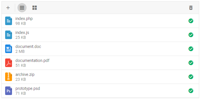
To add data into the Vault, we need to provide a data set. Let's create the data.ts file in the src/app/vault/ directory and add some data into it:
data.ts
export function getData(): any {
  return [
    {
      size: '100000',
      name: 'index.php',
    },
    {
      size: '25555',
      name: 'index.js',
    },
    {
      size: '2555412',
      name: 'document.doc',
    },
    {
      size: '52555',
      name: 'documentation.pdf',
    },
    {
      size: '23555',
      name: 'archive.zip',
    },
    {
      size: '72555',
      name: 'prototype.psd',
    },
  ];
}
Then open the vault.component.ts file. Import the file with data and add the vault.data.parse() call into the ngOnInit() method, as shown below. It will reload data on each applied change.
This is what you need to do in detail:
- add the line for importing the data file after imports of Vault sources:
vault.component.ts
import { Vault } from '@dhx/trial-vault';
import '@dhx/trial-vault/codebase/vault.min.css';
import { getData } from './data';
- complete the ngOnInit() method with vault.data.parse():
vault.component.ts
ngOnInit() {
  let vault = new Vault(this.vaultContainer.nativeElement,{});
    vault.data.parse(getData());
    this._vault = vault;
}
Now the Vault component is ready. When the element will be added to the page, it will initialize the Vault object with data. You can provide necessary configuration settings as well. Visit our Vault API docs to check the full list of available properties.
Handling events
When a user makes some action in the Vault, it invokes an event. You can use these events to detect the action and run the desired code for it. See the full list of events.
Open the vault.component.ts file and complete the ngOnInit() method as in:
vault.component.ts
ngOnInit() {
  let vault = new Vault(this.vaultContainer.nativeElement,{});
  vault.data.parse(getData());

  this._vault = vault;

  this._vault.events.on('ActionName', () => {     // do something    });  }
Replace 'ActionName' with the actual name of the event you want to handle, and implement the corresponding code inside the callback function. Get more information about the work with events in the Handling Events article.
Step 3. Adding Vault into the app
Now it's time to add the component into our app. Open src/app/app.component.ts and use VaultComponent instead of the default content by inserting the code below:
app.component.ts
import { Component } from "@angular/core";

@Component({
  selector: "app-root",
  template: `<vault></vault>`,
})
export class AppComponent {
  name = "";
}
Then create the app.module.ts file in the src/app/ directory and insert the VaultComponent as provided below:
app.module.ts
import { NgModule } from "@angular/core";
import { BrowserModule } from "@angular/platform-browser";

import { AppComponent } from "./app.component";
import { VaultComponent } from "./vault/vault.component";

@NgModule({
  declarations: [AppComponent, VaultComponent],
  imports: [BrowserModule],
  providers: [],
  bootstrap: [AppComponent],
})
export class AppModule {}
For correct rendering of fonts, open the angular.json file and complete the "assets" array in the following way (replace vault_package with the name of your local folder that contains Vault source files):
angular.json
...
"assets": [
  "src/favicon.ico",
  "src/assets",
  {     "input": "./vault_package/codebase/fonts",     "glob": "**/*",     "output": "assets"   } ],
...
The last step is to open the src/main.ts file and replace the existing code with the following one:
main.ts
import { platformBrowserDynamic } from "@angular/platform-browser-dynamic";
import { AppModule } from "./app/app.module";
platformBrowserDynamic()
  .bootstrapModule(AppModule)
  .catch((err) => console.error(err));
After that, when we start the app, we should see Vault loaded with data on a page.
Now you should have a basic setup for integrating DHTMLX Vault with Angular using Angular CLI. You can customize the code according to your specific requirements.
Back to top