CSS 문서
이 문서에서는 Gantt 차트 요소의 기본 색상 설정을 사용자 정의 스타일로 덮어쓰는 방법을 설명합니다. 주요 class 선택자와 Gantt 차트의 다양한 부분을 스타일링하기 위한 템플릿을 다룹니다: 그리드 영역, 타임라인 영역, 리소스 패널.
그리드 스타일링
여기서는 그리드 영역의 주요 요소를 스타일링하는 데 사용되는 CSS 선택자를 확인할 수 있습니다.
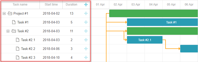
그리드 요소의 DOM 구조는 다음과 같습니다:
- .gantt_grid
    - .gantt_grid_scale
        - .gantt_grid_head_cell
    - .gantt_grid_data
        - .gantt_row.odd
        - .gantt_row
        - .gantt_row.gantt_row_task
        - .gantt_row.gantt_row_project
        - .gantt_row.gantt_row_milestone
            - gantt_cell.gantt_cell_tree
                - .gantt_tree_indent
                - .gantt_tree_icon.gantt_close
                - .gantt_tree_icon.gantt_open
                - .gantt_tree_content
            - gantt_cell
                - .gantt_tree_content
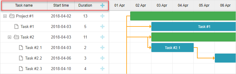
그리드 헤더
그리드 헤더의 스타일은 .gantt_grid_scale 클래스 선택자를 사용하여 사용자 정의할 수 있습니다.
다음은 그리드와 타임라인 헤더 모두에 공통 배경색과 글꼴 색상을 지정하는 예시입니다:
.gantt_grid_scale, .gantt_task_scale, .gantt_task_vscroll {
    background-color: #eee;
}
.gantt_grid_scale, .gantt_task_scale,
.gantt_task .gantt_task_scale .gantt_scale_cell,
.gantt_grid_scale .gantt_grid_head_cell {
    color: #000;
    font-size: 12px;
    border-bottom: 1px solid #cecece;
}
Related sample: Styling grid and timeline headers
스케일 높이
CSS로 그리드 헤더와 타임스케일의 높이를 변경하지 마세요.
대신, Gantt의 scale_height 구성 속성을 사용하세요:
gantt.config.scale_height = 50;
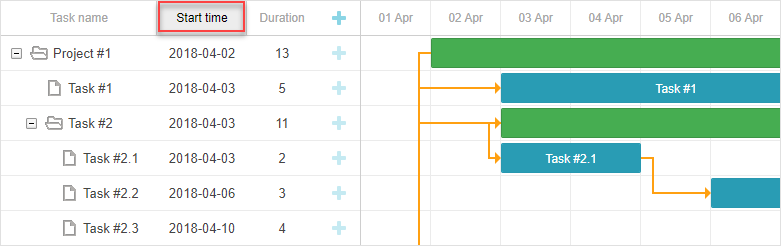
그리드 헤더의 셀
그리드 헤더의 셀을 스타일링하려면 .gantt_grid_head_cell 선택자를 사용하세요.
셀을 타겟팅하는 선택자:
- .gantt_grid_head_cell[data-column-id='columnName'] — 특정 컬럼의 셀을 선택합니다;
여기서 columnName은 column의 name 속성에 해당합니다:
<style>
    .gantt_grid_head_cell[data-column-id='columnName'] {
        background-color: #ededed;
        color:black;
    }
</style>
gantt.config.columns = [
    ...
    {name: "columnName", align: "center"},
    ...
];
Related sample: Styling a particular cell in the grid header
- .gantt_grid_head_cell[data-column-index='1'] — 컬럼 인덱스로 선택;
- .gantt_grid_head_cell[data-column-name='start_date'] — 컬럼 이름으로 선택.
그리드 본문
.gantt_grid_data 선택자에 CSS 스타일을 적용하여 그리드 본문의 색상을 사용자화할 수 있습니다.
그리드 행 스타일링
그리드 행의 스타일은 .gantt_row 선택자로 변경할 수 있습니다.
홀수 행 스타일링
교차 행(홀수 행)을 스타일링하려면 .gantt_row.odd 선택자에 CSS를 적용하세요. 예:
.gantt_row.odd{
    background-color:#f4f4fb;
}
Related sample: Styling every other row in grid
화면상에서는 짝수 행이 강조되어 보이지만, 실제로는 row indexes에서 홀수 인덱스(1, 3, 5 등)에 스타일이 적용됩니다.
선택된 행
그리드에서 선택된 행을 스타일링하려면 .gantt_row.gantt_selected 선택자를 사용하세요:
.gantt_grid_data .gantt_row.gantt_selected,
.gantt_grid_data .gantt_row.odd.gantt_selected,
.gantt_task_row.gantt_selected {
    background-color: #fff3a1;
}
Related sample: Styling selected row
작업, 프로젝트, 마일스톤 행
작업, 프로젝트, 마일스톤 행은 아래 선택자로 스타일링할 수 있습니다:
- .gantt_row.gantt_row_task
- .gantt_row.gantt_row_project
- .gantt_row.gantt_row_milestone
예시:
.gantt_row.gantt_row_project{
   background-color:#fafafa;
   font-weight: bold;
}
Related sample: Styling rows of project tasks
특정 행
특정 행에 사용자 정의 클래스를 추가하려면 grid_row_class 템플릿을 사용하세요:
<style>
    .highlighted_task.gantt_row {
        background-color: #ff9668;
        border-color: rgba(0,0,0,0.3);
    }
</style>
gantt.templates.grid_row_class = function(start, end, task){
    if(task.highlight){
        return "highlighted_task";     }
    return "";
};
Related sample: Styling a particular row in the grid
행 높이
행 높이는 row_height 설정으로 조정할 수 있습니다:
gantt.config.row_height = 40;
또는 작업별로 row_height 속성을 지정할 수 있습니다:
{ id: 2, text: "Task #1", start_date: "02-04-2018",
    duration: 8, row_height:40, parent: 1 },
CSS로 행 높이를 변경하면 레이아웃이 깨질 수 있으니 권장하지 않습니다.
그리드 셀/컬럼 스타일링
그리드의 셀이나 컬럼은 .gantt_row .gantt_cell로 스타일링할 수 있습니다.
특정 컬럼을 스타일링하려면 아래와 같이 할 수 있습니다:
- .gantt_row .gantt_cell[data-column-name='columnName'] — 컬럼 이름으로 타겟팅, 예시:
.gantt_grid_head_cell[data-column-id='start_date'],
.gantt_row .gantt_cell[data-column-name='start_date'] {
    background-color: #ededed;
    color:black;
}
Related sample: Styling a column in grid
.gantt_grid_head_cell과 .gantt_cell은 각각 data-column-id와 data-column-name 속성을 사용합니다. 이 불일치는 향후 릴리즈에서 해결될 예정입니다.
- 또는, .gantt_row .gantt_cell[data-column-index='1']로 컬럼 인덱스로 타겟팅할 수 있습니다.
타임라인 스타일링
이 섹션에서는 타임라인 영역 요소의 기본 스타일을 사용자 정의할 수 있는 CSS 선택자를 설명합니다.
타임라인 영역의 DOM 구조는 다음과 같습니다:
- .gantt_task
    - .gantt_task_scale
        - .gantt_scale_line
            - .gantt_scale_cell
    - .gantt_data_area
        - .gantt_task_bg
            - .gantt_task_row
            - .gantt_task_row.odd
                - .gantt_task_cell
        - .gantt_links_area
            - .gantt_task_link
        - .gantt_bars_area
            - .gantt_task_line
                - .gantt_task_progress_wrapper
                    - .gantt_task_progress
                - .gantt_task_progress_drag
                - .gantt_task_content
                - .gantt_task_drag.task_start_date
                - .gantt_task_drag.task_end_date
                - .gantt_link_control.task_start_date
                - .gantt_link_control.task_end_date
                    - .gantt_link_point
        - div - custom layers
타임스케일
타임스케일의 DOM 구조는 다음과 같습니다:
- .gantt_task_scale
    - .gantt_scale_line
        - .gantt_scale_cell
타임스케일 컨테이너
.gantt_task_scale 선택자는 타임스케일의 컨테이너를 타겟팅합니다.
예를 들어, 타임스케일의 글꼴 색상과 테두리를 변경하려면:
.gantt_grid_scale, .gantt_task_scale {
    border-bottom: 1px solid #0e0e0e;
}

.gantt_task .gantt_task_scale .gantt_scale_cell {
    color: #000;
}
.gantt_grid_scale .gantt_grid_head_cell {
    color: #000;
}
Related sample: Styling text and borders of the time scale
타임스케일 라인
.gantt_scale_line 선택자를 사용하여 전체 타임스케일을 스타일링할 수 있습니다. 위치별로 특정 타임스케일을 타겟팅하려면 .gantt_scale_line:nth-child(n)을 사용하세요.
예시, 각 스케일별 배경색을 지정:
.gantt_scale_line:nth-child(1){
    font-weight:bold;
    background-color:#eee;
}
.gantt_scale_line:nth-child(2){
    background-color:#fff;
}
Related sample: Background color of the time scale
기본적으로 단위별로 타임스케일을 타겟팅하는 CSS 클래스는 없지만, scale_row_class 템플릿을 사용하여 추가할 수 있습니다.
month, week, day 등 다양한 스케일을 스타일링하는 방법:
<style>
    .gantt_scale_line.month_scale{
        font-weight:bold;
        background-color:#ddd;
    }
    .gantt_scale_line.week_scale{
        background-color:#e1e1e1;
    }

    .gantt_scale_line.day_scale{
        background-color:#efefef;
    }
</style>
gantt.templates.scale_row_class = function(scale){
    return scale.unit + "_scale";
};
Related sample: Styling different time scales
타임스케일 셀
.gantt_scale_cell 선택자를 사용하여 타임스케일의 개별 셀을 스타일링할 수 있습니다.
예를 들어, 글꼴 색상과 테두리 변경:
.gantt_task .gantt_task_scale .gantt_scale_cell {
    color: #a6a6a6;
    border-right: 1px solid #ebebeb;
}
Related sample: Styling text and borders of the scale cells
타임스케일에서 특정 날짜를 강조하려면 gantt.config.scales 객체의 css 속성을 사용하세요:
gantt.config.scales = [
    {unit: "month", step: 1, format: "%Y %M"},
    {unit: "day", step: 1, format: "%l, %F %d", css: function(date){
        if(!gantt.isWorkTime({date: date, unit: "day"})){
            return "weekend";
        }
        return "";
    }}
];
<style>
    .gantt_scale_cell.weekend {
        background-color: #F5F5F5;
    }
</style>
Related sample: Duration includes only working days
전체 컬럼에 색상을 적용하려면, 이후에 설명할 timeline_cell_class 템플릿을 사용하세요.
데이터 영역
데이터 영역의 DOM 구조는 다음과 같습니다:
- .gantt_data_area
    - .gantt_task_bg
        - .gantt_task_row
        - .gantt_task_row.odd
            - .gantt_task_cell
    - .gantt_links_area
        - .gantt_task_link
    - .gantt_bars_area
        - .gantt_task_line
            - .gantt_task_progress_wrapper
                - .gantt_task_progress
            - .gantt_task_progress_drag
            - .gantt_task_content
            - .gantt_task_drag.task_start_date
            - .gantt_task_drag.task_end_date
            - .gantt_link_control.task_start_date
            - .gantt_link_control.task_end_date
                - .gantt_link_point
    - div - custom layers
작업(Task)
작업 바(Task bar)
작업 바의 외형을 사용자 정의하려면 .gantt_task_line 선택자에서 직접 스타일을 정의하세요.
아래는 작업 바의 테두리 스타일을 변경하는 예시입니다:
.gantt_task_line {
    border-radius: 14px;
}
Related sample: Styling borders of the task bars
작업 바의 색상을 조정하려면 다음 두 단계를 따르세요:
- 작업 바에 사용자 색상을 적용할 때, 테두리와 진행 바(progress bar) 스타일도 덮어써서 색상이 일치하도록 합니다:
.gantt_task_line{
    border-color: rgba(0, 0, 0, 0.25); /* 25% 투명도의 검정색 */
}
.gantt_task_line .gantt_task_progress {
    background-color: rgba(0, 0, 0, 0.25);
}
- 작업 바와 그 내부 콘텐츠의 원하는 색상을 지정합니다:
.gantt_task_line{
    background-color: #03A9F4;
}
.gantt_task_line.gantt_task_content {
    color: #fff;
}
작업 바에 다양한 색상을 적용하고, 테두리와 진행 바의 색상도 일치시키는 방법에 대한 예시는 Task Coloring 문서에서 확인할 수 있습니다.
작업, 프로젝트, 또는 마일스톤 행(row)에 색상을 지정하려면, 해당 클래스 선택자에 사용자 CSS를 추가하세요:
- .gantt_task_line.gantt_bar_task
- .gantt_task_line.gantt_bar_project
- .gantt_task_line.gantt_bar_milestone
선택된 바를 스타일링하는 예시는 다음과 같습니다:
.gantt_task_line.gantt_selected {
    box-shadow: 0 2px 5px #000;
}

.gantt_task_line.gantt_bar_project.gantt_selected {
    box-shadow: 0 2px 5px #000;
}
Related sample: Styling selected bar
사용자 정의 타입의 작업은 해당 타입을 반영하는 클래스 이름을 가집니다:
{
    id: 2, text: "Task #1", start_date: "02-04-2018", duration: 8,
    type:"custom_type", parent: 1 },
이 경우 선택자는 .gantt_task_line.gantt_bar_custom_type가 됩니다.
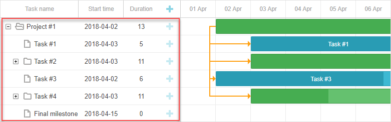
분할 작업(Split tasks)
분할 작업은 상위 항목의 하위 작업입니다. 배경의 연한 초록색 바는 상위 항목의 바를 나타내며, 별도로 스타일링됩니다.
Related sample: Expand and collapse split tasks
예시를 열고 ‘Task #2’를 확장하면 ‘Task #2’ 요약 항목의 초록 바를 볼 수 있습니다.
분할 작업이 한 행에 표시될 때, 이 초록 바는 같은 위치를 유지하지만 투명도(opacity)와 z-index가 조정됩니다.
타임라인 내의 다른 바처럼 스타일을 지정하거나, 아래 CSS로 완전히 숨길 수 있습니다:
.gantt_task_line.gantt_split_parent {
    display: none;
}
분할 작업이 하나만 있는 경우, 요약 항목(type=“project”)은 분할 작업에 완전히 가려져 보이지 않게 됩니다. 분할 하위 작업이 없으면, 요약 항목은 기본 날짜와 기간을 유지합니다.
진행 바(Progress bar)
진행 바를 스타일링하려면 다음 선택자를 사용하세요:
- .gantt_task_progress — 진행 바의 채우기 색상 변경
- .gantt_task_progress_drag — 진행 바의 드래그 핸들 스타일링
아래는 작업 바와 진행 바를 CSS로 사용자 정의하는 예시입니다:
- 배경, 텍스트, 진행 색상 변경:
/* 작업 */

/* 작업 바의 배경색 */
.gantt_task_line {
    background-color: #3db9d3;
    border: 1px solid #2898b0;
}

/* 텍스트 색상 */
.gantt_task_line .gantt_task_content {
    color: #fff;
}

/* 진행 바 채우기 */
.gantt_task_progress {
    background: #299cb4;
}
- 프로젝트(요약) 바 스타일링:
/* 프로젝트 */
/* 프로젝트 바의 배경색 */
.gantt_task_line.gantt_bar_project {
    background-color: #65c16f;
    border: 1px solid #3c9445;
}

/* 프로젝트 바의 진행 */
.gantt_task_line.gantt_bar_project .gantt_task_progress {
    background-color: #46ad51;
}
- 마일스톤 바 스타일링:
/* 마일스톤 */
.gantt_task_line.gantt_milestone {
    background-color: #d33daf;
    border: 0 solid #61164f;
}
Related sample: Background, foreground, and progress colors. Styling Project and Milestone bars.
특정 작업 바에 사용자 색상 지정
특정 작업 바에 색상을 지정하려면 gantt.templates.task_class 템플릿을 통해 사용자 클래스를 추가하세요:
gantt.templates.task_class = function(start, end, task){
    if(task.highlight){
        return "highlighted_task";
    }
    return "";
};
그리고 CSS에서 해당 클래스를 스타일링합니다:
.highlighted_task.gantt_task_line {
    background-color: #ff9668;
    border-color: rgba(0,0,0,0.3);
}
.highlighted_task .gantt_task_progress {
    text-align: center;
    z-index: 0;
    background: rgba(0,0,0,0.3);
}
Related sample: Styling particular task bars
작업 바 내부 영역 강조
작업 바 내부의 특정 영역을 강조하려면 gantt.templates.task_text 템플릿을 사용해 바 안에 추가 요소를 삽입하세요:
gantt.templates.task_text = function(start, end, task){
    return '<div class="custom_progress warm_up" style="width:20%"></div>' +
      '<div class="custom_progress in_progress" style="width:60%">'+task.text+'</div>'
      '<div class="custom_progress cool_down" style="width:20%"></div>';
};
그리고 해당 요소의 스타일을 정의합니다:
.custom_progress {
    display: inline-block;
    vertical-align: top;
    text-align: center;
    height: 100%;
}

.custom_progress.nearly_done {
    background-color: #4CC259;
}

.custom_progress.in_progress {
    background-color: #88BFF5;
}

.custom_progress.idle {
    background-color: #d96c49;
}
Related sample: Custom html content (Stackbar)
링크(Link)
링크의 DOM 구조는 다음과 같습니다:
- .gantt_task_link
    - .gantt_line_wrapper
    - .gantt_link_line_right
    - .gantt_link_line_left
    - .gantt_link_line_up
    - .gantt_link_line_down
- .gantt_link_arrow.gantt_link_arrow_right
- .gantt_link_arrow.gantt_link_arrow_left
의존성 링크 요소에 색상을 지정하는 예시는 다음과 같습니다:
.gantt_line_wrapper div {
    background-color: #ffa011;
}
.gantt_link_arrow_right {
    border-left-color: #ffa011;
}
.gantt_link_arrow_left {
    border-right-color: #ffa011;
}
.gantt_task_link:hover .gantt_line_wrapper div {
    box-shadow: 0 0 5px 0 #ffa011;
}
링크 선의 두께는 gantt.config.link_line_width 설정으로 제어할 수 있습니다.
리사이저(Resizer)
리사이저 요소를 타겟팅하려면 다음 선택자를 사용하세요:
- .gantt_task_drag
- .gantt_task_drag.task_start_date
- .gantt_task_drag.task_end_date
시작 날짜 리사이저를 비활성화하려면:
.gantt_task_line:hover .gantt_task_drag.task_start_date{
    display: none;
}
Related sample: Disabling resizer of the start date
종료 날짜 리사이저를 비활성화하려면:
.gantt_task_line:hover .gantt_task_drag.task_end_date{
    display: none;
}
Related sample: Disabling resizer of the end date
링크 컨트롤(Link control)
작업의 시작 또는 끝에 있는 원형 핸들 요소를 스타일링하려면 다음 선택자를 사용하세요:
- .gantt_link_control .gantt_link_point
- .gantt_link_control.task_start_date .gantt_link_point
- .gantt_link_control.task_end_date .gantt_link_point
배경 그리드(Background grid)
배경 그리드의 DOM 구조는 다음과 같습니다:
- .gantt_data_area
    - .gantt_task_bg
        - .gantt_task_row
        - .gantt_task_row.odd
            - .gantt_task_cell
배경 행(Background rows):
배경 행의 기본 스타일을 사용자 정의하려면 .gantt_task_row 선택자에 스타일을 추가하세요. 예시:
.gantt_row,
.gantt_task_row {
    border-bottom: 1px solid #ebebeb;
    background-color: #fff;
}
홀수 번째 배경 행에 다른 색상을 지정하려면 .gantt_task_row.odd 선택자에 스타일을 정의하세요.
선택된 행에 스타일을 지정하려면 다음과 같이 할 수 있습니다:
.gantt_grid_data .gantt_row.gantt_selected,
.gantt_grid_data .gantt_row.odd.gantt_selected,
.gantt_task_row.gantt_selected {
    background-color: #fff3a1;
}
.gantt_task_row.gantt_selected .gantt_task_cell{
    border-right-color: #ffec6e;
}
Related sample: Styling selected row
배경 셀
배경 셀의 기본 스타일을 조정하려면 .gantt_task_cell 선택자를 사용하여 사용자 지정 스타일을 정의하세요.
배경 컬럼에 색상을 입히려면 timeline_cell_class 템플릿을 사용하세요:
gantt.templates.timeline_cell_class = function (task, date) {
    if(!gantt.isWorkTime({date: date, unit: "day", task: task})){
        return "weekend";
    }
    return "";
};
그리고 다음 CSS를 적용하세요:
.gantt_task_cell.weekend {
    background-color: #F5F5F5;
}

.gantt_task_row.gantt_selected .gantt_task_cell.weekend {
    background-color: #F8EC9C;
}
Related sample: Duration includes only working days
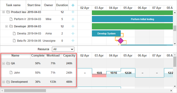
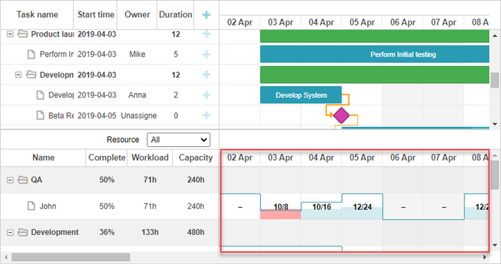
리소스 패널
리소스 패널에는 메인 간트 영역과 유사한 그리드와 타임라인이 포함되어 있습니다.
기본적으로 리소스 뷰의 그리드와 타임라인은 전역 템플릿과 구성을 사용합니다. 별도의 템플릿과 구성을 리소스 패널에만 적용하려면 layout config에 전달하면 됩니다.
리소스 그리드와 타임라인을 스타일링하려면 해당 뷰 이름을 타겟팅하는 CSS 선택자를 사용하세요:
.resourceGrid_cell .gantt_row,
.resourceHistogram_cell .gantt_task_row {
    border-bottom: 1px solid #ebebeb;
    background-color: #fff;
}
리소스 패널의 DOM 구조는 다음과 같습니다:
- .gantt_layout_root
    - .grid_cell
    - .timeline_cell
    - .resourceGrid_cell
    - .resourceHistogram_cell
    - .resourceTimeline_cell
.gantt_layout_root 아래의 클래스 이름은 layout config의 view 속성 값과 일치합니다:
gantt.config.layout = {
    css: "gantt_container",
    rows: [
        {
            cols: [
                {view: "grid", group:"grids", scrollY: "scrollVer"},                 ...
            ]
        },
        ...
        {
            id: "resources",
            cols: [
                { view: "resourceGrid", group:"grids", scrollY: "resourceVScroll" },                 ...
                { view: "resourceHistogram", capacity:24, scrollX: "scrollHor",                      scrollY: "resourceVScroll" },
                ...
            ]
        },
        ...
    ]
};
리소스 그리드
리소스 그리드는 태스크 그리드와 동일한 선택자를 사용하며, .resourceGrid_cell이 최상위 선택자입니다:
.resourceGrid_cell .gantt_row,
.resourceGrid_cell .gantt_row.odd{
    background-color: rgba(232, 232, 232, 0.6);
}
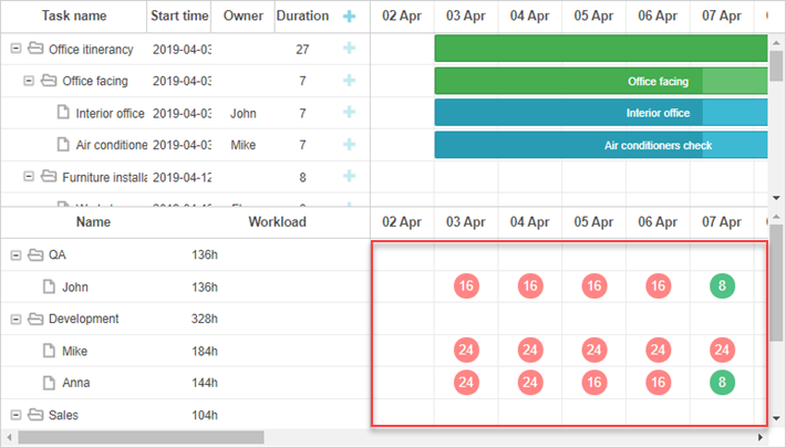
리소스 히스토그램
리소스 히스토그램은 메인 타임라인과 동일한 요소를 공유합니다. 기본적으로 메인 타임라인을 타겟팅하는 선택자는 layout cell 클래스(.timeline_cell 또는 .resourceHistogram_cell)를 사용하지 않는 한 리소스 타임라인에도 적용됩니다.
리소스 히스토그램만 타겟팅하려면 .resourceHistogram_cell 선택자를 사용하세요.
리소스 히스토그램의 DOM 구조는 다음과 같습니다:
- .gantt_task_bg
- .gantt_bars_area
    - div
        - .gantt_histogram_fill
        - .gantt_histogram_cell
    - div
        - .gantt_histogram_hor_bar
        - .gantt_histogram_vert_bar
히스토그램 요소 스타일 예시는 다음과 같습니다:
.gantt_histogram_cell {
    color: #000;
}

.gantt_histogram_label {
    font-weight: 700;
    font-size: 13px;
}

.gantt_histogram_fill {
    background-color: rgba(41,157,180,.2);
}
특정 셀을 스타일링하려면 gantt.templates.histogram_cell_class 템플릿을 사용하세요:
gantt.templates.histogram_cell_class = function(start_date,end_date,resource,tasks) {
    if (getAllocatedValue(tasks, resource) > getCapacity(start_date, resource)) {
        return "column_overload"
    }
};
이러한 셀을 강조하려면 CSS를 적용하세요:
.column_overload .gantt_histogram_fill {
    background-color: #ffa9a9;
}
히스토그램 라인을 커스터마이즈하려면 다음 선택자에 CSS를 적용하세요:
- .gantt_histogram_hor_bar
- .gantt_histogram_vert_bar
예를 들어, 색상을 변경하려면 다음과 같이 할 수 있습니다:
.gantt_histogram_hor_bar, .gantt_histogram_vert_bar {
    background: #299db4;
}
리소스 다이어그램
리소스 다이어그램은 메인 타임라인과 동일한 요소를 공유합니다. 기본적으로 메인 타임라인을 타겟팅하는 선택자는 layout cell 클래스(.timeline_cell 또는 .resourceTimeline_cell)로 범위가 지정되지 않는 한 여기에도 적용됩니다.
.resourceTimeline_cell 선택자를 사용하여 리소스 다이어그램만 타겟팅할 수 있습니다.
리소스 다이어그램의 DOM 구조는 다음과 같습니다:
- .gantt_task_bg
- .gantt_bars_area
    - div
        - .gantt_resource_marker
            - div
최상위 선택자는 .resourceTimeline_cell입니다.
리소스 다이어그램 레이블 스타일 예시:
.gantt_resource_marker div {
    background: #51c185;
    width: 28px;
    height: 28px;
    line-height: 29px;
    display: inline-block;
    color: #FFF;
    margin: 3px;
}
특정 마커의 스타일을 커스터마이즈하려면 gantt.templates.resource_cell_class 템플릿을 사용하세요:
<style>
    .resource_marker.workday_over div {
        border-radius: 3px;
        background: #ff8686;
    }
gantt.templates.resource_cell_class = function(start_date, end_date, resource, tasks){
    var css = [];
    css.push("resource_marker");
    if (tasks.length <= 1) {
        css.push("workday_ok");
    } else {
        css.push("workday_over");
    }
    return css.join(" ");
};