Gantt 스타일 작업하기
dhtmlxGantt는 외관을 사용자 정의할 수 있는 다양한 옵션을 제공합니다. 전체 Gantt 차트의 모양을 변경하려면 미리 정의된 스킨을 적용할 수 있고, 또는 작업, 링크, 스케일, 그리드 등 개별 요소들의 스타일을 세밀하게 조정할 수 있습니다.
이 가이드는 Gantt 차트의 다양한 부분을 스타일링하는 일반적인 방법을 모아, 관련 문서를 더 쉽게 탐색할 수 있도록 도와줍니다. 각 요소별 자세한 정보는 관련 문서를 참고하세요.
그리드 스타일링
그리드 영역의 스타일은 관련 그리드의 템플릿를 통해 수정할 수 있습니다.
그리드 컬럼 헤더
grid_header_class 템플릿을 사용하면 그리드 컬럼 헤더에 사용자 지정 스타일을 적용할 수 있습니다. 예를 들어, 특정 헤더의 배경색을 변경하려면 다음과 같이 할 수 있습니다:
<style>
    .updColor{
        background-color:#ffeb8a!important;
    }
</style>
gantt.templates.grid_header_class = function(columnName, column){
  if(columnName == 'duration' ||columnName == 'text')
    return "updColor";
};
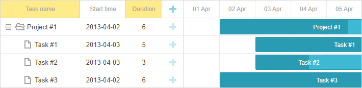
Related sample: Styling Headers of Grid Columns
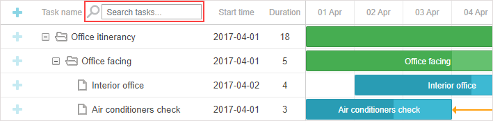
그리드 헤더에 커스텀 요소 추가
버튼, 아이콘, 입력창 등 커스텀 요소를 그리드 헤더에 추가할 수 있습니다. 이를 위해서는 gantt.config.columns 설정 옵션의 label 속성에 해당 요소의 HTML을 지정하면 됩니다:
gantt.config.columns = [
  {name:"add", label:"", width:50, align:"left" },
  {name:"text", label:"<div class='searchEl'>Task name <input id='search' type='text'"+       "placeholder='Search tasks...'></div>", width:250, tree:true},                            // other columns
];
아래는 검색 기능이 구현된 예시입니다:
var inputEl = document.getElementById('search');

inputEl.oninput = function(){
  gantt.refreshData();
}

function hasSubstr(parentId){
  var task = gantt.getTask(parentId);
  if(task.text.toLowerCase().indexOf(inputEl.value.toLowerCase() ) !== -1)
    return true;

  var child = gantt.getChildren(parentId);
  for (var i = 0; i < child.length; i++) {
    if (hasSubstr(child[i]))
      return true;
  }
  return false;
}

gantt.attachEvent("onBeforeTaskDisplay", function(id, task){
  if (hasSubstr(id))
    return true;

    return false;
});
Related sample: Custom Elements in Grid Header
그리드 헤더에 아이콘 및 이미지 삽입
헤더에 이미지나 아이콘을 넣으려면 label 속성에 해당 요소의 HTML을 추가하면 됩니다:
var textLabel = [
    "<div class='gantt-text-label'>"+
    "<img src='http://docs.dhtmlx.com/scheduler/assets/index/icon1.png'>"+
    "<span>Text</span>" +
    "</div>"
].join("");

gantt.config.columns = [
    {name: "text", label:textLabel,tree: true, width: '*', resize: true},
    {name: "start_date", align: "center", resize: true},
    {name: "duration", align: "center"},
    {name: "add", width: 44}
];
Related sample: Images in Grid Header: Columns Config
또는, CSS의 .gantt_grid_head_
.gantt_grid_head_text  {
    background-image:url('http://docs.dhtmlx.com/scheduler/assets/index/icon1.png');
    background-repeat:no-repeat;
}
Related sample: Images in Grid Header:CSS
그리드 헤더의 멀티라인 텍스트
그리드 셀/헤더에 여러 줄을 표시하는 방법 섹션의 예제를 참고하세요.
그리드 행의 배경색
grid_row_class 템플릿을 사용해 모든 그리드 행 또는 특정 작업이 포함된 행의 배경색을 지정할 수 있습니다. 예를 들어, 특정 행의 배경색을 변경하려면:
<style>
  .updColor{
    background-color:#ffeb8a!important;
  }
</style>
gantt.templates.grid_row_class = function(start, end, task){
 if(task.id == 12)
    return "updColor";
};
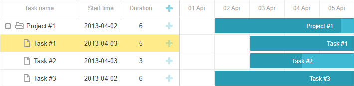
Related sample: Coloring Grid Rows
그리드 행 마우스오버 색상
마우스를 올렸을 때 그리드 행을 강조하려면 다음 스타일을 적용하세요:
.gantt_grid_data .gantt_row.odd:hover, .gantt_grid_data .gantt_row:hover,
.gantt_grid_data .gantt_row.gantt_selected,
.gantt_grid_data .gantt_row.odd.gantt_selected,
.gantt_task_row.gantt_selected{
    background-color: cyan;
}
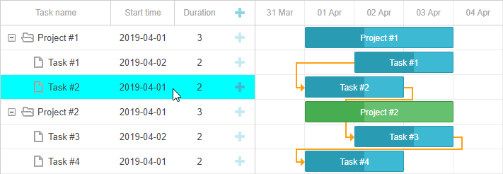
Related sample: Coloring Grid Rows on Hover
그리드 컬럼 커스터마이징
dhtmlxGantt는 gantt.config.columns 설정 옵션의 template 속성을 통해 그리드 컬럼의 기본 모양을 사용자 정의할 수 있습니다.
template 속성은 데이터 항목 객체를 받아 최종 컨텐츠를 반환하는 함수입니다. 이를 통해 거의 모든 형태의 컨텐츠 커스터마이징이 가능합니다. 예를 들어, 그리드 행의 텍스트 색상을 변경하거나, 컬럼에 커스텀 요소를 삽입할 수 있습니다.
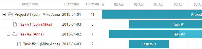
그리드 행의 텍스트 색상
작업의 우선순위에 따라 텍스트 색상을 지정하려면 다음과 같이 할 수 있습니다:
gantt.config.columns=[
    {name:"text",       label:"Task name",  tree:true, width:230, template:myFunc },       {name:"start_date", label:"Start time", align: "center" },
    {name:"duration",   label:"Duration",   align: "center" }
];

function myFunc(task){
    if(task.priority ==1)
        return "<div class='important'>"+task.text+" ("+task.users+") </div>";
    return task.text+" ("+task.users+")";
};
Related sample: Template for tree nodes
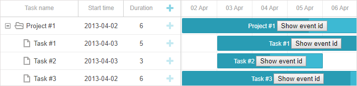
그리드 컬럼의 커스텀 요소
버튼이나 입력창 등 커스텀 요소를 그리드 컬럼에 추가하려면, 해당 컬럼의 template 속성에 요소의 HTML을 지정하세요:
var colContent = function (task) {
    return ('<i class="fa gantt_button_grid gantt_grid_edit fa-pencil"'+
                'onclick="clickGridButton(' + task.id + ', \'edit\')"></i>' +
            '<i class="fa gantt_button_grid gantt_grid_add fa-plus"'+
                'onclick="clickGridButton(' + task.id + ', \'add\')"></i>' +
            '<i class="fa gantt_button_grid gantt_grid_delete fa-times"'+
                'onclick="clickGridButton(' + task.id + ', \'delete\')"></i>');
};

gantt.config.columns = [
    {name: "text", tree: true, width: '*', resize: true},
    {name: "start_date", align: "center", resize: true},
    {name: "duration", align: "center"},
    {name: "buttons", label: colHeader, width: 75, template: colContent}  ];
Related sample: Custom Buttons in a Grid
긴 텍스트를 말줄임표로 표시
Gantt는 그리드 행에서 긴 텍스트를 자동으로 축약해 보여줍니다.
버전 7.0부터는 .gantt_tree_content CSS 클래스를 재정의하여 말줄임표로 표시할 수 있습니다:
<style>
.gantt_tree_content {
    overflow:hidden;
    text-overflow: ellipsis;
}
</style>

gantt.init("gantt_here");
Related sample: Truncate long text with ellipsis
그리드 셀 내 멀티라인 텍스트
그리드 셀/헤더에 여러 줄을 표시하는 방법 섹션의 예제를 참고하세요.
스케일 스타일링
스케일의 스타일은 타임라인 영역의 관련 템플릿으로 제어합니다.
스케일 행
scale_row_class 템플릿을 사용해 스케일 행의 스타일을 지정할 수 있습니다. 예를 들어, 배경색을 지정하려면:
<style>
  .updColor{
    background-color:#ffeb8a!important
  }
</style>
gantt.templates.scale_row_class = function(scale){
    return "updColor";
}
Related sample: Styling Row of the Scale
스케일 셀
scale_cell_class 템플릿을 사용해 특정 스케일 셀을 스타일링할 수 있습니다. 예를 들어, 주말을 강조하려면:
gantt.templates.scale_cell_class = function(date){
    if(date.getDay()==0||date.getDay()==6){
        return "updColor";
    }
};
Related sample: Styling Separate Cells on the Scale
자세한 내용은 스케일 설정하기 및 타임 슬롯 하이라이트하기를 참고하세요.
서브스케일
scales 속성의 css 속성을 통해 스케일에 새로운 스타일을 지정할 수 있습니다. 예를 들어, 주말을 다른 색으로 표시하려면:
<style type="text/css">
    .weekend{
        background: #F0DFE5 !important;
    }
</style>
var daysStyle = function(date){
    var dateToStr = gantt.date.date_to_str("%D");
    if (dateToStr(date) == "Sun"||dateToStr(date) == "Sat")  return "weekend";

    return "";
};

gantt.config.scales = [
    {unit:"day", format:"%D", css:daysStyle }
];
Related sample: Multiple scales
작업(Task) 스타일링
작업 스타일링은 타임라인 영역의 관련 템플릿을 통해 커스터마이즈할 수 있습니다.
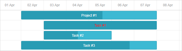
작업 바
task_class 템플릿을 재정의하여 작업 스타일을 변경할 수 있습니다. 자세한 내용은 Tasks Coloring를 참고하세요.
gantt.templates.task_class = function(start, end, task){return "";};
템플릿은 동적 스타일링을 지원합니다. 예를 들어, 작업 진행률에 따라 색상을 변경할 수 있습니다:
gantt.templates.task_class = function(start,end,task){
    if(task.progress > 0.5){
        return "";
    }else{
        return "important";
    }
};
Related sample: Styling task bars with events
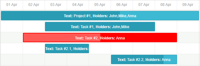
작업 바 텍스트
task_text 템플릿을 사용하면 작업 바 텍스트에 인라인 스타일을 적용할 수 있습니다:
gantt.templates.task_text = function(start, end, task){
  if(task.id == 12)
    return "<span style='color:red'>"+task.text+"</span>";

  return task.text;
};
Related sample: Inline Styling of the Task Text
멀티라인 텍스트
예제는 그리드 셀/헤더에 여러 줄을 표시하는 방법 섹션을 참고하세요.
작업 바 내 커스텀 요소
task_text 템플릿을 사용해 작업 바 내부에 커스텀 요소를 추가할 수 있습니다. 예를 들어, 버튼을 삽입하려면 다음과 같이 할 수 있습니다:
gantt.templates.task_text = function(start, end, task){
  return task.text+" <button>Text</button>";
};
Related sample: Custom Elements in Task Bars
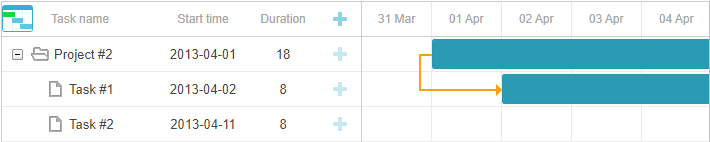
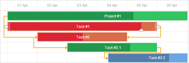
작업 객체 속성을 통한 스타일 지정
작업 객체 설정에 추가 속성을 지정해 작업의 색상을 커스터마이즈할 수 있습니다. 사용 가능한 속성은 color, textColor, progressColor 입니다.
var tasks = {
  data:[
     {id:1, text:"Project #1", start_date:"01-04-2013", duration:18, color:"red"},
     {id:2, text:"Task #1", start_date:"02-04-2013",
        duration:8, color:"blue", parent:1}
   ]
};
gantt.init("gantt_here");
gantt.parse(tasks);

gantt.getTask(1).color = "red"
자세한 내용은 Tasks Coloring 문서의 관련 섹션을 참고하세요.
라이트박스를 통한 작업 바 스타일링
미리 정의된 색상 목록을 설정하고 이를 라이트박스 설정의 옵션으로 포함할 수 있습니다. 이를 통해 작업에 텍스트 또는 배경색을 지정할 수 있습니다:
var colors = [
    {key:"", label:"Default"},
    {key:"#4B0082",label:"Indigo"},
    {key:"#FFFFF0",label:"Ivory"},
    {key:"#F0E68C",label:"Khaki"}
    // more colors
];

gantt.config.lightbox.sections = [
    {name:"description", height:38, map_to:"text", type:"textarea", focus:true},
    {name:"priority", height:22, map_to:"color", type:"select", options:colors},
    {name:"textColor", height:22, map_to:"textColor", type:"select", options:colors},
    {name:"time", type:"duration", map_to:"auto"}
];
Related sample: Specify inline colors for Tasks and Links
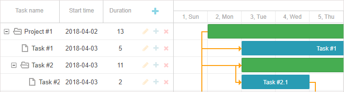
타임라인 영역의 행
task_row_class 템플릿을 사용하면 Gantt 작업 뒤의 타임라인 행 색상을 변경할 수 있습니다.
gantt.templates.task_row_class = function(start, end, task){
  if(task.id == 12)
    return "updColor";
};
Related sample: Styling Rows of the Timeline Area
Related sample: Custom tree formatting
타임라인 셀 강조 표시
timeline_cell_class 템플릿을 사용하여 요일에 따라 특정 타임라인 셀을 강조 표시할 수 있습니다. 이 템플릿 함수는 셀을 반복하면서 선택된 셀에 CSS 클래스를 적용합니다. 예를 들어, 주말을 다음과 같이 강조할 수 있습니다:
<style>
    .weekend{
        background: #f4f7f4;
    }
</style>
gantt.templates.timeline_cell_class = function(item,date){
    if(date.getDay()==0||date.getDay()==6){
        return "weekend"
    }
};
Related sample: Highlighting weekends
자세한 내용은 타임 슬롯 하이라이트하기 문서를 참고하세요.
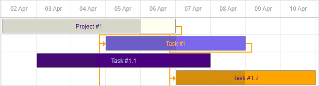
외부 요소(베이스라인, 마감일 등) 표시
이 기능은 PRO 에디션에서만 사용할 수 있습니다.
베이스라인이나 마감일 마커 등과 같은 추가 요소를 Gantt 차트에 표시할 수 있습니다. 이를 위해 addTaskLayer 메서드를 사용하여 새로운 표시 레이어를 만들고, 여기에 사용자 정의 요소를 추가합니다. 이 메서드는 작업 객체를 받아서 표시할 DOM 요소를 반환하거나, 해당 작업에 요소를 숨기려면 false를 반환하는 함수를 인자로 받습니다:
gantt.addTaskLayer(function myNewElement(task) {
    var el = document.createElement('div');
    // your code
    return el;
});
이런 외부 요소의 예시는 다음과 같습니다:
- 베이스라인
Related sample: Display baselines
- 마감일
Related sample: Displaying deadlines
더 자세한 내용은 타임라인 영역의 커스텀 요소 문서를 참고하세요.
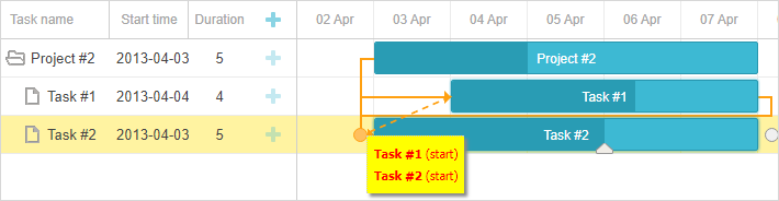
작업 툴팁
툴팁은 작업 세부 정보를 간결하게 보여주는 방법입니다.
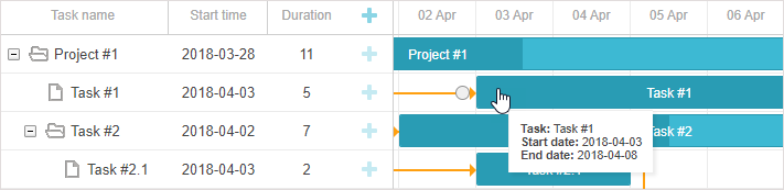
기본적으로 tooltip 플러그인을 활성화하면 작업에 툴팁이 표시됩니다.
툴팁 텍스트 커스터마이징
툴팁 텍스트를 커스터마이즈하려면 tooltip_text 템플릿을 사용하세요:
gantt.templates.tooltip_text = function(start,end,task){
    return "<b>Task:</b> "+task.text+"<br/><b>Duration:</b> " + task.duration;
};
툴팁에 대한 자세한 내용은 Gantt 요소의 툴팁 문서를 참고하세요.
링크 스타일링
의존성 링크 템플릿 리소스를 사용하여 의존성 링크의 모양을 커스터마이즈할 수 있습니다.
의존성 링크의 선
link_class 템플릿을 사용하면 의존성 선의 색상을 변경할 수 있습니다.
gantt.templates.link_class = function(link){
    return "";
};
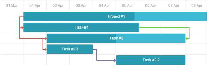
추가 정보는 링크 색상 및 스타일링 문서에서 확인할 수 있습니다.
링크 객체 속성을 통한 링크 색상 지정
링크 객체에 color 속성을 추가하여 의존성 링크의 색상을 직접 지정할 수도 있습니다:
var tasks = {
  data:[
     // tasks configuration
  ],
  links:[
     {id:1, source:1, target:2, type:"1", color:"red"},
     {id:2, source:2, target:3, type:"0", color:"blue"}
  ]
};

gantt.init("gantt_here");
gantt.parse(tasks);

gantt.getLink(2).color = "blue";
자세한 내용은 링크 색상 및 스타일링 섹션을 참고하세요.
링크 호버 시 색상 변경
CSS를 사용하여 링크에 마우스를 올렸을 때 색상을 변경할 수 있습니다:
.gantt_task_link:hover .gantt_line_wrapper div{
    box-shadow: 0 0 5px 0 yellowgreen;
    background: yellowgreen
}

.gantt_task_link:hover .gantt_link_arrow_left,
.gantt_task_link:hover .gantt_link_arrow_right{
    border-left-color: yellowgreen !important;
    border-right-color: yellowgreen !important;
}
Related sample: Link color on hover
자세한 내용은 링크 색상 및 스타일링 문서를 참고하세요.
의존성 링크 팝업
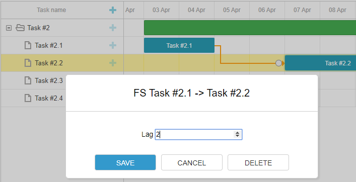
drag_link_class 템플릿을 사용하면 작업 간 의존성 선을 드래그할 때 표시되는 팝업의 스타일을 지정할 수 있습니다. 예를 들어, 팝업의 배경 및 텍스트 색상을 조정할 수 있습니다:
<style>
  .gantt_link_tooltip{color:red; background-color:yellow}
</style>
gantt.templates.drag_link_class = function(from, from_start, to, to_start) {
    return "gantt_link_tooltip" ;
};
Related sample: Styling the Popup of Dependency Link
더 많은 정보는 의존성 링크 템플릿 문서에 있습니다.
UI에서 링크 값 편집
작업 바를 편집하고 스타일링할 수 있는 라이트박스는 제공되지만, 링크를 편집할 수 있는 내장 UI는 없습니다. 그러나 별도의 문서를 참고하여 직접 인터페이스를 구축할 수 있습니다.
Related sample: Custom UI for Editing Link Values
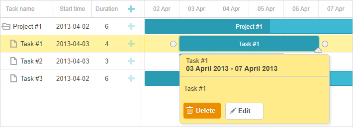
퀵 인포 팝업 스타일링
퀵 인포(Quick Info) 팝업 스타일은 'Quick Info' 확장(터치 지원)의 템플릿 템플릿을 통해 제어됩니다.
quick_info_class 템플릿을 사용하여 팝업 편집 폼에 스타일을 적용할 수 있습니다. 예를 들어, 특정 작업에 대해 퀵 인포 팝업을 스타일링하려면 다음과 같이 합니다:
<style>
  .updColor{
    background-color:#ffeb8a!important;
  }
  .updColor .gantt_cal_qi_title{
    background-color:#ffeb8a!important;
  }
</style>
gantt.templates.quick_info_class = function(start, end, task){
  if(task.id == "12")
    return "updColor";

    return ""
};
Related sample: Styling Quick Info Popup
Back to top