Configuring Lightbox Elements
Lightbox is an edit form used to change task details.
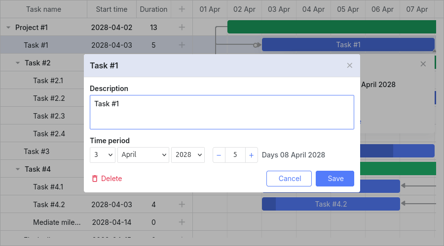
The default lightbox is shown in the image below.
Lightbox configuration can differ by task type. Settings for each type are stored in the lightbox object:
- gantt.config.lightbox.sections - for regular tasks.
- gantt.config.lightbox.project_sections - for project tasks.
- gantt.config.lightbox.milestone_sections - for milestones.
You can also add a custom type and define a lightbox structure for it. For details, see Task Types.
The overall type structure looks like this:
- sections? - (LightboxSection[]) - optional, the lightbox sections array for regular tasks
- project_sections? - (LightboxSection[]) - optional, the lightbox sections array for project tasks
- milestone_sections? - (LightboxSection[]) - optional, the lightbox sections array for milestones
- [lightboxType: string] - (LightboxSection[] | undefined) - the lightbox sections array for the custom type
From v7.1.13, if either gantt.config.csp is set to true or Gantt works in the Salesforce environment, the lightbox will be rendered inside the Gantt container.
Lightbox structure
Sections
The structure of the lightbox is specified by the sections property of the lightbox object:
// default lightbox definition
gantt.config.lightbox.sections = [
    { name: 'description', height: 70, map_to: 'text', type: 'textarea', focus: true },
    { name: 'time', height: 72, map_to: 'auto', type: 'duration' }
];
Each item in the sections array is an object that defines a single section in the lightbox. See lightbox config for available section properties.
Section controls
Each section of the lightbox is based on some control. The following types of controls are available for use in the lightbox:
- Textarea - a multiline text field
- Time - a pair of selectors for setting the task duration by specifying the task's start and end dates
- Duration - a set of selectors for setting the task duration by specifying the task's start date and the number of days
- Select - a simple select box
- Typeselect - a select box for changing the type of a task
- Parent - a select box for changing the parent of a task
- Template - a container with some HTML content inside
- Checkbox - a checkbox for switching an option or several values on/off
- Radio button - a radio button for selecting only one option from a given set of options
- Resources - a complex control for assigning several resources to a task
- Resource Assignments - an extended control for assigning resources to a task
- Constraint - a complex control for setting constraints for a task
- Baselines - a complex control for setting baselines for a task
const opts = [
    { key: 1, label: 'High' },
    { key: 2, label: 'Normal' },
    { key: 3, label: 'Low' }
];

gantt.config.lightbox.sections = [
    { name: 'description', height: 38, map_to: 'text', type: 'textarea', focus: true },
    { name: 'priority', height: 22, map_to: 'priority', type: 'select', options: opts },
    { name: 'time', height: 72, map_to: 'auto', type: 'duration' }
];