Resource Assignments Control
This functionality is available in the Gantt PRO edition only.
An extended control used to assign multiple resources and their quantity to a task.
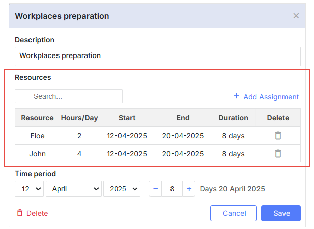
Here is an example of the Resource Assignments control with the default configuration:
gantt.config.lightbox.sections = [
    { name: "description", height: 38, map_to: "text", type: "textarea", focus: true },
    { name: "resource_selector", label: "Resources", type: "resource_selector", map_to: "auto" },
    { name: "time", type: "duration", map_to: "auto" }
];
You can configure the resource grid columns of the control and provide the necessary resource options:
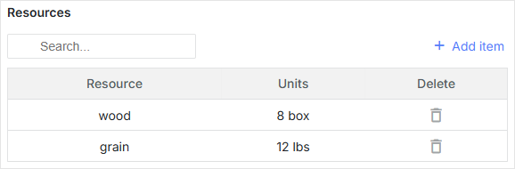
// resource options
const usageMap = [
    { key: 1, label: "wood", text: "wood", unit: "box" },
    { key: 2, label: "water", text: "water", unit: "liter" },
    { key: 3, label: "grain", text: "grain", unit: "lbs" }
];

// helper editors
const selectResEditor = { type: "select", map_to: "resource_id", options: usageMap };
const numberEditor = { type: "number", map_to: "value", min: 0, max: 100 };

// resource grid columns config
const resourceLightboxConfig = {
    columns: [
        {
               name: "resource",
            label: "Resource",
            editor: selectResEditor
            // more column's options
        },
        {
            name: "units",
            label: "Units",
            editor: numberEditor,
            // more column's options
        },
        {
            name: "delete",
            label: "Delete",
            // more column's options
        }
    ]
};

gantt.config.lightbox.sections = [
    { name: "description", height: 38, map_to: "text", type: "textarea", focus: true },
    { name: "time", type: "duration", map_to: "auto" },
    { name: "resource_selector", type: "resource_selector", map_to: "auto", /*!*/
        config: resourceLightboxConfig } /*!*/
];

gantt.locale.labels.section_resource_selector = "Resources";
You can also create a custom control to assign multiple resources to a task.
Initialization
To add the resource_selector control to the lightbox, follow the steps below:
1. Add a section to the lightbox configuration:
gantt.config.lightbox.sections = [
    { name: "description", height: 38, map_to: "text", type: "textarea", focus: true },
    { name: "resource_selector", type: "resource_selector", map_to: "auto" },
    { name: "time", type: "duration", map_to: "auto" }
];
2. Set a label for the section:
gantt.locale.labels.section_resource_selector = "Resources";
Properties
The following properties are mostly important and commonly set for the resource_selector control:
- name - (string) the section's name
- map_to - (string) the name of a data property that will be mapped to the section
- type - (string) the type of the section control
- label - (string) the section's label
- config - (object) the resource grid config in the lightbox to display required columns
- templates - (object) templates for the resource grid in the lightbox
The initial start_date, end_date, and duration properties may have null values. If so, they will be initialized using the corresponding values from the task object.
Configuring resource grid columns in the lightbox
The default configuration of columns of the resource table in the lightbox is given below:
// helper editors
const selectResEditor = {
  type: "select", map_to: "resource_id", options: gantt.serverList("resourceOptions")
};
const numberEditor = { type: "number", map_to: "value", min: 0, max: 100 };

const dateToStr = gantt.date.date_to_str("%d-%m-%Y");
const resourceStore = gantt.getDatastore(gantt.config.resource_store);
// default columns definition
const defaultResourceLightboxConfig = {
    scale_height: 35, // height of the grid scale
    row_height: 35, // height of assignment rows
    // configures the columns of the grid
    columns: [
        {
            name: "resource", label: "Resource", align: "center", width: 80,
            editor: selectResEditor, template: function (assignment) {
            let defaultValue = "Unassigned";
            const resource = resourceStore .getItem(assignment.resource_id);
            return resource ? resource.text : defaultValue;
            }
        },
        {
            name: "hours/Day", label: "Hours/Day", align: "center", width: 70,
            editor: numberEditor, template: function (assignment) {
            return assignment.value ? +assignment.value : ``;
            }
        },
        {
            name: "start", label: "Start", align: "center", width: 100,
            template: function (assignment) {
            return assignment.start_date ? dateToStr(assignment.start_date) : ``;
            }
        },
        {
            name: "end", label: "End", align: "center", width: 100,
            template: function (assignment) {
            return assignment.end_date ? dateToStr(assignment.end_date) : ``;
            }
        },
        {
            name: "duration", label: "Duration", align: "center", width: 80,
            template: function (assignment) {
            if (assignment.duration) {
                return `${assignment.duration} day${assignment.duration == 1 ? '' : 's'}`;
            } else {
                return ``;
            }
            }
        },
        {
            name: "delete", label: "Delete", align: "center", width: 80,
            template: function (assignment) {
                return `<div
                    data-assignment-id='${assignment.id}'
                    data-assignment-delete='${assignment.id}'
                    className='dhx_gantt_icon dhx_gantt_icon_delete'
                    >
                    </div>`;
            }
        }
    ],
    //Configures the default adding assignment(assignment that will be added by "Add Assignment button")
    resource_default_assignment: {
        duration: null,
        value: 8,
        start_date: null,
        end_date: null,
        mode: "default"
    }
};
Details
Each object in the columns array specifies a single column. An object can take the following attributes:
- name? - (string | number) - defines the column's id;
- align? - (string) - sets the horizontal title alignment. Possible values: 'left', 'center', or 'right';
- hide? - (boolean) - hides/shows a column (PRO);
- label? - (string | number | any) - specifies the title of the column;
- max_width? - (number) - sets the maximum column width;
- min_width? - (number) - sets the minimum column width;
- width? - (number | string) - defines the width of the column;
- template? (assignment): any - sets a data template.
- assignment - (Assignment) - the Assignment object;
- onrender? (assignment, node): any - optional, a callback function for rendering a cell into the DOM.
The function takes an assignment object and the DOM element of the grid cell as
parameters and may return a component of the framework. See details here;
- assignment - (Assignment) - the Assignment object;
- node - (HTMLElement) - the HTML element of the Grid cell;
- editor? - (object) - the attached inline editor;
- type - (string) - the type of the inline editor;
- map_to - (string) - specifies which property of the assignment should be updated by the inline editor;
- min? - (Date | number) - the minimal value for the date and duration types;
- max? - (Date | number) - the maximal value for the date and duration types;
- options? - (Array <any>) - an array with the options for the select types;
- formatter? - (DurationFormatter | LinkFormatter) - formatter for the date and predecessor types.
You can change the default added assignment by specifying the following property in resource lightbox config:
- resource_default_assignment - (object) the configuration object of the default assignment (that will be added by the "Add Assignment" button)
- start_date - (Date | string | null) the date the assignment is scheduled to start
- end_date - (Date | string | null) the date the assignment is scheduled to be completed
- value - (number | string) the quantity of the resource assigned to a task
- duration - (number | null) the duration of the assignment
- mode - (string) the calculation mode of the time of the resource assignment: "default" | "fixedDates" | "fixedDuration"
The template attribute is a function that takes a data item object as a parameter and returns the final data template. The function definition allows you to present almost any content.
Populating control with data
If you use the default resource Datastore created by Gantt, the resource_selector control will be connected to the gantt.serverList("resourceOptions") collection. This collection will be populated with the resources from the resource datastore. You can access options by using the following code line:
const options = gantt.serverList("resourceOptions");
Take notice that the options array will be empty before the resources are loaded into the datastore.
You can also update this collection using the custom list of options as follows:
gantt.updateCollection("resourceOptions", [...]);
Note that if you load resources into the gantt after that, the gantt will update this collection and overwrite your changes.
Populating control with data from the server
To populate the control from the server, use the serverList() method in the options of the resource editor:
const resourceEditor = {
    type: "select", map_to: "resource_id", options: gantt.serverList("resourceOptions")
};

const defaultResourceLightboxConfig = {
    // other settings
    ...
    // an array with the columns configs
    columns:[
        {
              name: "resource",
            label: "Resource",
            align: "center",
            editor: resourceEditor
        },
        // more columns configs
    ]
}
The contents of gantt.serverList("resourceOptions") can be defined when the options become available using the updateCollection() method:
gantt.updateCollection("resourceOptions", [
    // resource objects
    { id: 1, text: "QA", parent: null },
    { id: 2, text: "Development", parent: null },
    { id: 3, text: "Sales", parent: null },
    { id: 4, text: "Other", parent: null },
    { id: 5, text: "Unassigned", parent: 4 },
    { id: 6, text: "John", parent: 1 },
    { id: 7, text: "Mike", parent: 2 },
    { id: 8, text: "Anna", parent: 2 },
    { id: 9, text: "Bill", parent: 3 },
    { id: 10, text: "Floe", parent: 3 }
]);