Accessibility in DHTMLX Spreadsheet
This guide is for developers who embed DHTMLX Spreadsheet in an application that has to meet accessibility requirements. Use it to check the component against your checklist and to configure it for keyboard, screen reader and high-contrast users.
The Spreadsheet renders WAI-ARIA roles and states as part of its markup. The keyboard focus stays on the active cell, and the toolbar, the menu bar and the sheet tabs are one tab stop each. Changes that have no element of their own, such as a refused edit or a search result, go to a live region that screen readers read aloud.
DHTMLX Spreadsheet is designed to meet WCAG 2.2 Level AA, Section 508 of the U.S. Rehabilitation Act, and EN 301 549 (the technical baseline of the European Accessibility Act).
Conformance is reported criterion by criterion for DHTMLX Spreadsheet 6.0.4. The detailed Accessibility Conformance Report (VPAT® 2.5) is available: Accessibility Conformance Report.
Capabilities
| Area | Support |
|---|---|
| Keyboard operation | Every command on the cells has a key. The toolbar, the menu bar and the sheet tabs are single tab stops navigated with the arrow keys. The column width, the row height and the column filter have context menu commands, so they don't require dragging or a click on an icon |
| WAI-ARIA semantics | The cells are a grid with columnheader, rowheader and gridcell elements. The roles are always rendered |
| Focus model | The keyboard focus is on the active cell. Tab enters the sheet on the active cell and leaves it from the last and the first cell. Ctrl + F6 moves the focus between the menu, the toolbar, the sheet and the sheet tabs |
| Selection model | The active cell, a range and several ranges are exposed through aria-selected, and the extent of a range is announced. The selection can be turned off with the selection option |
| Read-only mode | The sheet can be navigated, selected, copied and searched; edits are refused and announced, and the context menu is not available |
| Screen readers | Tested with NVDA, JAWS and VoiceOver |
| Visual accessibility | The contrast-light and contrast-dark themes, a visible focus indicator in every theme, and cues that don't depend on color |
| Text resize and zoom | The layout stays operable at 200% and 400% zoom and with text spacing overrides |
| Customization | The public announce() method for your own messages, and translatable aria_* locale strings for every built-in name and announcement |
| Standards | WCAG 2.2 AA, Section 508, EN 301 549 |
Covered areas
This guide covers the Spreadsheet widget:
- the cells, the column and row headers, merged cells and frozen rows and columns
- the selection: the active cell, ranges and several ranges
- the formula bar and the cell editors, including the editor of a cell with a list of values
- the toolbar with its color and border popups, the menu bar and the context menus
- the sheet tabs
- sorting, filtering, search, data validation, links in cells, import and export
- the themes and the focus indicator
The accessibility of the final page also depends on the host application. See Host-page responsibilities.
WAI-ARIA support
The Spreadsheet adds WAI-ARIA roles and attributes to its markup automatically, and you can't turn them off. Each part of the widget has its own role and name, and the names come from the locale.
Spreadsheet container
The parts of the Spreadsheet are separate named controls:
| Part | Role / attribute | Accessible name |
|---|---|---|
| Menu bar | role="menubar" + aria-label | "Main" |
| Toolbar | role="toolbar" + aria-label | "Formatting" |
| Formula bar | aria-label on the input | "Formula bar, B7", with the address of the active cell |
| Cells | role="grid" + aria-label | "Spreadsheet" |
| Sheet tabs | role="toolbar" + aria-label | "Sheets" |
| Live region | role="status", aria-live="polite", aria-atomic="true" | visually hidden, placed next to the grid outside role="grid" |
The root element of the Spreadsheet has no landmark role, so you can place it inside the landmark that fits your page.
Cell surface
The following attributes describe the cells as a whole. The .dhx_grid-content element carries them:
| Selector | Role / attribute | Purpose |
|---|---|---|
.dhx_grid-content | role="grid" | The interactive grid of cells |
.dhx_grid-content | aria-label | "Spreadsheet", from the aria_grid locale key |
.dhx_grid-content | aria-rowcount | The number of rows of the sheet plus the header row |
.dhx_grid-content | aria-colcount | The number of visible columns plus the column of row numbers |
.dhx_grid-content | aria-readonly | "true" in the read-only mode and while the selection is turned off |
.dhx_grid-content | aria-multiselectable | "true"; "false" while the selection is turned off |
Rows and cells
The following table lists the roles and the position and state attributes of the rows and the cells:
| Selector | Role / attribute | Purpose |
|---|---|---|
| Row | role="row" + aria-rowindex | A row of the sheet. Row 1 of the sheet has aria-rowindex="2", since the column header is the first row |
| Cell | role="gridcell" + aria-colindex | A cell. Column A has aria-colindex="2", since the row numbers are the first column |
| Row number | role="rowheader" | The header of the row |
| Cell | aria-selected | "true" on the active cell and on every cell of the selected ranges |
| Cell | aria-readonly | "true" in the read-only mode, while the selection is turned off, and on locked cells |
| Cell | tabindex | "0" on the active cell and "-1" on the other cells, so the cells are one tab stop |
| Active cell | DOM focus | The keyboard focus is on the active cell itself, not on a separate input. While the cell is edited, the focus is on the cell editor |
| Merged cell | aria-colspan / aria-rowspan | The number of columns or rows that the merged cell spans. The cells it covers are hidden with aria-hidden="true" |
| Link in a cell | <a href> with target="_blank" and rel="noopener noreferrer" | A link with the http, https, mailto, ftp or tel scheme |
A cell also contains visually hidden text, which screen readers read together with the value:
| Hidden text | When |
|---|---|
| The cell address, for example, "B7" | On the active cell and on every cell of a selected range. Screen readers read the address before the value |
| "link" | On a selected cell with a link. Alt + Enter opens the link |
| "locked" | On a selected locked cell |
| A description of the formula error, for example, "Reference error. Check the cell references" | On a cell with a formula error |
| "Invalid value. Choose a value from the list" | On a cell whose value is not in its list of values |
| "Filter" / "Filter applied" | On a cell with the filter icon |
Column and row headers
| Selector | Role / attribute | Purpose |
|---|---|---|
| Column letter | role="columnheader" + aria-colindex | The header of the column |
| Select-all corner | role="columnheader" | Named "Select all" |
| Row number | role="rowheader" | The header of the row |
| Column menu icon, icons of hidden rows and columns | aria-hidden="true" | Decorative. The commands are in the context menu |
The headers are not tab stops. A click on a column letter, a row number or the corner selects the rows or columns and returns the focus to the active cell.
Formula bar and editors
| Selector | Role / attribute | Purpose |
|---|---|---|
| Formula bar input | aria-label | "Formula bar, B7", with the address of the active cell. The input is readonly on a locked cell, so its value can still be read. While the selection is turned off, the formula bar is empty and locked |
| Cell editor input | aria-label | "Cell editor, B7" |
| Editor of a cell with a list of values | role="combobox", aria-controls, aria-expanded, aria-activedescendant | The list of values is a listbox of option elements, and the highlighted option is aria-selected |
| Editor with an invalid value | aria-invalid="true" | The saved value of the cell is not in its list of values. The attribute is updated after the value is saved, not while the user types |
| Close icon of the formula help | role="button" + aria-label | "Close formula help" |
Toolbar and menus
| Selector | Role / attribute | Purpose |
|---|---|---|
| Toolbar | role="toolbar" + aria-label | "Formatting"; the toolbars of the Border popup, the search bar and the link popup are named "Borders", "Search" and "Link" |
| Toolbar button | aria-label | The value of the button. An icon button is named by its tooltip, for example, "Bold (ctrl+b)". The icons are hidden with aria-hidden="true" |
| Bold, Italic, Underline, Strikethrough, Lock, Filter | aria-pressed | Whether the formatting or the filter is on |
| Button that opens a dropdown | aria-haspopup="menu", aria-expanded | The dropdown is a menu named after its button |
| Alignment, text wrapping, number formats | role="menuitemradio" + aria-checked | One option of an exclusive set |
| Text color, Background color, Border color | aria-label | The name of the control and of the current color, for example, "Text color: dark gray" |
| Color palette | role="grid" of gridcell elements | The grid is named "Color palette". Each color cell is named after its color, and the chosen one has aria-selected="true" |
| Border style list | role="listbox" of option elements | The options are named "Thin line", "Medium line", "Thick line", "Dashed line", "Dotted line", "Double line" |
| Menu bar | role="menubar" + aria-label | "Main". Its items open popups with role="menu". In the popups, the formatting items have role="menuitemcheckbox", and the alignment, text wrapping and number format items have role="menuitemradio". Both report their state with aria-checked |
| Context menus | role="menu" + aria-label | "Cell" for the cells and "Sheet" for the sheet tabs |
Sheet tabs
| Selector | Role / attribute | Purpose |
|---|---|---|
| Sheet tab bar | role="toolbar" + aria-label | "Sheets" |
| Sheet tab | button + aria-pressed | The tab is named after its sheet. The tab of the active sheet has aria-pressed="true" |
| Add sheet button | aria-label | "Add sheet" |
Dialogs
| Selector | Role / attribute | Purpose |
|---|---|---|
| Column width and Row height dialogs | role="dialog", aria-modal="true", aria-label | Named by the dialog title. The input is labeled "Width in pixels" / "Height in pixels" |
| Search bar | role="dialog" + aria-label | Named "Search". The search input is labeled "Search", and the buttons are named "Previous match", "Next match" and "Close search" |
| Insert link, Data validation | role="dialog" + aria-label | Named by the dialog title |
| Alerts | role="alertdialog", aria-modal="true", aria-labelledby, aria-describedby | Named by the alert header and described by its text |
Hidden and decorative elements
The Spreadsheet hides decorative parts from assistive technology with aria-hidden="true". These are the lock, filter and column menu icons, the icons of hidden rows and columns, and the select-all icon. The layer that draws the selection, the copy and search highlights and the fill handle is hidden as well. So are the colored copy of the formula in the formula bar and the cells covered by a merged cell. Layout wrappers have role="presentation". The focus sentinels before and after the grid only pass the focus to the active cell.
Selection and editing model
The DOM focus is on the active cell itself, so a screen reader reads the cell, not a separate input. When the active cell moves, the screen reader reads the address of the new cell first, then its value and its hidden descriptions. When the user selects a range with the keyboard or the mouse, the screen reader announces the extent of the range once the selection stops changing. A cell shared by several ranges is counted once, and the cells of hidden rows and columns are counted. Nothing is announced while a cell is edited. When a range is reduced to the active cell, the address of the cell is announced.
| Situation | What the screen reader gets |
|---|---|
| The active cell moves | The cell with its address, value and descriptions, for example, "B7, 120, locked" |
| A range is selected | "B2 to D7, 18 cells" |
| Several ranges are selected with Ctrl | "B2 to B4, D2 to D4, 6 cells" |
| The editor opens with Enter, F2 or typing | The editor input named "Cell editor, B7" |
| The editor of a cell with a list of values opens | An expanded combobox. After ↑ or ↓, the highlighted option of the list is read |
| The edit is saved | New formula errors in the edited cells and in the cells that depend on them, and invalid values in the edited cells, are announced |
| An edit of a locked cell is refused | "The cell is locked" |
| An editing key is pressed in the read-only mode | "The sheet is read-only" |
Enter, F2 or typing opens the editor. Enter saves the value and moves down, Tab saves it and moves right, and Esc cancels the edit.
Keyboard navigation
The keyboard works as soon as the Spreadsheet is on the page; no configuration is needed. The tables below summarize the keyboard model. See Hot keys list for the complete set of shortcuts.
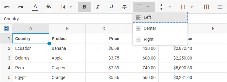
Cells
| Keys | Action |
|---|---|
| Arrow keys | Move the active cell. The active cell stops at the first and last visible row and column |
| Shift + arrow keys | Extend the selected range |
| Home / End | Move to the first or the last visible cell of the row |
| Ctrl + arrow keys, Ctrl + Home / End | Move to the edge of the sheet |
| Tab / Shift + Tab | Move right or left within the row. From the last or the first cell of the sheet, move the focus out of the cells to the next or the previous part of the page, for example, the sheet tabs or the formula bar |
| Enter, F2 | Open the editor |
| Esc | Close the editor without saving |
| Ctrl + Space / Shift + Space | Select the column or the row |
| Ctrl + Shift + 9 / 0 | Show the hidden rows or columns inside the selected range |
| Alt + Enter | Open the link of the active cell |
| Shift + F10 or the Menu key | Open the context menu with the commands for the cell, or for the column after Ctrl + Space |
| Alt + ↑ / ↓, Ctrl + Alt + Page Down / Page Up | Switch to the next or the previous sheet |
Moving between the parts
| Keys | Action |
|---|---|
| Ctrl + F6 / Ctrl + Shift + F6 | Move the focus to the next or the previous part: the menu, the toolbar, the sheet, the sheet tabs. The formula bar and hidden parts are skipped. An open edit is saved first |
| Tab / Shift + Tab | Move the focus to the next or the previous part in the page tab order. Each bar is one tab stop, and the focus lands on the control used last |
Toolbar, menu bar and sheet tabs
| Keys | Action |
|---|---|
| ← / →, Home / End | Move between the controls of the bar |
| Enter / Space | Press the control: run the command, open the dropdown or switch to the sheet |
| ↓ | Open the dropdown and move the focus to its first item |
| ↑ / ↓ | Move between the items of an open dropdown or menu |
| → / ← | Open or close a submenu |
| Esc | Close the dropdown or the menu and return the focus to its control |
Popups and dialogs
| Keys | Action |
|---|---|
| Arrow keys, Home / End | Move between the colors of the color palette |
| Enter | Apply the color, the border, or the size in the Column width and Row height dialogs |
| Esc | Close the popup, the dialog or the search bar and return the focus to the control or the cell that opened it. In the custom color mode, return to the palette. In a color or style popup opened from the Border popup, close it and return the focus to its button in the Border popup |
| Tab / Shift + Tab | Move between the controls of a dialog or of the custom color mode. In a color popup or the Border popup, close it and return the focus to its toolbar button |
| ↑ / ↓, Enter | Move through the list of values of a cell and choose a value |
Pointer-only actions have keyboard alternatives. The Column width and Row height commands of the context menu set an exact size without dragging, and the Open filter command opens a filter without a click on its icon.
Assistive technology
The DHTMLX team tests the Spreadsheet with the following screen readers:
| Screen reader | Browser | Platform |
|---|---|---|
| NVDA | Firefox | Windows |
| JAWS | Chrome | Windows |
| VoiceOver | Safari | macOS |
Screen readers get each state from the element it belongs to:
| State | Exposed through | Read on |
|---|---|---|
| Position | aria-rowindex, aria-colindex, and the cell address in the cell text | Each cell. The address is in the text of the active cell and of the cells of the selected ranges |
| Selection | aria-selected | The active cell and the cells of the selected ranges |
| Editability | aria-readonly | The grid and the cells in the read-only mode and while the selection is turned off, and locked cells |
| Merged cells | aria-colspan, aria-rowspan | The merged cell |
| Row headers | role="rowheader" | The row numbers |
| Toggle state | aria-pressed | The Bold, Italic, Underline, Strikethrough, Lock and Filter buttons and the sheet tabs |
| Checked state | aria-checked | The formatting items of the menu bar, and the alignment, text wrapping and number format items |
| Errors and invalid values | Hidden text in the cell, aria-invalid | The cell and its editor |
| Links | <a href> and the hidden text "link" | The cell with a link |
High contrast and focus
Themes
The Spreadsheet has four built-in themes: light (default), dark, contrast-light and contrast-dark. The contrast-light and contrast-dark themes meet the WCAG AA contrast requirements for text. Switch a theme with the dhx.setTheme() method or with the data-dhx-theme attribute:
dhx.setTheme("contrast-light"); // or "contrast-dark"
See the Built-in themes article for the details.
In the light themes, the colors that mark the cell references of a formula have a contrast of at least 4.5:1.
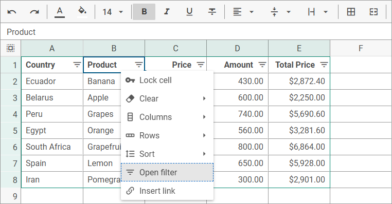
The contrast-light theme draws dark text and borders on a white background. In the Spreadsheet below, the context menu of a cell with the filter icon is opened with the keyboard. Its focused command, Open filter, is marked by a dashed outline, and the active cell is marked by a solid border in the primary color of the theme:
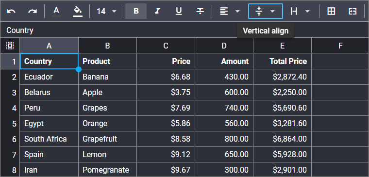
The contrast-dark theme draws light text and borders on a dark background. When the focus is on a toolbar control, the control is marked by a focus ring in the --dhx-spreadsheet-focus-color color, which is lighter than the primary color of the active cell border in the dark themes:
Focus indicator
The keyboard focus is shown in every theme:
- the active cell has a 2px solid border in the primary color of the theme
- a cell and the cell editor that have the keyboard focus get a 2px outline in the primary color of the theme
- the formula bar and the controls of the toolbar, the menu bar, the sheet tabs, the Border popup, the link popup and the search bar get a 2px outline in the color of the
--dhx-spreadsheet-focus-colorvariable - in the color palette, the border style list, the dropdowns of the toolbar and the menu bar, and the context menus, the focused item gets a 1px dashed outline in the
--dhx-color-focusedcolor - in the list editor of a cell, the focus stays in the editor, and the current item of the list is highlighted with a background color
The --dhx-spreadsheet-focus-color variable is lighter than the primary color in the dark themes and can be redefined in a custom theme. The contrast of each indicator in each theme is given in the Accessibility Conformance Report.
Color and zoom
- Color is not the only signal. The active cell and the selection have a border and a fill, an invalid value has a marker and a hidden description, and the formatting buttons report their state through
aria-pressed. The color buttons have the name of the color in their accessible name. - Zoom and reflow. The Spreadsheet stays operable at 200% and 400% zoom. The cells scroll in two directions, and the toolbar, the menu bar and the sheet tabs fit a width of 320 CSS px.
- Text spacing. With the WCAG text spacing overrides, no control label is cut, and the sheet tab bar scrolls when the tabs grow.
- Scrolling into view. The active cell is scrolled into view next to the frozen rows and columns.
Status announcements
The Spreadsheet announces the changes that have no element of their own through a polite live region, so the screen reader finishes the current sentence first:
| Event | Announced text | Locale key |
|---|---|---|
| A range is selected | "B2 to D7, 18 cells" | aria_selectedRange, aria_rangeExtent, aria_rangeSeparator |
| An edit causes a formula error or an invalid value | "B7: Reference error. Check the cell references" | aria_cellMessage |
| An edit causes several errors / invalid values | "3 new errors. B7: ..." / "3 invalid values. B7: ..." | aria_newErrors, aria_invalidValues |
| An edit of a locked cell / range is refused | "The cell is locked" / "Locked cells were not changed" | aria_lockedCell, aria_lockedCells |
| An editing key is pressed in the read-only mode | "The sheet is read-only" | aria_readonlySheet |
| The search text is typed | "Results: 5. 1 of 5, B2" or "No results" | aria_searchResults, aria_searchMatch, aria_searchNoResults |
| The next or previous match is shown | "2 of 5, B7" | aria_searchMatch |
| An Excel file is exported | "Exporting the file", "The file is exported" | aria_exportStarted, aria_exportDone |
| A file chosen in the file dialog is imported | "Importing the file", "The file is imported" | aria_importStarted, aria_importDone |
| The Column width / Row height command is applied | "Column width set to 120 pixels" | aria_columnWidthSet, aria_rowHeightSet |
| Ctrl + Shift + 9 / 0 finds nothing to show | "No hidden rows in the selection" | aria_noHiddenRows, aria_noHiddenCols |
To announce the result of your own command, call the announce() method:
spreadsheet.announce("The report is saved");
Localization
The accessible names, the cell descriptions and the announcements are stored in the spreadsheet locale as keys with the aria_ prefix, next to the interface labels. Translate them with the dhx.i18n.setLocale() method before the Spreadsheet is initialized:
dhx.i18n.setLocale("spreadsheet", {
    // other keys of the locale
    aria_grid: "Tabelle",
    aria_cellEditor: "Zelleneditor, {cell}",
    aria_readonlySheet: "Das Blatt ist schreibgeschützt",
    aria_selectedRange: "{range}, {count} Zellen",
    aria_rangeExtent: "{start} bis {end}"
});

const spreadsheet = new dhx.Spreadsheet("spreadsheet_container");
The parts in curly braces, such as {cell} or {count}, are replaced with the values and must be kept in the translated strings. The names of the colors and of the alert buttons come from the colorpicker and message locales. See Localization for the full list of keys and Localizing built-in widgets for the other locales.
Configuration recipes
Accessible default setup
The Spreadsheet needs no configuration for the keyboard and the WAI-ARIA output. To meet the WCAG AA contrast requirements for text, select a contrast theme. See Built-in themes for the other ways to set a theme:
const spreadsheet = new dhx.Spreadsheet("spreadsheet_container", {
    // the keyboard navigation and the WAI-ARIA output need no configuration
});
spreadsheet.parse(data);

dhx.setTheme("contrast-light"); // or "contrast-dark"
Read-only setup
Use the readonly option to show data that users can read and copy but not change. Keyboard and screen reader users can still move through the cells:
const spreadsheet = new dhx.Spreadsheet("spreadsheet_container", {
    readonly: true
});
spreadsheet.parse(data);
To show the data without an active cell and without selection, add selection: false. The grid then becomes one tab stop that the keyboard passes through.
Translated accessibility strings
Screen readers read the accessibility strings from four locales: spreadsheet holds the names, cell descriptions and announcements, colorpicker holds the color names, message holds the names of the alert buttons, and grid holds the announcement of the number of loaded rows. Set all four before you create the Spreadsheet. See Localizing built-in widgets for the keys:
const deSpreadsheet = {
    // other keys of the locale
    aria_grid: "Tabelle",
    aria_readonlySheet: "Das Blatt ist schreibgeschützt"
};
const deColorpicker = {
    aria_palette: "Farbpalette",
    aria_colorRed: "rot"
};
const deMessage = {
    aria_confirm: "Bestätigen"
};
const deGrid = {
    aria_rowsLoaded: "{count} Zeilen geladen"
};

dhx.i18n.setLocale("spreadsheet", deSpreadsheet);
dhx.i18n.setLocale("colorpicker", deColorpicker);
dhx.i18n.setLocale("message", deMessage);
dhx.i18n.setLocale("grid", deGrid);

const spreadsheet = new dhx.Spreadsheet("spreadsheet_container");
Announcing a custom command
When your own command changes the data, tell screen reader users about the result with the announce() method. The example adds a menu command that clears the active sheet:
const spreadsheet = new dhx.Spreadsheet("spreadsheet_container");

spreadsheet.menu.data.add({ id: "clear-sheet", value: "Clear sheet" });

spreadsheet.menu.events.on("click", function (id) {
    if (id === "clear-sheet") {
        spreadsheet.sheets.clear();
        spreadsheet.announce("The sheet is cleared");
    }
});
Host-page responsibilities
A few requirements live at the page level, not inside the component. Make sure that the host page:
- sets the document language, for example,
<html lang="en">, and a page title - puts a heading above the Spreadsheet and places it inside a landmark, for example,
<main> - provides a skip link, if the Spreadsheet is preceded by a long navigation
- gives a second signal, such as text or an icon, to any state that you mark with a cell color, since the colors of the cell styles are part of your data
- checks the contrast of the colors that you set in the cell styles and in a custom theme
Testing and methodology
The DHTMLX team validates the accessibility of Spreadsheet 6.0.4 against the component source and in the browser:
- Automated testing with axe-core in the
light,dark,contrast-lightandcontrast-darkthemes, with the search bar, the list editor, the dialogs and an alert open. - Manual review of the source: the roles, states and names of each part, the keyboard handlers and the focus regions, and the theme tokens with their contrast ratios.
- Manual testing: keyboard-only walkthroughs of the cells, the bars, the menus and the dialogs, screen reader passes with NVDA, JAWS and VoiceOver, 200% and 400% zoom, reflow at 320 CSS px and WCAG text spacing overrides.
- Conformance reporting: the results are published criterion by criterion in the Accessibility Conformance Report, including the criteria that the Spreadsheet partially supports.