Customization
You can customize the appearance, structure and functionality of the toolbar, menu, and context menu and define custom read-only behavior for Spreadsheet.
Default and custom icons
DHTMLX Spreadsheet uses the Material Design-based icons by default. However, you can use any other icon font pack, if necessary. For this, you need to include the desired icon font on a page and apply icons in any possible part of the spreadsheet: in Toolbar controls, Menu and Context menu items.
For example, you can use the Font Awesome icon pack by including link to its CDN after the source files of DHTMLX Spreadsheet as follows:
<script type="text/javascript" src="../../codebase/spreadsheet.js"></script>
<link rel="stylesheet" href="../../codebase/spreadsheet.css">

<link rel="stylesheet" href="https://use.fontawesome.com/releases/v5.3.1/css/all.css"
  integrity="sha384-mzrmE5qonljUremFsqc01SB46JvROS7bZs3IO2EmfFsd15uHvIt+Y8vEf7N7fWAU"
  crossOrigin="anonymous">
Then you can use the name of the icon as the value of the icon property in the object with the control parameters for toolbar, menu or context menu. See details below.
Controls types and operations
Types
You can add the following types of controls: button, menuItem, separator, and spacer.
The button object has the following properties:
type- the type of a button, set it to "button"id- the id of a buttonicon- the name of an icon from the used icon fonthotkey- the name of the hot key for a buttonvalue- the value of a buttontooltip- the tooltip of a buttontwoState- the flag that defines whether a button can be used in two statesactive- the state of a button:true- active,false- inactive
The menuItem object has the properties below:
type- the type of a menu item, set it to "menuItem"id- the id of a menu itemicon- the name of an icon from the used icon fonthotkey- the name of the hot key for a menu itemvalue- the value of a menu itemchilds- an array of children controls (note that all the children should have the typemenuItem)
The data collection API of the toolbar, menu, and context menu lets you manage controls: add custom ones, remove those you don't need, or update them — for example, change their icons.
Adding controls
To add a new control, apply the spreadsheet.{name}.data.add() method. It takes the parameters below:
config- (object) an object with the control configindex- (number) the index of the position to place the control intoparent- (string) the id of a parent control (for themenuItemtype)
For a button:
// spreadsheet.menu.data.add / spreadsheet.contextMenu.data.add
spreadsheet.toolbar.data.add({
    type: "button", // "menuItem"
    id: "button-id",
    tooltip: "Some tooltip",
    icon: "icon-name"
}, 2);
For a menuItem:
// spreadsheet.menu.data.add / spreadsheet.contextMenu.data.add
spreadsheet.toolbar.data.add({
    type: "menuItem",
    id: "menuitem-id",
    value: "Some value",
}, -1, "parent-id");
Updating controls
You can change the icon of the control and its other config options via the spreadsheet.{name}.data.update() method. It takes two parameters:
- the id of the control
- an object with new configuration of the control
// spreadsheet.menu.data.update / spreadsheet.contextMenu.data.update
spreadsheet.toolbar.data.update("add", {
    icon: "icon_name"
});
Deleting controls
To remove a control, make use of the spreadsheet.{name}.data.remove() method. Pass the id of the control that should be removed to the method:
// spreadsheet.menu.data.remove / spreadsheet.contextMenu.data.remove
spreadsheet.toolbar.data.remove("control-id");
Toolbar
Default controls
The default toolbar contains the following blocks of controls:
- the Undo block
- the Undo button (id: "undo")
- the Redo button (id: "redo")
- the Colors block
- the Text color button (id: "color")
- the Background color button (id: "background")
- the Font block
- the Font size combobox (id: "font-size")
- the Decoration block
- the Bold button (id: "font-weight-bold")
- the Italic button (id: "font-style-italic")
- the Underline button (id: "text-decoration-underline")
- the Strikethrough button (id: "text-decoration-line-through")
- the Align block
- the Horizontal align sub-block
- the Left button (id: "halign-left")
- the Center button (id: "halign-center")
- the Right button (id: "halign-right")
- the Vertical align sub-block
- the Top button (id: "valign-top")
- the Center button (id: "valign-center")
- the Bottom button (id: "valign-bottom")
- the Text wrapping sub-block
- the Clip button (id: "multiline-clip")
- the Wrap button (id: "multiline-wrap")
- the Horizontal align sub-block
- the Cell block
- the Border button (id: "border")
- the Merge/Unmerge button (id: "merge")
- the Format block
- the Format menuItem (id: "format")
- the Actions block
- the Filter button (id: "filter")
- the Insert link button (id: "link")
It is also possible to add the blocks enumerated below:
- the Lock block
- the Lock button (id: "lock")
- the Clear block
- the Clear group menuItem (id: "clear-group")
- the Clear value menuItem (id: "clear-value")
- the Clear styles menuItem (id: "clear-styles")
- the Clear all menuItem (id: "clear-all")
- the Clear group menuItem (id: "clear-group")
- the Rows block
- the Add row button (id: "add-row")
- the Remove row button (id: "remove-row")
- the Unfreeze rows button (id: "unfreeze-rows")
- the Freeze up to row [id] (id: "freeze-rows")
- the Hide row(s) [id] (id: "hide-rows")
- the Columns block
- the Add column button (id: "add-col")
- the Remove column button (id: "remove-col")
- the Unfreeze columns button (id: "unfreeze-cols")
- the Freeze up to column [id] (id: "freeze-cols")
- the Hide column(s) [id] (id: "hide-cols")
- the File block
- the Export menuItem (id: "export")
- the "Microsoft Excel(.xlsx)" menuItem (id: "export-xlsx")
- the Import menuItem (id: "import")
- the "Microsoft Excel(.xlsx)" menuItem (id: "import-xlsx")
- the Export menuItem (id: "export")
- the Help block
- the Help button (id: "help")
Adding controls
In the example below a new button is added into the toolbar:
spreadsheet.toolbar.data.add({
    type: "button",
    icon: "dxi dxi-delete",
    tooltip: "Remove all",
    id: "remove-all"
});
Related sample: Spreadsheet. Custom toolbar button
In the example below a new menuItem option is added into the "clear-group" control:
spreadsheet.toolbar.data.add({
    type: "menuItem",
    id: "clear-value2",
    value: "Clear value2"
}, -1, "clear-group");
There is a simplified notation for adding a menuItem, in case the exact position of the new item is not required:
spreadsheet.toolbar.data.add({
    type: "menuItem",
    id: "clear-value2",
    value: "Clear value2",
    parent: "clear-group"
});
Updating controls
In the example below the default icons of the toolbar Undo/Redo buttons are changed to Font Awesome ones:
spreadsheet.toolbar.data.update("undo", { icon: "fa fa-undo" });
spreadsheet.toolbar.data.update("redo", { icon: "fa fa-redo" });
Related sample: Spreadsheet. Custom toolbar icons
Deleting controls
In the example below the Undo button is removed from the toolbar:
spreadsheet.toolbar.data.remove("undo");
Custom font size
You can redefine the list of available font sizes in the Font toolbar block by removing the existing items from the "font-size" combobox and adding your own:
const FONT_SIZES = [8, 10, 12, 14, 16, 20];

const spreadsheet = new dhx.Spreadsheet("spreadsheet_container", {
    // configuration options
});

spreadsheet.toolbar.data.removeAll("font-size");
spreadsheet.toolbar.data.add(
    FONT_SIZES.map(size => ({ value: size, id: `font-size-${size}` })),
    -1,
    "font-size"
);

spreadsheet.parse(dataset);
Related sample: Spreadsheet. Set custom font size
Menu
Default controls
The default menu has the following structure:
- the File menuItem (id: "edit")
- the Import as... menuItem (id: "import")
- the "Microsoft Excel(.xlsx)" menuItem (id: "import-xlsx")
- the Download as... menuItem (id: "download")
- the "Microsoft Excel(.xlsx)" menuItem (id: "export-xlsx")
- the Import as... menuItem (id: "import")
- the Edit menuItem (id: "edit")
- the Undo menuItem (id: "undo")
- the Redo menuItem (id: "redo")
- the separator
- the Freeze menuItem (id: "freeze")
- the Unfreeze columns menuItem (id: "unfreeze-cols")
- the Freeze up to column [id] (id: "freeze-cols")
- the separator (id: "freeze-sep")
- the Unfreeze rows menuItem (id: "unfreeze-rows")
- the Freeze up to row [id] (id: "freeze-rows")
- the Lock menuItem (id: "lock")
- the separator
- the Clear menuItem (id: "clear")
- the Clear value menuItem (id: "clear-value")
- the Clear styles menuItem (id: "clear-styles")
- the Clear all menuItem (id: "clear-all")
- the Insert menuItem (id: "insert")
- the Columns menuItem (id: "columns")
- the Add column menuItem (id: "add-col")
- the Remove column menuItem (id: "remove-col")
- the Rows menuItem (id: "rows")
- the Add row menuItem (id: "add-row")
- the Remove row menuItem (id: "remove-row")
- the Insert link menuItem (id: "link")
- the Columns menuItem (id: "columns")
- the Format menuItem (id: "configuration")
- the Bold menuItem (id: "font-weight-bold")
- the Italic menuItem (id: "font-style-italic")
- the Underline menuItem (id: "text-decoration-underline")
- the Strikethrough menuItem (id: "text-decoration-line-through")
- the separator
- the Horizontal align menuItem (id: "halign")
- the Left menuItem (id: "halign-left")
- the Center menuItem (id: "halign-center")
- the Right menuItem (id: "halign-right")
- the Vertical align menuItem (id: "valign")
- the Top menuItem (id: "valign-top")
- the Center menuItem (id: "valign-center")
- the Bottom menuItem (id: "valign-bottom")
- the Text wrapping menuItem (id: "multiline")
- the Clip menuItem (id: "multiline-clip")
- the Wrap menuItem (id: "multiline-wrap")
- the Format menuItem (id: "format")
- the Merge/Unmerge menuItem (id: "merge")
- the Data menuItem (id: "data")
- the Data validation menuItem (id: "validation")
- the Search menuItem (id: "search")
- the Filter menuItem (id: "filter")
- the Sort menuItem (id: "sort")
- the Sort A to Z menuItem (id: "asc-sort")
- the Sort Z to A menuItem (id: "desc-sort")
- the Help menuItem (id: "help")
Adding controls
In the example below a new menuItem is added into the menu:
spreadsheet.menu.data.add({
    id: "validate",
    value: "Validate",
    childs: [
        {
            id: "isNumber",
            value: "Is number"
        },
        {
            id: "isEven",
            value: "Is even number"
        }
    ]
});
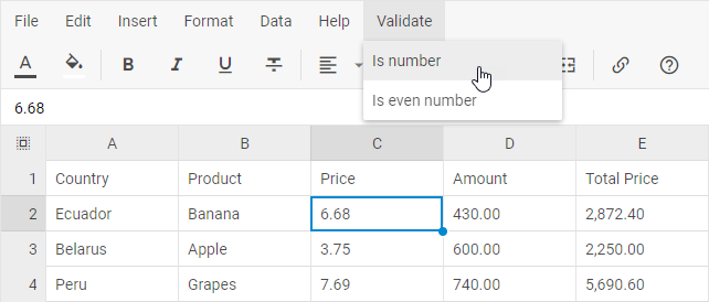
Related sample: Spreadsheet. Menu data
Updating controls
In the example below the default icons of the Undo/Redo menuItems are changed to Font Awesome ones:
spreadsheet.menu.data.update("undo", { icon: "fa fa-undo" });
spreadsheet.menu.data.update("redo", { icon: "fa fa-redo" });
Deleting controls
In the example below the Undo menuItem is removed from the menu:
spreadsheet.menu.data.remove("undo");
Context menu
Default controls
The default context menu has the following structure:
- the Lock menuItem (id: "lock")
- the Clear menuItem (id: "clear")
- the Clear value menuItem (id: "clear-value")
- the Clear styles menuItem (id: "clear-styles")
- the Clear all menuItem (id: "clear-all")
- the Columns menuItem (id: "columns")
- the Add column menuItem (id: "add-col")
- the Remove column menuItem (id: "remove-col")
- the Fit to data menuItem (id: "fit-col")
- the separator
- the Unfreeze columns menuItem (id: "unfreeze-cols")
- the Freeze up to column [id] menuItem (id: "freeze-cols")
- the Show columns menuItem (id: "show-cols")
- the Hide column(s) [id] menuItem (id: "hide-cols")
- the Rows menuItem (id: "rows")
- the Add row menuItem (id: "add-row")
- the Remove row menuItem (id: "remove-row")
- the separator
- the Unfreeze rows menuItem (id: "unfreeze-rows")
- the Freeze up to row [id] menuItem (id: "freeze-rows")
- the Show rows menuItem (id: "show-rows")
- the Hide row(s) [id] menuItem (id: "hide-rows")
- the Sort menuItem (id: "sort")
- the Sort A to Z menuItem (id: "asc-sort")
- the Sort Z to A menuItem (id: "desc-sort")
- the Insert link menuItem (id: "link")
Adding controls
In the example below a new menuItem is added into the context menu:
spreadsheet.contextMenu.data.add({
    icon: "mdi mdi-eyedropper-variant",
    value: "Paint format",
    id: "paint-format"
});
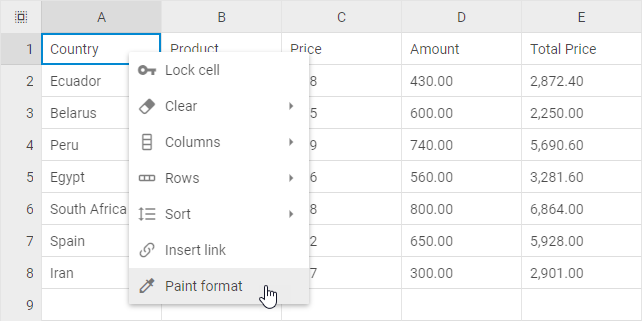
Related sample: Spreadsheet. Context menu
Updating controls
In the example below the default icons of the Lock menuItem is changed to the Font Awesome one:
spreadsheet.contextMenu.data.update("lock", { icon: "fa fa-key" });
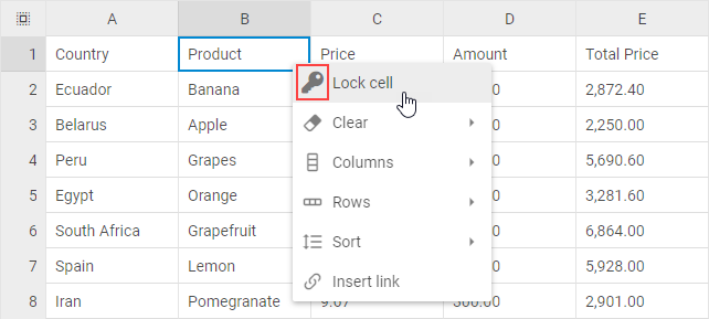
Deleting controls
In the example below the Undo menuItem is removed from the context menu:
spreadsheet.contextMenu.data.remove("lock");
Custom read-only mode
Besides applying the read-only mode to the whole Spreadsheet, you can block specific operations with the events whose names start with before, for example:
const spreadsheet = new dhx.Spreadsheet("spreadsheet_container", {});

spreadsheet.events.on("beforeEditStart", function(){
    return false;
});

spreadsheet.events.on("beforeAction", function(actionName){
    if (actionName === "setCellValue" || actionName === "setCellStyle") {
        return false;
    }
});

spreadsheet.parse(data);
Related sample: Spreadsheet. Custom readonly