Toolbar
Toolbar is a top part of Diagram Editor that helps users control the editing process.

To configure the Toolbar you can use the following properties:
-
css- applies the custom CSS class -
navigationType- defines the action that activates a Toolbar item. You can specify one of the following actions:"click"- activates a Toolbar item when a user clicks on it"pointer"- activates a Toolbar item when a user hovers the mouse pointer over it
-
items- the array ofitems(controls) arranged on Toolbar. There are 2 ways how to configure Toolbar items:
const editor = new dhx.DiagramEditor("editor_container", {
    type: "default",
    view: {
        // toolbar: true, // displays default Toolbar
        // or configure Toolbar via object
        toolbar: {
            css: "custom_css",
            navigationType: "pointer",
            items: [
                {
                    type: "file",
                    items: [
                        "importJson",
                        {
                            type: "exportJson",
                            value: "Export to JSON"
                        },
                        {
                            id: "custom_id_1",
                            type: "menuItem",
                            value: "Server export",
                            icon: "dxi dxi-vault",
                            items: [
                                "exportPdf",
                                {
                                    id: "custom_id_2",
                                    type: "menuItem",
                                    value: "PNG",
                                    handler: editor => {
                                        editor.diagram.export.png();
                                        // custom logic here
                                    }
                                }
                            ]
                        }
                    ]
                },
                "spacer",
                "scale"
            ]
        }
    }
});
Service elements
Toolbar items are represented by service elements. You can use and configure the following service elements:
-
file- forms a group of service elements for importing and exporting filesDetails
The
fileitem has the following structure:- file
- importJson
- export
    - exportJson
    - exportPdf
- exportPngThe
filecollection of items looks in the following way: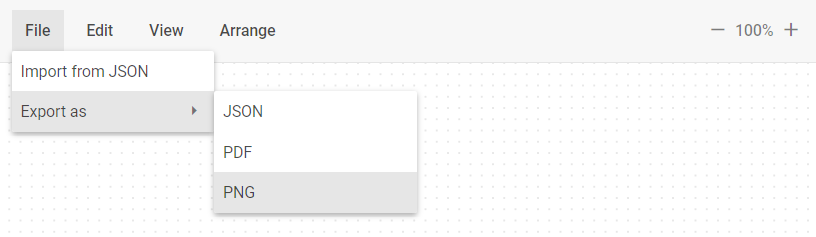
-
importJson- opens a dialog box to import a file in the JSON format -
export- forms a group of service elements for exporting a file in the selected formatDetails
The
exportitem has the following structure:- export
- exportJson
- exportPdf
- exportPng -
exportJson- exports a file in the JSON format -
exportPdf- exports a file in the PDF format -
exportPng- exports a file in the PNG format
-
edit- forms a group of service elements for managing and editing shapes, lines, groups, and swimlanesDetails
In the
defaultmode theeditcollection of items has the following default structure:- edit
- undo
- redo
- separator
- duplicate
- copy
- paste
- separator
- copyStyle
- pasteStyle
- separator
- selectAll
- selectNone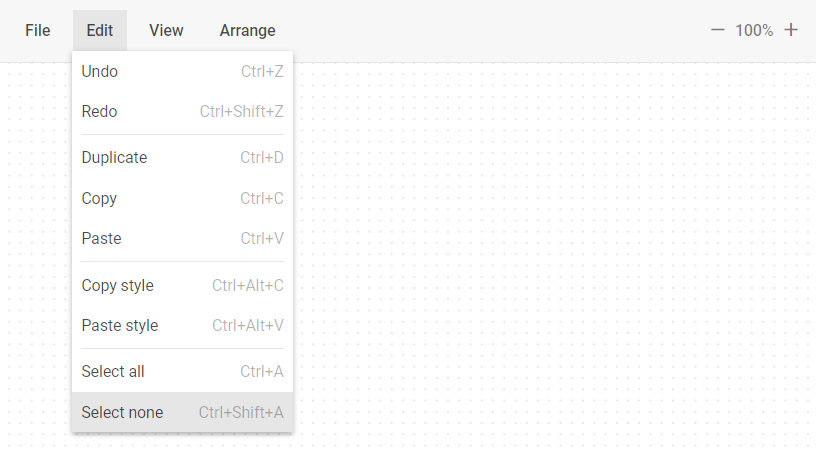
In the
org/mindmapmodes theeditcollection of items has the following default structure:- edit
- undo
- redo
- separator
- copyStyle
- pasteStyle
- separator
- selectAll
- selectNone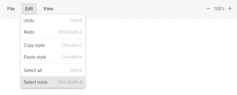
-
undo- takes a step back in the history of changes -
redo- takes a step forward in the history of changes -
duplicate- duplicates selected elements -
copy- copies selected files to themodelobject -
paste- pastes copied files from themodelobject -
copyStyle- copies the selected element styles to themodelobject -
pasteStyle- applies styles stored in themodelobject to the selected elements -
selectAll- selects all the elements available for selection -
selectNone- deselects all the available items
-
view- forms a group of service elements for managing view of Diagram Editor elementsDetails
In the
defaultmode theviewcollection of items has the following default structure:- view
- theme
    - themeLight
    - themeDark
    - themeLightContrast
    - themeDarkContrast
- separator
- shapebar
- editbar
- grid
- separator
- connectionPoints
- resizePoints
- magnetic
- separator
- zoomIn
- zoomOut
In the
org/mindmapmodes theviewcollection of items has the following default structure:- view
- theme
- themeLight
- themeDark
- themeLightContrast
- themeDarkContrast
- separator
- editbar
- separator
- grid
- separator
- resizePoints
- itemsDraggable
- separator
- zoomIn
- zoomOut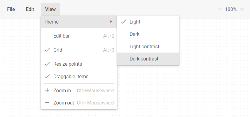
-
theme- forms a group of service elements for applying themesDetails
The
themeitem has the following structure:- theme
- themeLight
- themeDark
- themeLightContrast
- themeDarkContrast -
themeLight- applies the Light theme -
themeDark- applies the Dark theme -
themeLightContrast- applies the LightContrast theme -
themeDarkContrast- applies the DarkContrast theme -
shapebar- shows/hides theShapebarpanel -
editbar- shows/hides theEditbarpanel -
grid- shows/hides thegridon the Grid area -
connectionPoints- shows/hides the connection points -
resizePoints- shows/hides the resize points -
magnetic- turns on/off themagneticfunctionality -
zoomIn- increases the scale value by 0.05 (5%) -
zoomOut- decreases the scale value by 0.05 (5%)
-
arrange- forms a group of service elements for arranging Diagram Editor elementsDetails
In the
defaultmode thearrangecollection of items has the following default structure:- arrange
- layout
    - layoutMode
        - layoutModeDirect
        - layoutModeEdges
    - separator
    - layoutOrthogonal
    - layoutRadial
- align
- alignHorizontalLeft
- alignHorizontalCenter
- alignHorizontalRight
- separator
- alignVerticalTop
- alignVerticalCenter
- alignVerticalBottom
- distribute
- distributeVertical
- distributeHorizontal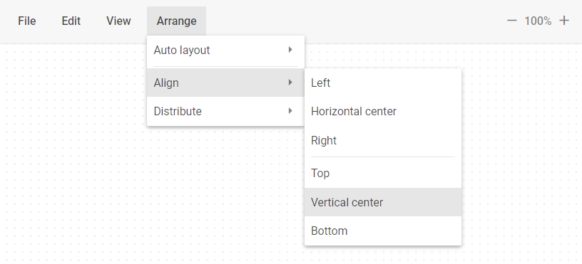
-
layout- forms a group of service elements to autoplace Diagram Editor elementsDetails
The
layoutitem has the following structure:- layout
- layoutMode
    - layoutModeDirect
    - layoutModeEdges
- separator
- layoutOrthogonal
- layoutRadial -
layoutMode- forms a group of service elements for managing the autoplacement modeDetails
The
layoutModeitem has the following structure:- layoutMode
- layoutModeDirect
- layoutModeEdges -
layoutModeDirect- applies thedirectmode of the element connectors -
layoutModeEdges- applies theedgesmode of the element connectors -
layoutOrthogonal- applies theorthogonalmode of the element arrangement -
layoutRadial- applies theradialmode of the element arrangement -
align- forms a group of service elements for managing alignment of the Diagram Editor elementsDetails
The
alignitem has the following structure:- align
- alignHorizontalLeft
- alignHorizontalCenter
- alignHorizontalRight
- separator
- alignVerticalTop
- alignVerticalCenter
- alignVerticalBottom -
alignHorizontalLeft- aligns elements horizontally on the left -
alignHorizontalCenter- aligns elements horizontally in the center -
alignHorizontalRight- aligns elements horizontally on the right -
alignVerticalTop- aligns elements vertically at the top -
alignVerticalCenter- aligns elements vertically in the center -
alignVerticalBottom- aligns elements vertically at the bottom -
distribute- forms a group of service elements for distributing the Diagram Editor elementsDetails
The
distributeitem has the following structure:- distribute
- distributeVertical
- distributeHorizontal -
distributeVertical- distributes elements vertically -
distributeHorizontal- distributes elements horizontally
-
scale- the control that allows users to increase or decrease the scale value by 0.05 (5%)Details
The
scaleitem looks in the following way: -
separator- a horizontal (between menu options) or vertical (between toolbar controls) line separating items/groups of items from each other. -
spacer- a space on the toolbar used for aligning controls
Base elements
Besides Service elements, you can also specify and configure the following Base elements using the object approach:
- Button
- Custom HTML
- Datepicker
- ImageButton
- Input
- MenuItem
- NavItem
- SelectButton
- Separator
- Spacer
- Title
The example below shows how to add the Button control to the Toolbar:
const editor = new dhx.DiagramEditor("editor_container", {
    type: "org", // "default" | "org" | "mindmap"
    view: {
        // toolbar: true, // displays default Toolbar
        // or configure Toolbar via object
        toolbar: {
            items: [
                {
                    type: "button",
                    value: "Best button"
                }
            ]
        }
    }
});
In addition to the inner properties of base elements (excluding Separator, Spacer and Title) you can also use the following properties:
checkIcon- (optional) - the handler that returns the icon css class. It is called with the following argument:editor- the Diagram Editor object
checkIcon?: (editor: IDiagramEditor) => string; // Use only for base elements that contain icon
handler- (optional) - the handler that runs when theclickorinputChangeevent occurs. It is called with the following arguments:editor- the Diagram Editor objectevent- a native event
handler?: (editor: object, event: Event) => void;
Related sample: Diagram with Editor. Default mode. Customization of cards, editbar, toolbar and shapebar