Combo
The basic input control that represents an advanced editable select box with a set of options.
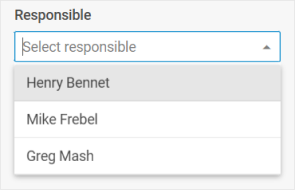
Usage
{
    type: "combo",
    options: (object | string)[],
    key?: string | string[],
    wrap?: boolean, // false by default

    css?: string,
    disabled?: boolean, // false by default
    hidden?: boolean, // false by default
    height?: string | number | "content", // "content" by default
    width?: string | number | "content", // "content" by default
    padding?: string | number,

    filter?: (item: any, input: string) => boolean,
    eventHandlers?: {
        [eventName: string]: {
            [className: string]: (event: Event, id: string | number) => void | boolean;
        };
    },
    itemHeight?: number | string, // 32 by default
    itemsCount?: boolean | ((count: number) => string),
    listHeight?: number | string, // 224 by default
    multiselection?: boolean, // false by default
    placeholder?: string,
    readOnly?: boolean, // false by default
    selectAllButton?: boolean, // false by default
    template?: (item: object) => string,
    virtual?: boolean, // false by default

    // for `wrap:true` check the label properties for the Fieldset
    label?: string,
    labelWidth?: string | number,
    labelPosition?: "left" | "top", // "top" by default

    // service properties and methods
    $on?: { [eventName: string]: function },
    $handler?: function,
    $setValue?: function,
    $layout?: function
}
Option configuration object inside Combo:
{
    id: string | number,
    value: string | number
}
Description
Combo properties
Basic properties
type- (required) the type of a control. Set it to"combo"options- (required) an array of Combo options, each option can be set as a string or as an object with a set ofkey:valuepairs - attributes of options and their valueskey- (optional) the name of the specified/modified property or the path to it in the object of a Diagram itemwrap- (optional) allows displaying the external wrapping. false by defaultcss- (optional) adds style classes to a controldisabled- (optional) defines whether a control is enabled (false) or disabled (true). false by defaulthidden- (optional) defines whether a combo is hidden. false by defaultheight- (optional) the height of a control."content"by defaultwidth- (optional) the width of a control."content"by defaultpadding- (optional) sets padding between a cell and a border of a Combo controlfilter- (optional) sets a custom function for filtering Combo options. Check the detailseventHandlers- (optional) adds event handlers to HTML elements of a custom template of Combo items. Check the detailsitemHeight- (optional) sets the height of a cell in the list of options. 32 by defaultitemsCount- (optional) shows the total number of selected optionslistHeight- (optional) sets the height of the list of options. 224 by defaultmultiselection- (optional) enables selection of multiple options in Combo. false by defaultplaceholder- (optional) sets a placeholder in the input of ComboreadOnly- (optional) makes Combo readonly (it is only possible to select options from the list, without entering words in the input). false by defaultselectAllButton- (optional) defines whether the "Select All" button should be shown. false by defaulttemplate- (optional) sets a template of displaying options in the popup listvirtual- (optional) enables dynamic loading of data on scrolling the list of options. false by defaultlabel- (optional) specifies a label for a controllabelPosition- (optional) defines the position of a label:"left"|"top"."top"by defaultlabelWidth- (optional) sets the width of the label of a control
Service properties and methods
warning
Note that we strongly recommend not redefining the service properties and methods for the default types of controls, since it may cause breaks in their functionality.
$on- (optional) - allows setting an event listener. The object has the following properties:eventName- a callback function which is called with the following parameters:object- an object with the following properties:control- the Combo Form controleditor- the object of the Diagram Editorid- the id of a Diagram item
arguments- (optional) - the original event arguments
$handler- (optional) - a callback function that allows handling actions on firing thechangeevent of the Combo Form control and thechangeevent of DataCollection. Called with the following parameter:object- an object with the following properties:
$setValue- (optional) - a callback function that allows setting the value of the Combo Form control on initialization of a control and on changing the value in DataCollection. Called with the following parameter:object- an object with the following properties:editor- the object of the Diagram Editorcontrol- the object of the Combo Form control the component is built onvalue- the value of a Diagram item
$layout- (optional) - a callback function that allows setting the structure of a control. Returns the configuration of the Combo Form control. Called with the following parameter:object- the configuration of a control without service properties
Option properties
id- theidattribute is returned and goes to form data. This attribute should always be fulfilled to avoid unexpected behaviorvalue- thevalueattribute is displayed in the input field
Example
const editor = new dhx.DiagramEditor("editor_container", {
    type: "org",
    view: {
        editbar: {
            properties: {
                $shape: [
                    {
                        type: "combo",
                        key: "responsible",
                        label: "Responsible",
                        placeholder: "Select responsible",
                        options: ["Henry Bennet", "Mike Frebel", "Greg Mash"]
                    }
                ]
            }
        }
    }
});
editor.parse([
    { "id": "shape_1" },
    { "id": "shape_2", "parent": "shape_1", "responsible": undefined },
    { "id": "shape_3", "parent": "shape_1", "responsible": "Henry Bennet" }
]);
With multiselection enabled
const editor = new dhx.DiagramEditor("editor_container", {
    type: "org",
    view: {
        editbar: {
            properties: {
                $shape: [
                    {
                        type: "combo",
                        key: "responsible",
                        multiselection: true,
                        label: "Responsible",
                        placeholder: "Select responsible",
                        options: ["Henry Bennet", "Mike Frebel", "Greg Mash"]
                    }
                ]
            }
        }
    }
});
editor.parse([
    { "id": "shape_1" },
    { "id": "shape_2", "parent": "shape_1", "responsible": [] },
    { "id": "shape_3", "parent": "shape_1", "responsible": ["Henry Bennet", "Mike Frebel"] }
]);
Setting options as objects
const editor = new dhx.DiagramEditor("editor_container", {
    type: "org",
    view: {
        editbar: {
            properties: {
                $shape: [
                    {
                        type: "combo",
                        key: "responsible",
                        multiselection: true,
                        label: "Responsible",
                        placeholder: "Select responsible",
                        options: ["Henry Bennet", "Mike Frebel", { id: 1, value: "Greg Mash" }]
                    }
                ]
            }
        }
    }
});
editor.parse([
    { "id": "shape_1" },
    { "id": "shape_2", "parent": "shape_1", "responsible": [] },
    { "id": "shape_3", "parent": "shape_1", "responsible": ["Mike Frebel", 1] }
]);