Fieldset
The basic control for creating complex controls with the help of the controls or the properties Editbar configuration options.
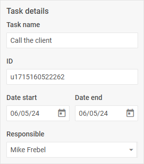
Usage
{
    type: "fieldset",

    compact?: boolean,
    hidden?: boolean, // false by default
    disabled?: boolean, // false by default

    css?: string,
    width?: string | number | "content", // "content" by default
    height?: string | number | "content", // "content" by default
    padding?: string | number,
    align?: "start" | "center" | "end" | "between" | "around" | "evenly", // "start" by default

    label?: string,
    labelAlignment?: "left" | "right" | "center", // "left" by default

    rows?: object[],
    cols?: object[],

    $layout?: function
}
The rows and cols properties may include an array of objects of the specified controls or the nested structure given below:
{
    css?: string,
    width?: string | number | "content", // "content" by default
    height?: string | number | "content", // "content" by default
    padding?: string | number,
    align?: "start" | "center" | "end" | "between" | "around" | "evenly", // "start" by default
    rows?: object[],
    cols?: object[]
}
Description
Basic properties
type- (required) the type of a control. Set it to"fieldset"compact- (optional) specifies the compact mode, removes indents and frame. false by defaultdisabled- (optional) defines whether a control is enabled (false) or disabled (true). false by defaulthidden- (optional) defines whether a control is hidden. false by defaultcss- (optional) the name of a CSS class(es) applied to the control groupwidth- (optional) sets the width of the control group."content"by defaultheight- (optional) sets the height of the control group."content"by defaultpadding- (optional) sets the padding for the content inside the control groupalign- (optional) sets the alignment of controls inside the control group."start"by defaultlabel- (optional) specifies a label for a controllabelAlignment- (optional) defines the position of the label:"left"|"right"|"center"."left"by defaultrows- (optional) arranges controls inside the control group verticallycols- (optional) arranges controls inside the control group horizontally
Service properties and methods
warning
Note that we strongly recommend not redefining the service properties and methods for the default types of controls, since it may cause breaks in their functionality.
$layout- (optional) - a callback function that allows setting the structure of a control. Returns the configuration of the Fieldset Form control. Called with the following parameter:object- the configuration of a control without service properties
Example
Creating a fieldset via the properties property
const editor = new dhx.DiagramEditor("editor_container", {
    type: "org",
    view: {
        editbar: {
            properties: {
                $shape: [
                    {
                        type: "fieldset",
                        label: "Task details",
                        rows: [
                            { type: "input", key: "name", label: "Task name" },
                            { type: "input", key: "id", label: "ID", readOnly: true },
                            {
                                align: "between",
                                cols: [
                                    { type: "datepicker", key: "date_start", label: "Date start", width: "48%" },
                                    { type: "datepicker", key: "date_end", label: "Date end", width: "48%" },
                                ]
                            },
                            {
                                type: "combo",
                                key: "responsible",
                                label: "Responsible",
                                placeholder: "Select responsible",
                                options: ["Henry Bennet", "Mike Frebel", "Greg Mash"]
                            }
                        ]
                    }
                ]
            }
        }
    }
});
Creating a complex control via the controls property
const editor = new dhx.DiagramEditor("editor_container", {
    type: "default",
    view: {
        editbar: {
            properties: {
                $shape: [
                    { type: "details" }
                ]
            },
            controls: {
                details: {
                    type: "fieldset",
                    label: "Task details",
                    rows: [
                        { type: "input", key: "name", label: "Task name" },
                        { type: "input", key: "id", label: "ID", readOnly: true },
                        {
                            align: "between",
                            cols: [
                                { type: "datepicker", key: "date_start", label: "Date start", width: "48%" },
                                { type: "datepicker", key: "date_end", label: "Date end", width: "48%" }
                            ]
                        },
                        {
                            type: "combo",
                            key: "responsible",
                            label: "Responsible",
                            placeholder: "Select responsible",
                            options: ["Henry Bennet", "Mike Frebel", "Greg Mash"]
                        }
                    ]
                }
            }
        }
    }
});