Timepicker
The basic control for selecting a time value either by moving handles along track bars or by entering hour and minutes values directly into related inputs.
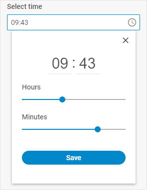
Usage
{
    type: "timepicker",
    key?: string | string[],
    wrap?: boolean, // false by default

    css?: string,
    disabled?: boolean, // false by default
    hidden?: boolean, // false by default
    height?: string | number | "content", // "content" by default
    width?: string | number | "content", // "content" by default
    padding?: string | number,

    controls?: boolean, // false by default
    icon?: string,
    placeholder?: string,
    timeFormat?: 12 | 24, // 24 by default
    valueFormat?: "string" | "timeObject", // "string" by default

    // for `wrap:true` check the label properties for the Fieldset
    label?: string,
    labelWidth?: string | number,
    labelPosition?: "left" | "top", // "top" by default

    // service properties and methods
    $on?: { [eventName: string]: function },
    $handler?: function,
    $setValue?: function,
    $layout?: function
}
Description
Basic properties
type- (required) the type of a control. Set it to"timepicker"key- (optional) the name of the specified/modified property or the path to it in the object of a Diagram itemwrap- (optional) allows displaying the external wrapping. false by defaultcss- (optional) adds style classes to a controlhidden- (optional) defines whether a control is hidden. false by defaultdisabled- (optional) defines whether a control is enabled (false) or disabled (true). false by defaultwidth- (optional) the width of a control."content"by defaultheight- (optional) the height of a control."content"by defaultpadding- (optional) sets padding between a cell and a border of the Timepicker controlcontrols- (optional) defines whether a timepicker is equipped with the Close and Save buttons. false by defaulticon- (optional) the CSS class of an icon from the used icon fontplaceholder- (optional) a tip for the inputtimeFormat- (optional) defines what clock format is activated: the 12-hour or 24-hour one. Set the property to 12 or 24, correspondingly. 24 by defaultvalueFormat- (optional) defines the format of the value to be applied when working with the events of the timepicker control:"string"|"timeObject"."string"by defaultlabel- (optional) specifies a label for the controllabelWidth- (optional) sets the label width of the controllabelPosition- (optional) defines the position of a label:"left"|"top"."top"by default
Service properties and methods
warning
Note that we strongly recommend not redefining the service properties and methods for the default types of controls, since it may cause breaks in their functionality.
$on- (optional) - allows setting an event listener. The object has the following properties:eventName- a callback function which is called with the following parameters:object- an object with the following properties:control- the Timepicker Form controleditor- the object of the Diagram Editorid- the id of a Diagram item
arguments- (optional) - the original event arguments
$handler- (optional) - a callback function that allows handling actions on firing thechangeandinputevents of the Timepicker Form control and thechangeevent of DataCollection. Called with the following parameter:object- an object with the following properties:id- the id of a Diagram itemkey- the name of the specified/modified property or the path to it in the object of a Diagram itemeditor- the object of the Diagram Editorcontrol- the object of the Timepicker Form control the component is built onvalue- the new value of the Timepicker Form control
$setValue- (optional) - a callback function that allows setting the value of the Timepicker Form control on initialization of a control and on changing the value in DataCollection. Called with the following parameter:object- an object with the following properties:editor- the object of the Diagram Editorcontrol- the object of the Timepicker Form control the component is built onvalue- the value of a Diagram item
$layout- (optional) - a callback function that allows setting the structure of a control. Returns the configuration of the Timepicker Form control. Called with the following parameter:object- the configuration of a control without service properties
Example
const editor = new dhx.DiagramEditor("editor_container", {
    type: "org",
    view: {
        editbar: {
            show: true,
            properties: {
                $shape: [
                    {
                        type: "timepicker",
                        key: "time",
                        label: "Select time",
                        controls: true
                    }
                ]
            }
        }
    }
});
editor.parse([
    { "id": "shape_1" },
    { "id": "shape_2", "parent": "shape_1", "time": "14:00" },
    { "id": "shape_3", "parent": "shape_1", "time": "18:30" }
]);