Container
The basic control for attaching an HTML code.
Usage
{
    type: "container",
    html: HTMLElement | string,
    wrap?: boolean, // false by default

    css?: string,
    disabled?: boolean, // false by default
    hidden?: boolean, // false by default
    height?: string | number | "content", // "content" by default
    width?: string | number | "content", // "content" by default
    padding?: string | number,

    // for `wrap:true` check the label properties for the Fieldset
    label?: string,
    labelWidth?: string | number,
    labelPosition?: "left" | "top", // "top" by default

    // service method
    $layout?: function
}
Description
Basic properties
type- (required) the type of a control. Set it to"container"html- (required) the HTML content of a controlwrap- (optional) allows displaying the external wrapping. false by defaultcss- (optional) adds style classes to a control stringdisabled- (optional) defines whether a control is enabled (false) or disabled (true). false by defaulthidden- (optional) defines whether a control is hidden. false by defaultheight- (optional) the height of a control."content"by defaultwidth- (optional) the width of a control."content"by defaultpadding- (optional) sets padding between a cell and a border of a controllabel- (optional) specifies a label for the controllabelWidth- (optional) sets the label width of the controllabelPosition- (optional) defines the position of a label:"left"|"top"."top"by default
Service properties and methods
warning
Note that we strongly recommend not redefining the service properties and methods for the default types of controls, since it may cause breaks in their functionality.
$layout- (optional) - a callback function that allows setting the structure of a control. Returns the configuration of the Container Form control. Called with the following parameter:object- the configuration of a control without service properties
Example
const editor = new dhx.DiagramEditor("editor_container", {
    type: "org",
    view: {
        editbar: {
            properties: {
                $default: [
                    {
                        type: "container",
                        html: `
                            <h3>DHTMLX Diagram</h3>
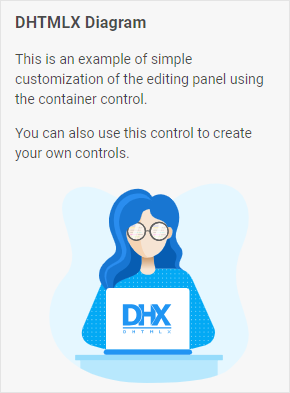
                            <p>This is an example of simple customization of the editing panel using the container control.</p>
                            <p>You can also use this control to create your own controls.</p>
                            <img
                                style='display: block; width: 200px; height: 200px; margin-top: 20px; margin-left: auto; margin-right: auto'
                                src='https://snippet.dhtmlx.com/codebase/data/common/img/01/developer-01.svg'
                            >
                        `
                    }
                ]
            }
        }
    }
});