时间与日期
本节介绍了一对日期选择器,用于设置特定的时间和日期范围。
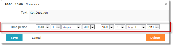
scheduler.locale.labels.section_time = 'Time period';

scheduler.config.lightbox.sections = [
    { name:"text", height:50, map_to:"text", type:"textarea", focus:true },
    { name:"time", height:72, type:"time", map_to:"auto"}
];
Related sample: Basic initialization
属性
以下是“time”控件常用的一些关键属性(完整列表请参见 这里):
| name | (string) 区块的名称 |
| height | (number) 区块的高度 |
| map_to | (string) 区块映射到的数据属性名 |
| type | (textarea,time,select,template,multiselect,radio,checkbox,combo) 区块中使用的控件类型,其中 "time" 表示日期时间控件 |
| year_range | (array, number) 定义年份选择器的范围。可以通过两种方式设置: year_range: [2005, 2025] - 包含2005到2025年 year_range: 10 - 包含当前年份前后各10年 |
Time控件中的自动结束日期
如果希望设置默认事件持续时间,并且结束日期会自动调整以保持该持续时间,可以使用 event_duration 和 auto_end_date 设置:
// 设置事件时长(分钟),用于自动调整结束时间
scheduler.config.event_duration = 60;
scheduler.config.auto_end_date = true;
Related sample: Automatic end date
这样设置后,每当在弹出框中更改事件的开始时间或日期时,结束时间和日期会自动更新,以保持事件持续时间为60分钟(由 event_duration 选项指定)。
日期时间选择器的顺序
可以修改“Time period”区块内日期时间控件的顺序,或移除某些选择器。通过 time_format 属性实现:
scheduler.config.lightbox.sections=[
  {name:"description", height:130, map_to:"text", type:"textarea", focus:true},
  {name:"time", ..., time_format:["%H:%i","%m","%d","%Y"]}
];
请注意,这只改变了数组中项目的顺序,并不影响数据的显示格式。若需调整时间部分的显示格式,请使用 time_picker 模板。
不同格式的示例:
//默认顺序
time_format:["%H:%i", "%m", "%d", "%Y"]
//月份优先
time_format:["%m","%d", "%Y", "%H:%i"]
//移除年份选择器
time_format:["%H:%i", "%m", "%d"]
//错误示例
time_format:["%H:%i", "%M", "%d", "%Y"] // "%m" 被错误替换为 "%M"
弹出框中的迷你日历
可以在弹出框中添加迷你日历(日期选择器),用于选择“开始”和“结束”日期。
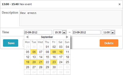
要将迷你日历添加到弹出框,请按照以下步骤操作:
- 在页面中引入扩展:
scheduler.plugins({
    minical: true
});
- 将 time 区块的 type 从 time 更改为 calendar_time:
//默认弹出框设置
scheduler.config.lightbox.sections=[
  {name:"description", height:200, map_to:"text", type:"textarea", focus:true},
  {name:"time", height:72, type:"time", map_to:"auto"}
];
//将"type"从"time"更改为"calendar_time"
scheduler.config.lightbox.sections = [
  {name:"description", height:200, map_to:"text", type:"textarea", focus:true},
  {name:"time", height:72, type:"calendar_time", map_to:"auto" }
];
Related sample: Mini calendar in the lightbox
如需进一步自定义迷你日历,请参阅 Mini Calendar Templates。
返回顶部