라이트박스 조작
컨트롤 값 가져오기/설정하기
섹션의 컨트롤 값을 가져오거나 설정하려면 아래와 같이 [formSection] 객체를 사용합니다:
//값을 가져오기
const value = scheduler.formSection('description').getValue();

//값을 설정하기
scheduler.formSection('description').setValue('abc');
단일 클릭으로 라이트박스 열기
기존 라이트박스를 단일 클릭으로 열 수 있습니다. 이를 위해 [onClick] 이벤트와 [showLightbox] 메서드를 사용합니다:
scheduler.attachEvent("onClick", function (id, e){
    scheduler.showLightbox(id);
    return true;
});
관련 샘플 하나의 클릭으로 라이트박스 열기
사용자가 이벤트 박스를 왼쪽 마우스 버튼으로 클릭하면 라이트박스가 열립니다.
라이트박스가 열렸는지 확인하기
현재 라이트박스가 열려 있는지 닫혀 있는지 확인하려면 getState 메서드가 반환하는 상태 객체의 lightbox_id 속성을 사용합니다.
라이트박스가 열려 있다면 열려 있는 이벤트의 id를 반환하고, 그렇지 않으면 'null' 또는 'undefined'가 반환됩니다:
if (scheduler.getState().lightbox_id){
    // 열린 라이트박스에 대한 코드
} else {
    // 닫힌 라이트박스에 대한 코드
}
이벤트 객체의 속성을 라이트박스 섹션에 매핑하기
이벤트 객체의 속성을 라이트박스 섹션에 매핑하려면 다음을 수행합니다:
- 데이터 소스가 지원 형식으로 이벤트를 반환하는지 확인합니다.
{
   "data":[
      {
          "id":"1",
          "start_date":"2027-03-02 00:00:00",
          "end_date":"2027-03-04 00:00:00",
          "text":"Graduation ceremony",
          "type":"1",
          "location":"London"
      },
      ...
   ]
}
참고로, 데이터 소스가 반환하는 모든 속성은 이벤트 객체에 추가되며 클라이언트 측 API에서 사용할 수 있습니다.
- 특정 속성에 라이트박스 컨트롤을 매핑하려면 섹션의 map_to 속성에 이벤트 속성의 이름을 지정합니다:
scheduler.config.lightbox.sections=[
    {name:"description", height:70, map_to:"text", type:"textarea" , focus:true},
    {name:"locationInput", height:35, map_to:"location", type:"textarea" },
    {name:"typeSelect", map_to:"type", type:"select", options:scheduler.serverList("types")},
    {name:"time", type:"time", map_to:"auto"}
];
다음 예외는 항상 고정 속성에 매핑되는 컨트롤로, [time] 및 [recurring] 컨트롤입니다(각각은 고정 속성에 매핑됩니다: event.start_date/event.end_date 및 event.rec_type/event.event_length/event.event_pid).
Time 컨트롤의 자동 종료 날짜
초기 이벤트 지속 시간을 설정하고 종료 날짜가 자동으로 바뀌도록 하려면 [event_duration]과 [auto_end_date] 속성을 사용합니다:
//auto_end_time 매개변수에 대한 이벤트 지속 시간을 분 단위로 지정
scheduler.config.event_duration = 60;
scheduler.config.auto_end_date = true;
이와 같은 구성으로 사용자가 라이트박스에서 시작 시간이나 날짜를 변경할 때마다 종료 시간과 날짜가 자동으로 변경되어 이벤트 지속 시간이 60분(옵션의 [event_duration])과 같아지게 됩니다.
라이트박스 컨트롤의 기본값 설정하기
라이트박스 섹션의 기본값을 설정하려면 섹션 객체의 default_value 속성을 사용합니다.
예를 들어, 이벤트의 위치를 표시하는 커스텀 섹션을 라이트박스에 추가하고 이를 'Location'이라고 부른 경우, 사용자가 새 이벤트를 만들 때 해당 필드는 비어 있습니다. 이러한 동작을 수정하고 Greenwich Observatory의 주소를 기본값으로 표시하려면 다음과 같이 라이트박스를 지정합니다:
scheduler.config.lightbox.sections = [
    { name:"description", height:50, map_to:"text", type:"textarea", focus:true },
    { name:"location", height:43, map_to:"event_location", type:"textarea",
    default_value:"Blackheath Avenue London,Greenwich,Greater London SE10 8XJ,UK"},
    { name:"time", height:72, type:"time", map_to:"auto"}
];
참고로, default_value 속성은 라이트박스 섹션의 기본값을 설정하며 새 이벤트의 기본값이 아닙니다. 즉, 새 이벤트는 사용자가 라이트박스를 열고 이벤트를 저장한 후에만 지정된 값을 받습니다.
새 이벤트에 대해 직접 기본값을 설정하려면 onEventCreated 이벤트를 사용합니다:
scheduler.attachEvent("onEventCreated", function(id,e){
    scheduler.getEvent(id).location = 'Blackheath Avenue London, Greenwich...';
    scheduler.updateEvent(id); // 업데이트된 이벤트를 렌더링
    return true;
});
날짜-시간 컨트롤의 순서 변경 및 시간 선택기 제거
'Time period' 섹션에서 날짜-시간 컨트롤의 순서를 변경하거나 일부를 제거할 수 있습니다. 이를 위해 time_format 속성을 사용합니다:
scheduler.config.lightbox.sections= [
  {name:"description", height:130, map_to:"text", type:"textarea" , focus:true},
  {name:"time", ..., time_format:["%H:%i","%m","%d","%Y"]}
];
참고: 데이터 표시 형식을 변경할 수 없으며, 배열 항목의 순서만 변경할 수 있습니다.
예를 들어 형식을 아래와 같이 바꿀 수 있습니다:
//기본값
time_format:["%H:%i", "%m", "%d", "%Y"]
//월을 먼저 표시
time_format:["%m","%d", "%Y", "%H:%i"]
// 연도 선택기를 제거
time_format:["%H:%i", "%m", "%d"]
// 잘못된 예
time_format:["%H:%i", "%M", "%d", "%Y"] //"%m"이 "%M"으로 변경됨
읽기 전용 모드
읽기 전용 모드에 대한 자세한 내용은 읽기 전용 모드 챕터를 참조하세요.
특정 이벤트에 대해 섹션을 숨기기
특정 이벤트에 대해 섹션을 숨기려면 해당 섹션의 set_value 메서드를 아래와 같이 재정의합니다:
scheduler.form_blocks.textarea.set_value = function(node,value,ev){
    node.firstChild.value= value || "";
    let style = ev.some_property ? "" : "none";
    node.style.display = "style;" // 편집기 영역
    node.previousSibling.style.display = "style;" //섹션 헤더
    scheduler.setLightboxSize(); // 라이트박스의 올바른 크기 설정
}
'종일 이벤트' 옵션
라이트박스에 '종일 이벤트' 옵션을 추가하려면 full_day 옵션을 true로 설정합니다. 이를 위해 아래의 코드 줄을 추가하면 됩니다:
scheduler.config.full_day = true;
한 번 full_day 옵션이 활성화되면, 왼쪽 부분의 Time period 섹션에 있는 Full Day 체크박스가 표시됩니다. 선택하면 해당 섹션의 모든 입력 필드가 차단되고, 이벤트 지속 시간이 현재 셀 날짜의 자정부터 다음 날 자정까지의 전체 일정으로 설정됩니다.
라이트박스의 유형
라이트박스는 두 가지 유형 중 하나로 제시될 수 있습니다:
- Standard (wide);
- Short.
기본 스킨에서는 표준(와이드) 유형으로만 표시될 수 있으며, 반면에 'glossy' 또는 'classic' 스킨에서는 두 유형 중 하나를 선택할 수 있습니다.
원하는 유형을 설정하려면 [wide_form] 속성을 사용합니다:
scheduler.config.wide_form = true;
Standard (wide) lightbox:

Short form:

섹션 머리글의 버튼
섹션 머리글에 커스텀 버튼을 두는 것이 가능합니다. 헤더에 버튼을 추가하려면 다음 절차를 따라야 합니다:
- 섹션 객체에 'button' 속성을 지정합니다:
{name:"description", height:130, map_to:"text", type:"textarea", button:"help"}
- 버튼의 레이블을 설정합니다:
// 'button' 속성의 값은 'help'입니다
scheduler.locale.labels.button_help = "Help label";
- 버튼 클릭의 핸들러를 지정합니다:
scheduler.form_blocks.textarea.button_click = function(index,button,shead,sbody){
    // 사용자 정의 코드
}
여기서:
- index - (number) 섹션의 인덱스. 0부터 시작하는 번호 매김
- button - (HTMLElement) 버튼의 HTML 요소
- shead - (HTMLElement) 섹션 헤더의 HTML 요소
- sbody - (HTMLElement) 섹션 본문의 HTML 요소
버튼에 사용할 이미지를 아래의 CSS 클래스로 정의할 수 있습니다:
.dhx_custom_button_help{
    background-image:url(imgs/but_help.gif);
}
선택 컨트롤 연결하기
라이트박스에서 선택 컨트롤을 서로 의존적으로 만들 수 있습니다. 이를 위해 선택 컨트롤의 onchange 속성을 사용합니다:
const update_select_options = function(select, options) { // 도우미 함수
    select.options.length = 0;
    for (let i = 0; i < options.length; i++) {
        let option = options[i];
        select[i] = new Option(option.label, option.key);
    }
};

const parent_onchange = function(event) {
    const new_child_options = child_select_options[this.value];
    update_select_options(scheduler.formSection('child').control, new_child_options);
};
scheduler.attachEvent("onBeforeLightbox", function(id){
    const ev = scheduler.getEvent(id);
    if (!ev.child_id) {
        const parent_id = ev.parent_id||parent_select_options[0].key;
        const new_child_options = child_select_options[parent_id];
        update_select_options(
            scheduler.formSection('child').control, new_child_options
        );
    }
    return true;
});

scheduler.config.lightbox.sections= [
    ...
    {name:"parent", height:23, type:"select", options: parent_select_options,
     map_to:"parent_id", onchange:parent_onchange },
    {name:"child", height:23, type:"select", options: child_select_options,
     map_to:"child_id" }
    ...
];
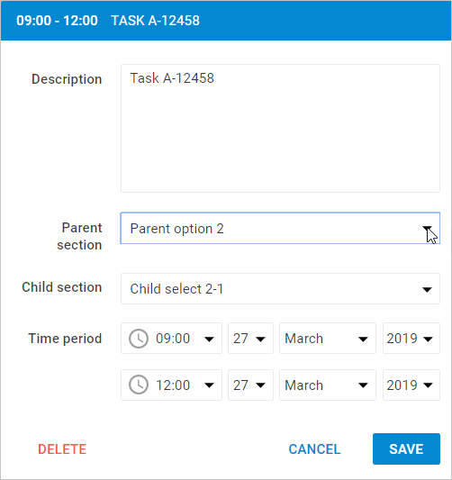
onchange 이벤트는 사용자가 부모 섹션의 선택 옵션을 변경할 때 트리거됩니다. 자식 섹션의 옵션이 그에 따라 변경됩니다.
라이트박스 섹션의 동적 변경
라이트박스 섹션을 동적으로 변경하는 기능이 있습니다. 즉, 구성에 따라 라이트박스의 섹션을 숨기거나 차단하거나 표시할 수 있습니다.
다음의 resetLightbox() 메서드를 통해 라이트박스 섹션을 동적으로 변경할 수 있습니다. 예를 들면:
- 두 가지 서로 다른 컨트롤 세트를 포함하는 두 개의 배열로 라이트박스 구성을 만듭니다.
const full_lightbox = [
    { name: "description", height: 200, map_to: "text", type: "textarea", focus: true},
    { name: "hidden", height: 23, map_to: "hidden", type: "textarea"},
    { name: "time", height: 72, type: "time", map_to: "auto"}
];
const restricted_lightbox = [
    { name: "description", height: 200, map_to: "text", type: "textarea", focus: true},
    { name: "time", height: 72, type: "time", map_to: "auto"}
];
- 다음 단계에서는 아래의 절차를 구현합니다.
-
새로운 라이트박스를 표시하기 전에 현재 편집 양식의 컨트롤 세트를 제거하고 다른 컨트롤 세트로 새로운 라이트박스 객체를 생성하기 위해 resetLightbox() 메서드를 호출합니다.
-
id로 이벤트 객체를 가져오고, 이 라이트박스 구성 중 어떤 것을 적용할지 조건을 지정합니다. 아래 예제에서 조건은 "restricted" 속성으로 도입되었습니다.
scheduler.attachEvent("onBeforeLightbox", function(event_id) {
    scheduler.resetLightbox();
    const ev = scheduler.getEvent(event_id);
    scheduler.config.lightbox.sections = (ev.restricted) ?
        restricted_lightbox : full_lightbox;
    return true;
});
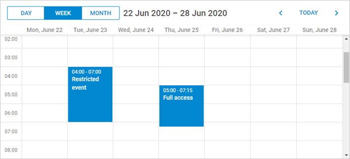
- 'restricted' 이벤트 속성을 사용하여 "restricted_lightbox" 구성을 적용합니다. 그렇지 않으면 전체 라이트박스가 표시됩니다.
scheduler.init('scheduler_here', new Date(2027, 5, 30), "week");
scheduler.parse([
    { start_date: "2027-06-27 04:00", end_date: "2027-06-27 7:00",
        text: "Restricted event", hidden: "You won't see me", restricted: true },
    { start_date: "2027-06-29 05:00", end_date: "2027-06-29 11:00",
        text: "Full access", hidden: "Hidden text" }
]);