List of Controls
Block
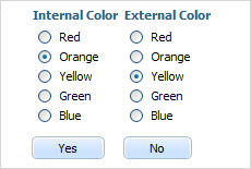
allows combining several sense-connected items. It's identical to fieldset but doesn't have label and frame.
Attributes
| blockOffset | number | left-side offset of the item content (default 20) |
| className | string | the user-defined css class for block's items |
| disabled | boolean | disables/enables the block's items |
| hidden | boolean | hides/shows the item. The default value - false (the item is shown) |
| inputLeft | number | sets the left absolute offset of input.The attribute is applied only if the position is set as "absolute" |
| inputTop | number | sets the top absolute offset of input. The attribute is applied only if the position is set as "absolute" |
| name | string | the identification name. Used for referring to item |
| list | array | defines the array of nested elements |
| offsetLeft | number | sets the left relative offset of item |
| offsetTop | number | sets the top relative offset of item |
| position | string | label-left, label-right, label-top or absolute - defines the position of label relative to block. As just labels are defined for block, just value absolute makes sense and is used for setting absolute label position |
| width | number | the width of block |
var formData = [
    {type: "settings", position: "label-right"},
    {type: "block", width: 900, list:[
        {type: "label", label: "Internal Color"},
        {type: "radio", name: "n1", value: 1, label: "Red"},
        {type: "radio", name: "n1", value: 2, label: "Orange"},
        {type: "radio", name: "n1", value: 3, label: "Yellow"},
        {type: "radio", name: "n1", value: 4, label: "Green"},
        {type: "radio", name: "n1", value: 5, label: "Blue"},
        {type: "button", value: "Yes"},
        {type: "newcolumn"},
        {type: "label", label: "External Color"},
        {type: "radio", name: "n2", value: 1, label: "Red"},
        {type: "radio", name: "n2", value: 2, label: "Orange"},
        {type: "radio", name: "n2", value: 3, label: "Yellow"},
        {type: "radio", name: "n2", value: 4, label: "Green"},
        {type: "radio", name: "n2", value: 5, label: "Blue"},
        {type: "button", value: "No"}
    ]}
];
Btn2state
presents a customizable checkbox
Attributes
| checked | boolean | defines whether or not checkbox will be checked initially. The default value is "false" |
| className | string | the user-defined css class for item |
| cssName | string | allows setting individual look for a specific item's instance (see details below) |
| disabled | boolean | disables/enables the item |
| hidden | boolean | hides/shows the item. The default value - "false" (the item is shown) |
| info | boolean | adds the |
| inputLeft | number | sets the left absolute offset of input. The attribute is applied only if the position is set as "absolute" |
| inputTop | number | sets the top absolute offset of input. The attribute is applied only if the position is set as "absolute" |
| inputWidth | string|number | the width of input. The default value is "auto" |
| label | string | the text label of the item |
| labelAlign | string | left, right or center - the alignment of label within the defined width |
| labelHeight | string|number | the height of DIV where the label is placed (not the font size). The default value is "auto" |
| labelLeft | number | sets the left absolute offset of label. The attribute is applied only if the position is set as "absolute" |
| labelTop | number | sets the top absolute offset of label. The attribute is applied only if the position is set as "absolute" |
| labelWidth | string|number | the width of label. The default value is "auto" |
| list | array | defines the array of nested elements |
| name | string | the identification name. Used for referring to item |
| note | object | creates the details block which is placed under the input, parameters: text- (string) the note's text, width - (number) the note area's width (get from input by default) |
| offsetLeft | number | sets the left relative offset of item (both input and label) |
| offsetTop | number | sets the top relative offset of item (both input and label) |
| position | string | label-left/label-right/label-top/absolute - defines the position of label relative to check box |
| required | boolean | adds the |
| readonly | boolean | true/false or 0/1 - specifies whether item's value can be changed by button click in browser (meanwhile, item's value can be changed programmatically anytime) |
| tooltip | string | creates the tooltip for the input label |
| value | string | the initial value of item |
| userdata | object | sets some user data for the input ("key:value" pairs) |
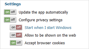
var formData = [
    {type:"label", label: "Settings"},
    {type: "btn2state", label:"Auto-update the app",checked:true,
       info:true,required:true},
    {type: "btn2state", label: "Configure privacy settings", list:[
        {type: "btn2state", label: "Start when I start Windows"},
        {type: "btn2state", label: "Allow to be shown on the web"},
        {type: "btn2state", label: "Accept browser cookies", checked:true}
    ]}
];
Details
The control behaves itself as a checkbox but doesn't have any visual representation ( i.e. if you simply add it to the page the page will display nothing (it just adds an empty DIV).
To form the look of the control you should specify four CSS classes with the following names (the CSS classes will be applied to all controls of the "bt2state" type):
- .dhxform_obj_dhx_skyblue div.dhxform_img.btn2state_0 - applied when the item is enabled and not checked
- .dhxform_obj_dhx_skyblue div.dhxform_img.btn2state_1 - applied when the item is enabled and checked
- .dhxform_obj_dhx_skyblue div.disabled div.dhxform_img.btn2state_0 - applied when the item is disabled and not checked
- .dhxform_obj_dhx_skyblue div.disabled div.dhxform_img.btn2state_1 - applied when the item is disabled and checked
.dhxform_obj_dhx_skyblue div.dhxform_img.btn2state_0 {
    background-image: url("imgs/toggle_off.png");
    width: 42px;
    height: 20px;
};
.dhxform_obj_dhx_skyblue div.dhxform_img.btn2state_1 {
    background-image: url("imgs/toggle_on.png");
    width: 42px;
    height: 20px;
};
.dhxform_obj_dhx_skyblue div.disabled div.dhxform_img.btn2state_0 {
    background-image: url("imgs/toggle_off_dis.png");
    width: 42px;
    height: 20px;
}
.dhxform_obj_dhx_skyblue div.disabled div.dhxform_img.btn2state_1 {
    background-image: url("imgs/toggle_on_dis.png");
    width: 42px;
    height: 20px;
}

formData = [
    {type: "btn2state", label: "Update the app automatically", checked: true},
        ...
]
To set the look of just a specific bt2state instance you should use the cssName attribute.
In this case, CSS classes must have the following names:
- .dhxform_obj_dhx_skyblue div.dhxform_img.[cssName]_0
- .dhxform_obj_dhx_skyblue div.dhxform_img.[cssName]_1
- .dhxform_obj_dhx_skyblue div.disabled div.dhxform_img.[cssName]_0
- .dhxform_obj_dhx_skyblue div.disabled div.dhxform_img.[cssName]_1
Related sample: Button 2-State
Button
presents a standard button
Attributes
| className | string | a user-defined css class for an item |
| disabled | boolean | disables/enables the item |
| hidden | boolean | hides/shows the item. The default value - "false" (the item is shown) |
| inputLeft | number | sets the left absolute offset of control. The attribute is applied only if the *position* is set as "absolute" |
| inputTop | number | sets the top absolute offset of control. The attribute is applied only if the *position* is set as "absolute" |
| name | string | the identification name. Used for referring to item |
| offsetLeft | number | sets the left relative offset of item |
| offsetTop | number | sets the top relative offset of item |
| tooltip | string | creates the tooltip for the control label |
| value | string | the text label of button |
| width | number | the button's width |
| userdata | object | sets some user data for the control "key:value" pairs) |
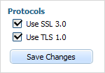
var formData = [
    {type: "label", label: "Protocols"},
    {type: "checkbox", name: "ssl", label: "Use SSL 3.0", checked:true},
    {type: "checkbox", name: "tls", label: "Use TLS 1.0", checked:true},
    {type: "button", name: "btn", value: "Save Changes"}
];
Calendar
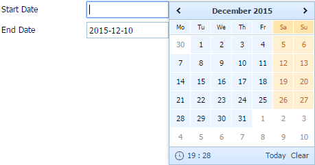
dhtmlxCalendar integration. Presents date field with a pop-up calendar.
Please note, in order to use the calendar item you must include 2 files:
<link rel="STYLESHEET" type="text/css" href="../codebase/dhtmlx.css">
<script src="../codebase/dhtmlx.js" type="text/javascript"></script>
Using dhtmlxCalendar API
To use the dhtmlxCalendar API for the item, get the calendar object as in:
var dhxCalendar = myForm.getCalendar("myCalendar");
...
dhxCalendar.showTime();
Attributes
| calendarPosition | string | bottom/right - sets the position pop-up calendar will appear from. The default value is bottom |
| className | string | the user-defined css class for item |
| dateFormat | string | sets format of date presentation in input (see available format characters in setCalendarDateFormat) |
| disabled | boolean | disables/enables the item |
| enableTime | boolean | defines whether time manage elements will be presented at the bottom of the calendar |
| enableTodayButton | boolean | defines whether the Today and Clear buttons will be displayed at the bottom of the calendar |
| hidden | boolean | hides/shows the item. The default value - "false" (the item is shown) |
| info | boolean | adds the |
| inputHeight | string|number | the height of input. The default value is "auto" |
| inputLeft | number | sets the left absolute offset of input.The attribute is applied only if the *position* is set as "absolute" |
| inputTop | number | sets the top absolute offset of input. The attribute is applied only if the *position* is set as "absolute" |
| inputWidth | string|number | the width of input. The default value is "auto" |
| label | string | the text label of item |
| labelAlign | left | right or center, the alignment of a label within the defined width |
| labelHeight | string|number | the height of a label. The default value is "auto" |
| labelLeft | number | sets the left absolute offset of a label. The attribute is applied only if the *position* is set as "absolute" |
| labelTop | number | sets the top absolute offset of a label. The attribute is applied only if the *position* is set as "absolute" |
| labelWidth | string|number | the width of a label. The default value is "auto" |
| minutesInterval | number | 1/5/10/15 - the time interval (in minutes) for the predefined values in the time selector. The default value is 5 |
| name | string | the identification name. Used for referring to item |
| note | object | creates the details block which is placed under the input, parameters: text- (string) the note's text, width - (number) the note area's width (get from input by default) |
| offsetLeft | number | sets the left relative offset of item (both input and label) |
| offsetTop | number | sets the top relative offset of item (both input and label) |
| position | string | label-left/label-right/label-top/absolute - defines the position of label relative to input |
| readonly | boolean | true/false or 0/1 - specifies whether item's value can be changed by typing in the input (you are still able to set the value by clicking on the calendar icon). Can be used to exclude the possibility of entering incorrect values |
| required | boolean | adds the |
| serverDateFormat | string | the format in which the date is stored on server (see available format characters setCalendarDateFormat) |
| showWeekNumbers | boolean | enables/disables an additional left column with weeks' numbers. By default, *false* |
| tooltip | string | creates the tooltip for the input label |
| validate | function | predefined rule or custom function - sets the validation rule. See details in the chapter Validation |
| value | string | the initial value of item |
| weekStart | number | from 1 to 7 - sets the start day of a week. '1' relates to Monday and '7' to Sunday. |
| userdata | object | sets some user data for the input "key:value" pairs) |
var formData = [
    {
        type: "calendar",
        name: "start_date",
        label: "Start Date",
        enableTime: true,
        enableTodayButton: true,
        calendarPosition: "right"
    },
    {type: "calendar", name: "end_date", label: "End Date", dateFormat: "%Y-%m-%d"}
];
Related sample: dhtmlxCalendar
Checkbox
presents a standard check box
Attributes
| checked | boolean | defines whether or not checkbox will be checked initially. The default value is "false" |
| className | string | the user-defined css class for item |
| disabled | boolean | disables/enables the item |
| hidden | boolean | hides/shows the item. The default value - "false" (the item is shown) |
| info | boolean | adds the |
| inputLeft | number | sets the left absolute offset of input. The attribute is applied only if the *position* is set as "absolute" |
| inputTop | number | sets the top absolute offset of input. The attribute is applied only if the *position* is set as "absolute" |
| label | string | the text label of item |
| labelAlign | string | left/right/center - the alignment of label within the defined width |
| labelHeight | string|number | the height of DIV where the label is placed (not the font size). The default value is "auto" |
| labelLeft | number | sets the left absolute offset of label. The attribute is applied only if the *position* is set as "absolute" |
| labelTop | number | sets the top absolute offset of label. The attribute is applied only if the *position* is set as "absolute" |
| labelWidth | string|number | the width of label. The default value is "auto" |
| list | array | defines the array of nested elements |
| name | string | the identification name. Used for referring to item |
| note | object | creates the details block which is placed under the input, parameters: text- (string) the note's text, width - (number) the note area's width (get from input by default) |
| offsetLeft | number | sets the left relative offset of item (both input and label) |
| offsetTop | number | sets the top relative offset of item (both input and label) |
| position | string | label-left, label-right, label-top or absolute, defines the position of label relative to check box |
| required | boolean | adds the |
| readonly | boolean | true/false or 0/1 - specifies whether item's value can be changed by button click in browser (meanwhile, item's value can be changed programmatically anytime) |
| tooltip | string | creates the tooltip for the input label |
| value | string | the initial value of item |
| userdata | object | sets some user data for the input "key:value" pairs) |
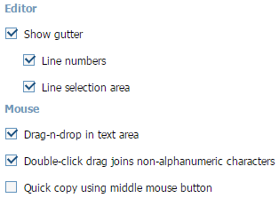
var formData = [
    {type: "checkbox", label: "Show gutter", checked: true, list:[
        {type:"checkbox", name:"ch1", value:"r1", label:"Line numbers", checked:true},
        {type:"checkbox", name:"ch2", value:"r2", label:"Line selection area",
            checked:true}
    ]},
    //
    {type "label", label:"Mouse"},
    {type:"checkbox", label:"Drag-n-drop in text area", checked: true},
    {type:"checkbox", label:"Double-click drag joins non-alphanumeric characters",
        checked: true},
    {type:"checkbox", label:"Quick copy using middle mouse button"},
];
Related sample: Checkbox/Radio button
Colorpicker
dhtmlxColorPicker integration. A data field with a pop-up colorPicker.
Please note, in order to use the colorpicker item you must include 2 files:
<link rel="STYLESHEET" type="text/css" href="../codebase/dhtmlx.css">
<script src="../codebase/dhtmlx.js" type="text/javascript"></script>
Using dhtmlxColorpicker API
To use the dhtmlxColorpicker API for the item, get the colorpicker object as in:
var dhxColorPicker = myForm.getColorPicker("myPicker");
...
dhxColorPicker.hide();
Attributes
| className | string | the user-defined css class for item |
| cpPosition | string | the colorpicker's position (right/bottom) |
| disabled | boolean | disables/enables the item |
| enableCustomColors | boolean | sets custom colors (specified in the customColors parameter) for the item. The default value - "false" |
| customColors | string | a comma-separated list of custom colors that will be used in the colorpicker if the enableCustomColors parameter is set to "true" |
| hidden | boolean | hides/shows the item. The default value - "false" (the item is shown) |
| info | boolean | adds the |
| inputHeight | string|number | sets input height. The default value is "auto" |
| inputLeft | number | the left absolute offset of input. The attribute is applied only if the "position" is set as "absolute" |
| inputTop | number | the top absolute offset of input. The attribute is applied only if the "position" is set as "absolute" |
| inputWidth | string|number | sets input width. The default value is "auto" |
| label | string | the text label of item |
| labelAlign | string | left/right/center - the alignment of label within the defined width |
| labelHeight | string|number | the height of label. The default value is "auto" |
| labelLeft | number | the left absolute offset of label. The attribute is applied only if the "position" is set as "absolute" |
| labelTop | number | the top absolute offset of label. The attribute is applied only if the "position" is set as "absolute" |
| labelWidth | string|number | the width of label. The default value is "auto" |
| name | string | the identification name. Used for referring to item |
| note | object | creates the details block which is placed under the input, parameters: text- (string) the note's text, width - (number) the note area's width (get from input by default) |
| offsetLeft | number | sets the left relative offset of item (both input and label) |
| offsetTop | number | sets the top relative offset of item (both input and label) |
| position | string | label-left/label-right/label-top/absolute - defines the position of label relative to input |
| readonly | boolean | true/false or 0/1 - specifies whether item's value can be changed by typing in the input (you are still able to set the value by clicking on the colorpicker icon). Can be used to exclude the possibility of entering incorrect values |
| required | boolean | adds the |
| tooltip | string | creates the tooltip for the input label |
| validate | function | predefined rule or custom function, sets the validation rule. See details in the chapter Validation |
| value | string | the initial value of item |
| userdata | object | sets some user data for the input "key:value" pairs) |
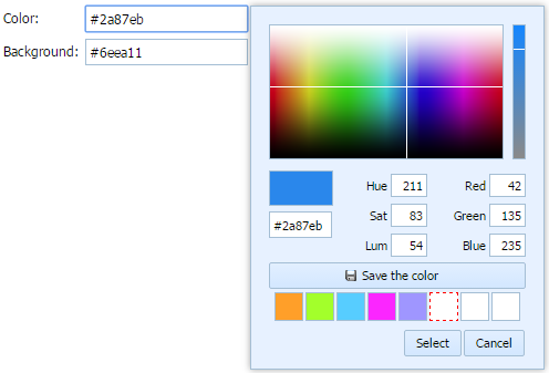
var formData = [
    {type: "colorpicker", name: "Color", label: "Color:", value: "#2a87eb",
        enableCustomColors:"1", customColors:"#ff9f29,#a3ff2b,#57cdff,#fb26ff,#9f96ff"},
    {type: "colorpicker", name: "Background", label: "Background:", value: "#6eea11"}
];
Related sample: dhtmlxColorPicker
Combo
dhtmlxCombo integration. Presents a normal combo box.
Please note, in order to use the combo item you must include 2 files:
<link rel="STYLESHEET" type="text/css" href="../codebase/dhtmlx.css">
<script src="../codebase/dhtmlx.js" type="text/javascript"></script>
Form supports combo nesting, i.e. you can set different items for different options. Subject to the selected option - the appropriate set of items will be shown.
Using dhtmlxCombo API
To use the dhtmlxCombo API for the item, get the combo object as in:
var dhxCombo = myForm.getCombo("myCombo");
...
dhxCombo.attachEvent("onChange", function(){});
Attributes
| className | string | the user-defined css class for item |
| connector | url | allows loading select options of the item from database. See details in Combo Specific HowTos. |
| comboType | string | "checkbox" or "image" - allows adding check boxes or images to combo's items |
| disabled | boolean | disables/enables the item |
| hidden | boolean | hides/shows the item. The default value - "false" (the item is shown) |
| info | boolean | adds the |
| inputLeft | number | sets the left absolute offset of input.The attribute is applied only if the "position" is set as "absolute" |
| inputTop | number | sets the top absolute offset of input. The attribute is applied only if the "position" is set as "absolute" |
| inputWidth | string|number | the width of input. The default value is "auto" |
| filtering | boolean | switches on the filtering mode (when a user starts to type, combo suggests matching search results). The default value is "false" |
| label | string | the text label of item |
| labelAlign | string | left/right/center - the alignment of label within the defined width |
| labelHeight | string|number | the height of label. The default value is "auto" |
| labelLeft | number | sets the left absolute offset of label. The attribute is applied only if the "position" is set as "absolute" |
| labelTop | number | sets the top absolute offset of label. The attribute is applied only if the "position" is set as "absolute" |
| labelWidth | string|number | the width of label. The default value is "auto" |
| name | string | the identification name. Used for referring to item |
| note | object | creates the details block which is placed under the input, parameters: text- (string) the note's text, width - (number) the note area's width (get from input by default) |
| offsetLeft | number | sets the left relative offset of item (both input and label) |
| offsetTop | number | sets the top relative offset of item (both input and label) |
| options | object | specifies select options of item, parameters: list - (array) defines the array of nested elements, selected - (boolean) defines whether the option will be selected initially, text- (string) the option's text, value - (string) the option's id |
| position | string | label-left/label-right/label-top/absolute - defines the position of label relative to input |
| readonly | boolean | true/false or 0/1 - specifies whether the value of the item can be changed by button click in browser (meanwhile, the value can be changed programmatically anytime) |
| required | boolean | adds the |
| tooltip | string | creates the tooltip for the item label |
| validate | function | predefined rule or custom function - sets the validation rule. See details in the chapter Validation |
| value | string | the initial value of item |
| userdata | object | sets some user data for the item "key:value" pairs) |
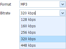
var formData = [
    {type: "combo", label: "Format", name: "format", options:[
        {text: "AAC", value: "AAC"},
        {text: "AC3", value: "AC3", selected: true},
        {text: "MP3", value: "MP3"},
        {text: "FLAC", value: "FLAC"}
    ]},
    {type: "combo", label: "Bitrate", name: "a_bitrate", options:[
        {text: "128 kbps", value: "128"},
        {text: "160 kbps", value: "160"},
        {text: "256 kbps", value: "256"},
        {text: "320 kbps", value: "320", selected: true},
        {text: "448 kbps", value: "448"}
    ]},
];
XML format for connector attribute and reloadOptions() method
<complete>
    <option value="value_a">text</option>
    <option value="value_b" selected="true">new text</option>
    ...
</complete>
Container
presents a simple HTML container where you can place any content
Attributes
| className | string | the user-defined css class for item |
| hidden | boolean | hides/shows the item. The default value - "false" (the item is shown) |
| info | boolean | adds the |
| inputHeight | string|number | the height of input. The default value is "auto" |
| inputWidth | string|number | the width of input. The default value is "auto" |
| inputLeft | number | sets the left absolute offset of input. The attribute is applied only if the "position" is set as "absolute" |
| inputTop | number | sets the top absolute offset of input. The attribute is applied only if the "position" is set as "absolute" |
| label | string | the text label of item |
| labelLeft | number | sets the left absolute offset of label. The attribute is applied only if the "position" is set as "absolute" |
| labelTop | number | sets the top absolute offset of label. The attribute is applied only if the "position" is set as "absolute" |
| name | string | the identification name. Used for referring to item |
| note | object | creates the details block which is placed under the input, parameters: text- (string) the note's text, width - (number) the note area's width (get from input by default) |
| offsetLeft | number | sets the left relative offset of item (both input and label) |
| offsetTop | number | sets the top relative offset of item (both input and label) |
| position | string | label-left/label-right/label-top/absolute - defines the position of label relative to input |
| required | boolean | adds the |
| style | string | specifies css style that will be applied to the input |
| tooltip | string | creates the tooltip for the input label |
| userdata | object | sets some user data for the input "key:value" pairs) |
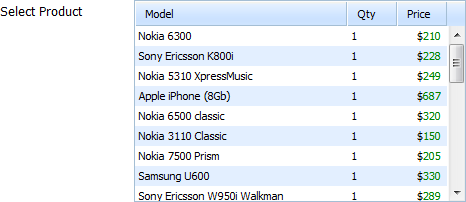
var formData = [
    {
        type:"container",
        name:"myGrid",
        label:"Select Product",
        inputWidth:330,
        inputHeight:200
    }
];
Details
The main use case of the control is integration with the DHTMLX components.
- components are initialized as usual with the only difference is that they use the container control as a DIV container.
- the getContainer() method returns an HTMLDivElement object of the control.
For example, to integrate dhtmlxGrid with the form:
var formData = [
    {
        type:"container",
        name: "myGrid",
        label: "Select Product",
        inputWidth: 330,
        inputHeight: 200
    }
];
var myForm = new dhtmlXForm("myForm", formData);

grid = new dhtmlXGridObject(myForm.getContainer("myGrid"));
Related events:
- onEnable - fires when the control is enabled after being disabled
- onDisable - fires when the control is disabled after being enabled
Related sample: Attach Grid to Form / Container
Editor
dhtmlxEditor integration. Presents text editor.

Please note, in order to use the editor item you must include 2 files:
<link type="text/css" href="../codebase/dhtmlx.css">
<script src="../codebase/dhtmlx.js" type="text/javascript"></script>
Using dhtmlxEditor API
To use the dhtmlxEditor API for the item, get the editor object as in:
var dhxEditor = myForm.getEditor("myEditor");
...
dhxEditor.alignCenter();
Attributes
| className | string | the user-defined css class for item |
| disabled | boolean | disables/enables the item |
| hidden | boolean | hides/shows the item. The default value - false (the item is shown) |
| info | boolean | adds the |
| inputHeight | string|number | sets the height of input. The default value is auto |
| inputLeft | number | the left absolute offset of input. The attribute is applied only if the "position" is set as "absolute" |
| inputTop | number | the top absolute offset of input. The attribute is applied only if the "position" is set as "absolute" |
| inputWidth | string|number | sets the width of input. The default value is auto |
| label | string | the text label of item |
| labelAlign | string | left/right/center - the alignment of label within the defined width |
| labelHeight | string|number | the height of label. The default value is auto |
| labelLeft | number | the left absolute offset of label. The attribute is applied only if the "position" is set as "absolute" |
| labelTop | number | the top absolute offset of label. The attribute is applied only if the "position" is set as "absolute" |
| labelWidth | string|number | the width of label. The default value is auto |
| name | string | the identification name. Used for referring to item |
| note | object | creates the details block which is placed under the input, parameters: text- (string) the note's text, width - (number) the note area's width (get from input by default) |
| offsetLeft | number | sets the left relative offset of item (both input and label) |
| offsetTop | number | sets the top relative offset of item (both input and label) |
| position | string | label-left/label-right/label-top/absolute - defines the position of label relative to input |
| required | boolean | adds the |
| tooltip | string | creates the tooltip for the item label |
| validate | function | predefined rule or custom function - sets the validation rule. See details in the chapter Validation |
| value | string | the initial value of item |
| userdata | object | sets some user data for the item ("key:value" pairs) |
var formData = [
    {type:'editor', name:'Description', label:'Description:', labelWidth:90,
      labelLeft:-4, labelTop:112, inputWidth:300, inputLeft:97, inputTop:110,
        position:'absolute', labelAlign:'right', inputHeight:124, value:"Hello,Editor!"}
];
Creating long editor toolbar
If you want to create a long toolbar for Editor, you need to use 2 more properties:
- toolbar - (boolean) true/false to enable/disable toolbar
- iconsPath - (string) path to toolbar icons, they should be placed in the folder with Editor images ("../dhtmlxEditor/codebase/imgs/")

Fieldset
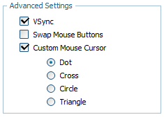
presents a standard fieldset that allows combining several sense-connected items.
Attributes
| className | string | the user-defined css class for fieldset's items |
| disabled | boolean | disables/enables the fieldset's items |
| hidden | boolean | hides/shows the item. The default value - false (the item is shown) |
| inputLeft | number | sets the left absolute offset of input.The attribute is applied only if the "position" is set as "absolute" |
| inputTop | number | sets the top absolute offset of input. The attribute is applied only if the "position" is set as "absolute" |
| label | string | the text label of item (legend) |
| list | array | defines the array of nested elements |
| offsetLeft | number | sets the left relative offset of item (both input and label) |
| offsetTop | number | sets the top relative offset of item (both input and label) |
| position | string | label-left/label-right/label-top/absolute - defines the position of label relative to fieldset. As just labels are defined for fieldset, |
| width | number | the width of fieldset |
| userdata | object | sets some user data for the item ("key:value" pairs) |
var formData = [
    {type: "fieldset",  name: "mydata", label: "Advanced Settings", width:180, list:[
        {type:"settings", position:"label-right"},
        {type: "checkbox", name: "vsync", label: "VSync", checked: "1"},
        {type: "checkbox", name: "mouse_invert", label: "Swap Mouse Buttons"},
        {type:"checkbox", name:"custom_cursor", label:"Custom Mouse Cursor",
          checked:"0", list:[
            {type:"radio", name:"cursor_value", value:"dot", label:"Dot", checked:"1"},
            {type:"radio", name:"cursor_value", value:"cross",  label:"Cross"},
            {type:"radio", name:"cursor_value", value:"circle", label:"Circle"},
            {type:"radio", name:"cursor_value", value:"triangle", label:"Triangle"}
        ]}
    ]}
];
File
(Deprecated) presents a file upload item.
Attributes
| className | string | the user-defined css class for item |
| disabled | boolean | disables/enables the item |
| hidden | boolean | hides/shows the item. The default value - false (the item is shown) |
| info | boolean | adds the |
| inputLeft | number | sets the left absolute offset of input.The attribute is applied only if the "position" is set as "absolute" |
| inputTop | number | sets the top absolute offset of input. The attribute is applied only if the "position" is set as "absolute" |
| label | string | the text label of item |
| labelAlign | string | left/right/center - the alignment of label within the defined width |
| labelHeight | string|number | the height of label. The default value is "auto" |
| labelLeft | number | sets the left absolute offset of label. The attribute is applied only if the "position" is set as "absolute" |
| labelTop | number | sets the top absolute offset of label. The attribute is applied only if the "position" is set as "absolute" |
| labelWidth | string|number | the width of label. The default value is "auto" |
| name | string | the identification name. Used for referring to item |
| note | object | creates the details block which is placed under the input, parameters: text- (string) the note's text, width - (number) the note area's width (get from input by default) |
| offsetLeft | number | sets the left relative offset of item (both input and label) |
| offsetTop | number | sets the top relative offset of item (both input and label) |
| position | string | label-left/label-right/label-top/absolute - defines the position of label relative to input |
| required | boolean | adds the |
| tooltip | string | creates the tooltip for the input label |
| userdata | object | sets some user data for the input ("key:value" pairs) |
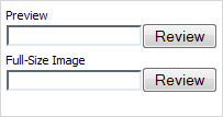
var formData = [
    {type: "file", name: "caret", label: "Preview", position:"label-top"},
    {type: "file", name: "caret", label: "Full-size image", position:"label-top"}
];
How to use
- Create a real html form (this form should be "around" dhtmlxForm):
<form id="realForm" method="POST" enctype="multipart/form-data">
    <div id="dhxForm">

    </div>
</form>
- Put the dhtmlxForm instance inside the real form, attach a callback to a dhtmlxForm button (or the 'submit' button of the real form) and submit the real form manually:
var formData = [
    {type: "file", name: "my_file", ...},
    {type: "button", name: "upload", value: "Upload"}
];

var myForm = new dhtmlXForm("dhxForm", formData);
myForm.attachEvent("onButtonClick", function(id){
    if (id == "upload") {
        document.getElementById("realForm").submit();
    }
});

function myCallBack(state, fileName, fileSize) {
    // see below what is this needed for
};
Upload files without page reloading:
- Create a hidden iframe on your page like the one shown below:
<iframe name="upload_area" frameBorder="0" height="0"></iframe>- Set the "target" attribute of your real form to the name of the iframe, i.e. "upload_area". In this case, the form will be submitted into the iframe and the page won't be reloaded. The myCallBack() function can be called as in:
<?php
// move_uploaded_file() and other code here
// print result
print_r("<SCRIPT>parent.myCallBack(true, 'filename.rar', '234123')</SCRIPT>");
?>
Hidden
A hidden text field (invisible for users). Presents original input type=hidden.
Attributes
| name | string | the identification name. Used for referring to item |
| value | string | the initial value of item |
| userdata | object | sets some user data for the input ("key:value" pairs) |
Usage of value is optional, but without this attribute hidden doesn't make any sense.
var formData = [
    {type: "hidden", name:"topField", value:"1"}
];
Image
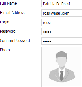
presents an image with the ability to upload a new one
Attributes
| className | string | the user-defined css class for item |
| disabled | boolean | disables/enables the item |
| hidden | boolean | hides/shows the item. The default value - false (the item is shown) |
| info | boolean | adds the |
| inputHeight | string|number | the height of input. The default value is "auto" |
| inputLeft | number | sets the left absolute offset of input. The attribute is applied only if the "position" is set as "absolute" |
| inputTop | number | sets the top absolute offset of input. The attribute is applied only if the "position" is set as "absolute" |
| inputWidth | string|number | the width of input. The default value is "auto" |
| label | string | the text label of item |
| labelAlign | string | left/right/center - the alignment of label within the defined width |
| labelHeight | string|number | the height of DIV where the label is placed (not the font size). The default value is "auto" |
| labelLeft | number | sets the left absolute offset of label. The attribute is applied only if the "position" is set as "absolute" |
| labelTop | number | sets the top absolute offset of label. The attribute is applied only if the "position" is set as "absolute" |
| labelWidth | string|number | the width of label. The default value is "auto" |
| name | string | the identification name. Used for referring to item |
| offsetLeft | number | sets the left relative offset of item (both input and label) |
| offsetTop | number | sets the top relative offset of item (both input and label) |
| position | string | label-left/label-right/label-top/absolute - defines the position of label relative to input |
| style | string | specifies css style that will be applied to the input |
| tooltip | string | creates the tooltip for the input label |
| value | string | the initial value of an item |
| userdata | object | sets some user data for the input "key:value" pairs) |
| url | string | server side script (see the details below) |
| imageWidth | number | the width of the image (image will be centered within inputWidth) |
| imageHeight | number | the height of the image (image will be centered within inputHeight) |
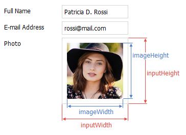
To initialize an item as a part of Form, you need to specify at least the type, name and url params (if you omit the name property Form will generate it automatically).
{
    type: "image",
    name: "user_photo",
    url:  "some.php",
    imageWidth: 126,
    imageHeight: 126,
    inputWidth: 130,
    inputHeight: 130
}
Rendering an item
If you set an item value or the whole form data in the following way:
myForm.setItemValue("user_photo", "avatar.jpg");
// or
myForm.setFormData({user_photo: "avatar.jpg"});
The GET request will be performed by Form to get image source from the server:
some.php?action=loadImage&itemId=user_photo&itemValue=avatar.jpg&dhxr1441638923235=1
You can turn off the dhxr param by setting window.dhx.ajax.cache=true (see cache for details).
An example of server response:
if (@$_REQUEST["action"] == "loadImage") {

    // load any default image
    $i = "empty_user.jpg";

    // check if requested image exists
    $k = "uploaded/".md5($_REQUEST["itemValue"]);
    if (file_exists($k)) $i = $k;

    // output image
    header("Content-Type: image/jpg");
    print_r(file_get_contents($i));

}
The above code will load a custom image (if it was previously uploaded to server) or just load the default 'empty_user.jpg' image which will notify the user about missing image.
Uploading an image
When the user clicks to upload an image, selects the needed image and presses "open" in the browser dialog box, uploading will start automatically.
The POST request will be performed by the form with the following parameters:
action=uploadImage
itemId=user_photo
file=file data here
The form waits for the following response:
{
    state: true,                // true if the file uploaded successfully
    itemId: 'user_photo',       // item name
    itemValue: 'item_value',    // value to set via setItemValue() after upload
    extra: {any data here}      // optional data for uploading ok/fail events
}
A server side script example:
if (@$_REQUEST["action"] == "uploadImage") {

    $k = md5($_FILES["file"]["filename"]);

    // make sure you added security checks for $k variable here
    @unlink("uploaded/".$k);

    // and here...
    move_uploaded_file($_FILES["file"]["tmp_name"], "uploaded/".$k);

    header("Content-Type: text/html; charset=utf-8");
    print_r("{state: true, itemId: '".@$_REQUEST["itemId"]."', itemValue: '".$k."'}");

}
After the form got the response, it will call the onImageUploadSuccess or onImageUploadFail events. If the file was uploaded successfully, the form will also update the image by calling the URL with the returned itemValue parameter.
// correctly
myForm.attachEvent("onImageUploadSuccess", function(name, value, extra){
    // your code here
});

// fires when an image was uploaded incorrectly
myForm.attachEvent("onImageUploadFail", function(name, extra){
    // your code here
});
Input/Textarea
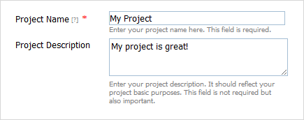
presents a standard text input field or a textarea. To define textarea, use the attribute rows (see details below).
Attributes
| className | string | the user-defined css class for item |
| disabled | boolean | disables/enables the item |
| hidden | boolean | hides/shows the item. The default value - "false" (the item is shown) |
| info | boolean | adds the |
| inputHeight | string|number | the height of input. The default value is "auto" |
| inputLeft | number | sets the left absolute offset of input. The attribute is applied only if the "position" is set as "absolute" |
| inputTop | number | sets the top absolute offset of input. The attribute is applied only if the "position" is set as "absolute" |
| inputWidth | string|number | the width of input. The default value is "auto" |
| label | string | the text label of item |
| labelAlign | string | left/right/center, the alignment of label within the defined width |
| labelHeight | string|number | the height of DIV where the label is placed (not the font size). The default value is "auto" |
| labelLeft | number | sets the left absolute offset of label. The attribute is applied only if the "position" is set as "absolute" |
| labelTop | number | sets the top absolute offset of label. The attribute is applied only if the "position" is set as "absolute" |
| labelWidth | string|number | the width of label. The default value is "auto" |
| maxLength | number | the max number of characters that can be entered in input |
| name | string | the identification name. Used for referring to item |
| numberFormat | string|array | sets the format of numeric data (see details below) |
| offsetLeft | number | sets the left relative offset of item (both input and label) |
| offsetTop | number | sets the top relative offset of item (both input and label) |
| position | string | label-left/label-right/label-top/absolute - defines the position of label relative to input |
| readonly | boolean | true/false or 0/1, specifies whether item's value can be changed by button click in browser (meanwhile, item's value can be changed programmatically anytime). |
| required | boolean | adds the |
| rows | number | used to present textarea (instead of a single input) of the specified height see details below) |
| style | string | specifies css style that will be applied to the input |
| tooltip | string | creates the tooltip for the input label |
| validate | function | predefined rule or custom function - sets the validation rule. See details in the chapter (Validation) |
| value | string | the initial value of an item |
| userdata | object | sets some user data for the input "key:value" pairs) |
var formData = [
    {type:"input",name:"prj_name",label:"Project Name",value:"Project1",
       tooltip:"Enter Name",required:true, info:true,
       note:{text:"Enter project name.The fields are required."}},
    {type:"input",name:"prj_descr",label:"Project Description",
       value:"Project is great!", rows:3,
       note:{text:"Describe your project's basic purposes.The fields are optional."}}
];
"textarea" details
Generally, to turn a standard input to textarea you should set attribute rows.
Note, the attribute doesn't specify the number of rows, it specifies the initial height of the control, calculated by the formula: 35px + (rows-1)16px . For example, rows:3 means that the height of your textarea will be 35+216 = 67px.
To set any random value for the height, use rows in pair with attribute style. In this case, rows can be set to any value (but it must be specified anyway!) while the style attribute must specify the desired height.
{type: "input", label: "Details", rows:3, style:"width:200px;height:200px;"}
Number formats
To set format of numeric data you should use the attribute numberFormat.
For JSON data you should use the following syntax:
- numberFormat: "format";
- numberFormat: ["format", "groupSep", "decSep"].
- groupSep - a mark that will be used to divide numbers with many digits into groups. By default - '.' (dot);
- decSep - a mark that will be used as the decimal delimiter. By default - ',' (comma).
formData = [
   {type:"input", name:"inp1", label:"Format: 0,000.00",  numberFormat:"0,000.00"},
   {type:"input", name:"inp2", label:"Format: @ 0,00",    numberFormat:["@ 0,00",":"]},
   {type:"input", name:"inp3", label:"Format: $ 0.00",
      numberFormat:["$ 0,000.00",",","."]},
   {type:"input", name:"inp4", label:"Format: 0,000 Rub",
      numberFormat:["0,000 Rub","'"]}
];
In XML format_ you can use the following attributes:
- numberFormat="format";
- groupSep="group_sep";
- decSep="dec_sep".
<?xml version="1.0" encoding="UTF-8"?>
<items>
   <item type="input" label="Sales" numberFormat="$ 0,000.00" groupSep="'" decSep='.'/>
</items>
Out of the constructor, you can set the format by calling the setNumberFormat() method.
Related sample: Text/Select/Password
Label
presents a text label.

Attributes
| className | string | the user-defined css class for item |
| disabled | boolean | disables/enables the item |
| hidden | boolean | hides/shows the item. The default value - false (the item is shown) |
| label | string | the text label of item |
| labelHeight | string|number | the height of label. The default value is "auto" |
| labelLeft | number | sets the left absolute offset of label. The attribute is applied only if the "position" is set as "absolute" |
| labelTop | number | sets the top absolute offset of label. The attribute is applied only if the "position" is set as "absolute" |
| labelWidth | string|number | the width of label. The default value is "auto" |
| name | string | the identification name. Used for referring to item |
| offsetLeft | number | sets the left relative offset of item |
| offsetTop | number | sets the top relative offset of item |
| userdata | object | sets some user data for the input ("key:value" pairs) |
var formData = [
    {type: "label", label: "Caret"},
    {type: "radio", name: "caret", label: "Blinking", checked: true,
       position:"label-right"},
    {type: "radio", name: "caret", label: "Block", position:"label-right"},
    {type: "radio", name: "caret", label: "Thick", position:"label-right"}
];
Related sample: Text/Select/Password
Multiselect
presents a multi-select list box.

Attributes
| className | string | the user-defined css class for item |
| connector | url | allows to load select options of the item from database. See details (SelectOptionsConnector) |
| disabled | boolean | disables/enables the item |
| hidden | boolean | hides/shows the item. The default value - false (the item is shown) |
| info | boolean | adds the |
| inputHeight | string|number | the height of input. The default value is "auto" |
| inputLeft | number | sets the left absolute offset of input. The attribute is applied only if the *position* is set as "absolute" |
| inputTop | number | sets the top absolute offset of input. The attribute is applied only if the *position* is set as "absolute" |
| inputWidth | string|number | the width of input. The default value is "auto" |
| label | string | the text label of item |
| labelAlign | string | left/right/center - the alignment of label within the defined width |
| labelHeight | string|number | the height of label. The default value is "auto" |
| labelLeft | number | sets the left absolute offset of label. The attribute is applied only if the *position* is set as "absolute" |
| labelTop | number | sets the top absolute offset of label. The attribute is applied only if the *position* is set as "absolute" |
| labelWidth | string|number | the width of label. The default value is "auto" |
| name | string | the identification name. Used for referring to item |
| note | object | creates the details block which is placed under the input, parameters: text- (string) the note's text, width - (number) the note area's width (get from input by default) |
| offsetLeft | number | sets the left relative offset of item (both input and label) |
| offsetTop | number | sets the top relative offset of item (both input and label) |
| options | object | specifies select options of item, parameters: selected - (boolean) defines whether the option will be selected initially, text- (string) the option's text, value - (string) the option's id |
| position | string | label-left/label-right/label-top/absolute - defines the position of label relative to input |
| required | boolean | adds the |
| size | number | sets the number of lines in the item (the height of the list box) |
| style | string | specifies css style of item |
| tooltip | string | creates the tooltip for the input label |
| userdata | object | sets some user data for the input ("key:value" pairs) |
var formData = [
    {
      type:"multiselect",
      label:"Can create/edit/delete users:",
      inputHeight:90,
      inputWidth:130,
      options:[
        {text: "Administrators", value: "Option 1", selected: true},
        {text: "Power users", value: "Option 2", selected: true},
        {text: "Registered users", value: "Option 3"},
        {text: "Guests", value: "Option 4"},
        {text: "All users", value: "Option 5"},
    ]}
];
XML format for
<data>
    <item value="value_a" label="text"/>
    <item value="value_b" label="new text" selected="true"/>
    ...
</data>

//in case of loading data using 'myForm.load()':
<data>
    <name>value1,value2,valueN</name>
</data>
Details
To validate a multiselect field you should define a custom validation logic. You can't use a standard validation as it works ONLY with string values and the item operates with arrays.
Newcolumn
allows creating a new column of items.

Attributes
| offset | number | sets the distance between columns |
Just write
{type:"newcolumn"}
and all further items will be placed into next column. In such way you can create any number of columns.
var formData = [
        {type:"settings", position:"label-right"},
        {type: "label", label: "Content"},
        {type: "checkbox", label: "Block pop-up windows", checked: true},
        {type: "checkbox", label: "Load images automatically", checked: true},
        {type: "checkbox", label: "Enable JavaScript", checked: true},
        {type: "newcolumn", offset:20},
        {type: "label", label: "History"},
        {type: "checkbox", label: "Remember by browsing history", checked: true},
        {type: "checkbox", label: "Remember download history", checked: true},
        {type: "checkbox", label: "Remember search and form history", checked: true}
];
If you had defined "newcolumn" but the items didn't split, please, check the width of your form's container. Most probably, the container doesn't have enough width to place items into 2 columns.
Password
presents a field where all the entered characters are shown as asterisks.

Attributes
| className | string | the user-defined css class for item |
| disabled | boolean | disables/enables the item |
| hidden | boolean | hides/shows the item. The default value - false (the item is shown) |
| info | boolean | adds the |
| inputHeight | string|number | the height of input. The default value is "auto" |
| inputLeft | number | sets the left absolute offset of input. The attribute is applied only if the "position" is set as "absolute" |
| inputTop | number | sets the top absolute offset of input. The attribute is applied only if the "position" is set as "absolute" |
| inputWidth | string|number | the width of input. The default value is "auto" |
| label | string | the text label of item |
| labelAlign | string | left/right/center - the alignment of label within the defined width |
| labelHeight | string|number | the height of label. The default value is "auto" |
| labelLeft | number | sets the left absolute offset of label. The attribute is applied only if the "position" is set as "absolute" |
| labelTop | number | sets the top absolute offset of label. The attribute is applied only if the "position" is set as "absolute" |
| labelWidth | string|number | the width of label. The default value is "auto" |
| maxLength | number | the max number of characters that can be entered in input |
| name | string | the identification name. Used for referring to item |
| note | object | creates the details block which is placed under the input, parameters: text- (string) the note's text, width - (number) the note area's width (get from input by default) |
| offsetLeft | number | sets the left relative offset of item (both input and label) |
| offsetTop | number | sets the top relative offset of item (both input and label) |
| position | string | label-left/label-right/label-top/absolute - defines the position of label relative to input |
| readonly | boolean | true/false or 0/1 - specifies whether item's value can be changed by button click in browser (meanwhile, item's value can be changed programmatically anytime) |
| required | boolean | adds the |
| style | string | specifies css style of item |
| tooltip | string | creates the tooltip for the input label |
| validate | function | predefined rule or custom function - sets the validation rule. See details in the chapter Validation |
| value | string | the initial value of item |
| userdata | object | sets some user data for the input ("key:value" pairs) |
var formData = [
    {type: "settings", position: "label-left", labelWidth: 120, inputWidth: 120},
    //
    {type: "input", label: "Name", value: "John Smith"},
    {type: "password", label: "Password", value: "123"},
    {type: "select", label: "Session", options:[
        {value: "1", text: "Administration"},
        {value: "2", text: "Design"},
        {value: "3", text: "Manage Articles"}
    ]}
];
Related sample: Text/Select/Password
Radio
presents a standard radio button.

Attributes
| checked | boolean | defines whether or not radio button will be checked initially. The default value is false |
| className | string | the user-defined css class for item |
| disabled | boolean | disables/enables the item |
| hidden | boolean | hides/shows the item. The default value - false (the item is shown) |
| info | boolean | adds the |
| inputLeft | number | sets the left absolute offset of radio button. The attribute is applied only if the "position" is set as "absolute" |
| inputTop | number | sets the top absolute offset of radio button. The attribute is applied only if the "position" is set as "absolute" |
| label | string | the text label of item |
| labelAlign | string | left/right/center - the alignment of label within the defined width |
| labelHeight | string|number | the height of label. The default value is "auto" |
| labelLeft | number | sets the left absolute offset of label. The attribute is applied only if the "position" is set as "absolute" |
| labelTop | number | sets the top absolute offset of label. The attribute is applied only if the "position" is set as "absolute" |
| labelWidth | string|number | the width of label. The default value is "auto" |
| list | array | defines the array of nested elements |
| name | string | the identification name. Used for referring to item. Specify the same "name" attribute to identify group of buttons in which just one radio button can be selected at the same time |
| note | object | creates the details block which is placed under the input, parameters: text- (string) the note's text, width - (number) the note area's width (get from input by default) |
| offsetLeft | number | sets the left relative offset of item (both input and label) |
| offsetTop | number | sets the top relative offset of item (both input and label) |
| position | string | label-left/label-right/label-top/absolute - defines the position of label relative to radio button |
| readonly | boolean | true/false or 0/1 - specifies whether item's value can be changed by button click in browser (meanwhile, item's value can be changed programmatically anytime) |
| required | boolean | adds the |
| tooltip | string | creates the tooltip for the input label |
| value | string | the value of a radio button ( the identification name of a certain radio button in a group of buttons with the same "name" parameter) |
| userdata | object | sets some user data for the input ("key:value" pairs) |
var formData = [
    {type:"radio", name:"font", value:"by_pages", label:"Use fonts defined by pages",
      checked:true, readonly:true},
    {type: "radio", name: "font", value: "custom", label: "Use custom font", list:[
        {type:"select", label:"Default Font", position:"label-left",
           labelWidth:"auto", inputWidth:"auto", options:[
            {value: "1", text: "Georgia"},
            {value: "2", text: "Sans"},
            {value: "3", text: "Tahoma", selected: true},
            {value: "4", text: "Trebuchet MS"},
            {value: "5", text: "Verdana"}
        ]},
        {type: "newcolumn"},
        {type: "select", label: "Size", position: "label-left", labelWidth: "auto",
          inputWidth: "auto", options:[
            {value: "8", text: "8"},
            {value: "9", text: "9"},
            {value: "10", text: "10"},
            {value: "11", text: "11"},
            {value: "12", text: "12"},
            {value: "13", text: "13"},
            {value: "14", text: "14", selected: true},
            {value: "15", text: "15"},
            {value: "16", text: "16"}
        ]}
    ]},
];
Related sample: Checkbox/Radio button
Select
presents a dropdown list.
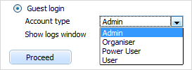
Form supports select nesting, i.e. you can set different items for different options. Subject to the selected option - the appropriate set of items will be shown.
Attributes
| className | string | the user-defined css class for item |
| connector | url | allows to load select options of the item from database. See details (SelectOptionsConnector) |
| disabled | boolean | disables/enables the item |
| hidden | boolean | hides/shows the item. The default value - false (the item is shown) |
| info | boolean | adds the |
| inputHeight | string|number | the height of input. The default value is "auto" |
| inputLeft | number | sets the left absolute offset of input. The attribute is applied only if the "position" is set as "absolute" |
| inputTop | number | sets the top absolute offset of input. The attribute is applied only if the "position" is set as "absolute" |
| inputWidth | string|number | the width of input. The default value is "auto" |
| label | string | the text label of item |
| labelAlign | string | left, right or center - the alignment of label within the defined width |
| labelHeight | string|number | the height of label. The default value is "auto" |
| labelLeft | number | sets the left absolute offset of label. The attribute is applied only if the "position" is set as "absolute" |
| labelTop | number | sets the top absolute offset of label. The attribute is applied only if the "position" is set as "absolute" |
| labelWidth | string|number | the width of label. The default value is "auto" |
| name | string | the identification name. Used for referring to item |
| note | object | creates the details block which is placed under the input, parameters: text- (string) the note's text, width - (number) the note area's width (get from input by default) |
| offsetLeft | number | sets the left relative offset of item (both input and label) |
| offsetTop | number | sets the top relative offset of item (both input and label) |
| options | object | specifies select options of item, parameters: list - (array) defines the array of nested elements, selected - (boolean) defines whether the option will be selected initially, text- (string) the option's text, value - (string) the option's id |
| position | string | label-left/label-right/label-top/absolute - defines the position of label relative to input |
| required | boolean | adds the |
| style | string | specifies css style of item |
| tooltip | string | creates the tooltip for the input label |
| userdata | object | sets some user data for the input ("key:value" pairs) |
var formData = [
    {type:"radio", name:"type", label:"Guest login", labelWidth:"auto",
      position:"label-right",
      list:[
        {type: "select", label: "Account type", options:[
            {text: "Admin", value: "admin"},
            {text: "Organizer", value: "org"},
            {text: "Power User", value: "poweruser"},
            {text: "User", value: "user"}
        ]},
        {type: "checkbox", label: "Show logs window"}
    ]},
    {type: "button", value: "Proceed"}
];
XML format for
<data>
    <item value="value_a" label="text"/>
    <item value="value_b" label="new text" selected="true"/>
    ...
</data>
Related sample: Text/Select/Password
Settings
allows overriding some default form settings for items (placed at the beginning of data block).
For example, attribute position. You'd like to place labels of several items to left.
You can specify position:"label-left" for each item or just put this stuff into settings item once.
In case you specify the same attribute in settings and item: setting's value will be ignored.

Attributes
| blockOffset | number | the offset of the item content. For the Block only |
| inputHeight | string|number | sets the height of input. The default value is "auto" |
| inputWidth | string|number | sets the width of input. The default value is "auto" |
| labelAlign | string | left/right/center - the alignment of label within the defined width |
| labelHeight | string|number | sets the height of label. The default value is "auto" |
| labelWidth | string|number | sets the width of label. The default value is "auto" |
| noteWidth | string|number | sets the width of the details block (which is placed under the input) |
| offsetLeft | number | sets the left relative offset of item (both input and label) |
| offsetTop | number | sets the top relative offset of item (both input and label) |
| position | string | label-left/label-right/label-top/absolute - defines the position of label relative to input |
var formData = [
    {type:"settings",position:"label-left",labelWidth:120,inputWidth:120,
       labelAlign:"right"},
    {type: "input", label: "Name", value: "John Smith", labelAlign: "left"},
    {type: "password", label: "Password", value: "123", labelAlign: "center"},
    {type: "select", label: "Session", options:[
        {value: "1", text: "Administration"},
        {value: "2", text: "Design"},
        {value: "3", text: "Manage Articles"}
    ]}
];
Template
allows setting any template to item. It can be some link, some text, another item, etc. Template is specified by the parameter format where you define the appropriate template handler.

Attributes
| className | string | the user-defined css class for item |
| info | boolean | adds the |
| format | function | defines template handler. This function should return value (formatted by user) which will be inserted instead of input. Gets parameters - "name", "value" |
| hidden | boolean | hides/shows the item. The default value - false (the item is shown) |
| inputHeight | string|number | the height of input. The default value is "auto" |
| inputLeft | number | sets the left absolute offset of input.The attribute is applied only if the "position" is set as "absolute" |
| inputTop | number | sets the top absolute offset of input.The attribute is applied only if the "position" is set as "absolute" |
| inputWidth | string|number | the width of input. The default value is "auto" |
| label | string | the text label of item |
| labelAlign | string | left/right/center - the alignment of label within the defined width |
| labelHeight | string|number | the height of label. The default value is "auto" |
| labelLeft | number | sets the left absolute offset of label. The attribute is applied only if the "position" is set as "absolute" |
| labelTop | number | sets the top absolute offset of label. The attribute is applied only if the "position" is set as "absolute" |
| labelWidth | string|number | the width of label. The default value is "auto" |
| name | string | the identification name. Used for referring to item |
| note | object | creates the details block which is placed under the input, parameters: text- (string) the note's text, width - (number) the note area's width (get from input by default) |
| offsetLeft | number | sets the left relative offset of item (both input and label) |
| offsetTop | number | sets the top relative offset of item (both input and label) |
| position | string | label-left/label-right/label-top/absolute - defines the position of label relative to input |
| required | boolean | adds the |
| style | string | specifies css style of item |
| tooltip | string | creates the tooltip for the input label |
| value | string | the initial value of item |
| userdata | object | sets some user data for the input ("key:value" pairs) |
function doLink(name, value) {
    var f = this.getForm();
    return '<a href="script/do_edit.php?id='+value+'&t=abc">hello</a>';
}
var formData = [
    {type: "checkbox", label: "Accept cookies from sites", checked: true, list:[
        {type:"checkbox", label:"Accept third-party cookies", checked: true},
        {type:"select", label:"Keep until", inputWidth:"auto", position:"label-left",
          options:[
            {value: "1", text: "they expire", selected: true},
            {value: "2", text: "I close Firefox"},
            {value: "3", text: "ask me every time"}
        ]},
        {type:"template",name:"a",label:"Today:",value:"Hello",position:"label-left",
          format:doLink}
    ]}
]
Upload
An item that allows uploading multiple files and tracking the progress of individual file upload.

You can find specific methods and events of the Uploader control in the dhtmlXFileUploader API.
Attributes
Common attributes:
| className | string | the user-defined css class for the item |
| hidden | boolean | hides/shows the item. The default value - false (the item is shown) |
| name | string | the identification name. Used for referring to the item |
| inputHeight | string|number | the height of the item. The default value is "auto" |
| inputWidth | string|number | the width of the item. The default value is "auto" |
| offsetLeft | number | sets the left relative offset of the item |
| offsetTop | number | sets the top relative offset of the item |
| disabled | boolean | disables/enables the item. The default value - false |
| userdata | object | sets some user data for the item ("key:value" pairs) |
Uploader-related attributes:
| mode | string | html5, html4, flash, sl - allows you to manually set the mode in use. Beware, once you set the mode manually, the control will work in this mode permanently independent of the browser you use |
| titleScreen | boolean | defines whether the initial screen (when no files are selected) must be displayed. The default value - true |
| titleText | string | the text of the initial screen. The default value - "Drag-n-Drop files here or click to select files for upload" |
| autoStart | boolean | defines whether files must be immediately loaded after selecting. The default value - false |
| autoRemove | boolean | defines whether files must be removed from the item after complete downloading. The default value - false |
URL attributes:
| url | string | the path to the server-side script (relative to the index file) which will parse the requests received from the uploader. Used in the html5/html4 modes |
| swfPath | string | the path to the uploader.swf file |
| swfUrl | string | the path to the server script file (relative to the client flash script file) which will parse the requests. Used in the flash mode |
Silverlight-related attributes:
| slXap | string | the path to the dhxupload.xap file (full path is required, i.e. including http://host..) |
| slUrl | string | the full path to the server script file |
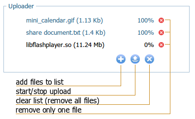
Controls
Details
The control can work in 4 modes:
- html5 (multiple files selecting, tracking the progress, loading by Ajax, d-n-d for selecting files, IE10, IE11, FF, Opera, Chrome)
- flash (multiple files selecting, tracking the progress, loading by Flash, any browser with flash installed)
- html4 (works as a standard HTML input upload control, IE6-IE9)
- sl (based on the Silverlight engine, experimental mode, IE)
By default, the item uses the html5 mode, then flash if html5 isn't supported. If both html5 and flash aren't supported - html4.
The sl mode can be invoked just manually.
How does the control work?
To provide the loading, the control uses a script that gets files to load. The same script is used in all modes but with slight differences.
Let's assume you have the folders tree as in:
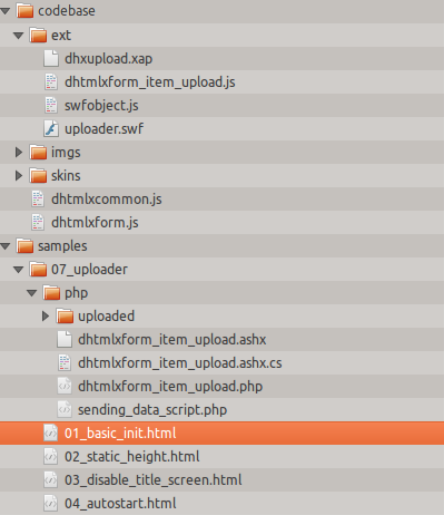
where
- samples/07_uploader/01_basic_init.html - the index file (currently selected).
- samples/07_uploader/php/dhtmlxform_item_upload.php - the server script we use.
To understand how the control saves files on the server side, please check the 'dhtmlxform_item_upload.php' file in the dhtmlxForm package (resided in the directory: dhtmlxForm\samples\07_uploader\php\ )
html5/html4 modes
For html5/html4 modes it's quite enough to set the url parameter:
- url - the path to the server script file "dhtmlxform_item_upload.php" relative to the index file "01_basic_init.html", in our case the path will be "php/dhtmlxform_item_upload.php"
flash mode
For the flash mode you must specify 2 parameters: swfPath, swfUrl
- swfPath - the path to the client flash script file "uploader.swf" relative to the index file "01_basic_init.html", in our case the path will be "../../codebase/ext/uploader.swf"
- swfUrl - the path to the server script file "dhtmlxform_item_upload.php" relative to the client flash script file "uploader.swf", in our case the path will be "../../samples/07_uploader/php/dhtmlxform_item_upload.php"
To provide correct running in all browsers you need to specify 3 parameters at a time.
formdata = [{
    type: "upload",
    name: "myFiles",
    url: "php/dhtmlxform_item_upload.php",
    swfPath: "../../codebase/ext/uploader.swf",
    swfUrl: "../../samples/07_uploader/php/dhtmlxform_item_upload.php"
}]
"sl" mode (loading with Silverlight)
Note, it's an experimental mode.
For the sl mode you can specify the next parameters:
- slXap - the path to the client script file "dhxupload.xap" relative to the index file "01_basic_init.html", in our case the path will be "../../codebase/ext/dhxupload.xap";
- slUrl - the full path to the server script file "dhtmlxform_item_upload.php".
formData = [{
   type: "upload",
   name: "myFiles",
   mode: "sl", // enables the sl mode
   url: "dhtmlxform_item_upload.php",
   slXap: "../../codebase/ext/dhxupload.xap",
   // FULL path is required
   slUrl:"http://localhost/dhtmlx/dhtmlxForm/samples/07_uploader/php/dhtmlxform_item_upload.php",
}];
Related samples: folder "samples/07_uploader"
Please, make sure that for the 'html4' mode you set the response content type to "text/html", while for the other modes - to "text/json" .