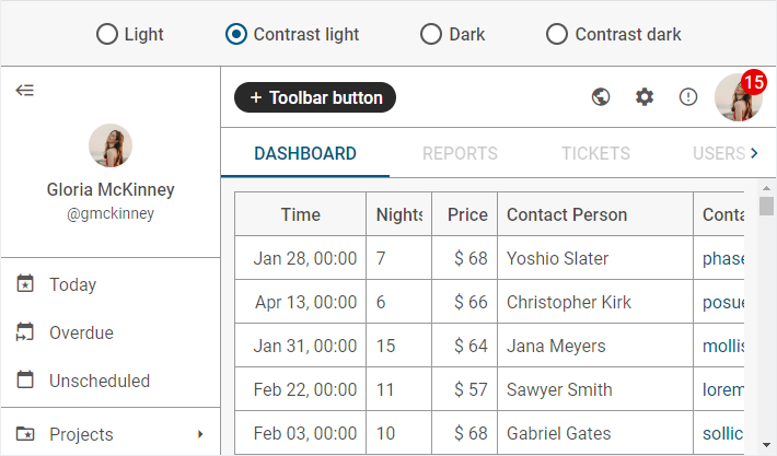
Light high contrast theme
The "contrast-light" theme is configured both on the base of the root CSS variables and variables which are listed below:
[data-dhx-theme='contrast-light'] {
    /* font */
    --dhx-font-size-normal: 16px;
    --dhx-font-size-small: var(--dhx-font-size-normal);

    --dhx-font-color-secondary: rgba(0, 0, 0, .66);
    --dhx-font-color-additional: var(--dhx-font-color-secondary);
    /* end font */

    /* border */
    --dhx-border-color: rgba(0, 0, 0, .4);
    /* end border */

    /* color scheme */
    --dhx-l-contrast-offset: 14%;
    /* end color scheme */

    /* DHTMLX Toolbar service variables*/
    --dhx-s-toolbar-background: var(--dhx-background-primary);
    --dhx-s-toolbar-button-background-hover: rgba(0, 0, 0, .07);
    --dhx-s-toolbar-button-background-active: rgba(0, 0, 0, .15);
    /* end DHTMLX Toolbar service variables */

    /* DHTMLX Grid service variables*/
    --dhx-s-grid-header-background: var(--dhx-background-secondary);
    --dhx-s-grid-selection-background: var(--dhx-color-gray-700);
    /* end DHTMLX Grid service variables*/

    /* DHTMLX Calendar service variables*/
    --dhx-s-calendar-muffled: .8;
    /* end DHTMLX Calendar service variables*/

    /* DHTMLX Slider service variables*/
    --dhx-s-tick-font-size: var(--dhx-font-size-small);
    /* end DHTMLX Slider service variables*/
}