Border
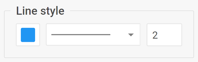
用于显示和修改 Diagram 元素边框的复杂控件
信息
Border 控件不适用于 lineTitle 元素。
用法
{
    type: "border",

    hidden?: boolean, // 默认为 false
    disabled?: boolean, // 默认为 false

    css?: string,
    width?: string | number | "content", // 默认为 "content"
    height?: string | number | "content", // 默认为 "content"
    padding?: string | number, // 默认为 "0 16px"

    label?: string,
    labelAlignment?: "left" | "right" | "center", // 默认为 "left"
    align?: "start" | "center" | "end" | "between" | "around" | "evenly", // 默认为 "between"
    compact?: boolean, // 默认为 false

    // 服务属性
    $properties?: object
}
描述
基本属性
type- (必需)控件的类型。将其设置为"border"hidden- (可选)定义控件是否隐藏。默认值为 falsedisabled- (可选)定义控件是启用(false)还是禁用(true)。默认值为 falsecss- (可选)为控件添加样式类width- (可选)控件的宽度。默认值为"content"height- (可选)控件的高度。默认值为"content"padding- (可选)设置控件组内内容的内边距。默认值为 "0 16px"label- (可选)指定控件的标签labelAlignment- (可选)定义标签的位置。默认值为"left"align- (可选)设置控件组内控件的对齐方式。默认值为"between"compact- (可选)指定紧凑模式,移除缩进和边框。默认值为 false
服务属性
$properties- (可选)允许您在复杂控件内覆盖基本控件的值。您可以基于基本控件配置 Border 控件的以下元素:stroke- (colorpicker)设置边框颜色strokeType- (combo)设置边框类型strokeWidth- (input)设置边框宽度
示例
const editor= new dhx.DiagramEditor("editor_container", {
    type: "default",
    view: {
        editbar: {
            properties: {
                rectangle: [
                    {
                        type: "border",
                        label: "Border style",
                        $properties: {
                            strokeType: { hidden: true }
                        }
                    }
                ]
            }
        }
    }
});