Groups
Group overview
A group is a separate kind of Diagram item. You can draw simple or more complicated schemes by grouping shapes or other groups in different ways. You can create both one-level and nested groups, and configure their appearance and behavior.
Groups are available only in the default mode of Diagram/Diagram Editor (type: "default").
Creating groups
To create a group, specify "$group" as a value of the type attribute inside the group object while preparing a related JSON structure to load into the diagram:
const data = [
    {
        type: "$group",
        id: 1,
        width: 400,
        height: 200,
        x: 0,
        y: 0,
        header: {
            text: "User Access"
        },
        groupChildren: ["1.1", "1.2"]
    },
    {
        type: "it",
        id: "1.1",
        x: 50,
        y: 75,
        text: "Remote Desktop"
    },
    {
        type: "it",
        id: "1.2",
        x: 200,
        y: 75,
        text: "Login Server"
    },
];

// initializing a diagram
const diagram = new dhx.Diagram("diagram_container");
diagram.data.parse(data);
Properties
See the full list of configuration properties of a group object which allow you to configure the positioning and appearance of the group.
Grouping shapes in the PERT mode
To group the "task" and "milestone" types of shapes in the PERT mode of the Diagram, use the "project" object in the data set of a diagram. The "project" object serves as a container for tasks and milestones, working as a group. It allows creating PERT charts with various nesting levels and provides visual grouping.
const data = [
    {
        "id": "4.2",
        "text": "QA Testing",
        "type": "project",
        "parent": "4",
        "start_date": new Date(2026, 1, 18),
        "duration": 3,
        "progress": 0,
        "open": true
    },
    {
        "id": "4.2.1",
        "text": "Functional Testing",
        "type": "task",
        "parent": "4.2",
        "start_date": new Date(2026, 1, 18),
        "duration": 2
    },
    {
        "id": "4.2.2",
        "text": "Usability Testing",
        "type": "task",
        "parent": "4.2",
        "start_date": new Date(2026, 1, 20),
        "duration": 1
    }
];
Properties
See the full list of configuration properties of a "project" object which allow you to configure the positioning and appearance of tasks and milestones in the project.
Configuring the group header
The header of the group is disabled by default. To create a group with the header, you should specify the header property in the configuration object of the group.
const data = [
    {
        type: "$group",
        id: 1,
        width: 400,
        height: 200,
        x: 0,
        y: 0,
        header: {}
    }
];
The property contains several attributes which allow you to easily adjust the configuration of the group header. For example, you can define the height of the header and its position, specify the text for your header and adjust its settings.
Check the full list of API properties of the group object.
A header icon
To collapse or expand a group, enable the closable attribute of the header property. As a result, an icon, which allows a user to expand/collapse a group, will be added to the header.
const data = [
    {
        type: "$group",
        id: 1,
        width: 400,
        height: 200,
        x: 0,
        y: 0,
        header: {
            text: "Top and collapsed header with tеxt alignment",
            closable: true
        }
    }
];
You can change the color of the icon via the iconColor attribute of the group object.
Configuring the behavior of group items
By default, you can drag any child item of the group out of the group and drag it into another group.
To change how the group items behave, use the groupBehavior and padding attributes of the exitArea property of the group object.
The exitArea property defines the behavior of the first-level children of the configurable group only.
The "unbound" and "boundBorderExtension" values of the groupBehavior attribute allow you to define whether the child items can be moved out of the group, and to make the group borders expand when a user is trying to drag an item outside. If needed, you can also disable the ability to drag items outside the group via the "boundNoBorderExtension" value.
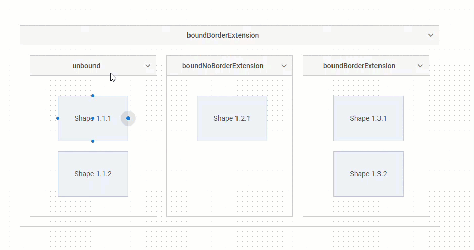
If groupBehavior is set to "boundNoBorderExtension" or "boundBorderExtension", you can specify the padding between the group and the edge of the item when moving the item inside the group. For this purpose, use the padding attribute:
const data = [
    {
        type: "$group",
        id: 1,
        width: 830,
        height: 400,
        x: 0,
        y: 0,
        exitArea: {
            groupBehavior: "boundBorderExtension",
            padding: 10
        },
        //fixed: true,
        groupChildren: ["1.1", "1.2", "1.3"]
    },
    // ...
];